CSS3动画
CSS3过渡的基本用法:
CSS3过渡是元素从一种样式逐渐改变为另一种样式的效果。
过渡属性-transition
值与说明
transition-property
必需,指定CSS属性的name,transition效果即哪个属性发生过渡。
transition-duration
必需,transition效果需要指定多少秒s或毫秒ms才能完成。
transition-timing-function
指定transition效果的转速曲线,即规定过渡效果在不同阶级的速度。
transition-delay
定义transition效果开始的时候延时。
语法:
transition: property duration
timing-function delay;
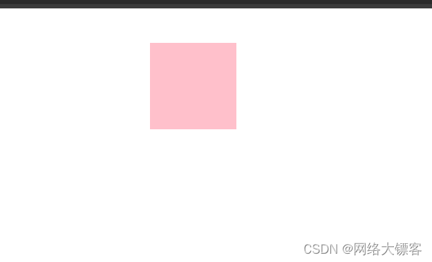
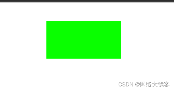
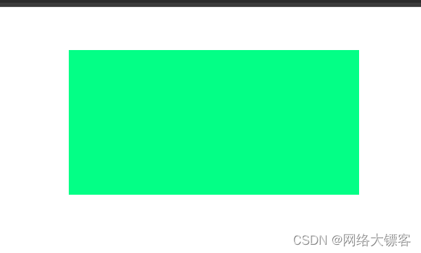
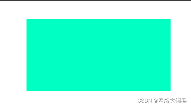
例:我们鼠标放置div上时,变化在两秒内完成
<style>
*{
margin: 0;
padding: 0;
}
.box{
width: 200px;
height: 100px;
background-color: rgb(9, 255, 0);
margin: 50px auto;
}
.box:hover{
width: 400px;
height: 200px;
background-color: rgb(0, 255, 195);
transition: all 2s;
}
</style>
</head>
<body>
<div class="box"> </div>
</body>
除了宽高当然背景颜色也是可以渐变的,一个一个写width,height bgc太麻烦,我们如果想全部变化就直接写all。
过渡这个属性是谁想发生变化就加在谁上面,我们也可以分开设置: transition: width 2s,height 3s,background-color 3s; (注意用逗号隔开),每个属性单独控制以达到意想不到的效果。
————————————————————
过渡效果在不同阶段的效果timing-function
值与说明
linear(线性的)
规定以相同速度开始是结束的过渡效果(匀速)
ease
规定慢速开始,然后变快,最后慢速结束的过渡效果(慢快慢)
ease-in
规定以慢速开始的过渡效果(慢快)
ease-out
规定以慢速结束的过渡效果(快慢)
ease-in-out
规定以慢速开始和结束的过渡效果(慢快慢),效果比ease还要慢一点。
————————————————————
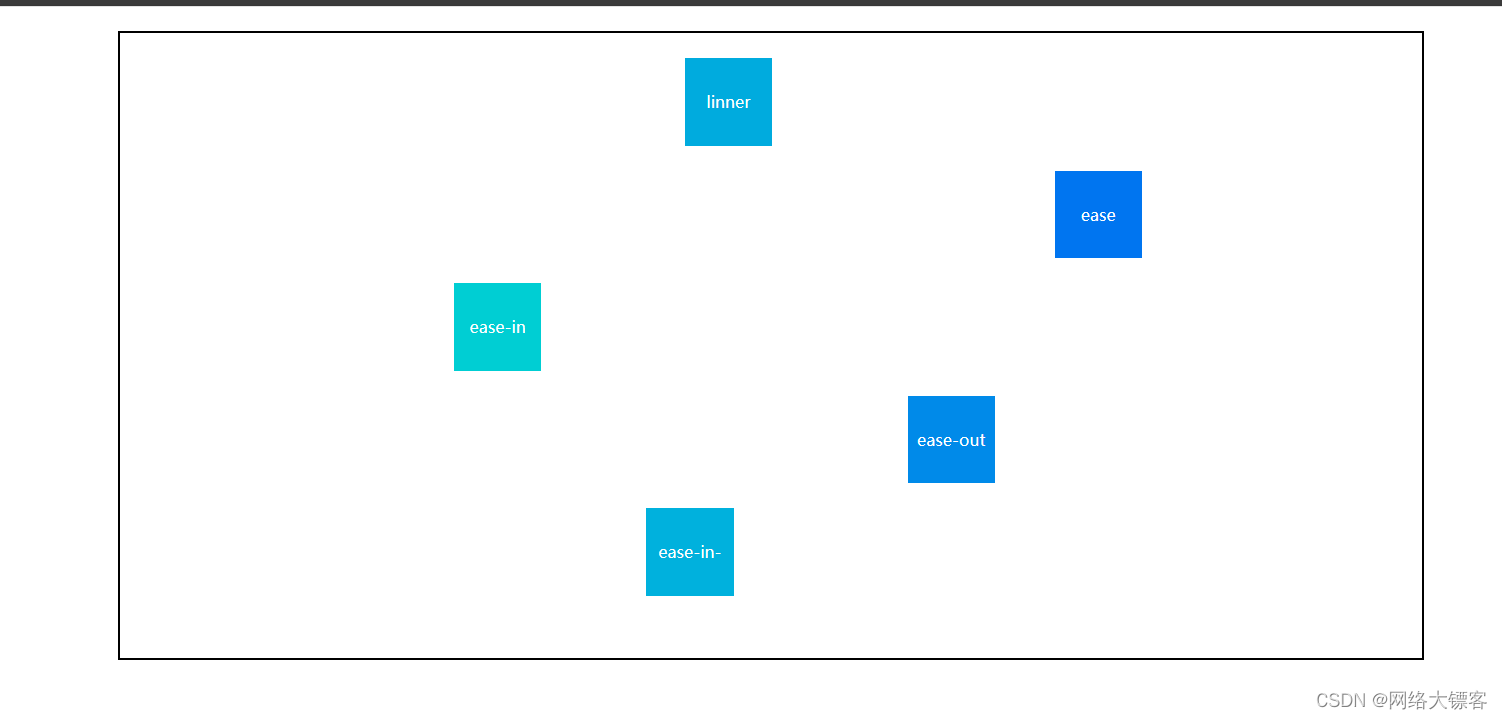
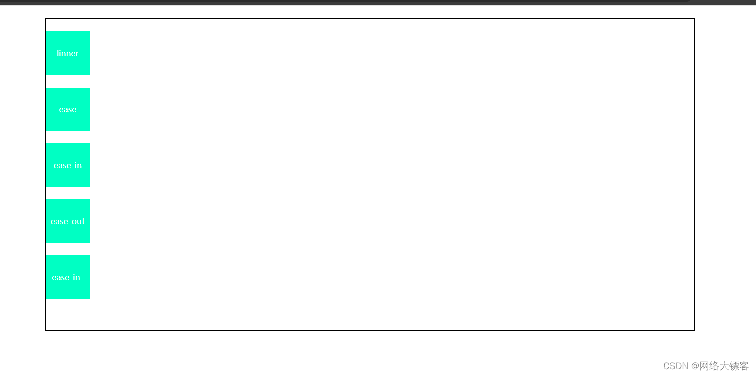
我们可以写运动的方块来看看他们的具体运动情况,上代码:
<title>css3动画</title>
<style>
*{
margin: 0;
padding: 0;
}
.box{
width: 70%;
border: 2px solid black;
margin: 20px auto;
position: relative;
height: 500px;
}
.a,.b,.c,.d,.e{
width: 70px;
height: 70px;
background-color: rgb(0, 255, 195);
text-align: center;
line-height: 70px;
color: white;
font-size: 13px;
margin-top: 20px;
position: absolute;
top: 0;
left: 0;
}
.a{
transition: all 5s linear;
}
.b{
margin-top: 110px;
transition: all 5s ease;
}
.c{
margin-top: 200px;
transition: all 5s ease-in;
}
.d{
margin-top: 290px;
transition: all 5s ease-out;
}
.e{
margin-top: 380px;
transition: all 5s ease-in-out;
}
.box:hover .a,(注意hover后有空格)
.box:hover .b,
.box:hover .c,
.box:hover .d,
.box:hover .e{
background-color: rgb(0, 72, 255);
left: 95%;(令其移动到右边95%的位置)
}
</style>
</head>
<body>
<div class="box">
<div class="a">linner</div>
<div class="b">ease</div>
<div class="c">ease-in</div>
<div class="d">ease-out</div>
<div class="e">ease-in-out</div>
</div>
</body>
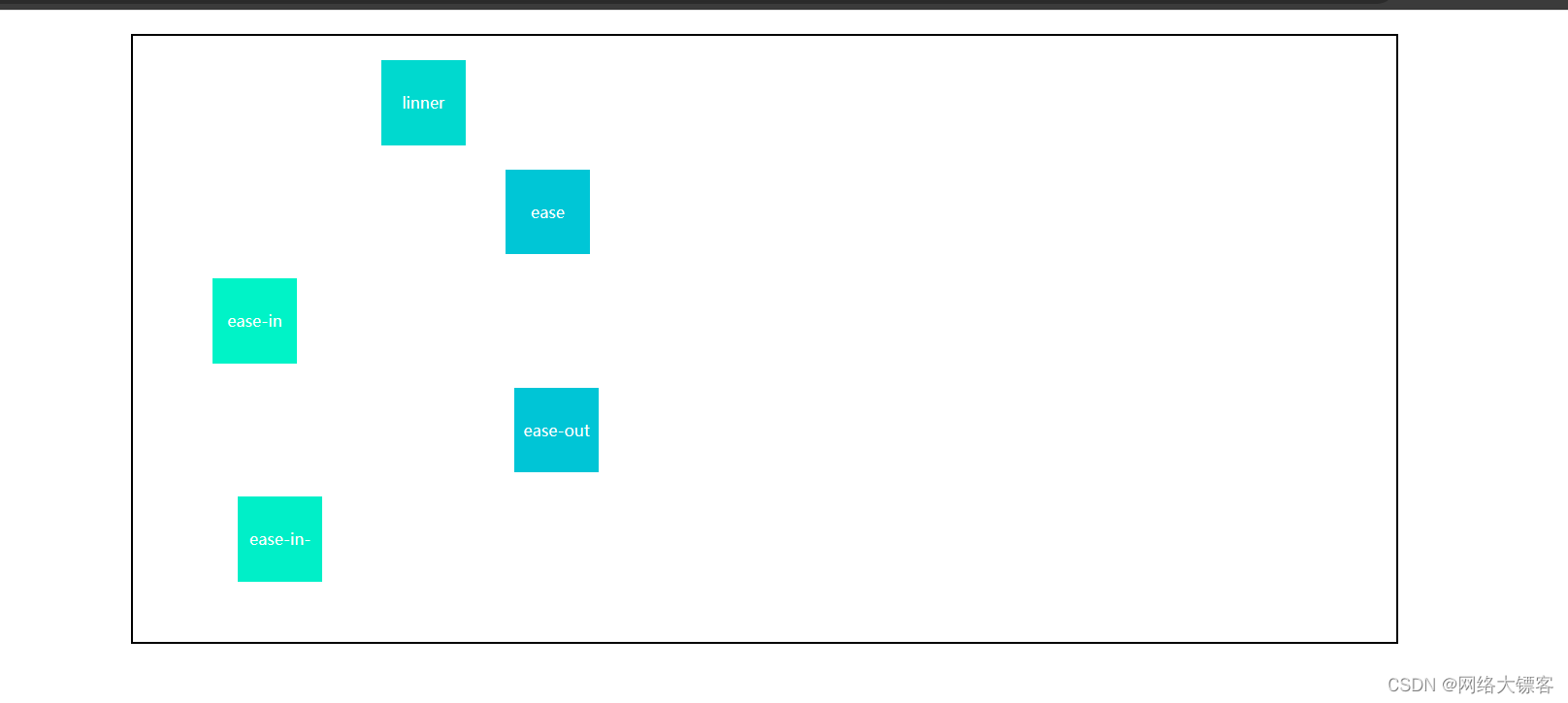
也可以加上颜色渐变,更清晰观察运动变化