水平居中
1.文本居中对齐
内联元素(给容器添加样式)
限制条件:仅用于内联元素 display:inline 和 display: inline-block;
<!DOCTYPE html>
<html lang="en">
  <head>
    <meta charset="UTF-8" />
    <meta name="viewport" content="width=device-width, initial-scale=1.0" />
    <title>Document</title>
    <style>
      .box {
        margin: 30px 30px 0px 300px;
        border: 1px solid gray;
        text-align: center;
      }

      .item {
        display: inline-block;
        width: 400px;
        background: yellow;
      }
    </style>
  </head>
  <body>
    <div class="box">
      <span>水平居中 -- display: inline</span>
    </div>
    <div class="box">
      <div class="item">水平居中 -- display: inline-block</div>
    </div>
  </body>
</html>
自动外边距(块级元素)
限制条件:仅用于块级元素 display:block;
<!DOCTYPE html>
<html lang="en">
  <head>
    <meta charset="UTF-8" />
    <meta name="viewport" content="width=device-width, initial-scale=1.0" />
    <title>Document</title>
    <style>
      .box {
        margin: 30px;
        border: 1px solid gray;
      }
      .item {
        margin: auto;
        width: 300px;
        background: yellow;
      }
    </style>
  </head>
  <body>
    <div class="box">
      <div class="item">水平居中 -- 块级元素 display:block</div>
    </div>
  </body>
</html>
flex布局
给容器添加样式 :display: flex; justify-content: center; ()
<!DOCTYPE html>
<html lang="en">
  <head>
    <meta charset="UTF-8" />
    <meta name="viewport" content="width=device-width, initial-scale=1.0" />
    <title>Document</title>
    <style>
      .box {
        margin: 30px 30px 0px 300px;
        border: 1px solid gray;
        display: flex;
        justify-content: center;
      }
      .item {
        width: 400px;
        background: yellow;
      }
    </style>
  </head>
  <body>
    <div class="box">
      <span>水平居中 -- flex布局 display: inline</span>
    </div>
    <div class="box">
      <div class="item">水平居中 -- flex布局 display: block</div>
    </div>
  </body>
</html>
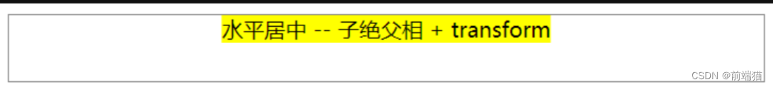
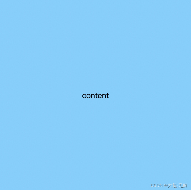
子绝父相 + transform (CSS3)
限制条件:浏览器需支持CSS3,比较老的浏览器不适用
给容器(父元素)添加样式
position: relative给内部元素添加样式
position: absolute;
left: 50%;
transform: translate(-50%, 0);
<!DOCTYPE html>
<html lang="en">
  <head>
    <meta charset="UTF-8" />
    <meta name="viewport" content="width=device-width, initial-scale=1.0" />
    <title>Document</title>
    <style>
      .box {
        margin: 30px 30px 0px 300px;
        border: 1px solid gray;
        height: 50px;
        position: relative;
      }

      .item {
        background-color: yellow;
        position: absolute;
        left: 50%;
        transform: translate(-50%, 0);
      }
    </style>
  </head>
  <body>
    <div class="box">
      <span class="item">水平居中 -- 子绝父相 + transform</span>
    </div>
  </body>
</html>
子绝父相 + 自动外边距 (指定宽度)
限制条件:内部元素需限定宽度
给容器(父元素)添加样式
position: relative
给内部元素添加样式
position: absolute; left: 0; right: 0; margin: auto;
<!DOCTYPE html>
<html lang="en">
  <head>
    <meta charset="UTF-8" />
    <meta name="viewport" content="width=device-width, initial-scale=1.0" />
    <title>Document</title>
    <style>
      .box {
        margin: 30px 30px 0px 300px;
        border: 1px solid gray;
        height: 50px;
        position: relative;
      }

      .item {
        background-color: yellow;
        position: absolute;
        left: 0;
        right: 0;
        margin: auto;
        width: 300px;
      }
    </style>
  </head>
  <body>
    <div class="box">
      <span class="item">水平居中 -- 子绝父相 + 自动外边距</span>
    </div>
  </body>
</html>
子绝父相 + 负外边距 (知道宽度 + 宽度计算)不退推荐
限制条件:需知道内部元素的宽度(无法预知宽度的内联元素和未知宽度的块级元素都不适用)
给容器(父元素)添加样式
position: relative给内部元素添加样式
position: absolute;
left:50%;
margin-left:-内部元素宽度的一半
<!DOCTYPE html>
<html lang="en">
<head>
<meta charset="UTF-8" />
<meta name="viewport" content="width=device-width, initial-scale=1.0" />
<title>Document</title>
<style>
.box {
margin: 30px;
border: 1px solid gray;
height: 100px;
position: relative;
}
.item {
width: 400px;
background: yellow;
position: absolute;
left: 50%;
margin-left: -200px;
}
</style>
</head>
<body>
<div class="box">
<div class="item">水平居中 -- 绝对定位元素 position:absolute</div>
</div>
</body>
</html>


![[MRCTF2020]Transform1](https://img-blog.csdnimg.cn/direct/bf55184487954b78b997fb83caa41d1a.png)
![BUUCTF---[MRCTF2020]你传你呢1](https://img-blog.csdnimg.cn/direct/8f6d683d091840879c093b62e9576676.png)