友情提示:本项目使用stage模型,ArkTs语言,api9。
先看项目结构,本项目所有代码都在Index.ets文件下,图片资源在image文件夹和resources下的media文件下都有分布。

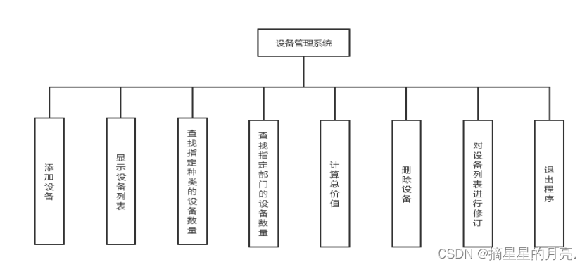
这项目就一个界面,看似简单,其实一步一个难点,比上一篇文章的微信项目有过之无不及。主要难点有以下几个:
1、头像昵称的叠加布局
2、导航栏的隐藏和显示
3、评论弹窗的动画效果和单例显示
4、点击图片预览
在开始构建页面之前,先解决一下数据问题,我先定义一个数据模型,然后自己手写几条朋友圈数据:
class MomentClass {
  public nickName: string; //昵称
  public content: string; //内容
  public date: string; //发表日期
  public showC: boolean; //是否显示评论和赞弹窗
  public images: string[]; //内容图片列表

  constructor(nickName: string,content: string,date: string,showC: boolean,images:string[]) {
    this.nickName = nickName;
    this.content = content;
    this.date = date;
    this.showC = showC;
    this.images = images;
  }
}
@State momentList: MomentClass[] = [
    new MomentClass('老张1','今朝有酒今朝醉','8天前',false,['/image/moment_1.png']),
    new MomentClass('老张2','hahahah2','8天前',false,['/image/grid_0.png','/image/grid_1.png','/image/grid_2.png','/image/grid_1.png']),
    new MomentClass('老张3','哈哈真的很不错','8天前',false,[]),
    new MomentClass('老张4','我emo了我emo了我emo了我emo了。。。。。。。。','8天前',false,[]),
    new MomentClass('老张5','今朝有酒今朝醉今朝有酒今朝醉今朝有酒今朝醉今朝有酒今朝醉今朝有酒今朝醉今朝有酒今朝醉今朝有酒今朝醉今朝有酒今朝醉今朝有酒今朝醉今朝有酒今朝醉今朝有酒今朝醉今朝有酒今朝醉今朝有酒今朝醉今朝有酒今朝醉','8天前',false,[]),
  ];
有了数据就可以开始开发页面了。我们先忽略导航栏,先看滚动区域部分,显然它是一个List,根据内容不同我把它分成两个ListItemGroup:

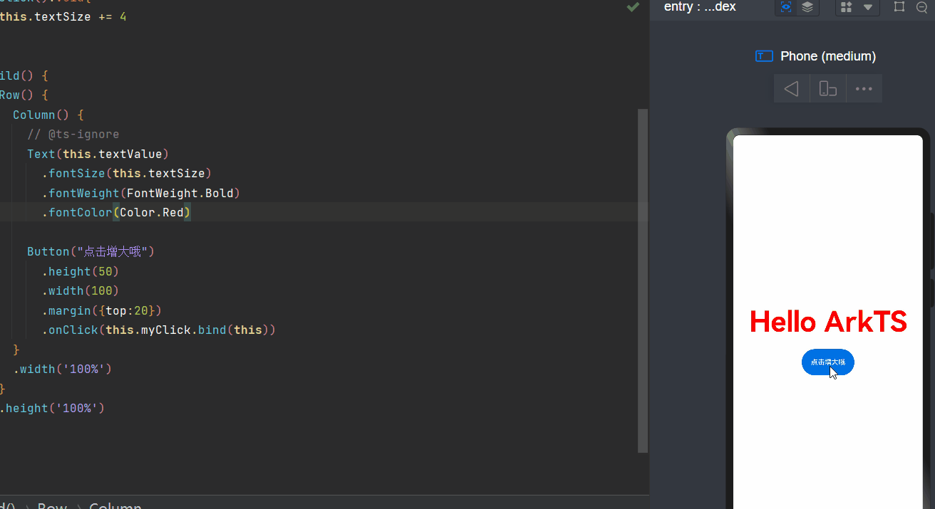
第1部分,叠加布局,背景图片上叠加昵称和头像,对齐格式设置bottomEnd,然后调整一下外边距margin就会有底部超出范围的效果:
ListItemGroup(){
        ListItem(){
          Stack({alignContent:Alignment.BottomEnd}){
            Flex() {
              Image('/image/backImage.png')
                .width('100%')
                .height(300)
            }

            Flex({direction:FlexDirection.Row,justifyContent:FlexAlign.End,alignItems:ItemAlign.Center}){
              Text("幽蓝君")
                .fontColor(Color.White)
                .margin({right:5})
              Image('/image/head.png')
                .width(70)
                .height(70)
                .borderRadius(8)
            }
            .padding({right:10})
            .width('100%')
            .height(70)
            .margin({bottom:-20})
          }
          .width('100%')
          .height(300)
        }
      }
下面的内容区域需要好好分析一下:

图中标出1、2、3部分相信对大家没什么难度,第4部分我使用的是Grid容器,然后根据图片的数量调整列数和行数:代码如下:
Grid(){
          ForEach(this.momentItem.images, (imagePath: string,index:number) => {
            GridItem() {
              Image(imagePath)
            }
          })
        }
        .columnsTemplate(this.calcColumnsTemplate())
        .rowsTemplate(this.calcRowsTemplate())
        .width(this.calcGridRow())
        .height(this.calcGridColum())
        .columnsGap(7)
        .rowsGap(7)
        .margin({top:5})
//计算列数
calcRowsTemplate(){
    if(this.momentItem.images.length <= 3){
      return '1fr'
    }else if(this.momentItem.images.length > 3 && this.momentItem.images.length <= 6){
      return '1fr 1fr'
    }else {
      return '1fr 1fr 1fr'
    }
  }
//计算行数
calcColumnsTemplate(){
    if(this.momentItem.images.length <= 1){
      return '1fr'
    }else if(this.momentItem.images.length == 2){
      return '1fr 1fr'
    }else {
      return '1fr 1fr 1fr'
    }
 }
第5部分看似是横向布局,它其实是一个叠加布局,黑色弹窗和两侧内容的叠加。代码如下:
Stack({alignContent:Alignment.End}){
          Flex({direction:FlexDirection.Row,justifyContent:FlexAlign.SpaceBetween,alignItems:ItemAlign.Center}){
            Text(this.momentItem.date)
              .fontColor('rgb(185,185,185)')
              .fontSize(13)
            Text('••')
              .width(35)
              .height(18)
              .borderRadius(5)
              .fontSize(12)
              .fontWeight(900)
              .textAlign(TextAlign.Center)
              .fontColor('rgb(90,109,150)')
              .backgroundColor('rgb(247,247,247)')

          }
          .padding({right:20})
          .height(40)


          Flex({direction:FlexDirection.Row,}){
            Flex({direction:FlexDirection.Row}){
              Flex({direction:FlexDirection.Row,justifyContent:FlexAlign.Center,alignItems:ItemAlign.Center}){
                Image($r('app.media.like'))
                  .width(18)
                  .height(18)
                Text('赞')
                  .fontColor(Color.White)
                  .fontSize(14)
                  .textAlign(TextAlign.Center)
              }
              .width(60)
              .height(40)
              Flex({direction:FlexDirection.Row,justifyContent:FlexAlign.Center,alignItems:ItemAlign.Center}){
                Image($r('app.media.commen'))
                  .width(18)
                  .height(18)
                Text('评论')
                  .fontColor(Color.White)
                  .fontSize(14)
                  .textAlign(TextAlign.Center)
              }
              .width(60)
              .height(40)
            }
            .borderRadius(4)
            .width(120)
            .height(40)
            .position({x:0})
            .backgroundColor('rgb(22,22,22)')

          }
          .margin({right:60})
          .width(120)
          .height(40)

        }
        .height(40)
这样做完之后,看下效果:

问题来了,评论和赞的弹窗不应该每一行都显示,它只能点击的时候显示一个并且带有动画效果,所以现在全部把它们隐藏,注意这里的隐藏不能使用Visibility.Hidden,而是设置位置和尺寸。因为只有宽度和x坐标的同时变化才能做到朋友圈那样的效果,假设弹窗显示时的x坐标是0,宽度120,那么动画开始之前x初始值应该是120,宽度为0才对,但是幽蓝君亲身实验宽度为0时是不行的,所以这里宽度初始值设置0.01,肉眼看不见就好。
说了一通,不知道大家能不能理解,看代码吧,当右侧的按钮点击时:
@State menuWidth:number = 0.001 //弹窗width初始值
@State menuX:number = 120 //弹窗x值初始值
animateTo({
      duration: 300,
      onFinish:() => {
           this.momentItem.showC = !this.momentItem.showC
       }
      }, () => {
      if(!this.momentItem.showC){
      //弹出
          this.menuX = 0
          this.menuWidth = 120
      }else {
      //收起
          this.menuX = 120
          this.menuWidth = 0.001
      }
})
这样可以实现单个弹窗的弹出和收起,但是我们要控制整个页面只能出现一个弹窗,所以在上述点击事件中要同时把点击的序号index传给父组件,让父组件处理数据列表,除index外其他行的showC置为false。
问题又来了,我们之前说过,@state修饰的变量,嵌套数据的变化它是监测不到的,所以即便把数据修改了其他弹窗也不会隐藏。
所以子组件中数据对象使用@ObjectLink修饰,数据模型MomentClass也要使用@Observed修饰:
@Observed
class MomentClass {
  public nickName: string;
  public content: string;
  public date: string;
  public showC: boolean;
  public images: string[];

  constructor(nickName: string,content: string,date: string,showC: boolean,images:string[]) {
    this.nickName = nickName;
    this.content = content;
    this.date = date;
    this.showC = showC;
    this.images = images;
  }
}
@ObjectLink @Watch('onCountUpdated2') momentItem: MomentClass;
这样就完成了整个评论弹窗的控制。
接下来就是导航栏了,导航栏有一个显示和隐藏的切换,规律是当第一个listGroupItem滑动消失时导航栏显示,否则隐藏。List组件有一个onScrollIndex方法:
.onScrollIndex((start,end)=>{
            if(start == 0 && end == 1){
              this.navHide = true
            }
            if(start == 1 && end == 1){
              this.navHide = false
            }
  })
然后把navHide变量赋值给导航栏的hideTitleBar:
.hideTitleBar(this.navHide)
这样导航栏就可以按照我们要求显示和隐藏了,至于隐藏时的导航栏图标大家可以自己添加一个,和导航栏反向显示就行了。
最后就是点击预览朋友圈图片,幽蓝君的做法是点击图片弹出一个List组件覆盖到屏幕上,看代码:
if (this.previewAlpha) {
        List({initialIndex:this.bigImageIndex}){
          ForEach(this.bigImageList,(imagePath)=>{
            ListItem(){
              Image(imagePath)
                .width('100%')
                .height('100%')
                .objectFit(ImageFit.Auto)
            }
          })

        }
        .edgeEffect(EdgeEffect.Spring)
        .listDirection(Axis.Horizontal)
        .width('100%')
        .height('100%')
        .backgroundColor(Color.Black)
        .onClick(()=>{
          animateTo({ duration: 500 }, () => {
            // 动画闭包内控制Image组件的出现和消失
            this.previewAlpha = !this.previewAlpha;
          })
        })
        //弹出动画
        .transition({ type: TransitionType.Insert, translate: { x: 20, y: 20 },scale: { x: 0, y: 0 } })
        //消失动画
        .transition({ type: TransitionType.Delete, opacity: 0, scale: { x: 0, y: 0 } })
      }
点击图片的时候设置previewAlpha:
animateTo({ duration: 500 }, () => {
            // 动画闭包内控制Image组件的出现和消失
            this.previewAlpha = !this.previewAlpha;
})
这样朋友圈的功能就基本完成了。
今天的项目比较复杂,描述有些混乱,不知道大家能不能看明白。
为了能让大家更好的学习鸿蒙 (OpenHarmony) 开发技术,这边特意整理了《鸿蒙 (OpenHarmony)开发学习手册》(共计890页),希望对大家有所帮助:https://qr21.cn/FV7h05
《鸿蒙 (OpenHarmony)开发学习手册》:https://qr21.cn/FV7h05
入门必看:https://qr21.cn/FV7h05
1. 应用开发导读(ArkTS)
2. ……

HarmonyOS 概念:https://qr21.cn/FV7h05
- 系统定义
- 技术架构
- 技术特性
- 系统安全
如何快速入门:https://qr21.cn/FV7h05
1. 基本概念
2. 构建第一个ArkTS应用
3. 构建第一个JS应用
4. ……

开发基础知识:https://qr21.cn/FV7h05
1. 应用基础知识
2. 配置文件
3. 应用数据管理
4. 应用安全管理
5. 应用隐私保护
6. 三方应用调用管控机制
7. 资源分类与访问
8. 学习ArkTS语言
9. ……

基于ArkTS 开发:https://qr21.cn/FV7h05
1. Ability开发
2. UI开发
3. 公共事件与通知
4. 窗口管理
5. 媒体
6. 安全
7. 网络与链接
8. 电话服务
9. 数据管理
10. 后台任务(Background Task)管理
11. 设备管理
12. 设备使用信息统计
13. DFX
14. 国际化开发
15. 折叠屏系列
16. ……
总结
鸿蒙系统开发作为当下的一个风口,对于有志于投身技术领域的小白来说是一个难得的机遇。通过深入了解鸿蒙系统的技术优势和市场前景,你将能够做出明智的选择。记住,站在风口上,猪都能飞起来,而掌握鸿蒙开发技能,或许就是你起飞的翅膀。现在就开始行动吧!