❤ css实用
CSS渐变色边框(Gradient borders方法的汇总 5种-代码可直接下载)
资源链接
https://download.csdn.net/download/weixin_43615570/88779950?spm=1001.2014.3001.5503
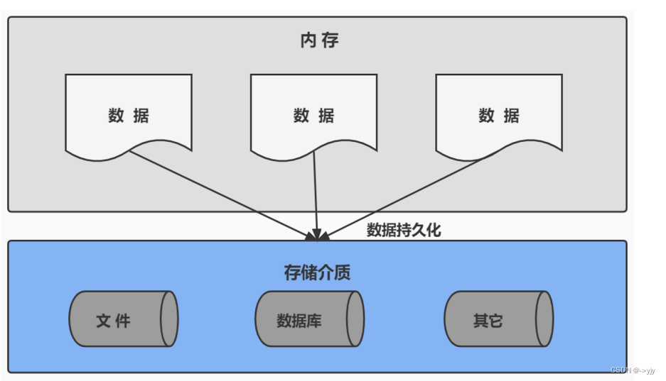
给 border 设置渐变色是很常见的效果,实现这个效果有很多思路
1、使用 border-image
使用 css 的 border-image 属性给 border 绘制复杂图样
与 background-image 类似,我们可以在 border 中展示image和linear-gradient。
通过 border-image 设置渐变色 border 是最简单的方法,只需要两行代码:
div {

  border: 4px solid;
  border-image: linear-gradient(to right, #8f41e9, #578aef) 1;
}

/* 或者 */
div {

  border: 4px solid;
  border-image-source: linear-gradient(to right, #8f41e9, #578aef);
  border-image-slice: 1;
}
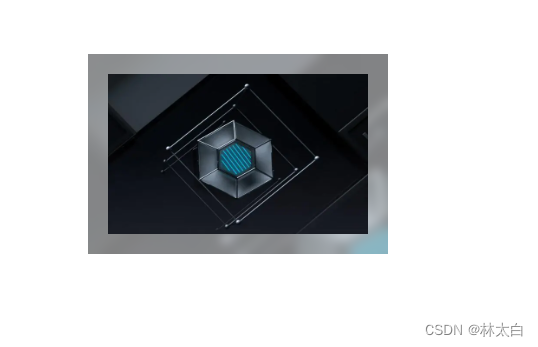
效果:

缺陷:不支持设置 border-radius
2、使用 background-image
使用 background-image 绘制渐变色背景,中间用纯色div块遮住应该是最容易想到的一种方法。
思路:两个盒子叠加,给下层的盒子设置渐变色背景和 padding,给上层盒子设置纯色背景。
效果:
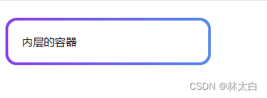
代码部分
<style>
  body {

       padding: 300px;
       box-sizing: border-box;
   }

   .border-bg {

       width: 300px;
       height: 100px;
       padding: 4px;
       background: linear-gradient(to right, #8f41e9, #578aef);
       border-radius: 16px;
   }

   .content {

       height: 100%;
       background: #fff;
       border-radius: 13px;
       padding: 20px;
       box-sizing: border-box;
       /*trciky part*/
   }
   </style>


<div class="border-bg">
    <div class="content">
       内层的容器
    </div>
</div>
优点:容易理解,兼容性好
缺点:设置 content 的 border-radius 会比较 tricky,且不准确。
代码链接:
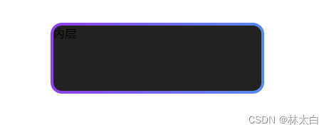
3、两层元素、background-image、background-clip
可以解决方法 2 中 border-radius 不准确的问题,可以使用一个单独的元素作为渐变色背景放在最下层,上层设置一个透明的 border 和纯色的背景(需要设置 background-clip: padding-box 以避免盖住下层元素的 border), 上下两层设置相同的 border-radius。(注意 border-radius: inherit; 这里原本的并不能生效)
重要的两句代码效果background-clip 属性用于指定背景图片的绘制区域。它有以下几个可选值:
border-box:背景绘制区域是包含边框和内边距的区域(默认值)。
padding-box:背景绘制区域是包含内边距的区域。
content-box:背景绘制区域是内容区域。
(1)
background-clip: padding-box;

当设置 background-clip: padding-box 时,
1. 背景图片将被限制在元素的内边距区域内。
2. 也就是说,背景图片不会超出元素的内边距区域,而边框区域和内容区域则没有背景图片
3. 这种情况下,如果元素存在边框或外边距,则背景图片不会延伸到它们之间的空间。

(2)
border-radius: inherit;

作用是继承父元素的 border-radius 值,并应用于当前元素。
当你在子元素上设置 border-radius: inherit; 时
子元素会继承父元素的圆角效果。这样可以确保子元素的边角与父元素保持一致,创建出一致的外观。
效果:
 <style>
    body {

        padding: 300px;
        box-sizing: border-box;
        position: relative;
    }

    .border-box1 {

        position: absolute;
        top: 0;
        right: 0;
        left: 0;
        bottom: 0;
        z-index: -1;
        /* margin: -4px;*/
        /* border-radius: inherit;  */
        border-radius: 16px; /*important*/
        width: 100%;
        height: 100%;
        box-sizing: border-box;
        background: linear-gradient(to right, #8f41e9, #578aef);
    }

     .border-box2 {

        width: 100%;
        height: 100%;
        border: 4px solid transparent;
        border-radius: 16px;
        position: relative;
        box-sizing: border-box;
        background-color: #222;
        background-clip: padding-box; /*important*/
    }
    </style>

	 <div style="position:relative;left: 100px;top: 100px;width: 300px;height: 100px">
	        <div class="border-box1"></div>
	        <div class="border-box2">
	            内层
	        </div>
	 </div>
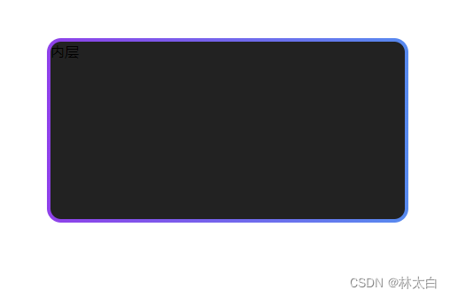
4、 伪元素(推荐)
效果:
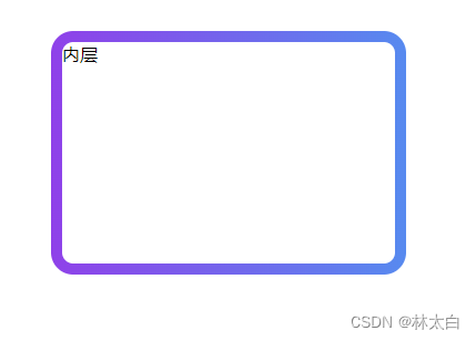
代码部分
<div>
        <div class="box">
            内层
        </div>
</div>
 body {

        padding: 300px;
        box-sizing: border-box;
        position: relative;
    }

     .box {

        position: relative;
        width: 300px;
        height: 200px;
        background-color: #fff;
        border: 10px solid transparent;
        border-radius: 20px;
        background-clip: padding-box;
      }
      .box::before {

        content: '';
        position: absolute;
        top: -10px;
        left: -10px;
        right: -10px;
        bottom: -10px;
        z-index: -1;
        background: linear-gradient(to right, #8f41e9, #578aef);
        border-radius: inherit;
      }
</style>
点击无需积分即可下载
5、单层元素、background-clip、background-origin、background-image(推荐)
CSS背景虚化backdrop-filter
资源链接 https://download.csdn.net/download/weixin_43615570/88776941
主要使用CSS的backdrop-filter属性,backdrop-filter属性可以对元素的背景进行模糊处理。
1、将要应用背景虚化效果的元素的position属性设置为relative或absolute,以便能够使用z-index属性。
2、使用::before或::after伪元素来创建一个与元素相同大小的伪元素,并将其position属性设置为absolute,top、left属性设置为0,z-index属性设置为-1,以确保伪元素在元素的下方
3、接下来,为伪元素设置背景图片,并使用backdrop-filter属性将背景进行虚化。可以使用blur()函数来设置模糊程度,也可以使用其他滤镜函数组合来实现更多效果。
4、使用content属性将伪元素的内容设置为空字符串。
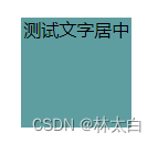
效果:
代码部分
代码地址
<style>
    .element {

        position: relative;
        width: 300px;
        height: 200px;
        overflow: hidden;
        padding: 20px;
        box-sizing: border-box;
    }

    .element::before {

        content: "";
        position: absolute;
        top: 0;
        left: 0;
        z-index: -1;
        width: 100%;
        height: 100%;
        background-image: url('https://img0.baidu.com/it/u=3855103837,344140545&fm=253&fmt=auto&app=138&f=JPEG?w=600&h=400');
        backdrop-filter: blur(5px);
        /* 虚化程度 */
    }

    .element::after {

        content: "";
        position: absolute;
        top: 0;
        left: 0;
        z-index: -1;
        width: 100%;
        height: 100%;
        background-color: rgba(255, 255, 255, 0.5);
        /* 虚化后的背景颜色 */
        backdrop-filter: blur(5px);
        /* 虚化程度 */
    }
    </style>
    <div>
        <div class="element">
            <div class="centerbox" style="width:100%;height: 100%;">
            <img src="https://img0.baidu.com/it/u=3855103837,344140545&fm=253&fmt=auto&app=138&f=JPEG?w=600&h=400" alt="" style="width:100%;height: 100%;">
            </div>
        </div>
    </div>
CSS实现背景图片全屏铺满自适应
① background-attachment:fixed;
效果:
<style>
		body{

			padding: 0;
			margin:0px;
			background: url('https://img1.baidu.com/it/u=2386402004,1368557636&fm=253&fmt=auto&app=138&f=JPEG?w=500&h=227') no-repeat;
			background-size:100% 100%;
			background-attachment:fixed;
		}
</style>
② 高度可以设置为 height:100vh;来进行调整
body{

			padding: 0;
			margin:0px;
			background: url('https://img1.baidu.com/it/u=2386402004,1368557636&fm=253&fmt=auto&app=138&f=JPEG?w=500&h=227') no-repeat;
			height:100%;
			width:100%;
			overflow: hidden;
			background-size:cover;
			/*或者background-size:100%;*/
		}
③ 背景图覆盖(推荐)
body{

	/* 加载背景图 */
	background-image: url('https://img1.baidu.com/it/u=2386402004,1368557636&fm=253&fmt=auto&app=138&f=JPEG?w=500&h=227');
	/* 背景图垂直、水平均居中 */
	background-position: center center;
	/* 背景图不平铺 */
	background-repeat: no-repeat;
	/* 当内容高度大于图片高度时,背景图像的位置相对于viewport固定 */
	background-attachment: fixed;
	/* 让背景图基于容器大小伸缩 */
	background-size: cover;
	/* 设置背景颜色,背景图加载过程中会显示背景色 */
	background-color: #464646;
}


