<!DOCTYPE html>
<html lang="en">
<head>
<meta charset="UTF-8">
<meta name="viewport" content="width=device-width, initial-scale=1.0">
<title>Document</title>
<style>
body,
html {
margin: 0;
padding: 0;
font-family: sans-serif;
}
* {
box-sizing: border-box;
}
ul,
li {
margin: 0;
padding: 0;
}
main {
display: flex;
align-items: center;
height: 100vh;
justify-content: center;
background-color: #1e272e;
}
ul {
width: 500px;
}
li {
list-style: none;
color: #d2dae2;
font-size: 18px;
margin: 48px 0;
position: relative;
}
li::before,
li::after {
content: '';
display: block;
height: 16px;
width: 100%;
background-color: #1f4a59;
position: absolute;
bottom: -28px;
border-radius: 6px;
}
li::before {
box-shadow: 0 0 6px rgba(75, 207, 250, 0.2);
}
li::after {
background-image: linear-gradient(90deg, #0fbcf9, #34e7e4);
animation-duration: 1.2s;
animation-fill-mode: forwards;
animation-timing-function: ease-in-out;
}
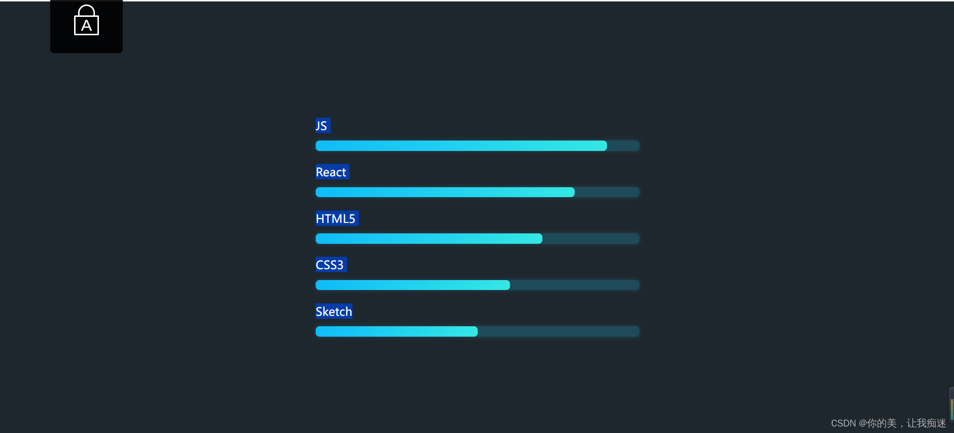
.js::after {
animation-name: js;
}
.react::after {
animation-name: react;
}
.html5::after {
animation-name: html5;
}
.css3::after {
animation-name: css3;
}
.sketch::after {
animation-name: sketch;
}
@keyframes js {
from {
width: 0;
}
to {
width: 90%;
}
}
@keyframes react {
from {
width: 0;
}
to {
width: 80%;
}
}
@keyframes html5 {
from {
width: 0;
}
to {
width: 70%;
}
}
@keyframes css3 {
from {
width: 0;
}
to {
width: 60%;
}
}
@keyframes sketch {
from {
width: 0;
}
to {
width: 50%;
}
}
</style>
</head>
<body>
<main>
<ul>
<li class="js">JS</li>
<li class="react">React</li>
<li class="html5">HTML5</li>
<li class="css3">CSS3</li>
<li class="sketch">Sketch</li>
</ul>
</main>
</body>
</html>
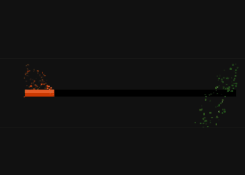
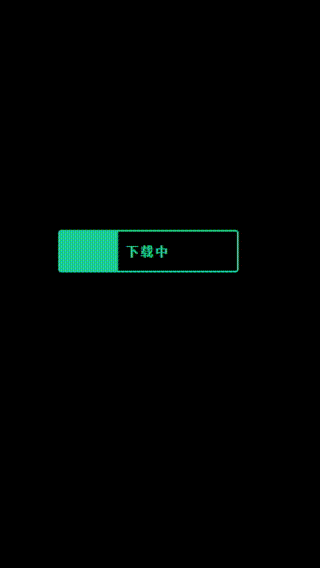
效果图:


