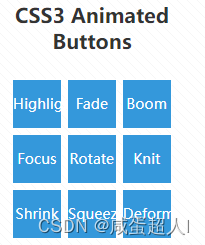
<div id="container">

  <h1>CSS3 Animated Buttons</h1>

  <button class="highlight"> Highlight</button>
  <button class="fade"> Fade</button>
  <button class="boom"> Boom</button>

  <button class="focus"> Focus</button>
  <button class="rotate"> Rotate</button>
  <button class="knit"> Knit</button>

  <button class="shrink"> Shrink</button>
  <button class="squeeze"> Squeeze</button>
  <button class="deform"> Deform</button>

</div>
* {
margin: 0;
padding: 0;
-webkit-backface-visibility: hidden;
-webkit-transition: all 0.5s;
-moz-transition: all 0.5s;
transition: all 0.5s;
}
body {
background-color: #333;
background: repeating-linear-gradient(45deg, #f6f6f6 0, #f6f6f6 5%, #fff 0, #fff 50%) 0 / 20px 20px;
}
#container {
width: 330px;
margin: 25px auto;
}
h1 {
color: #333;
font-family: Open Sans Condensed;
font-size: 2.5em;
text-align: center;
margin-bottom: 40px;
}
h1:hover {
font-size: 2.5em;
}
h1:hover:before,
h1:hover:after {
font-style: italic;
font-size: 0.5em;
}
h1:hover:before {
content: "some ";
}
h1:hover:after {
content: " by NobodyRocks";
}
button {
width: 100px;
height: 100px;
color: #ffffff;
background-color: #3498db;
font-family: Open Sans Condensed;
text-decoration: none;
font-size: 1.8em;
border: 2px #ffffff solid;
margin: 10px 0 0 5px;
-webkit-transition: all 0.5s;
-moz-transition: all 0.5s;
transition: all 0.5s;
}
button:hover {
cursor: pointer;
}
.highlight:hover {
background-color: #FFffff;
color: #3498db;
}
.fade:hover {
border: 0px;
color: #009999;
opacity: 0;
}
.boom:hover {
color: #009999;
border: #009999;
opacity: 0;
-webkit-transform: scale(2, 2);
-moz-transform: scale(2, 2);
transform: scale(2, 2);
}
.focus:hover {
border-width: 20px;
}
.rotate:hover {
-webkit-transform: rotate(90deg);
-moz-transform: rotate(90deg);
transform: rotate(90deg);
}
.knit:hover {
height: 0px;
}
.shrink:hover {
-webkit-transform: scale(0.0, 0.0);
-moz-transform: scale(0.0, 0.0);
transform: scale(0.0, 0.0);
}
.squeeze:hover {
-webkit-transform: scale(1.5, 0.0);
-moz-transform: scale(1.5, 0.0);
transform: scale(1.5, 0.0);
}
.deform:hover {
-webkit-transform: skew(45deg, 45deg);
-moz-transform: skew(45deg, 45deg);
transform: skew(45deg, 45deg);
}
@media (max-width: 330px) {
#container {
width: 100%;
}
button {
width: 90%;
margin: 5% 0 0 5%;
}
}


