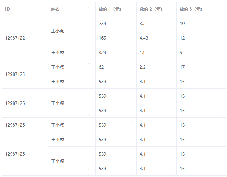
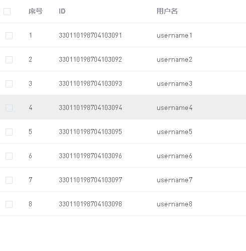
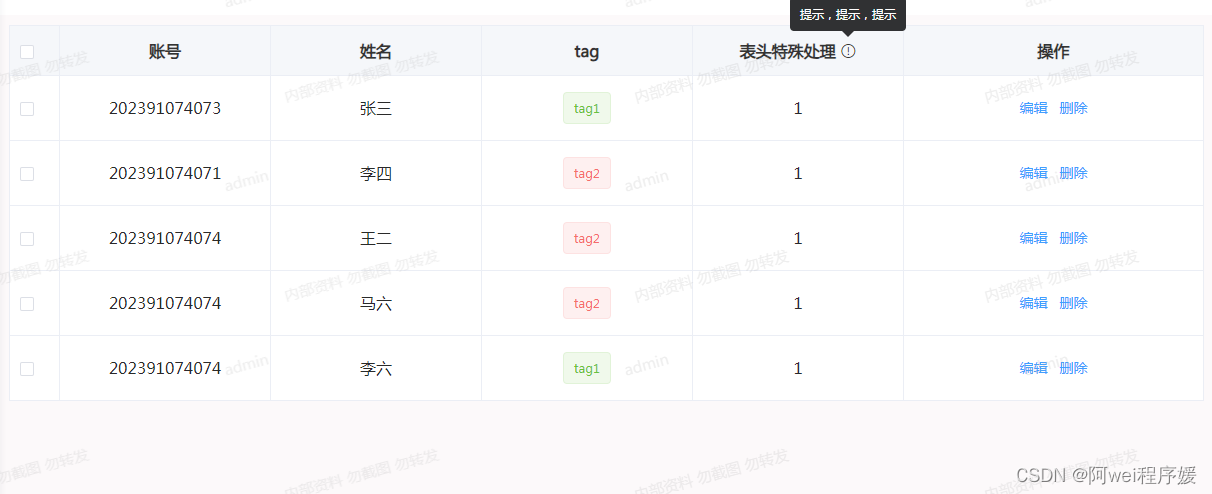
效果图:
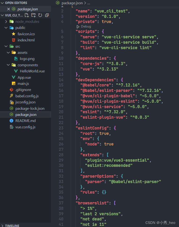
1.封装表格代码如下
<template>
<div>
  <div class="TableList">
    <el-table
        v-loading="loading"
        @selection-change="selectionChange"
        class="table"
        :data="tableData"
        :border="hasBorder"
        :row-class-name="tableRowClassName"
        ref="multipleTable"
        :header-cell-style="{
				background: 'rgb(245 247 250)',
				color: 'rgb(51, 51, 51)',
			}"
    >
      <el-table-column type="selection" width="50" v-if="selectionShow"> </el-table-column>
      <!-- 序号 -->
      <el-table-column v-if="hasIndex" type="index" label="序号" header-align="center" align="center" width="80"> </el-table-column>
      <!-- 其他 -->
      <template v-for="item in tableColumnOptions">
        <!-- 插槽列 -->
        <el-table-column
            v-if="item.columnType"
            :key="item.label"
            :prop="item.prop"
            :label="item.label"
            :width="item.width"
            :header-align="item.headerAlign || 'center'"
            :align="item.align || 'center'"
        >
          <template slot-scope="{ row }">
            <slot :name="item.soltName" :data="row"></slot>
          </template>
        </el-table-column>
        <!-- 非插槽列 -->
        <el-table-column
            v-else
            :key="item.label"
            :prop="item.prop"
            :label="item.label"
            :width="item.width"
            :header-align="item.headerAlign || 'center'"
            :align="item.align || 'center'"
        >
          <!--          表头的特殊处理(eg:表头上加提示或图标等)-->
          <template slot="header" v-if="item.showIcon">
            <div class="tab-header">
              {
  { item.label }}
              <el-tooltip :content="item.content" placement="top">
                <i  class="el-icon-warning-outline icon"></i>
              </el-tooltip>
            </div>
          </template>
        </el-table-column>
      </template>
      <el-table-column type="selection" width="50" v-if="selectionShow1" :selectable="checkboxT"> </el-table-column>
    </el-table>
  </div>
</div>
</template>
<script>
export default {
  props:{
    // 表格数据
    tableData: {
      type: Array,
      default() {
        return [];
      },
    },
    // 表格列项
    tableColumnOptions: {
      type: Array,
      require: true,
      default() {
        return [];
      },
    },
    // 是否具有索引
    hasIndex: {
      type: Boolean,
      default() {
        return true;
      },
    },
    // 是否显示边框
    hasBorder: {
      type: Boolean,
      default() {
        return false;
      },
    },
    // 是否显示选择框
    selectionShow: {
      type: Boolean,
      default() {
        return true;
      },
    },
    //加载
    loading: {
      type: Boolean,
      default: false,
    },
  },
  methods:{
    // 选择框改变
    selectionChange(e){
      this.$emit('selectionChange',e)
    },
    tableRowClassName({ row, rowIndex }) {},
  }
}
</script>
<style scoped lang="scss">

</style>
2.在页面上使用
<template>
<div>
  <tableList
      :selection-show="true"
      :loading="loading"
      :has-index="false"
      :has-border="true"
      :table-data="tableData"
      :table-column-options="tableColumnOptions"
      @selectionChange="selectionChange"
  >
    <!-- 类型插槽 -->
    <template #tag="{ data }">
      <div class="tag">
        <el-tag type="success" v-if="data.type === 1">tag1</el-tag>
        <el-tag type="danger" v-if="data.type === 0">tag2</el-tag>
      </div>
    </template>
    <!-- 操作插槽 -->
    <template #operation="{ data }">
      <el-button type="text" @click="handleEdit(data)">编辑</el-button>
      <el-button type="text" @click="handleDelete(data)" id="delete">删除</el-button>
    </template>
  </tableList>
</div>
</template>
<script>
import tableList from '@/views/daily-examine/components/table/index.vue';
export default {
  components:{
    tableList
  },
  data(){
    return {
      loading:false,
      tableData:[
        { id: 202391074073, name: "张三", type: 1,special:'1'},
        { id: 202391074071, name: "李四", type: 0,special:'1'},
        { id: 202391074074, name: "王二", type: 0,special:'1'},
        { id: 202391074074, name: "马六", type: 0,special:'1'},
        { id: 202391074074, name: "李六", type: 1,special:'1'},
      ],
      tableColumnOptions:[
        { label: "账号", prop: "id" },
        { label: "姓名", prop: "name" },
        { label: "tag", prop: "type", columnType: true, soltName: "tag" },
        { label: "表头特殊处理",prop:'special',showIcon:true, content:'提示,提示,提示', },
        { label: "操作", width: "300", columnType: true, soltName: "operation"},
      ],

    }
  },
  methods:{
    selectionChange(){

    },
    //编辑
    handleEdit(data){},
    //删除
    handleDelete(data){},

  }
}
</script>
<style scoped lang="scss">

</style>
以上就是基于element ui封装table组件