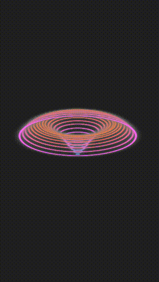
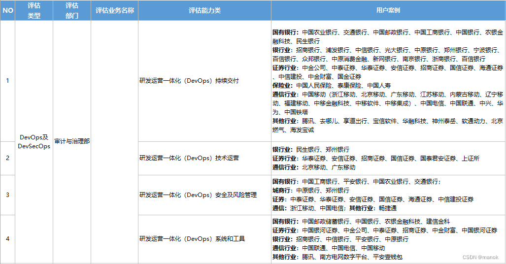
效果展示

CSS 知识点
- animation 综合运用
- animation-delay 综合运用
- filter 的 hue-rotate 属性运用
页面整体布局
<section>
  <div class="glass" style="--i: 1">
    <div class="inner">
      <div class="liquid"></div>
    </div>
  </div>

  <div class="glass" style="--i: 2">
    <div class="inner">
      <div class="liquid"></div>
    </div>
  </div>

  <div class="glass" style="--i: 3">
    <div class="inner">
      <div class="liquid"></div>
    </div>
  </div>
</section>
核心样式
编写瓶子样式
.glass {

  position: relative;
}

.glass .inner {

  position: relative;
  width: 200px;
  height: 400px;
  background: rgba(255, 255, 255, 0.1);
  border-radius: 40px;
  border: 8px solid transparent;
}

.glass .inner::before {

  content: "";
  position: absolute;
  width: calc(100% - 10px);
  height: 30px;
  border: 10px solid #444;
  border-radius: 50%;
  top: -15px;
  left: 50%;
  transform: translateX(-50%);
  box-shadow: 0 15px 0 #222;
}

.glass .inner::after {

  content: "";
  position: absolute;
  width: 50px;
  height: 250px;
  top: 80px;
  left: 30px;
  background: rgba(255, 255, 255, 0.1);
  border-radius: 4px;
}
编写瓶子液体样式
.glass .inner::before {

  content: "";
  position: absolute;
  width: calc(100% - 10px);
  height: 30px;
  border: 10px solid #444;
  border-radius: 50%;
  top: -15px;
  left: 50%;
  transform: translateX(-50%);
  box-shadow: 0 15px 0 #222;
}

.glass .inner::after {

  content: "";
  position: absolute;
  width: 50px;
  height: 250px;
  top: 80px;
  left: 30px;
  background: rgba(255, 255, 255, 0.1);
  border-radius: 4px;
}

.liquid {

  position: absolute;
  top: 50px;
  left: 5px;
  right: 5px;
  bottom: 1px;
  background: #41c1fb;
  border-bottom-left-radius: 30px;
  border-bottom-right-radius: 30px;
  filter: drop-shadow(0 0 80px #41c1fb);
}

.liquid::before {

  content: "";
  position: absolute;
  width: 100%;
  height: 20px;
  border-radius: 50%;
  background: #1fa4e0;
  top: -10px;
}
编写动画
.glass .inner {

  animation: animateColor 5s linear infinite;
  animation-delay: calc(var(--i) * -1.25s);
}

@keyframes animateColor {

  0% {

    filter: hue-rotate(0deg);
  }
  100% {

    filter: hue-rotate(360deg);
  }
}

.liquid {

  animation: animateLiquid 5s linear infinite;
  animation-delay: calc(var(--i) * -1.25s);
}

@keyframes animateLiquid {

  0%,
  20% {

    top: 50px;
  }
  50%,
  70% {

    top: 320px;
  }
  100% {

    top: 50px;
  }
}
完整代码下载
完整代码下载