Overview
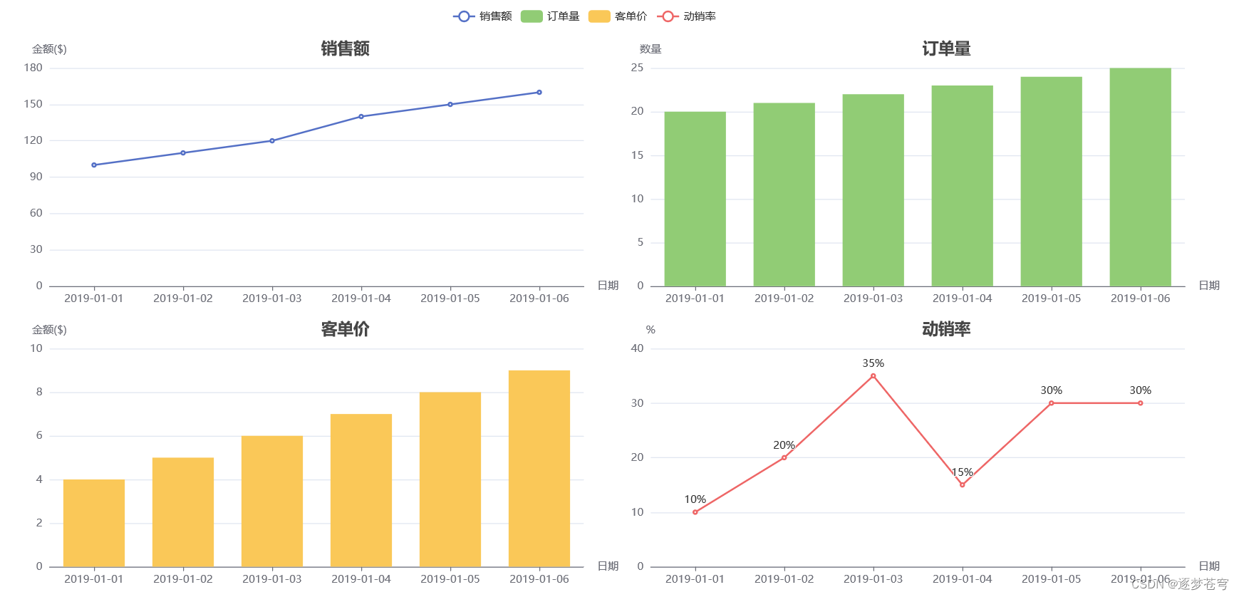
多模态统计图表综述
一、图表分类
1.1 Survey
题目:A Survey and Approach to Chart Classification
机构:印度理工学院
什么是信息图形 (Infographic)?
An infographic is a collection of imagery, data visualizations like pie charts and bar graphs, and minimal text that gives an easy-to-understand overview of a topic. As in the example below, infographics use striking, engaging visuals to communicate information quickly and clearly.
1.2 常见分类数据集:

1.3 常见图表类型
DocFigure提到的28种figure图表数据类型:

(a) Line graph, (b) Natural image, ©Table, (d) 3D object, (e) Bar plot, (f) Scatter plot, (g) Medical image, (h) Sketch, (i) Geographic map, (j) Flow chart, (k) Heat map, (l) Mask, (m) Block diagram, (n) Venn diagram, (o) Confusion matrix, § Histogram, (q) Box plot, ® Vector plot, (s) Pie chart, (t) Surface plot, (u) Algorithm, (v) Contour plot, (w) Tree diagram, (x) Bubble chart, (y) Polar plot, (z) Area chart, (A) Pareto chart and (B) Radar chart.
UB-PMCsample的15种图表类型:

二、图表理解
代表性任务:
- 图表VQA
- 图表Caption
代表性工作
2.1 VQA
2…1.1 DVQA CVPR2018
题目: DVQA: Understanding Data Visualizations via Question Answering
机构:罗彻斯特理工学院,adobe
论文: https://arxiv.org/pdf/1801.08163.pdf
代码: https://github.com/kushalkafle/DVQA_dataset
任务: 统计图表VQA(柱状图)
特点: 早期统计图表VQA工作,基于模板构造QA对,不涉及复杂推理
数据集概况:一种图表类别(bar),300K图像,3.4M VQA pair数据,26个模板,数据和bar都是生成的
Our work will enable algorithms to automatically extract numeric and semantic information from vast quantities of bar charts found in scientific publications, Internet articles, business reports, and many other areas.

三种问题类型:
Structure Understanding. 主要用于理解bar图的全局结构,其有下面的这些问题模板:
- How many bars are there?
- How many groups/stacks of bars are there?
- How many bars are there per group?
- Does the chart contain any negative values?
- Are the bars horizontal?
- Does the chart contain stacked bars?
- Is each bar a single solid color without patterns?
Data Retrieva. 关注于bar的某个局部区域,问题模板如下:
- Are the values in the chart presented in a logarithmic scale?
- Are the values in the chart presented in a percentage scale?
- What percentage of people prefer the object O?
- What is the label of the third bar from the left?
- What is the label of the first group of bars from the left?
- What is the label of the second bar from the left in each group?
- What element does the C color represent?
- How many units of the item I were sold in the store S?
Reasoning. 根据bar里面的多个组件进行推理,问题模板如下:
- Which algorithm has the highest accuracy?
- How many items sold more than N units?
- What is the difference between the largest and the smallest value in the chart?
- How many algorithms have accuracies higher than N?
- What is the sum of the values of L1 and L2?
- Did the item I1 sold less units than I2?
- How many groups of bars contain at least one bar with value greater than N?
- Which item sold the most units in any store?
- Which item sold the least number of units summed across all the stores?
- Is the accuracy of the algorithm A1 in the dataset D1 larger than the accuracy of the algorithm A2 in the dataset D2?
数据集下载链接:https://github.com/kushalkafle/DVQA_dataset
QA数据组织格式:
image: The image filename which the given question-answer pair applies to
question: Question
answer: Answer to the Questions. Remember that (cardinal numbers (1,2,3…) are used when
the number denotes the value and words (one,two,three…) are used to denote count
question_type: Denotes whether the question is structure, data or reasoning type
bbox_answer: If the answer is a text in the bar_chart, bounding box in form of [x,y,w,h], else []
question_id: Unique question_id associated with the question
meta data组织格式:
image: The image filename which the given metadata applies to
bars:
bboxes: Bounding boxes for different bars (number_of_bars x number_of_legends x 4)
names: Names for each bar in the form (number_of_bars x number_of_legends)
colors: Color of each bar (number_of_bars x number_of_legends)
texts:
text: The string of the text-block in the bar-chart
text_function: The function of text (e.g., title, legend, etc)
bbox: The bounding box surrounding the text-block
table: Underlying table used to create the chart saved in the following format.
single row charts:
	C_1 	C_2 	C_3	...	C_N
	-------------------------------------
	V_1	V_2	V_3	... 	V_N

multi row charts:

	None |	C_1 	C_2 	C_3	...	C_N
	-----|---------------------------------------
	R_1  |	V_11	V_21	V_31	... 	V_N1
	R_2  |	V_12	V_22	V_32	... 	V_N2
	...  |	...	...	... 	... 	...
	R_M  |	V_1M	V_2M	V_3M	... 	V_NM
2.1.2 PlotQA 2019
题目: PlotQA: Reasoning over Scientific Plots
机构:印度理工学院
论文:https://arxiv.org/pdf/1909.00997.pdf
代码:https://github.com/NiteshMethani/PlotQA
任务: 图表VQA
特点: 相比于figure VQA,DVQA,数据采自真实,且数值分布会更广泛(0 to 3.50e+15.)
数据集概况:三种图表类别(bar plots, line plots, and scatter plots),224K图像,28M pair数据,76个模板,数据是真实的,图表是生成的


we provide bounding box annotations for legend boxes, legend names, legend markers, axes titles, axes ticks, bars, lines, and title.
一些数据增强
To ensure variety in the plots, we randomly chose the following parameters: grid lines(present/absent), font size, notation used for tick labels (scientific-E notation or standard notation), line style (solid, dashed, dotted, dash-dot), marker styles for marking data points (asterisk, circle, diamond, square, triangle, inverted triangle), position of legends (bottom-left, bottom-centre, bottom-right, center-right, top-right), and colors for the lines and bars from a set of 73 colors. The number of discrete elements on the x-axis varies from 2 to 12 and the number of entries in the legendbox varies from 1 to 4.
This approach of creating questions on real-world plot data with carefully curated question templates followed by manual paraphrasing is a key contribution of our work.
2.1.3 ChartQA 2022
题目:ChartQA: A Benchmark for Question Answering about Charts with Visual and Logical Reasoning
机构:约克大学,南洋理工,Salesforce
论文:https://arxiv.org/pdf/2203.10244.pdf
代码:https://github.com/vis-nlp/ChartQA
任务:图表VQA
特点:三种图表类别,21.9K图像,32.7K (9.6K human,21.3K generated),Real-world charts from a web crawl
To address the unique challenges in our benchmark involving visual and logical reasoning over charts
Answering such questions requires a significant amount of perceptual and cognitive efforts as people need to combine multiple operations such as retrieving values, comparing values, finding maximum, calculating sums and differences of values.

分析了现存数据集存在的主要问题:
- 问题模板化
- 图表都是基于编程工具,例如matplotlib构建的,不能反应真实世界的图表多样性
- 回答往往是固定词汇集合,会忽略许多问题往往涉及到复杂的推理,涉及许多数值操作,比如聚合/比较。
从多个源去爬取图表:
- Statista (statista.com) is an online platform that presents charts covering a variety of topics including economy, politics, and industry.
- The Pew research (pewresearch.org) publishes report about social and economic issues, demographic trends and public opinion with a wide variety of charts.
- Our World In Data or OWID (ourworldin-data.org) is another platform that contains thousands of charts about different global issues such as economy, finance, and society.
- Organisationfor Economic Co-operation and Development or OECD (oecd.org) is a global organization which shares reports and data analysis for policymaking.
For the Pew dataset, we only crawled chart images since the underlying data tables are not available. For the other three, we extracted the underlying data tables, metadata (e.g., title, chart type), SVG file and associate text description. Finally, we extracted the bounding boxes information of the different chart elements (e.g., x-axis labels) from the SVG files to train our data extraction models.
数据标注有如下两种方式:
We have two main annotations procedures: (i) collect human-authored QA pairs using Amazon Mechanical Turk (AMT) and (ii) generate QA pairs from the Statista human-written summaries.
使用人工标注的时候,关注的问题维度主要包括两种:
- Compositional questions contain at least two mathematical/logical operations like sum, difference and average
- Visual questions refer to the visual attributes such as color, height, and length of graphical marks (e.g., bars) in the chart.
基于上述关注的重点,一个标注者标注两个问题和对应的答案,另一个标注者也去回答这个问题,如果两者匹配,则是一个合理的qa对,否则会进行复查,完全匹配统计下来有61.04%,如果忽略掉一些typo的表示法不同,那么这个数字会达到78.55%。
对于机器生成的QA对,采用的方式是利用T5模型,输入chartsummary去生成,但仅关注可以直接出chart里面能够得到答案的cases,忽略掉一些需要结合常识的cases。
ChartQA使用的方法架构:

一些可视化结果:

2.2 Summary
2.2.1 Chart-to-text ACL 2022
题目:Chart-to-Text: A Large-Scale Benchmark for Chart Summarization
机构:约克大学,南洋理工,Salesforce
论文:https://aclanthology.org/2022.acl-long.277.pdf
代码:https://github.com/vis-nlp/chart-to-text
任务:图表summary
特点:六种图表类别,44K图像,44K pairs
两种方式:
- 原始data table存在
- 直接从chart里面抽取
一个summary样例:

数据采集:
也是和ChartVQA类似,从两个第三方网站进行爬取
- https://www.statista.com/,对于每一张图表,获取它的图像,以及原始的data table(包括标题,轴标签,人工写的描述)。将图表分为两个组,一种是简单图表(只有两列),复杂图标(有stacked/group的bar,折线图也有多条线)。最终从December 2022,获得总计34811张统计图表图像。
- https://www.pewresearch.org/,这个网站主要是发表一些数据驱动的文章,主要关注社会事件,公众观点以及人口趋势。文章往往伴随着多个图表,并且自带专家/编辑的高质量描述。本文从这儿抓取了3999个网页(2021.01),最终获的9285个图表。与Statista不一样的是,pew大多数图表都是不提供原始的data table的。对于每一张图表,下载了chart图像,包裹的段落描述,alt attributes(if available)。像标题一样,alt text通常提供了相对简洁的描述。因为原始的data table不存在,因为人工进行划分simple以及complex图表。
数据标注:
- 对于statista,我们选择了文本的第一部分(来自图表图标到下一个标题)作为图表summary。这个源的数据提取相对容易,因为提供了原始的data table,但是大多数charts(32660 out of 34811)是没有提供x轴的标签的,因此进行了手工标注,赋予合适的x轴名字。
- 对于pew,标注会更加具有挑战性,因为每个webpage包含多个图表,并且段落并没有显示地refer到对应的chart。大多数chart也没有提供原始的data table。为了处理这些挑战,分为三步进行数据集构建:

(i) 从chart里面进行数据抽取:借助ocr以及检测的bbox,去标注少量数据(319 examples (171 bar, 68
line, and 80 pie charts) )划分训练集验证集测试集去训练一个分类模型,最终整体的准确率是95.0%,标题的分类准确率是97.6%。
(ii) 辨别段落备选项
(iii) 选择相关段落

from 笔者,从上面数据集的构建可以看出,chart2text核心并不是要把chart转化为类似table这样的精确描述,而是自然语言描述,因此抓中核心,其它不是最重要的数值/趋势,可能不一定需要面面俱到,用符合人类观察图表的习惯进行语言组织描述即可。
文章结尾也做了error分析,总结了如下几种主要的pattern:
- Perceptual and reasoning aspects
- Hallucinations
- Factual errors
- Computer vision challenges
- Generalizability
三、图表生成
四、图表大一统模型
4.1 UniChart 2023
题目:UniChart: A Universal Vision-language Pretrained Model for Chart Comprehension and Reasoning
机构:约克大学,南洋理工,Salesforce
论文:https://arxiv.org/pdf/2305.14761.pdf
代码:https://github.com/vis-nlp/unichart
任务:图表预训练以及大一统模型
特点:三种图表类别,627K图像,7M pairs

