之前有小伙伴反映模型解释部分会报错,这里也梳理了一遍。如果还有错误就是矩阵、变量不一致的原因,检查一下数据,再利用AI就能找到问题答案。
1 导入必要的库
import pandas as pd
from sklearn.model_selection import train_test_split, cross_val_score, KFold
import xgboost as xgb
from sklearn.model_selection import train_test_split
from sklearn.metrics import mean_squared_error, r2_score
import matplotlib.pyplot as plt
import seaborn as sns
import pandas as pd
import numpy as np
from sklearn.metrics import confusion_matrix, classification_report, accuracy_score
from sklearn.model_selection import RandomizedSearchCV
from skopt import BayesSearchCV
from skopt.space import Real, Categorical, Integer
from sklearn.tree import plot_tree
import matplotlib.pyplot as plt
import seaborn as sns
import shap
import missingno as msno
# 忽略Matplotlib的警告(可选)
import warnings
warnings.filterwarnings("ignore")
# 设置中文显示和负号正常显示
plt.rcParams['font.sans-serif'] = ['SimHei']
plt.rcParams['axes.unicode_minus'] = False
2 导入数据
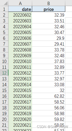
df = pd.read_excel('10.xls')
df
图 2-1
3 数据预处理
for column in ['Fault type', 'lithology']:
    df[column] = pd.factorize(df[column])[0]
df
图 3-1
4 数据框探索使用
#最大值与最小值
(df.head(20)
 .style
 .highlight_max(color='lime',subset=['sample', 'Storage depth /m', 'storage capacity', 'Fault type',
       'Tectonic activity/basic intensity', 'lithology', 'magnitude'])# 最大值高亮
 .highlight_min(color='blue',subset=['sample', 'Storage depth /m', 'storage capacity', 'Fault type',
       'Tectonic activity/basic intensity', 'lithology', 'magnitude']) # 最小值
)
图 4-1
#四分之一数
# 选择特定的列
df1 = df[['sample', 'Storage depth /m', 'storage capacity', 'Fault type',
       'Tectonic activity/basic intensity', 'lithology', 'magnitude']]
styled_df1 = (df1.head(20).style
              .highlight_quantile(axis=0, q_left=0.75, color="deepskyblue")  # 按行高亮后 25% 的数据
              .apply(lambda x: ['font-weight: bold; color: lime 'if v > x.quantile(0.75) else '' for v in x],
                     axis=0, subset=['sample', 'Storage depth /m', 'storage capacity', 'Fault type',
       'Tectonic activity/basic intensity', 'lithology', 'magnitude']))  # 自定义函数来设置更复杂的样式

# 显示结果(在 Jupyter Notebook 中自动显示)
styled_df1
图 4-2
# 链式方法使用样式
(df.head(20)
 .style
 .background_gradient(subset=['sample'], cmap='summer') # 指定色系
 .background_gradient(subset=['Storage depth /m'], vmin=40, vmax=100) # 指定应用值区间
 .background_gradient(subset=['storage capacity'], low=0.4, high=0) # 高低百分比范围
 .background_gradient(subset=['Fault type'], text_color_threshold=0.9) # 文本色深
 .background_gradient(subset=['Tectonic activity/basic intensity'], low=0.6, high=0) # 高低百分比范围
 .background_gradient(subset=['lithology'], low=0.4, high=0) # 高低百分比范围
 .background_gradient(subset=['magnitude'], low=0.4, high=0) # 高低百分比范围
)
图 4-3
# 基本使用,默认将数字应用
df.head(20).style.bar(cmap='rainbow')
图 4-4
5 数据分布
# 设置中文显示和负号正常显示
plt.rcParams['font.sans-serif'] = ['SimHei']
plt.rcParams['axes.unicode_minus'] = False
# 设置图形大小
plt.figure(figsize=(12, 24))

# 创建一个colormap实例
cmap = plt.get_cmap('jet')

# 获取DataFrame的列名作为要绘制的特征
features_to_plot_features = df.columns

# 对每个特征绘制箱线图子图
for i, feature in enumerate(features_to_plot_features):
    # 计算子图的位置
    nrows = len(features_to_plot_features) // 2 + 1
    if len(features_to_plot_features) % 2 == 0:
        ncols = 1
    else:
        ncols = 7 # 假设最后一行只有一个图时,我们想要它更宽一些
    ax = plt.subplot(nrows, ncols, i + 1)
    # 生成当前特征的颜色(从colormap中)
    color = cmap(i / (len(features_to_plot_features) - 1))  # 归一化索引
    # 绘制箱线图,使用单一颜色
    sns.boxplot(y=df[feature], ax=ax, palette=[color])  # 注意这里我们使用y参数,因为x轴通常是分类变量
    # 设置标题和移除x轴标签
    ax.set_title(feature)
    ax.set_xlabel('')
# 调整子图间距
plt.tight_layout()

# 显示图形
plt.show()
图 5-1
6 特征选择(回归互信息法)
import pandas as pd
import numpy as np
from sklearn.feature_selection import mutual_info_regression

# 特征和目标变量
X = df.drop('magnitude', axis=1)
y = df['magnitude']

# 计算互信息(使用回归互信息)
mi_scores = mutual_info_regression(X, y)

# 选择特征(例如,选择互信息值最高的前6个特征)
selected_features = X.columns[np.argsort(mi_scores)[::-1]][:6]

# 可视化互信息
plt.figure(figsize=(10, 6))
plt.bar(X.columns, mi_scores)
plt.xlabel('Features')
plt.ylabel('Mutual Information Score')
plt.title('Mutual Information Scores of Features for Regression')
plt.xticks(rotation=45, ha='right')  # 旋转x轴标签以便阅读
plt.tight_layout()
plt.show()

# 打印选择的特征
print("Selected Features:", selected_features)
图 6-1
7 划分数据集
X_train, X_test, y_train, y_test = train_test_split(X, y, test_size=0.3, random_state=42) 8 建立模型
# 设置XGBoost回归模型参数
params = {
    'max_depth': 3,  # 树的最大深度
    'eta': 0.1,      # 学习率
    'objective': 'reg:squarederror',  # 回归任务
    'n_estimators': 100,  # 树的数量
    'subsample': 0.8,  # 样本采样比例
    'colsample_bytree': 0.8  # 特征采样比例
}

# 转换为DMatrix格式,这是XGBoost的优化数据结构
dtrain = xgb.DMatrix(X_train, label=y_train)
dtest = xgb.DMatrix(X_test, label=y_test)
9 训练模型
model = xgb.train(params, dtrain, num_boost_round=params['n_estimators'])
10 可视化模型结构
graph库:
import xgboost as xgb
from xgboost import plot_tree
import graphviz
dtrain = xgb.DMatrix(X_train, label=y_train)
model = xgb.train(params, dtrain, num_boost_round=10)  # 只训练10轮以简化示例

# 提取第一棵树(注意:索引从0开始)
tree_dump = model.get_dump(dump_format='dot', fmap='', with_stats=False)[0]

# 使用graphviz的Source类来渲染DOT字符串
graph = graphviz.Source(tree_dump)
graph.render("tree_visualization", format='jpg')  # 保存为PNG文件

# 或者直接在Jupyter Notebook中显示(如果你在使用Jupyter)
display(graph)
图 10-1
或者使用plot_tree函数:
plt.figure(figsize=(12, 6))
plot_tree(model, num_trees=0)  # num_trees参数指定要绘制的树的索引
plt.show() 
图 10-2
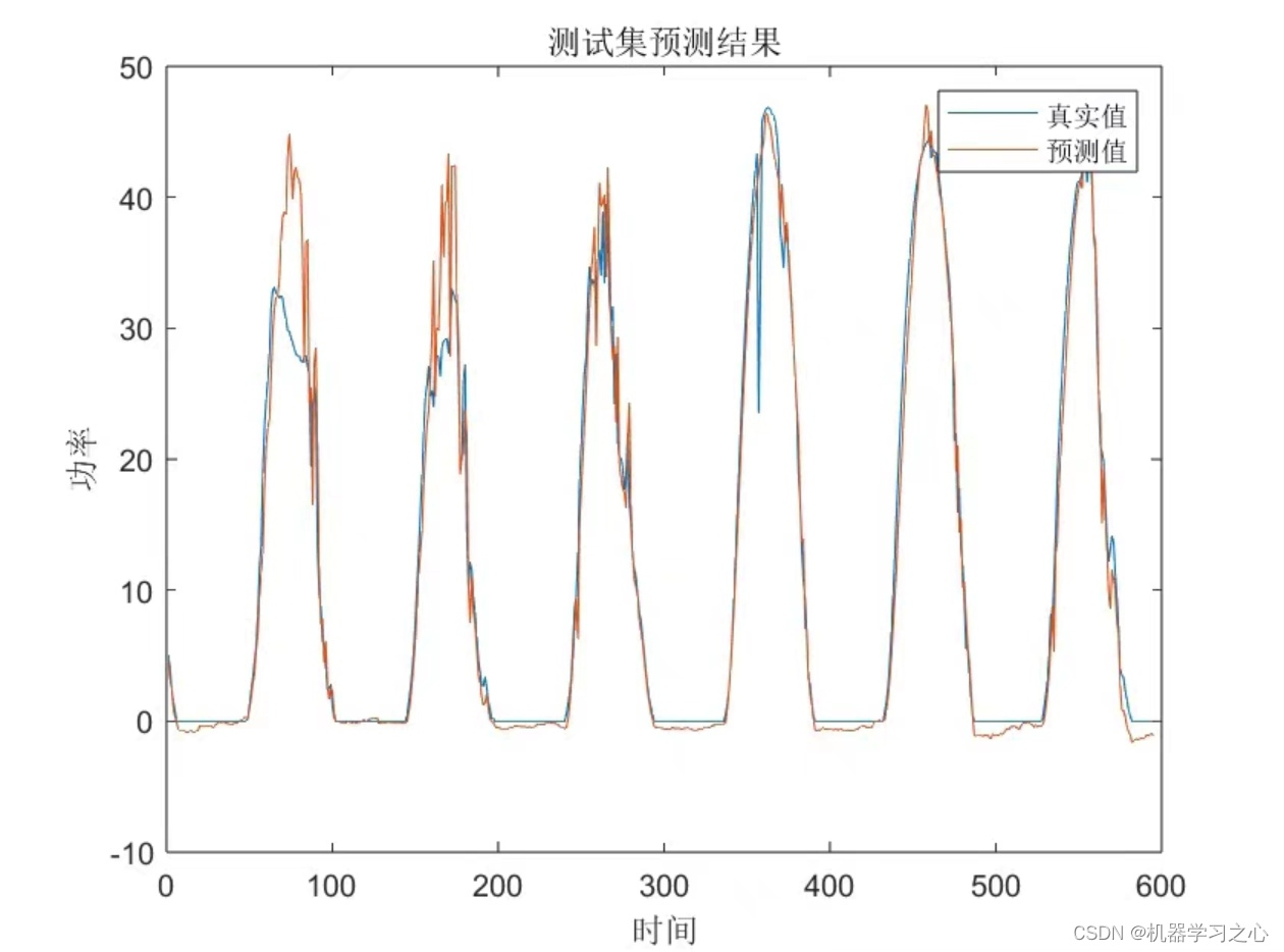
11 模型预测
# 预测测试集
y_pred = model.predict(dtest)
12 模型评估
1.模型评估指标
# 评估模型
mse = mean_squared_error(y_test, y_pred)
r2 = r2_score(y_test, y_pred)
print(f"MSE: {mse}, R^2: {r2}")
MSE: 0.34911419188813814, R^2: 0.8173440812702115
2.残差图:
residuals = y_test - y_pred
plt.figure(figsize=(10, 6))
sns.distplot(residuals, bins=30, kde=True)
plt.title('Residual Distribution')
plt.xlabel('Residuals')
plt.show()
图 12-1
13 SHAP 解释
13.1 summary_plot
# 创建SHAP解释器
explainer = shap.TreeExplainer(model)

# 计算SHAP值
shap_values = explainer.shap_values(X_test)

#特征标签
feature_label=['sample', 'Storage depth /m', 'storage capacity', 'Fault type',
       'Tectonic activity/basic intensity', 'lithology', 'magnitude']

#plt.rcParams['font.family'] = 'serif'
#plt.rcParams['font.serif'] = 'Times New Roman'
#plt.rcParams['font.size'] = 13  # 设置字体大小为14
# 现在创建 SHAP 可视化

#配色   viridis  Spectral   coolwarm  RdYlGn  RdYlBu  RdBu  RdGy  PuOr  BrBG PRGn  PiYG
shap.summary_plot(shap_values, X_test,feature_names=feature_label)

#粉红色点:表示该特征值在这个观察中对模型预测产生了正面影响(增加预测值)
#蓝色点:表示该特征值在这个观察中对模型预测产生了负面影响(降低预测值)
#水平轴(SHAP 值)显示了影响的大小。点越远离中心线(零点),该特征对模型输出的影响越大
#图中垂直排列的特征按影响力从上到下排序。上方的特征对模型输出的总体影响更大,而下方的特征影响较小。
# 最上方的特征显示了大量的正面和负面影响,表明它在不同的观察值中对模型预测的结果有很大的不同影响。
# 中部的特征也显示出两种颜色的点,但点的分布更集中,影响相对较小。
# 底部的特征对模型的影响最小,且大部分影响较为接近零,表示这些特征对模型预测的贡献较小
图 13-1
shap_interaction_values = explainer.shap_interaction_values(X_test)
shap.summary_plot(shap_interaction_values,X_test)
图 13-2
13.2 dependence_plot
#相互依赖图
# 设置字体为新罗马并调整字体大小
plt.rcParams['font.family'] = 'serif'
plt.rcParams['font.serif'] = 'Times New Roman'
plt.rcParams['font.size'] = 12  # 设置字体大小为14

# 创建 SHAP dependence plot,并修改配色方案为 'RdBu'

shap.dependence_plot('Storage depth /m', shap_values,X_test, interaction_index=None)
shap.dependence_plot('Fault type', shap_values,X_test, interaction_index='lithology')

图 13-3

图 13-4
13.3 热图
#热图
shap.initjs()
shap_values = explainer(X_test)
shap.plots.heatmap(shap_values)

图 13-5
13.4 瀑布图
1.单个变量瀑布图
shap.plots.waterfall(shap_values[0]) # For the first observation
图 13-6
2.多个变量瀑布图
shap.plots.force(explainer.expected_value,shap_values.values,shap_values.data)
图 13-7
13.5 特征重要性+层次聚类
# 层次聚类 + SHAP值
clust = shap.utils.hclust(X, y, linkage="single")
shap.plots.bar(shap_values, clustering=clust, clustering_cutoff=1)
图 13-8
13.6 decision_plot
# 样本决策图
shap.initjs()
shap_values = explainer.shap_values(X_test)
expected_value = explainer.expected_value
feature_label=['sample', 'Storage depth /m', 'storage capacity', 'Fault type',
       'Tectonic activity/basic intensity', 'lithology']
shap.decision_plot(expected_value, shap_values,feature_label)

图 13-9
# summarize the effects of all the features
# 样本决策图
shap.initjs()
shap_values = explainer(X_test)
expected_value = explainer.expected_value
shap.plots.beeswarm(shap_values)

图 13-10
#feature_label=['sample', 'Storage depth /m', 'storage capacity', 'Fault type',
#       'Tectonic activity/basic intensity', 'lithology']
# 创建SHAP解释器
explainer = shap.TreeExplainer(model)

# 计算SHAP值
shap_values = explainer.shap_values(X_test)
shap.decision_plot(expected_value, shap_values, feature_label, highlight=[1,2,3,5,6,7,8,10,12])

图13-11


![未来已来:LLMops如何重塑AI-native新范式的运维格局[行业范式]、以及主流LLMops推荐](https://img-blog.csdnimg.cn/img_convert/b48cbc942f87508630054a75698952dc.png)