为何要对element-plus表格进行二次封装?
- 我们正常在开发项目中,表格的风格是一致的,但是表格或多或少会有些不同,有些是需要分页,有些是按钮功能不同,有些又需要加Tag,或者对时间进行格式化等。所有才有了对element-plus的二次封装。
优势
- 组件中集成表格、分页、loading、tag等功能。
- 统一项目表格整体风格。
- 快速将表格在分页与不分页间切换。
- 表格列可根据需求进行定制化。
- 可快速开发大量自定义表格。
例子
<ELTable
  class="table"
  :table-data="tableObject.tableData"
  :columns="tableObject.columns"
  :page-config="tableObject.pageConfig"
  @current-change="onCurrentTableChange"
>
  <template #operate="{ scope }">
    <el-button size="small" @click="handleEdit(scope)">Edit</el-button>
    <el-button size="small" type="danger" @click="handleDelete(scope)"
      >Delete</el-button
    >
  </template>
</ELTable>
参数
- tableData 表格的数据
{
   tableData: any[];
}
- columns 列配置
type TableColumnType = {
    prop: string;
    label: string;
    attrs?: any;
    slot?: boolean;
    tagList?: TagObjectType[];
};

{
    columns: TableColumnType[];
};
- pageConfig 页面配置
type PageConfigType = {
  pageSize: number,
  total: number,
  pagerCount?: number,
  currentPage: number,
  // eslint-disable-next-line no-unused-vars
  handleCurrentChange: (val: number) => void
};

{
  pageConfig: PageConfigType;
}
- currentChange 点击分页后的事件
 {
   currentPageChange: (val: number,oldVal: number) => void;
 }
- 整体简单配置
<ELTable
  class="table"
  :table-data="tableObject.tableData"
  :columns="tableObject.columns"
  :page-config="tableObject.pageConfig"
  @current-change="onCurrentTableChange"
>
</ELTable>

const tableObject = reactive<TableType>({
  columns: [
    {
      prop: 'date',
      label: 'Date',
      attrs: {
        width: 140
      }
    },
    {
      prop: 'alarm',
      label: '告警等级',
      attrs: {
        width: 100
      }
    }
  ],
  pageConfig: {
    pageSize: 5,
    total: 100,
    pagerCount: 5,
    currentPage: 3,
    handleCurrentChange: (number: number) => {
      console.log('重新请求数据', number);
    }
  },
  tableData: [
    {
      date: '2016-05-03',
      alarm: '1'
    },
    {
      date: '2016-05-02',
      alarm: '4'
    }
  ]
});
简单的例子
带分页表格 usePagination
- 添加 usePaginnation后即可实现表格分页的功能,
@current-change是当分页页面变化时的回调
<ELTable
  class="table"
  :table-data="tableObject.tableData"
  :columns="tableObject.columns"
  :page-config="tableObject.pageConfig"
  usePagination
>
</ELTable>

const tableObject = reactive<TableType>({
  columns: [],
  pageConfig: {
    pageSize: 5,
    total: 100,
    pagerCount: 5,
    currentPage: 3,
    // 当前页发生变化时的回调
    handleCurrentChange: (number: number) => {
    tableObject.pageConfig.currentPage = number;
      console.log('重新请求当前页的数据数据', number);
    }
  },
  tableData: []
});
不带分页的表格
- 不带分页的表格只需要将
usePagination设置为false,pageConfig项可以不设置即可
<ELTable
  class="table"
  :table-data="tableObject.tableData"
  :columns="tableObject.columns"
  :usePagination="false"
>
</ELTable>

const tableObject = reactive<TableType>({
  columns: [],
  tableData: []
});
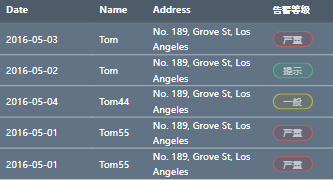
带 tag 的表格
<ELTable
  class="table"
  :table-data="tableObject.tableData"
  :columns="tableObject.columns"
  :page-config="tableObject.pageConfig"
>
</ELTable>
- 需要在 columns 下配置 tagList
import ELTable, { TableType } from '@/components/Table.vue';

const tableObject = reactive<TableType>({
  columns: [
    {
      prop: 'date',
      label: 'Date',
      attrs: {
        width: 140
      }
    },
    {
      prop: 'name',
      label: 'Name',
      attrs: {
        width: 80
      }
    },
    {
      prop: 'address',
      label: 'Address',
      attrs: {
        width: 180
      }
    },
    {
      prop: 'alarm',
      label: '告警等级',
      attrs: {
        width: 100
      },
      tagList: [
        {
          label: '严重',
          value: '1',
          className: 'error'
        },
        {
          label: '紧急',
          value: '2',
          className: 'warning'
        },

        {
          label: '一般',
          value: '3',
          className: 'info'
        },
        {
          label: '提示',
          value: '4',
          className: 'success'
        }
      ]
    }
  ],
  pageConfig: {
    pageSize: 5,
    total: 100,
    pagerCount: 5,
    currentPage: 3,
    handleCurrentChange: (number: number) => {
      console.log('重新请求数据', number);
    }
  },
  tableData: [
    {
      date: '2016-05-03',
      name: 'Tom',
      address: 'No. 189, Grove St, Los Angeles',
      alarm: '1'
    },
    {
      date: '2016-05-02',
      name: 'Tom',
      address: 'No. 189, Grove St, Los Angeles',
      alarm: '4'
    },
    {
      date: '2016-05-04',
      name: 'Tom44',
      address: 'No. 189, Grove St, Los Angeles',
      alarm: '3'
    },
    {
      date: '2016-05-01',
      name: 'Tom55',
      address: 'No. 189, Grove St, Los Angeles',
      alarm: '1'
    },
    {
      date: '2016-05-01',
      name: 'Tom55',
      address: 'No. 189, Grove St, Los Angeles',
      alarm: '1'
    }
  ]
});
带按钮的表格
- 带按钮的表格一般是需要自定义模板的 。需要在 columns 下面的配置项中添加操作选项。然后插槽名则是 prop 的值。
<ELTable
  class="table"
  :table-data="tableObject.tableData"
  :columns="tableObject.columns"
  :page-config="tableObject.pageConfig"
  @current-change="onCurrentTableChange"
>
  <template #operate="{ scope }">
    <el-button size="small" @click="handleEdit(scope)">Edit</el-button>
    <el-button size="small" type="danger" @click="handleDelete(scope)"
      >Delete</el-button
    >
  </template>
</ELTable>
import ELTable, { TableType } from '@/components/Table.vue';
const tableObject = reactive<TableType>({
  columns: [
    {
      prop: 'date',
      label: 'Date',
      attrs: {
        width: 140
      }
    },
    {
      prop: 'name',
      label: 'Name',
      attrs: {
        width: 80
      }
    },
    {
      prop: 'address',
      label: 'Address',
      attrs: {
        width: 180
      }
    },
    {
      prop: 'alarm',
      label: '告警等级',
      attrs: {
        width: 100
      },
      tagList: [
        {
          label: '严重',
          value: '1',
          className: 'error'
        },
        {
          label: '紧急',
          value: '2',
          className: 'warning'
        },

        {
          label: '一般',
          value: '3',
          className: 'info'
        },
        {
          label: '提示',
          value: '4',
          className: 'success'
        }
      ]
    },
    {
      prop: 'operate',
      label: '操作',
      slot: true,
      attrs: {
        width: '180'
      }
    }
  ],
  pageConfig: {
    pageSize: 5,
    total: 100,
    pagerCount: 5,
    currentPage: 3,
    handleCurrentChange: (number: number) => {
      console.log('重新请求数据', number);
    }
  },
  tableData: [
    {
      date: '2016-05-03',
      name: 'Tom',
      address: 'No. 189, Grove St, Los Angeles',
      alarm: '1'
    },
    {
      date: '2016-05-02',
      name: 'Tom',
      address: 'No. 189, Grove St, Los Angeles',
      alarm: '4'
    },
    {
      date: '2016-05-04',
      name: 'Tom44',
      address: 'No. 189, Grove St, Los Angeles',
      alarm: '3'
    },
    {
      date: '2016-05-01',
      name: 'Tom55',
      address: 'No. 189, Grove St, Los Angeles',
      alarm: '1'
    },
    {
      date: '2016-05-01',
      name: 'Tom55',
      address: 'No. 189, Grove St, Los Angeles',
      alarm: '1'
    }
  ]
});

配置插槽
如果在columns中配置了 sort:true。默认就会读取表格中插槽名称为 props值的结构,放入当前列。
<ELTable
  class="table"
  :table-data="tableObject.tableData"
  :columns="tableObject.columns"
  :page-config="tableObject.pageConfig"
  @current-change="onCurrentTableChange"
>
  <template #aaa="{ scope }">
    <el-button size="small" @click="handleEdit(scope)">Edit</el-button>
    <el-button size="small" type="danger" @click="handleDelete(scope)"
      >Delete</el-button
    >
  </template>
</ELTable>

<script>
import ELTable, { TableType } from '@/components/Table.vue';
const tableObject = reactive<TableType>({
  columns: [
    {
      prop: 'aaa',
      label: '操作',
      attrs: {
        width: '180'
      },
      slot: true // 属性为true时 插槽生效,并读取属性名为 aaa 的插槽。
    },

  ],
});
</script>
配置表格列的原生属性
- 如果想要配置表格列的原生属性。可以在
clounms下的attrs中去配置,例如:想要配置fixed、resizable、formatter等…
import ELTable, { TableType } from '@/components/Table.vue';
const tableObject = reactive<TableType>({
  columns: [
    {
      prop: 'date',
      label: 'Date',
      attrs: {
      // 配置表格的原生属性
        width: 140
        fixed: true,
        resizable: true
        formatter: function(row,column) {
          console.log('过滤器')
        }
      }
    },

  ],
});
当前项高亮时触发的方法@selection-change
<ELTable
  class="table"
  :table-data="tableObject.tableData"
  :columns="tableObject.columns"
  :page-config="tableObject.pageConfig"
  @selection-change="onSelectionChange"
  highlight-current-row
  stripe
>
</ELTable>

const onSelectionChange = (row) => {
  console.log('选中当前项时会触发的事件')
}
table表格封装的源码
<template>
    <div class="cus-table">
        <el-table v-loading="props.loading" :data="props.tableData" style="width: 100%" v-bind="$attrs">
            <el-table-column v-for="column in props.columns" :key="column.prop" :prop="column.prop" :label="column.label" width="180" v-bind="column?.attrs">
                <!-- 默认有插槽的情况 -->
                <template #default="scope">
                    <slot v-if="column.slot" :name="column.prop" :scope="scope" />
                    <!-- 当有告警时表格默认做出处理 -->
                    <template v-if="column.tagList?.length">
                        <div v-for="(tag, index) in filteredTagList(scope.row, column.tagList, column.prop)" :key="tag.value + '_' + index">
                            <div class="tag" :class="tag.className">{{ tag.label }}</div>
                        </div>
                    </template>
                </template>
            </el-table-column>
        </el-table>

        <!-- 分页 -->
        <template v-if="props.usePagination">
            <div class="pagination">
                <div>总共 {{ pageConfig.total }} 条信息</div>
                <el-pagination
                    v-model:current-page="currentPage"
                    class="cus-pagination"
                    background
                    layout="prev, pager, next"
                    :page-size="pageConfig.pageSize"
                    :total="pageConfig.total"
                    :pager-count="pageConfig.pagerCount"
                    @current-change="pageConfig.handleCurrentChange"
                />
            </div>
        </template>
    </div>
</template>

<script setup lang="ts">
type TagObjectType = {
    label: string;
    value: string;
    className: 'error' | 'warning' | 'info' | 'success' | 'offline';
};

type PageConfigType = {
    pageSize: number;
    total: number;
    pagerCount?: number;
    currentPage: number;
    // eslint-disable-next-line no-unused-vars
    handleCurrentChange?: (val: number) => void;
};

type TableColumnType = {
    prop: string;
    label: string;
    attrs?: any;
    slot?: boolean;
    tagList?: TagObjectType[];
};

export type TableType = {
    tableData: any[];
    columns: TableColumnType[];
    pageConfig?: PageConfigType;
    loading?: boolean;
    usePagination?: boolean;
};

const props = withDefaults(defineProps<TableType>(), {
    tableData: () => [],
    columns: () => [],
    pageConfig: () => ({
        pageSize: 5,
        total: 0,
        currentPage: 1,
    }),
    loading: false,
    usePagination: true,
});

const filteredTagList = (scope: any, tagList: any[], prop: string) => tagList?.filter((tag: any) => tag?.value === scope?.[prop]);

const currentPage = ref(props.pageConfig.currentPage);
</script>

<style lang="scss" scoped>
.error {
    background-color: rgba(171, 1, 0, 0.2);
    border: 2px solid rgba(255, 78, 77, 1);
}

.warning {
    background-color: rgba(185, 74, 0, 0.2);
    border: 2px solid rgba(255, 128, 15, 1);
}

.info {
    background-color: rgba(174, 127, 0, 0.2);
    border: 2px solid rgba(255, 235, 15, 1);
}

.tootip {
    background-color: rgba(0, 82, 183, 0.2);
    border: 2px solid rgba(61, 148, 255, 1);
}

.success {
    background-color: rgba(39, 191, 114, 0.2);
    border: 2px solid rgba(71, 221, 145, 1);
}

.offline {
    background-color: rgba(154, 158, 174, 0.2);
    border: 2px solid rgba(154, 158, 174, 1);
}

.cus-table {
    width: 100%;
    position: relative;
    overflow: hidden;

    .tag {
        display: flex;
        justify-content: center;
        align-items: center;
        width: 60px;
        height: 24px;
        color: #ffffff;
        opacity: 0.6;
        border-radius: 12px;
    }

    .pagination {
        display: flex;
        justify-content: space-between;
        align-items: center;
        margin-top: 30px;
        font-size: 18px;
        color: rgba(255, 255, 255, 0.6);
    }
}
</style>