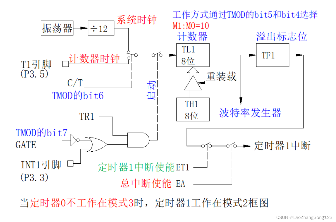
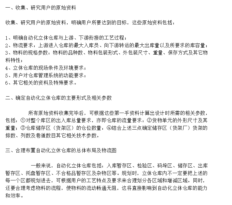
比较(六)利用python绘制径向柱图
径向柱图(Circular Barplot)简介

径向柱图基于同心圆网格来绘制条形图,虽然不如普通条形图表达准确,但却有抓人眼球的效果。其衍生的南丁格尔玫瑰图则广为人知。
快速绘制
基于matplotlib
import pandas as pd
import numpy as np
import matplotlib.pyplot as plt
import matplotlib.cm as cm

np.random.seed(0)  # 设置随机种子为0

# 自定义数据
df = pd.DataFrame(
        {
            'Name': ['item ' + str(i) for i in list(range(1, 51)) ],
            'Value': np.random.randint(low=10, high=100, size=50)
        })

# 初始化布局-极坐标图
plt.figure(figsize=(10,8))
ax = plt.subplot(111, polar=True)

# 移除网格
plt.axis('off')

# 坐标限制
upperLimit = 100
lowerLimit = 30

# 计算极值
max_value = df['Value'].max()

# 数据缩放
slope = (max_value - lowerLimit) / max_value
heights = slope * df.Value + lowerLimit

# 计算每个条形的宽度
width = 2*np.pi / len(df.index)

# 计算角度
indexes = list(range(1, len(df.index)+1))
angles = [element * width for element in indexes]
angles

# 增加条形图
bars = ax.bar(
    x=angles,
    height=heights,
    width=width,
    bottom=lowerLimit,
    linewidth=2,
    edgecolor="white",
    color="#61a4b2",)
定制多样化的径向柱图
自定义径向柱图一般是结合使用场景对相关参数进行修改,并辅以其他的绘图知识。参数信息可以通过官网进行查看,其他的绘图知识则更多来源于实战经验,大家不妨将接下来的绘图作为一种学习经验,以便于日后总结。
添加标签
import pandas as pd
import numpy as np
import matplotlib.pyplot as plt
import matplotlib.cm as cm

np.random.seed(0)  # 设置随机种子为0

# 自定义数据
df = pd.DataFrame(
        {
            'Name': ['item ' + str(i) for i in list(range(1, 51)) ],
            'Value': np.random.randint(low=10, high=100, size=50)
        })

# 初始化布局-极坐标图
plt.figure(figsize=(10,8))
ax = plt.subplot(111, polar=True)

# 移除网格
plt.axis('off')

# 坐标限制
upperLimit = 100
lowerLimit = 30

# 计算极值
max_value = df['Value'].max()

# 数据缩放
slope = (max_value - lowerLimit) / max_value
heights = slope * df.Value + lowerLimit

# 计算每个条形的宽度
width = 2*np.pi / len(df.index)

# 计算角度
indexes = list(range(1, len(df.index)+1))
angles = [element * width for element in indexes]
angles

# 添加条形图
bars = ax.bar(
    x=angles,
    height=heights,
    width=width,
    bottom=lowerLimit,
    linewidth=2,
    edgecolor="white",
    color="#61a4b2",
)

# 标签和bar的间距定义
labelPadding = 4

# 添加标签
for bar, angle, height, label in zip(bars,angles, heights, df["Name"]):

    # 弧度转化:将弧度转为度,如np.pi/2->90
    rotation = np.rad2deg(angle)

    # 颠倒一部分标签,方便查看
    alignment = ""
    if angle >= np.pi/2 and angle < 3*np.pi/2:
        alignment = "right"
        rotation = rotation + 180
    else:
        alignment = "left"

    # 通过text函数添加标签
    ax.text(
        x=angle,
        y=lowerLimit + bar.get_height() + labelPadding,
        s=label,
        ha=alignment,
        va='center',
        rotation=rotation,
        rotation_mode="anchor")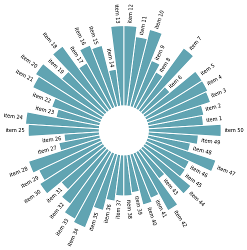
引申-简单绘制南丁格尔玫瑰图
import pandas as pd
import numpy as np
import matplotlib.pyplot as plt
import matplotlib.cm as cm

np.random.seed(0)  # 设置随机种子为0

# 自定义数据
df = pd.DataFrame(
        {
            'Name': ['item ' + str(i) for i in list(range(1, 51)) ],
            'Value': np.random.randint(low=10, high=100, size=50)
        })
# 排序
df = df.sort_values(by=['Value'])

# 初始化布局
plt.figure(figsize=(10,8))
ax = plt.subplot(111, polar=True)
plt.axis('off')

# 坐标限制
upperLimit = 100
lowerLimit = 30

# 高度
heights = df.Value
# 计算每个条形的宽度
width = 2*np.pi / len(df.index)

# 颜色
cmap = cm.RdYlGn
# 归一化
norm_heights = (heights - np.min(heights)) / (np.max(heights) - np.min(heights))
# 颜色映射到heights
colors = cmap(norm_heights)


# 计算角度
indexes = list(range(1, len(df.index)+1))
angles = [element * width + 0.5*np.pi for element in indexes] # 指定从0开始逆时针旋转


# 添加条形图
bars = ax.bar(
    x=angles,
    height=heights,
    width=width,
    bottom=lowerLimit,
    linewidth=2,
    edgecolor="white",
    color=colors,
)

# 标签和bar的间距定义
labelPadding = 4

# 添加标签
for bar, angle, height, label in zip(bars,angles, heights, df["Name"]):

    # 弧度转化:将弧度转为度,如np.pi/2->90
    rotation = np.rad2deg(angle)

    # 颠倒一部分标签,方便查看
    alignment = ""
    if angle >= np.pi/2 and angle < 3*np.pi/2:
        alignment = "right"
        rotation = rotation + 180
    else:
        alignment = "left"

    # 通过text函数添加标签
    ax.text(
        x=angle,
        y=lowerLimit + bar.get_height() + labelPadding,
        s=label,
        ha=alignment,
        va='center',
        rotation=rotation,
        rotation_mode="anchor")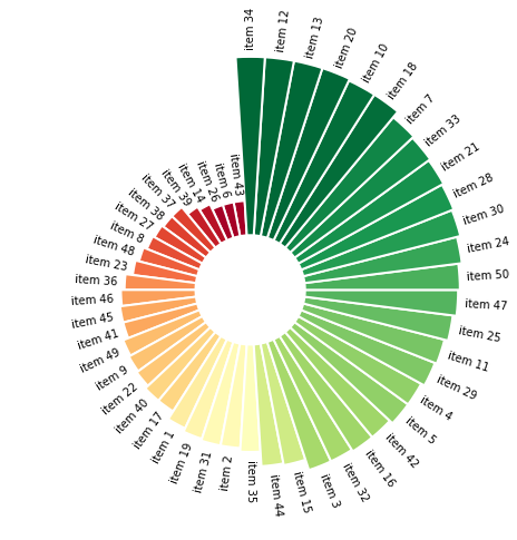
分组径向柱图
import matplotlib.pyplot as plt
import numpy as np
import pandas as pd

rng = np.random.default_rng(123) # 随机种子

# 自定义数据
df = pd.DataFrame({
    "name": [f"item {i}" for i in range(1, 51)],
    "value": rng.integers(low=30, high=100, size=50),
    "group": ["A"] * 10 + ["B"] * 20 + ["C"] * 12 + ["D"] * 8
})

# 自定义函数,将上述的弧度转换、添加标签抽象成函数
def get_label_rotation(angle, offset):
    '''
    输入弧度和偏移量,返回对应的角度rotation以及对齐方式alignment
    '''
    rotation = np.rad2deg(angle + offset)
    if angle <= np.pi:
        alignment = "right"
        rotation = rotation + 180
    else:
        alignment = "left"
    return rotation, alignment


def add_labels(angles, values, labels, offset, ax):

    # 标签与bar的间距
    padding = 4

    # 迭代每个弧度、bar值和标签
    for angle, value, label, in zip(angles, values, labels):
        angle = angle

        # 获取角度和对齐方式
        rotation, alignment = get_label_rotation(angle, offset)

        # 添加文本标签
        ax.text(
            x=angle,
            y=value + padding,
            s=label,
            ha=alignment,
            va="center",
            rotation=rotation,
            rotation_mode="anchor"
        )
# 自定义基础变量 GROUP = df["group"].values # 分组 GROUPS_SIZE = [len(i[1]) for i in df.groupby("group")] # 每组的数量 COLORS = [f"C{i}" for i, size in enumerate(GROUPS_SIZE) for _ in range(size)] # 每组使用不同的颜色 # bar的值与标签 VALUES = df["value"].values LABELS = df["name"].values # 偏移量:默认从0开始,指定成从90度位置开始 OFFSET = np.pi / 2 # bar宽度、角度 PAD = 3 # 每组末尾添加3个空白bar ANGLES_N = len(VALUES) + PAD * len(np.unique(GROUP)) ANGLES = np.linspace(0, 2 * np.pi, num=ANGLES_N, endpoint=False) WIDTH = (2 * np.pi) / len(ANGLES) # 2pi/条形数量得到每个条形宽度 # 获取索引 offset = 0 IDXS = [] for size in GROUPS_SIZE: IDXS += list(range(offset + PAD, offset + size + PAD)) offset += size + PAD # 初始化极坐标图 fig, ax = plt.subplots(figsize=(10, 8), subplot_kw={"projection": "polar"}) # 指定偏移量 ax.set_theta_offset(OFFSET) # 设置范围 ax.set_ylim(-100, 100) # 移除边框 ax.set_frame_on(False) # 移除网格和轴刻度 ax.xaxis.grid(False) ax.yaxis.grid(False) ax.set_xticks([]) ax.set_yticks([]) # 添加条形图 ax.bar( ANGLES[IDXS], VALUES, width=WIDTH, color=COLORS, edgecolor="white", linewidth=2 ) # 添加标签 add_labels(ANGLES[IDXS], VALUES, LABELS, OFFSET, ax) # 额外添加分组标签 offset = 0 # 重置为0 for group, size in zip(["A", "B", "C", "D"], GROUPS_SIZE): # 在条形图下添加线条 x1 = np.linspace(ANGLES[offset + PAD], ANGLES[offset + size + PAD - 1], num=50) ax.plot(x1, [-5] * 50, color="#333333") # 添加分组标签 ax.text( np.mean(x1), -20, group, color="#333333", fontsize=14, fontweight="bold", ha="center", va="center" ) # 添加参考线:[20, 40, 60, 80] x2 = np.linspace(ANGLES[offset], ANGLES[offset + PAD - 1], num=50) ax.plot(x2, [20] * 50, color="#bebebe", lw=0.8) ax.plot(x2, [40] * 50, color="#bebebe", lw=0.8) ax.plot(x2, [60] * 50, color="#bebebe", lw=0.8) ax.plot(x2, [80] * 50, color="#bebebe", lw=0.8) offset += size + PAD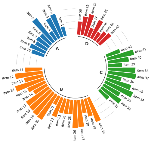
总结
以上通过matplotlib结合极坐标绘制基本的径向柱图,并结合相关绘图方法绘制南丁格尔玫瑰图和分组径向柱图。
共勉~


![[<span style='color:red;'>python</span>][plotly]<span style='color:red;'>利用</span>plotly<span style='color:red;'>绘制</span>散点<span style='color:red;'>图</span>](https://img-blog.csdnimg.cn/direct/5ee3195915fc40ae91c35fb714dd4c38.png)