目录
博主wx:yuanlai45_csdn 博主qq:2777137742
后期会创建粉丝群,为同学们提供分享交流平台以及提供官方发送的福利奖品~
1. MaterialApp
1.1 组件定义
Material 风格的程序的构建,当然相对应的是 ios 风格是 CupertinoApp
MaterialApp class - material library - Dart API
CupertinoApp class - cupertino library - Dart API
MaterialApp 是整个应用的根组件,它提供了应用的基础配置和框架。它承担了设定应用主题、路由以及其他全局配置的责任。
1.2 主要功能和属性
- title: 应用的标题,通常在任务管理器中显示
- theme: 应用的全局主题,定义了颜色、字体等统一样式
- home: 应用启动时的默认页面或根页面
- routes: 定义命名路由,用于应用内导航
- navigatorKey: 全局唯一的
Navigator,用于导航管理 - locale: 用于指定应用语言和区域的
Locale - localizationsDelegates: 本地化的代理,用于支持多语言
- debugShowCheckedModeBanner: 控制是否显示调试模式横幅
const MaterialApp({
  Key key,
  // 导航键 , key的作用提高复用性能
  this.navigatorKey,
  // 主页
  this.home,
  // 路由
  this.routes = const <String, WidgetBuilder>{},
  // 初始命名路由
  this.initialRoute,
  // 路由构造
  this.onGenerateRoute,
  // 未知路由
  this.onUnknownRoute,
  // 导航观察器
  this.navigatorObservers = const <NavigatorObserver>[],
  // 建造者
  this.builder,
  // APP 标题
  this.title = '',
  // 生成标题
  this.onGenerateTitle,
  // APP 颜色
  this.color,
  // 样式定义
  this.theme,
  // 主机暗色模式
  this.darkTheme,
  // 样式模式
  this.themeMode = ThemeMode.system,
  // 多语言 本地化
  this.locale,
  // 多语言代理
  this.localizationsDelegates,
  // 多语言回调
  this.localeListResolutionCallback,
  this.localeResolutionCallback,
  // 支持的多国语言
  this.supportedLocales = const <Locale>[Locale('en', 'US')],
  // 调试显示材质网格
  this.debugShowMaterialGrid = false,
  // 显示性能叠加
  this.showPerformanceOverlay = false,
  // 检查缓存图片的情况
  this.checkerboardRasterCacheImages = false,
  // 检查不必要的setlayer
  this.checkerboardOffscreenLayers = false,
  // 显示语义调试器
  this.showSemanticsDebugger = false,
  // 显示debug标记 右上角
  this.debugShowCheckedModeBanner = true,
})
1.3 示例
代码
import 'package:flutter/material.dart';

void main() {
  runApp(const MyApp());
}

class MyApp extends StatelessWidget {
  const MyApp({Key? key}) : super(key: key);

  @override
  Widget build(BuildContext context) {
    return MaterialApp(
      // APP 标题
      // ios 没有用、 android 进程名称 、 web 标题tab栏名称
      title: 'Material App',

      // APP 颜色
      color: Colors.green,

      // 样式
      theme: ThemeData(
        primarySwatch: Colors.yellow,
      ),

      // 主机暗色模式
      darkTheme: ThemeData(
        primarySwatch: Colors.red,
      ),

      // 显示debug标记 右上角
      // debugShowCheckedModeBanner: false,

      // 调试显示材质网格
      // debugShowMaterialGrid: true,

      // 显示性能叠加
      // showPerformanceOverlay: true,

      // 检查缓存图片的情况
      // checkerboardRasterCacheImages: true,

      // 检查不必要的setlayer
      // checkerboardOffscreenLayers: true,

      // 显示语义调试器
      // showSemanticsDebugger: true,

      // 首页
      home: Scaffold(
        appBar: AppBar(
          title: const Text('Material App'),
        ),
        body: Center(
          child: Column(
            children: const [
              Text("data"),
              FlutterLogo(
                size: 100,
              ),
            ],
          ),
        ),
      ),
    );
  }
}
输出
2. 脚手架 Scaffold
2.1 定义
Scaffold 是一个页面布局脚手架,实现了基本的 Material 布局,继承自 StatefulWidget,是有状态组件。我们知道大部分的应用页面都是含有标题栏,主体内容,底部导航菜单或者侧滑抽屉菜单等等构成,那么每次都重复写这些内容会大大降低开发效率,所以 Flutter 提供了 Material 风格的 Scaffold 页面布局脚手架,可以很快地搭建出这些元素部分
对应 ios 的是 CupertinoPageScaffold
Scaffold class - material library - Dart API
CupertinoPageScaffold class - cupertino library - Dart API
2.2 Scaffold 的属性
以下是 Scaffold 组件的一些常用属性:
- appBar:即顶栏,可以包含标题、导航按钮、动作按钮等
- body:应用的主体部分,显示页面的主要内容
- bottomNavigationBar:底部导航栏,用于页面间的切换
- floatingActionButton:浮动操作按钮,通常用于表示主要操作,如添加或编辑
- drawer:侧边栏菜单,用于导航到不同的页面或显示其他选项
- backgroundColor:背景颜色
- resizeToAvoidBottomInset:控制应用在有键盘弹出时是否调整布局以避免遮挡输入框
const Scaffold({
    Key key,
    // 菜单栏
    this.appBar,
    // 中间主体内容部分
    this.body,
    // 悬浮按钮
    this.floatingActionButton,
    // 悬浮按钮位置
    this.floatingActionButtonLocation,
    // 悬浮按钮动画
    this.floatingActionButtonAnimator,
    // 固定在下方显示的按钮
    this.persistentFooterButtons,
    // 左侧 侧滑抽屉菜单
    this.drawer,
    // 右侧 侧滑抽屉菜单
    this.endDrawer,
    // 底部菜单
    this.bottomNavigationBar,
    // 底部拉出菜单
    this.bottomSheet,
    // 背景色
    this.backgroundColor,
    // 自动适应底部padding
    this.resizeToAvoidBottomPadding,
    // 重新计算body布局空间大小,避免被遮挡
    this.resizeToAvoidBottomInset,
    // 是否显示到底部,默认为true将显示到顶部状态栏
    this.primary = true,
    this.drawerDragStartBehavior = DragStartBehavior.down,
  })
2.3 示例
代码
import 'package:flutter/gestures.dart';
import 'package:flutter/material.dart';
// class CupertinoPage extends StatelessWidget {
// const CupertinoPage({Key? key}) : super(key: key);
// @override
// Widget build(BuildContext context) {
// return const CupertinoPageScaffold(
// navigationBar: CupertinoNavigationBar(
// middle: Text('我是标题'),
// ),
// child: Center(
// child: Text('我是内容'),
// ),
// );
// }
// }
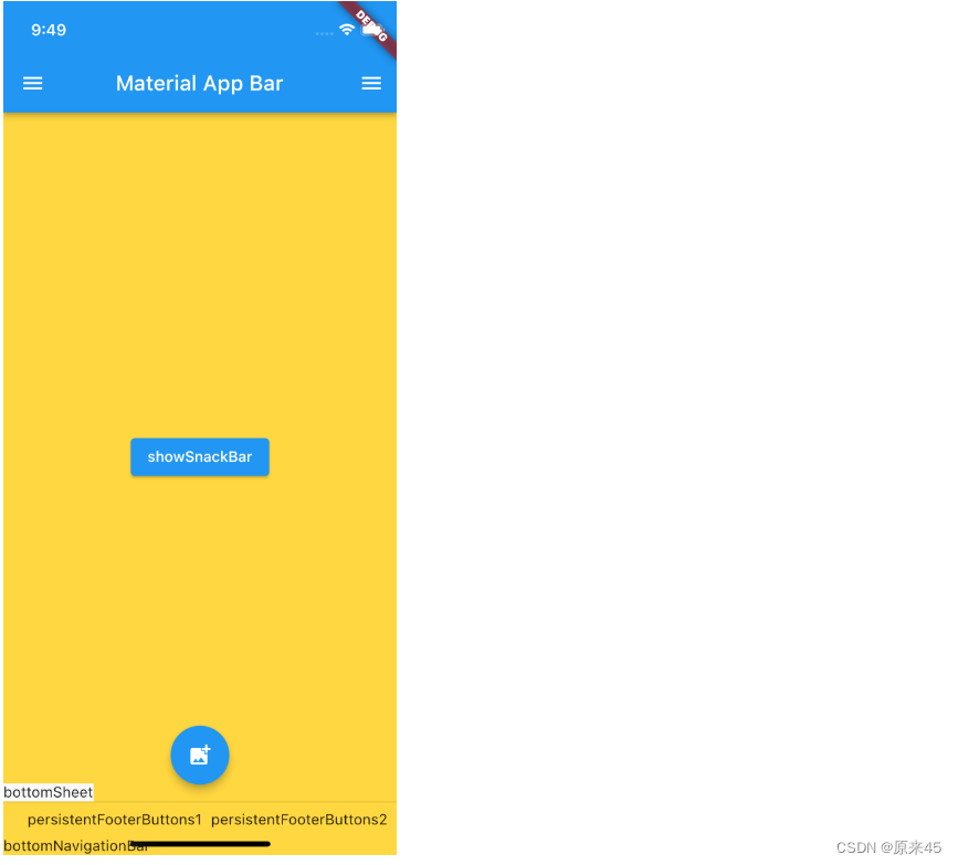
class ScaffoldPage extends StatelessWidget {
const ScaffoldPage({Key? key}) : super(key: key);
@override
Widget build(BuildContext context) {
return Scaffold(
// 菜单栏
appBar: AppBar(
title: const Text('Material App Bar'),
),
// 悬浮按钮
// floatingActionButton: FloatingActionButton(
// onPressed: () {},
// child: const Icon(Icons.add_photo_alternate),
// ),
// 悬浮按钮位置
// floatingActionButtonLocation: FloatingActionButtonLocation.centerFloat,
// 固定在下方显示的按钮
// persistentFooterButtons: const [
// Text('persistentFooterButtons1'),
// Text('persistentFooterButtons2'),
// ],
// 压缩顶部菜单空间
// primary: true,
// 左侧 侧滑抽屉菜单
// drawer: const Drawer(
// child: Text('data'),
// ),
// 右侧 侧滑抽屉菜单
// endDrawer: const Drawer(
// child: Text('data'),
// ),
// 检测手势行为方式,与drawer配合使用 down 方式有卡顿,可以 start 方式
// drawerDragStartBehavior: DragStartBehavior.start,
// 底部导航栏
// bottomNavigationBar: const Text('bottomNavigationBar'),
// 底部拉出菜单
// bottomSheet: const Text('bottomSheet'),
// 背景色
// backgroundColor: Colors.amberAccent,
// 自动适应底部padding
// resizeToAvoidBottomInset: true,
// 正文
body: Builder(
builder: (BuildContext context) {
return Center(
child: ElevatedButton(
onPressed: () {
// 脚手架管理
// Scaffold.of(context).openDrawer();
// 应用消息管理
ScaffoldMessenger.of(context).showSnackBar(const SnackBar(
content: Text('Hello!'),
));
},
child: const Text('showSnackBar'),
),
);
},
),
);
}
}输出
PS: 对于 Scaffold 和 MaterialApp
MaterialApp 是整个应用的根组件,它提供了应用的基础配置和框架。它承担了设定应用主题、路由以及其他全局配置的责任
Scaffold 是用来构建单个页面的布局框架。它提供了一个包含顶栏、底部导航栏、浮动按钮和主体内容的基本结构
3. 线性布局 Column Row
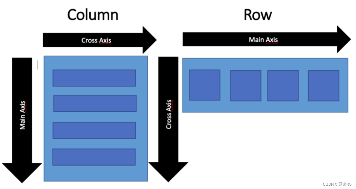
3.1 Row
Row 布局组件类似于 Android 中的 LinearLayout 线性布局,它用来做水平横向布局使用,里面的 children 子元素按照水平方向进行排列。
Row class - widgets library - Dart API
定义
Row({
    Key key,

  	// * 子元素集合
    List<Widget> children = const <Widget>[],

    // 主轴方向上的对齐方式(Row的主轴是横向轴)
    MainAxisAlignment mainAxisAlignment = MainAxisAlignment.start,
    // 在主轴方向(Row的主轴是横向轴)占有空间的值,默认是max
    MainAxisSize mainAxisSize = MainAxisSize.max,
    // 在交叉轴方向(Row是纵向轴)的对齐方式,Row的高度等于子元素中最高的子元素高度
    CrossAxisAlignment crossAxisAlignment = CrossAxisAlignment.center,

 		// 水平方向子元素的排列方向:从左到右排列还是反向
    TextDirection textDirection,
    // 表示纵轴(垂直)的对齐排列方向,默认是VerticalDirection.down,表示从上到下。这个参数一般用于Column组件里
    VerticalDirection verticalDirection = VerticalDirection.down,
    // 字符对齐基线方式
    TextBaseline textBaseline,

  })
MainAxisAlignment
主轴属性:主轴方向上的对齐方式,Row 是横向轴为主轴
enum MainAxisAlignment {
  // 按照主轴起点对齐,例如:按照靠近最左侧子元素对齐
  start,

  // 将子元素放置在主轴的末尾,按照末尾对齐
  end,

  // 子元素放置在主轴中心对齐
  center,

  // 将主轴方向上的空白区域均分,使得子元素之间的空白区域相等,首尾子元素都靠近首尾,没有间隙。有点类似于两端对齐
  spaceBetween,

  // 将主轴方向上的空白区域均分,使得子元素之间的空白区域相等,但是首尾子元素的空白区域为1/2
  spaceAround,

  // 将主轴方向上的空白区域均分,使得子元素之间的空白区域相等,包括首尾子元素
  spaceEvenly,
}
CrossAxisAlignment
交叉属性:在交叉轴方向的对齐方式,Row 是纵向轴。Row 的高度等于子元素中最高的子元素高度
enum CrossAxisAlignment {
  // 子元素在交叉轴上起点处展示
  start,

  // 子元素在交叉轴上末尾处展示
  end,

  // 子元素在交叉轴上居中展示
  center,

  // 让子元素填满交叉轴方向
  stretch,

  // 在交叉轴方向,使得子元素按照baseline对齐
  baseline,
}
MainAxisSize
在主轴方向子元素占有空间的方式,Row 的主轴是横向轴。默认是 max
enum MainAxisSize {
  // 根据传入的布局约束条件,最大化主轴方向占用可用空间,也就是尽可能充满可用宽度
  max,

  // 与max相反,是最小化占用主轴方向的可用空间
  min,
}
3.2 Column
Column 是纵向排列子元素
参数用法同上
Column class - widgets library - Dart API
代码
  @override
  Widget build(BuildContext context) {
    return Scaffold(
      body: Container(
        color: Colors.amber,
        child: Column(
          mainAxisAlignment: MainAxisAlignment.center,
          crossAxisAlignment: CrossAxisAlignment.center,
          // mainAxisSize: MainAxisSize.min,
          children: const [
            FlutterLogo(
              size: 24,
            ),
            FlutterLogo(
              size: 48,
            ),
            FlutterLogo(
              size: 128,
            ),
            FlutterLogo(
              size: 200,
            ),
          ],
        ),
      ),
    );
  }
输出
4. 盒模型 Box Model
Flutter 布局是混入了 RenderBox 特性,我们来了解下什么是盒模型
4.1 定义
盒子模型在 web 中是基础,所以本文参考了 mozilla w3schools
https://developer.mozilla.org/zh-CN/docs/Learn/CSS/Building_blocks/The_box_model
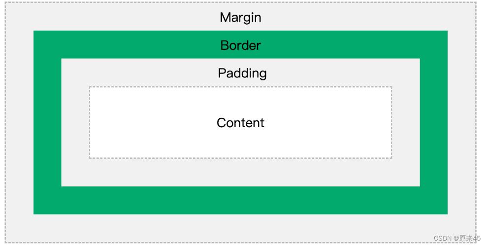
不同部分的说明:
- Margin(外边距) - 边框意外的距离。
- Border(边框) - 围绕在内边距和内容外的边框。
- Padding(内边距) - 边框内部到内容的距离。
- Content(内容) - 盒子的内容,显示文本和图像。
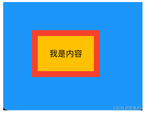
4.2 示例
代码
class BoxPage extends StatelessWidget {
  const BoxPage({Key? key}) : super(key: key);

  @override
  Widget build(BuildContext context) {
    return Scaffold(
      backgroundColor: Colors.blue,
      body: Container(
        // color: Colors.amber,

        // Margin(外边距)
        margin: const EdgeInsets.all(50),

        // Padding(内边距)
        padding: const EdgeInsets.all(20),

        // Content(内容)
        child: const Text("我是内容"),

        // 装饰样式
        decoration: BoxDecoration(
          // 背景色
          color: Colors.amber,

          // 边框
          border: Border.all(
            color: Colors.red,
            width: 10,
          ),
        ),
      ),
    );
  }
}
输出
5. 容器 Container
5.1 定义
Container 是一个组合类容器,它本身不对应具体的 RenderObject,它是 DecoratedBox、ConstrainedBox、Transform、Padding、Align 等组件组合的一个多功能容器,所以我们只需通过一个 Container 组件可以实现同时需要装饰、变换、限制的场景
Container class - widgets library - Dart API
下面是 Container 的定义:
Container({
    Key key,
    // 容器子Widget对齐方式
    this.alignment,
    // 容器内部padding
    this.padding,
    // 背景色
    Color color,
    // 背景装饰
    Decoration decoration,
    // 前景装饰
    this.foregroundDecoration,
    // 容器的宽度
    double width,
    // 容器的高度
    double height,
    // 容器大小的限制条件
    BoxConstraints constraints,
    // 容器外部margin
    this.margin,
    // 变换,如旋转
    this.transform,
    // 容器内子Widget
    this.child,
  })
BoxDecoration 装饰
const BoxDecoration({
  // 背景色
  this.color,
  // 背景图片
  this.image,
  // 边框样式
  this.border,
  // 边框圆角
  this.borderRadius,
  // 阴影
  this.boxShadow,
  // 渐变
  this.gradient,
  // 背景混合模式
  this.backgroundBlendMode,
  // 形状
  this.shape = BoxShape.rectangle,
})
5.2 示例
代码
import 'package:flutter/material.dart';
const img1 =
"https://ducafecat.tech/2021/12/09/blog/2021-jetbrains-fleet-vs-vscode/2021-12-09-10-30-00.png";
class MyPage extends StatelessWidget {
const MyPage({Key? key}) : super(key: key);
@override
Widget build(BuildContext context) {
return Scaffold(
body: Container(
// 约束父容器
constraints: const BoxConstraints.expand(
height: 300.0,
),
// 外边距
margin: const EdgeInsets.all(20.0),
// 内边距
padding: const EdgeInsets.all(30.0),
// 背景色
// color: Colors.teal.shade700,
// 子Widget居中
alignment: Alignment.centerLeft,
// 子Widget元素
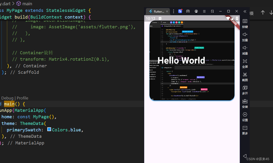
child: Text(
'Hello World',
style: TextStyle(
fontSize: 34,
fontWeight: FontWeight.bold,
color: Colors.white,
),
),
// 背景装饰
decoration: const BoxDecoration(
// 背景色
color: Colors.blueAccent,
// 圆角
borderRadius: BorderRadius.all(
Radius.circular(20.0),
),
// 渐变
// gradient: RadialGradient(
// colors: [Colors.red, Colors.orange],
// center: Alignment.topLeft,
// radius: .98,
// ),
// 阴影
boxShadow: [
BoxShadow(
blurRadius: 2,
offset: Offset(0, 2),
color: Colors.blue,
),
],
// 背景图
image: DecorationImage(
image: NetworkImage(img1),
fit: BoxFit.cover,
),
// 背景混合模式
backgroundBlendMode: BlendMode.color,
// 形状
// shape: BoxShape.circle,
),
// 前景装饰
// foregroundDecoration: BoxDecoration(
// image: DecorationImage(
// image: AssetImage('assets/flutter.png'),
// ),
// ),
// Container旋转
// transform: Matrix4.rotationZ(0.1),
),
);
}
}
void main() {
runApp(MaterialApp(
home: const MyPage(),
theme: ThemeData(
primarySwatch: Colors.blue,
),
));
}
6. 弹性布局 Flex
弹性布局允许子组件按照一定比例来分配父容器空间。
Flex class - widgets library - Dart API
6.1 Flex
我们可以发现 Column Row 组件都是继承与 Flex,功能非常强大,通常我们直接用 Column Row 即可
flutter/lib/src/widgets/basic.dart
/// * [Row], for a horizontal equivalent.

/// * [Flex], if you don't know in advance if you want a horizontal or vertical

/// arrangement.

/// * [Expanded], to indicate children that should take all the remaining room.

/// * [Flexible], to indicate children that should share the remaining room but

/// that may size smaller (leaving some remaining room unused).

/// * [SingleChildScrollView], whose documentation discusses some ways to

/// use a [Column] inside a scrolling container.

/// * [Spacer], a widget that takes up space proportional to its flex value.

/// * The [catalog of layout widgets](https://flutter.dev/widgets/layout/).

class Column extends Flex {

...
6.2 Expanded
Expanded 只能放在 Flex、Column、Row 中使用
把包裹的元素撑开
代码
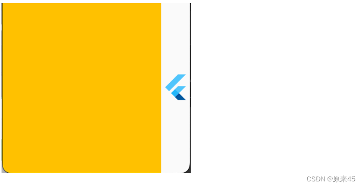
class FlexPage extends StatelessWidget {
  const FlexPage({Key? key}) : super(key: key);

  @override
  Widget build(BuildContext context) {
    return Scaffold(
      body: Row(
        children: [
          Expanded(
            child: Container(
              color: Colors.amber,
            ),
          ),
          const FlutterLogo(
            size: 32,
          ),
        ],
      ),
    );
  }
}
输出
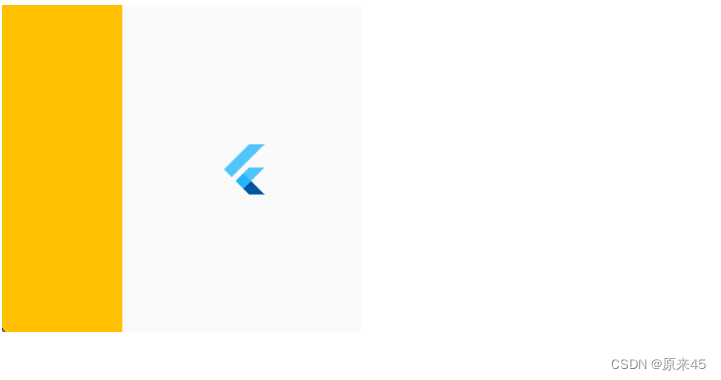
Flex 属性调整比例
代码
  children: [
    Expanded(
      flex: 1,
      child: Container(
        color: Colors.amber,
      ),
    ),
    const Expanded(
      flex: 2,
      child: FlutterLogo(
        size: 32,
      ),
    ),
  ],
输出
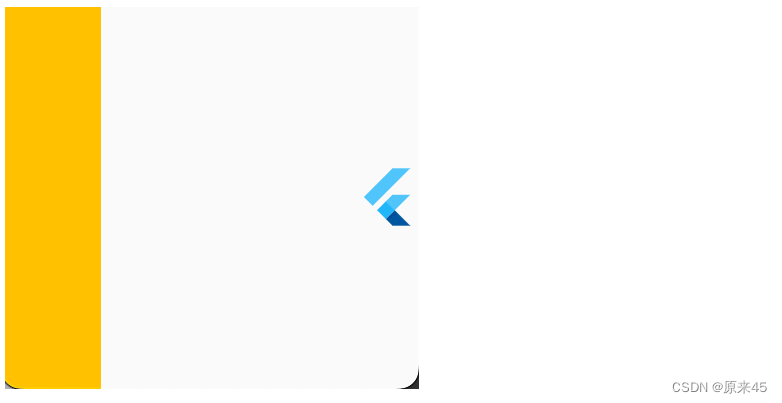
6.3 留白 Spacer
留白撑开,很适合用在标题按钮的场景中
代码
  children: [
    Container(
      width: 50,
      color: Colors.amber,
    ),
    const Spacer(),
    const FlutterLogo(
      size: 32,
    ),
  ],
输出
7. 层叠布局 Stack
7.1 Stack
Stack 允许子组件堆叠
Stack class - widgets library - Dart API
定义
Stack({

	Key key,

	// 对齐方式,默认是左上角(topStart)
	this.alignment = AlignmentDirectional.topStart,

	// 对齐方向
	this.textDirection,

	// 定义如何设置无定位子元素尺寸,默认为loose
	this.fit = StackFit.loose,

  // 对超出 Stack 显示空间的部分如何剪裁
  this.clipBehavior = Clip.hardEdge,

	// 子元素
	List<Widget> children = const <Widget>[],

})
7.2 Positioned
根据 Stack 的四个角来确定子组件的位置
定义
const Positioned({

	Key key,

	this.left, // 上下左右位置
	this.top,
	this.right,
	this.bottom,

	this.width, // 宽高
	this.height,

	@required Widget child,

})
7.3 示例
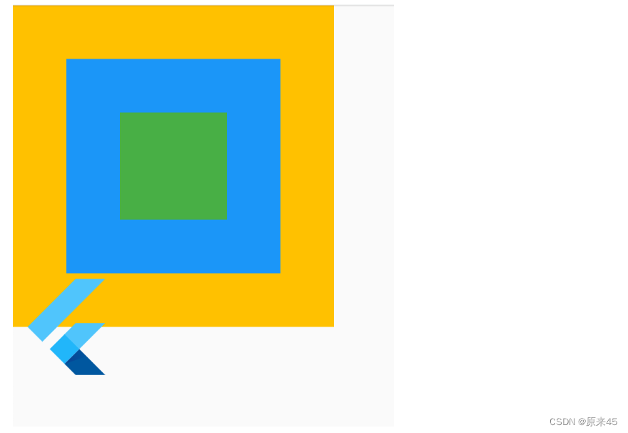
代码
import 'package:flutter/material.dart';

class StackPage extends StatelessWidget {
  const StackPage({Key? key}) : super(key: key);

  @override
  Widget build(BuildContext context) {
    return Scaffold(
      body: SizedBox(
        width: 300,
        height: 300,
        child: Stack(
          // 居中对齐
          alignment: Alignment.center,
          // 子元素溢出, none 不裁剪
          clipBehavior: Clip.none,
          // 子元素层叠放
          children: [
            // 三个色块
            Container(
              width: 300,
              height: 300,
              color: Colors.amber,
            ),
            Container(
              width: 200,
              height: 200,
              color: Colors.blue,
            ),
            Container(
              width: 100,
              height: 100,
              color: Colors.green,
            ),
            // 绝对定位
            const Positioned(
              left: 0,
              bottom: -50,
              child: FlutterLogo(size: 100),
            ),
          ],
        ),
      ),
    );
  }
}
输出
8. 流式布局 Wrap
用 Row 的时候可以发现子元素不会自动换行,这时候就需要 Wrap 了。
Wrap class - widgets library - Dart API
8.1 定义
Wrap({
  this.direction = Axis.horizontal,
  // 主轴方向的对齐方式
  this.alignment = WrapAlignment.start,
  // 主轴方向子widget的间距
  this.spacing = 0.0,
  // 纵轴方向的对齐方式
  this.runAlignment = WrapAlignment.start,
  // 纵轴方向的间距
  this.runSpacing = 0.0,
  // 交叉轴对齐方式
  this.crossAxisAlignment = WrapCrossAlignment.start,
  this.textDirection,
  this.verticalDirection = VerticalDirection.down,
  List<Widget> children = const <Widget>[],
})
8.2 示例
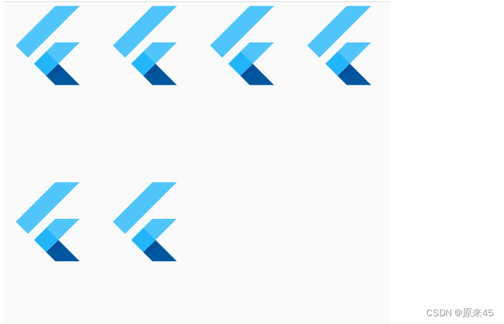
代码
import 'package:flutter/material.dart';

class WrapPage extends StatelessWidget {
  const WrapPage({Key? key}) : super(key: key);

  @override
  Widget build(BuildContext context) {
    return Scaffold(
      body: Wrap(
        // 主轴方向子widget的间距
        spacing: 10,
        // 纵轴方向的间距
        runSpacing: 100,
        // 主轴方向的对齐方式
        alignment: WrapAlignment.start,
        children: const [
          FlutterLogo(size: 100),
          FlutterLogo(size: 100),
          FlutterLogo(size: 100),
          FlutterLogo(size: 100),
          FlutterLogo(size: 100),
          FlutterLogo(size: 100),
        ],
      ),
    );
  }
}
输出
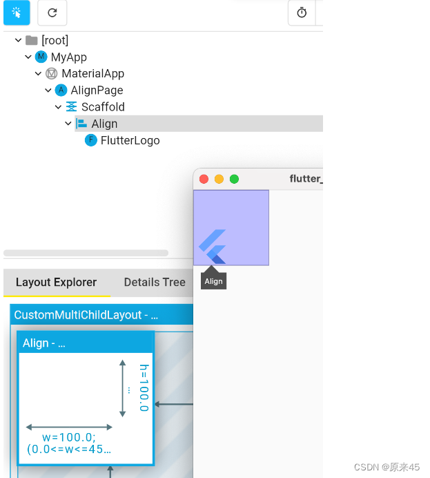
9. 对齐定位 Align
调整子元素在父元素的位置
Align class - widgets library - Dart API
9.1 Align
定义
Align({
Key key,
// 需要一个AlignmentGeometry类型的值
// AlignmentGeometry 是一个抽象类,
// 它有两个常用的子类:Alignment和 FractionalOffset
this.alignment = Alignment.center,
// 两个缩放因子
// 会分别乘以子元素的宽、高,最终的结果就是 Align 组件的宽高
this.widthFactor,
this.heightFactor,
Widget child,
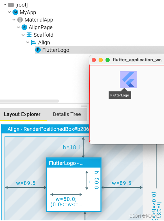
})代码
import 'package:flutter/material.dart';

class AlignPage extends StatelessWidget {
  const AlignPage({Key? key}) : super(key: key);

  @override
  Widget build(BuildContext context) {
    return const Scaffold(
      body: Align(
        widthFactor: 2,
        heightFactor: 2,
        alignment: Alignment.bottomLeft,
        child: FlutterLogo(
          size: 50,
        ),
      ),
    );
  }
}
输出
可以发现,Align 的高宽=子元素高宽*高宽因子factor,如果 null 采用父元素高度约束
9.2 Alignment
Alignment 是从 Align 的中心点出发
定义
/// The top left corner.
static const Alignment topLeft = Alignment(-1.0, -1.0);
/// The center point along the top edge.
static const Alignment topCenter = Alignment(0.0, -1.0);
/// The top right corner.
static const Alignment topRight = Alignment(1.0, -1.0);
/// The center point along the left edge.
static const Alignment centerLeft = Alignment(-1.0, 0.0);
/// The center point, both horizontally and vertically.
static const Alignment center = Alignment(0.0, 0.0);
/// The center point along the right edge.
static const Alignment centerRight = Alignment(1.0, 0.0);
/// The bottom left corner.
static const Alignment bottomLeft = Alignment(-1.0, 1.0);
/// The center point along the bottom edge.
static const Alignment bottomCenter = Alignment(0.0, 1.0);
/// The bottom right corner.
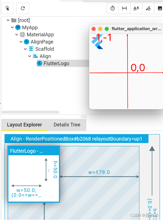
static const Alignment bottomRight = Alignment(1.0, 1.0);Alignment(-1.0, -1.0) 标识从中心点出发,左上角
代码
...
    return const Scaffold(
      body: Align(
        alignment: Alignment(-1, -1),
        child: FlutterLogo(
          size: 50,
        ),
      ),
    );
输出
Alignment.topLeft == Alignment(-1, -1) ,用哪种方式都可以
9.3 FractionalOffset
这种方式是固定从左上角出发
代码
...
  @override
  Widget build(BuildContext context) {
    return const Scaffold(
      body: Align(
        alignment: FractionalOffset(0.5, 0.1),
        child: FlutterLogo(
          size: 50,
        ),
      ),
    );
  }
用 FractionalOffset 对象,输入 0~1 的比例值
输出
9.4 Center
Center 是集成了 Align 对象,默认 alignment=Alignment.center
Center 定义, 少了一个 alignment 参数
class Center extends Align {
  /// Creates a widget that centers its child.
  const Center({ Key? key, double? widthFactor, double? heightFactor, Widget? child })
    : super(key: key, widthFactor: widthFactor, heightFactor: heightFactor, child: child);
}
然后 Align 定义, 默认了 this.alignment = Alignment.center,
class Align extends SingleChildRenderObjectWidget {
  /// Creates an alignment widget.
  ///
  /// The alignment defaults to [Alignment.center].
  const Align({
    Key? key,
    this.alignment = Alignment.center,
    this.widthFactor,
    this.heightFactor,
    Widget? child,
  }) : assert(alignment != null),
       assert(widthFactor == null || widthFactor >= 0.0),
       assert(heightFactor == null || heightFactor >= 0.0),
       super(key: key, child: child);
代码
...
  @override
  Widget build(BuildContext context) {
    return const Scaffold(
      body: Center(
        child: FlutterLogo(
          size: 50,
        ),
      ),
    );
  }
输出
创作不易,希望读者三连支持 💖
赠人玫瑰,手有余香 💖