🤵♂️ 个人主页:@艾派森的个人主页
✍🏻作者简介:Python学习者
🐋 希望大家多多支持,我们一起进步!😄
如果文章对你有帮助的话,
欢迎评论 💬点赞👍🏻 收藏 📂加关注+
目录
1.项目背景
艾滋病(Acquired Immunodeficiency Syndrome,AIDS)是一种由人类免疫缺陷病毒(Human Immunodeficiency Virus,HIV)引起的免疫系统功能受损的严重疾病。艾滋病的流行给全球卫生健康带来了严重挑战,特别是在一些发展中国家和弱势群体中。
艾滋病的研究和管理需要综合多方面的信息,包括患者的个人特征、病毒的特性、医疗历史等。利用机器学习算法对艾滋病数据进行分析和建模,有助于更好地理解该疾病的传播规律、风险因素以及预测患者的病情发展。Catboost算法作为一种擅长处理类别型特征的梯度提升树算法,在艾滋病数据的分析与建模中具有一定的优势。
本研究旨在利用Catboost算法对艾滋病数据进行分析与建模,并结合可视化技术,探索艾滋病患者的特征与疾病发展之间的关系。通过这一研究,可以为艾滋病的预防、诊断和治疗提供更加科学有效的支持和指导。
2.数据集介绍
本数据集来源于Kaggle,数据集包含有关被诊断患有艾滋病的患者的医疗保健统计数据和分类信息。该数据集最初于 1996 年发布。
属性信息:
time:失败或审查的时间
trt:治疗指标(0 = 仅 ZDV;1 = ZDV + ddI,2 = ZDV + Zal,3 = 仅 ddI)
age:基线年龄(岁)
wtkg:基线时的体重(公斤)
hemo:血友病(0=否,1=是)
homo:同性恋活动(0=否,1=是)
drugs:静脉注射药物使用史(0=否,1=是)
karnof:卡诺夫斯基分数(范围为 0-100)
oprior:175 年前非 ZDV 抗逆转录病毒治疗(0=否,1=是)
z30:175之前30天的ZDV(0=否,1=是)
preanti:抗逆转录病毒治疗前 175 天
race:种族(0=白人,1=非白人)
gender:性别(0=女,1=男)
str2:抗逆转录病毒史(0=未接触过,1=有经验)
strat:抗逆转录病毒病史分层(1='未接受过抗逆转录病毒治疗',2='> 1 但<= 52周既往抗逆转录病毒治疗',3='> 52周)
symptom:症状指标(0=无症状,1=症状)
treat:治疗指标(0=仅ZDV,1=其他)
offrtrt:96+/-5周之前off-trt的指标(0=否,1=是)
cd40:基线处的 CD4
cd420:20+/-5 周时的 CD4
cd80:基线处的 CD8
cd820:20+/-5 周时的 CD8
infected:感染艾滋病(0=否,1=是)
3.技术工具
Python版本:3.9
代码编辑器:jupyter notebook
4.实验过程
4.1导入数据
首先导入本次实验用到的第三方库并加载数据集
查看数据大小

查看数据基本信息

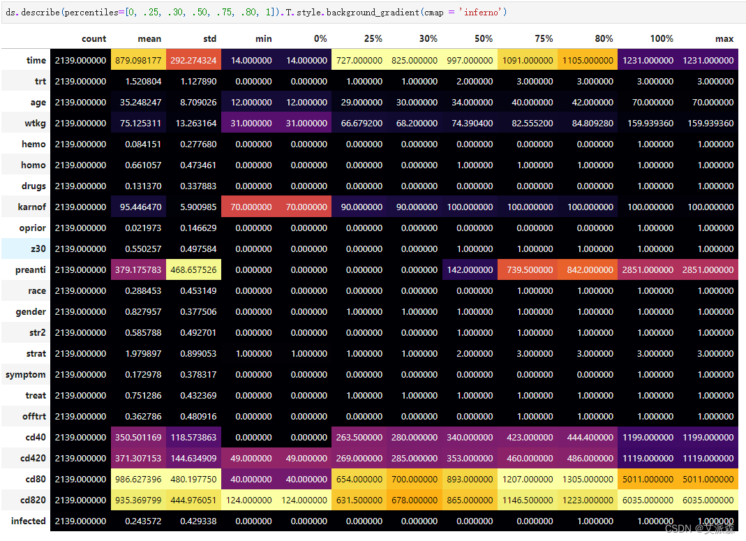
查看数据描述性统计
4.2数据预处理
统计数据缺失值情况

可以发现原始数据集并不存在缺失值,故不需要处理
统计重复值情况

可以发现原始数据集并存在重复值,故不需要处理
4.3数据可视化

为了方便后面作图,这里我们自定义一个画图函数
def mPlotter(r, c, size, _targets, text):

    bg = '#010108'

    palette = ['#df5337', '#d24644', '#f7d340', '#3339FF', '#440a68', '#84206b', '#f1ef75', '#fbbe23', '#400a67']

    font = 'ubuntu'

    fig = plt.figure(figsize=size)

    fig.patch.set_facecolor(bg)

    grid = fig.add_gridspec(r, c)

    grid.update(wspace=0.5, hspace=0.25)

    __empty_diff = ((r * c) - 1) - len(_targets)

    axes = []

    for i in range(r):
        for j in range(c):
            axes.append(fig.add_subplot(grid[i, j]))

    for idx, ax in enumerate(axes):
        ax.set_facecolor(bg)

        if idx == 0:
            ax.spines["bottom"].set_visible(False)
            ax.tick_params(left=False, bottom=False)
            ax.set_xticklabels([])
            ax.set_yticklabels([])
            ax.text(0.5, 0.5,
                 f'{text}',
                 horizontalalignment='center',
                 verticalalignment='center',
                 fontsize=18,
                 fontweight='bold',
                 fontfamily=font,
                 color="#fff")
        else:
            if (idx - 1) < len(_targets):
                ax.set_title(_targets[idx - 1].capitalize(), fontsize=14, fontweight='bold', fontfamily=font, color="#fff")
                ax.grid(color='#fff', linestyle=':', axis='y', zorder=0,  dashes=(1,5))
                ax.set_xlabel("")
                ax.set_ylabel("")
            else:
                ax.spines["bottom"].set_visible(False)
                ax.tick_params(left=False, bottom=False)
                ax.set_xticklabels([])
                ax.set_yticklabels([])

        ax.spines["left"].set_visible(False)
        ax.spines["top"].set_visible(False)
        ax.spines["right"].set_visible(False)

    def cb(ax):
        ax.set_xlabel("")
        ax.set_ylabel("")

    if __empty_diff > 0:
        axes = axes[:-1*__empty_diff]

    return axes, palette, cb
开始作图


4.4特征工程
拆分数据集为训练集和测试集

平衡数据集

数据标准化处理

4.5模型构建
首先找到catboost的最佳超参数!


使用超参数构建并训练模型,打印模型的准确率和分类报告

将混淆矩阵可视化

最后再作出ROC曲线


源代码
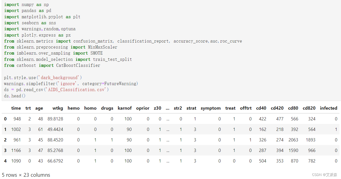
import numpy as np
import pandas as pd
import matplotlib.pyplot as plt
import seaborn as sns
import warnings,random,optuna
import plotly.express as px
from sklearn.metrics import confusion_matrix, classification_report, accuracy_score,auc,roc_curve
from sklearn.preprocessing import MinMaxScaler
from imblearn.over_sampling import SMOTE
from sklearn.model_selection import train_test_split
from catboost import CatBoostClassifier
plt.style.use('dark_background')
warnings.simplefilter('ignore', category=FutureWarning)
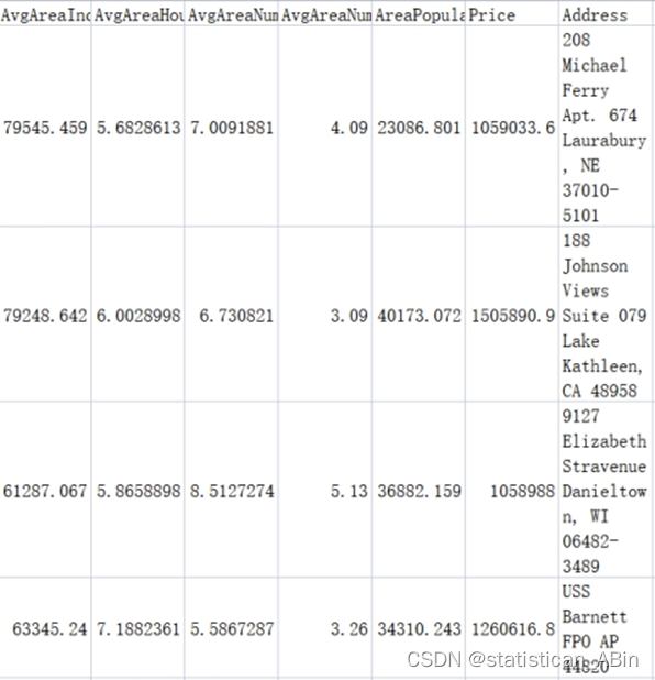
ds = pd.read_csv('AIDS_Classification.csv')
ds.head()
ds.shape
ds.info()
ds.describe(percentiles=[0, .25, .30, .50, .75, .80, 1]).T.style.background_gradient(cmap = 'inferno')
ds.isnull().sum()
ds.duplicated().sum()
def mPlotter(r, c, size, _targets, text):
bg = '#010108'
palette = ['#df5337', '#d24644', '#f7d340', '#3339FF', '#440a68', '#84206b', '#f1ef75', '#fbbe23', '#400a67']
font = 'ubuntu'
fig = plt.figure(figsize=size)
fig.patch.set_facecolor(bg)
grid = fig.add_gridspec(r, c)
grid.update(wspace=0.5, hspace=0.25)
__empty_diff = ((r * c) - 1) - len(_targets)
axes = []
for i in range(r):
for j in range(c):
axes.append(fig.add_subplot(grid[i, j]))
for idx, ax in enumerate(axes):
ax.set_facecolor(bg)
if idx == 0:
ax.spines["bottom"].set_visible(False)
ax.tick_params(left=False, bottom=False)
ax.set_xticklabels([])
ax.set_yticklabels([])
ax.text(0.5, 0.5,
f'{text}',
horizontalalignment='center',
verticalalignment='center',
fontsize=18,
fontweight='bold',
fontfamily=font,
color="#fff")
else:
if (idx - 1) < len(_targets):
ax.set_title(_targets[idx - 1].capitalize(), fontsize=14, fontweight='bold', fontfamily=font, color="#fff")
ax.grid(color='#fff', linestyle=':', axis='y', zorder=0, dashes=(1,5))
ax.set_xlabel("")
ax.set_ylabel("")
else:
ax.spines["bottom"].set_visible(False)
ax.tick_params(left=False, bottom=False)
ax.set_xticklabels([])
ax.set_yticklabels([])
ax.spines["left"].set_visible(False)
ax.spines["top"].set_visible(False)
ax.spines["right"].set_visible(False)
def cb(ax):
ax.set_xlabel("")
ax.set_ylabel("")
if __empty_diff > 0:
axes = axes[:-1*__empty_diff]
return axes, palette, cb
target = 'infected'
cont_cols = ['time', 'age', 'wtkg', 'preanti', 'cd40', 'cd420', 'cd80', 'cd820']
dis_cols = list(set(ds.columns) - set([*cont_cols, target]))
len(cont_cols), len(dis_cols)
axes, palette, cb = mPlotter(1, 2, (20, 5), [target], 'Count Of\nInfected Variable\n______________')
sns.countplot(x=ds[target], ax = axes[1], color=palette[0])
cb(axes[1])
axes, palette, cb = mPlotter(3, 3, (20, 20), cont_cols, 'KDE Plot of\nContinuous Variables\n________________')
for col, ax in zip(cont_cols, axes[1:]):
sns.kdeplot(data=ds, x=col, ax=ax, hue=target, palette=palette[1:3], alpha=.5, linewidth=0, fill=True)
cb(ax)
axes, palette, cb = mPlotter(3, 3, (20, 20), cont_cols, 'Boxen Plot of\nContinuous Variables\n________________')
for col, ax in zip(cont_cols, axes[1:]):
sns.boxenplot(data=ds, y=col, ax=ax, palette=[palette[random.randint(0, len(palette)-1)]])
cb(ax)
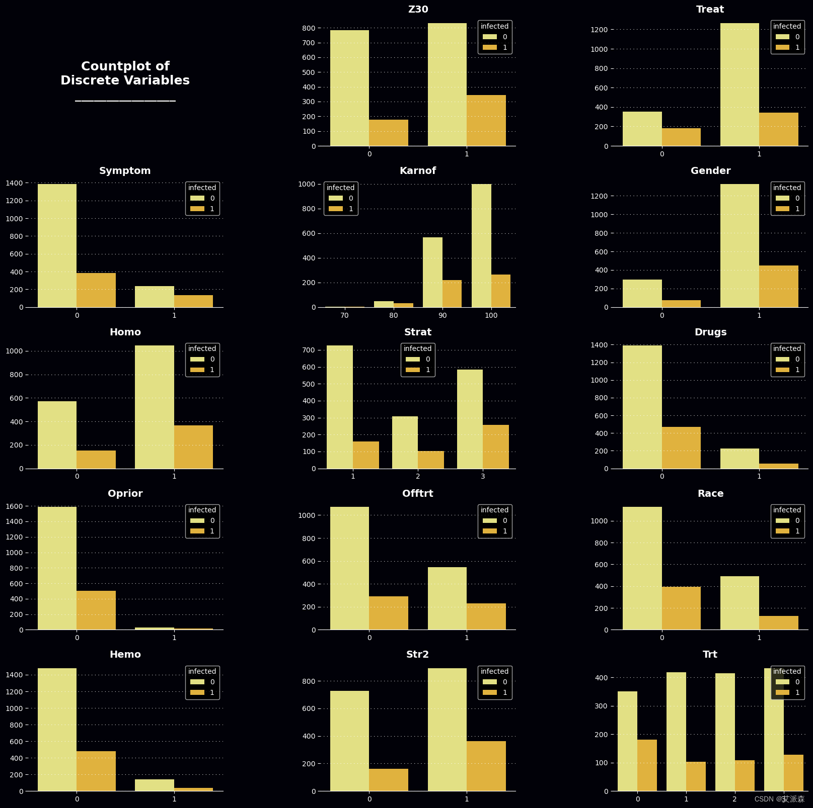
axes, palette, cb = mPlotter(5, 3, (20, 20), dis_cols, 'Countplot of\nDiscrete Variables\n________________')
for col, ax in zip(dis_cols, axes[1:]):
sns.countplot(x=ds[col], ax = ax, hue=ds[target], palette=palette[6:8])
cb(ax)
ax = px.scatter_3d(ds, x="age", y="wtkg", z="time", template= "plotly_dark", color="infected")
ax.show()
ax = px.scatter_3d(ds, x="preanti", y="cd40", z="cd420", template= "plotly_dark", color="infected")
ax.show()
ax = px.scatter_3d(ds, x="preanti", y="cd80", z="cd820", template= "plotly_dark", color="infected")
ax.show()
fig = plt.figure(figsize=(25, 8))
gs = fig.add_gridspec(1, 1)
gs.update(wspace=0.3, hspace=0.15)
ax = fig.add_subplot(gs[0, 0])
ax.set_title("Correlation Matrix", fontsize=28, fontweight='bold', fontfamily='serif', color="#fff")
sns.heatmap(ds[cont_cols].corr().transpose(), mask=np.triu(np.ones_like(ds[cont_cols].corr().transpose())), fmt=".1f", annot=True, cmap='Blues')
plt.show()
# 拆分数据集为训练集和测试集
x_train, x_test, y_train, y_test = train_test_split(ds.iloc[:,:-1], ds.iloc[:, -1], random_state=3, train_size=.7)
x_train.shape, y_train.shape, x_test.shape, y_test.shape
# 平衡数据集
smote = SMOTE(random_state = 14)
x_train, y_train = smote.fit_resample(x_train, y_train)
x_train.shape, y_train.shape, x_test.shape, y_test.shape
# 数据标准化处理
x_train = MinMaxScaler().fit_transform(x_train)
x_test = MinMaxScaler().fit_transform(x_test)
# 找到catboost的最佳超参数!
def objective(trial):
params = {
'iterations': trial.suggest_int('iterations', 100, 1000),
'learning_rate': trial.suggest_loguniform('learning_rate', 0.01, 0.5),
'depth': trial.suggest_int('depth', 1, 12),
'l2_leaf_reg': trial.suggest_loguniform('l2_leaf_reg', 1e-3, 10.0),
'border_count': trial.suggest_int('border_count', 1, 255),
'thread_count': -1,
'loss_function': 'MultiClass',
'eval_metric': 'Accuracy',
'verbose': False
}
model = CatBoostClassifier(**params)
model.fit(x_train, y_train, eval_set=(x_test, y_test), verbose=False, early_stopping_rounds=20)
y_pred = model.predict(x_test)
accuracy = accuracy_score(y_test, y_pred)
return accuracy
study = optuna.create_study(direction='maximize')
study.optimize(objective, n_trials=50, show_progress_bar=True)
# 初始化模型并使用前面的最佳超参数
model = CatBoostClassifier(
verbose=0,
random_state=3,
**study.best_params
)
# 训练模型
model.fit(x_train, y_train)
# 预测
y_pred = model.predict(x_test)
# 打印模型评估指标
print('模型准确率:',accuracy_score(y_test,y_pred))
print (classification_report(y_pred, y_test))
plt.subplots(figsize=(20, 6))
sns.heatmap(confusion_matrix(y_pred, y_test), annot = True, fmt="d", cmap="Blues", linewidths=.5)
plt.show()
# 画出ROC曲线
y_prob = model.predict_proba(x_test)[:,1]
false_positive_rate, true_positive_rate, thresholds = roc_curve(y_test, y_prob)
roc = auc(false_positive_rate, true_positive_rate)
plt.title('ROC')
plt.plot(false_positive_rate,true_positive_rate, color='red',label = 'AUC = %0.2f' % roc)
plt.legend(loc = 'lower right')
plt.plot([0, 1], [0, 1],linestyle='--')
plt.axis('tight')
plt.ylabel('True Positive Rate')
plt.xlabel('False Positive Rate')
plt.show()
# 模型预测
res = pd.DataFrame()
res['真实值'] = y_test
res['预测值'] = y_pred
res.sample(10)
资料获取,更多粉丝福利,关注下方公众号获取


![[经验] 平安银行怎么提升信用额度 #微信#微信](https://img-home.csdnimg.cn/images/20230724024159.png?origin_url=https%3A%2F%2Fwww.hao123rr.com%2Fzb_users%2Fcache%2Fly_autoimg%2F%25E5%25B9%25B3%25E5%25AE%2589%25E9%2593%25B6%25E8%25A1%258C%25E6%2580%258E%25E4%25B9%2588%25E6%258F%2590%25E5%258D%2587%25E4%25BF%25A1%25E7%2594%25A8%25E9%25A2%259D%25E5%25BA%25A6.jpg&pos_id=UQPsALwB)