1.封装公共组件
<template>
	<div class="confirm-popover disInlineBlock ml10">
		<el-popover placement="bottom" v-model="visible" :trigger="triggerType">
			<div class="confirm-popover-popover">
				<!-- 简单提示内容 -->
				<p class="confimStyle" v-if="!advanced">
					<span
						class="mr10 font20"
						:class="iconClass"
						:style="iconStyle"
						v-if="popoverIcon"
					></span
					>{{ textMessage }}
				</p>
				<!-- 自定义提示内容 -->
				<slot></slot>
			</div>
			<div class="operate-btns mt20">
				<el-button
					size="medium"
					plain
					class="w45pct"
					@click="visible = false"
					>{{ cancelTxt }}</el-button
				>
				<el-button
					size="medium"
					type="primary"
					class="w45pct mlpct10-imp"
					@click="fireHandler"
					>{{ confirmTxt }}</el-button
				>
			</div>
			<el-button
				v-if="!advancedBtn"
				:type="adsorptionBtnType"
				:plain="isPlain"
				:icon="adsorptionBtnIcon"
				:style="falseBtnContentStyle"
				:disabled="btnDisabled"
				size="medium"
				slot="reference"
				@click="referChange"
			>
				{{ adsorptionTxt }}
			</el-button>
			<el-button
				v-if="advancedBtn"
				:type="adsorptionBtnType"
				:plain="isPlain"
				:style="btnContentStyle"
				:icon="adsorptionBtnIcon"
				:disabled="btnDisabled"
				size="medium"
				slot="reference"
			>
				<slot name="btnContent"></slot>
			</el-button>
		</el-popover>
	</div>
</template>

<script>
export default {
	name: "ConfirmPopover",
	props: {
		// 按钮大小
		size: {
			type: String,
			default: "small",
		},
		//被吸附的按钮是否禁用
		btnDisabled: {
			type: Boolean,
			default: false,
		},
		//是否朴素按钮
		isPlain: {
			type: Boolean,
			default: true,
		},
		//是否开启自定义提示内容
		advanced: {
			type: Boolean,
			default: false,
		},
		//是否开启自定义按钮内的内容(如果想自定义btn内容,advancedBtn必须为true)
		advancedBtn: {
			type: Boolean,
			default: false,
		},
		//是否需要icon
		popoverIcon: {
			type: Boolean,
			default: true,
		},
		//popover中的icon 图标
		iconClass: {
			type: String,
			default: "el-icon-warning",
		},
		//popover中的icon 行内样式
		iconStyle: {
			type: Object,
			default: function () {
				return { color: "#f56c6c" };
			},
		},
		//btnContent中的icon 行内样式
		btnContentStyle: {
			type: Object,
			default: function () {
				return { color: "#f56c6c" };
			},
		},
		//falseBtnContentStyle中的icon 行内样式
		falseBtnContentStyle: {
			type: Object,
			default: function () {
				return { color: "#f56c6c" };
			},
		},
		//popover触发方式
		triggerType: {
			type: String,
			default: "click",
			required: false,
		},
		//提示文案
		textMessage: {
			type: String,
			default: "Hello world!!!",
			required: false,
		},
		//被吸附的按钮文案
		adsorptionTxt: {
			type: String,
			default: "按钮",
			required: false,
		},
		//被吸附的按钮的类型
		adsorptionBtnType: {
			type: String,
			default: "primary",
			required: false,
		},
		//被吸附的按钮的icon
		adsorptionBtnIcon: {
			type: String,
			default: "",
			required: false,
		},
		//取消按钮文案
		cancelTxt: {
			type: String,
			default: "取消",
			required: false,
		},
		//确认按钮文案
		confirmTxt: {
			type: String,
			default: "确定",
			required: false,
		},
	},
	components: {},
	computed: {},
	watch: {},
	data() {
		return {
			visible: false, //popover显示与隐藏
		};
	},
	mounted() {},
	methods: {
		fireHandler() {
			this.visible = false;
			this.$emit("emitCallback");
		},
		referChange() {
			this.visible = false;
			this.$emit("referBtn");
		},
	},
};
</script>

<style lang="scss" scoped>
::v-deep .el-icon-warning:before {
	content: "\e7a3" !important;
}
::v-deep .el-button {
	min-width: 60px;
}
.confirm-popover-popover {
	.confimStyle {
		color: #606266;
		font-size: 14px;
	}
}
</style>
2.使用场景
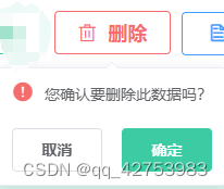
2-1 单纯的弹出按钮框 类似于这种
1.引入
import confirmPopover from "@/components/ConfirmPopover";
components:{confirmPopover}
2.使用
<confirm-popover
v-if="libraryFlag.isCanDelete"
class="deleteBtnActive ml10"
:textMessage="delMessage"
adsorptionBtnType="danger"
adsorptionBtnIcon="el-icon-delete"
adsorptionTxt="删除"
:falseBtnContentStyle="falseBtnContentStyleObj"
triggerType="manual"
@referBtn="deleApply"
ref="del"
@emitCallback="delSure">
</confirm-popover>
3.data
delMessage: "请选择确认删除的数据?",
falseBtnContentStyleObj: {
color: "#f9a7a7",
borderWidth: "1px",
borderColor: "#fde2e2",
borderStyle: "solid",
fontSize: "18px",
lineHeight: "13px",
fontWeight: 600,
background: "none",
},
4.methods
deleApply() {
this.visible = true;
this.$refs.del.visible = true;
},
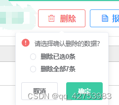
delSure() {}2-2 结合el-radio的弹出框
1.引入
import confirmPopover from "@/components/ConfirmPopover";
components:{confirmPopover}
2.使用
<confirm-popover
	v-if="libraryFlag.isCanDelete"
	class="deleteBtnActive ml10"
	:textMessage="delMessage"
	adsorptionBtnType="danger"
	adsorptionBtnIcon="el-icon-delete"
	adsorptionTxt="删除"
	:falseBtnContentStyle="falseBtnContentStyleObj"
	triggerType="manual"
	@referBtn="deleApply"
	ref="del"
	@emitCallback="delSure">
      <template slot="default">
		 <div class="custom-message">
			<el-radio-group
			  v-model="selectedOption"
			  style="display: flex; flex-direction: column"
			  class="ml20 mt10">
				<el-radio label="1">删除已选{{ selectedCount }}条</el-radio>
				<el-radio label="2" class="mt10">删除全部{{ totalCount }}条</el-radio>
			 </el-radio-group>
		  </div>
	   </template>
</confirm-popover>
3.data
delMessage: "请选择确认删除的数据?",
falseBtnContentStyleObj: {
  color: "#f9a7a7",
  borderWidth: "1px",
  borderColor: "#fde2e2",
  borderStyle: "solid",
  fontSize: "18px",
  lineHeight: "13px",
  fontWeight: 600,
  background: "none",
},
selectedOption: null,
selectedCount: 0,
totalCount: 0,
4.methods
deleApply() {
  this.visible = true;
  this.$refs.del.visible = true;
},
delSure() {}


