以红葡萄酒为例
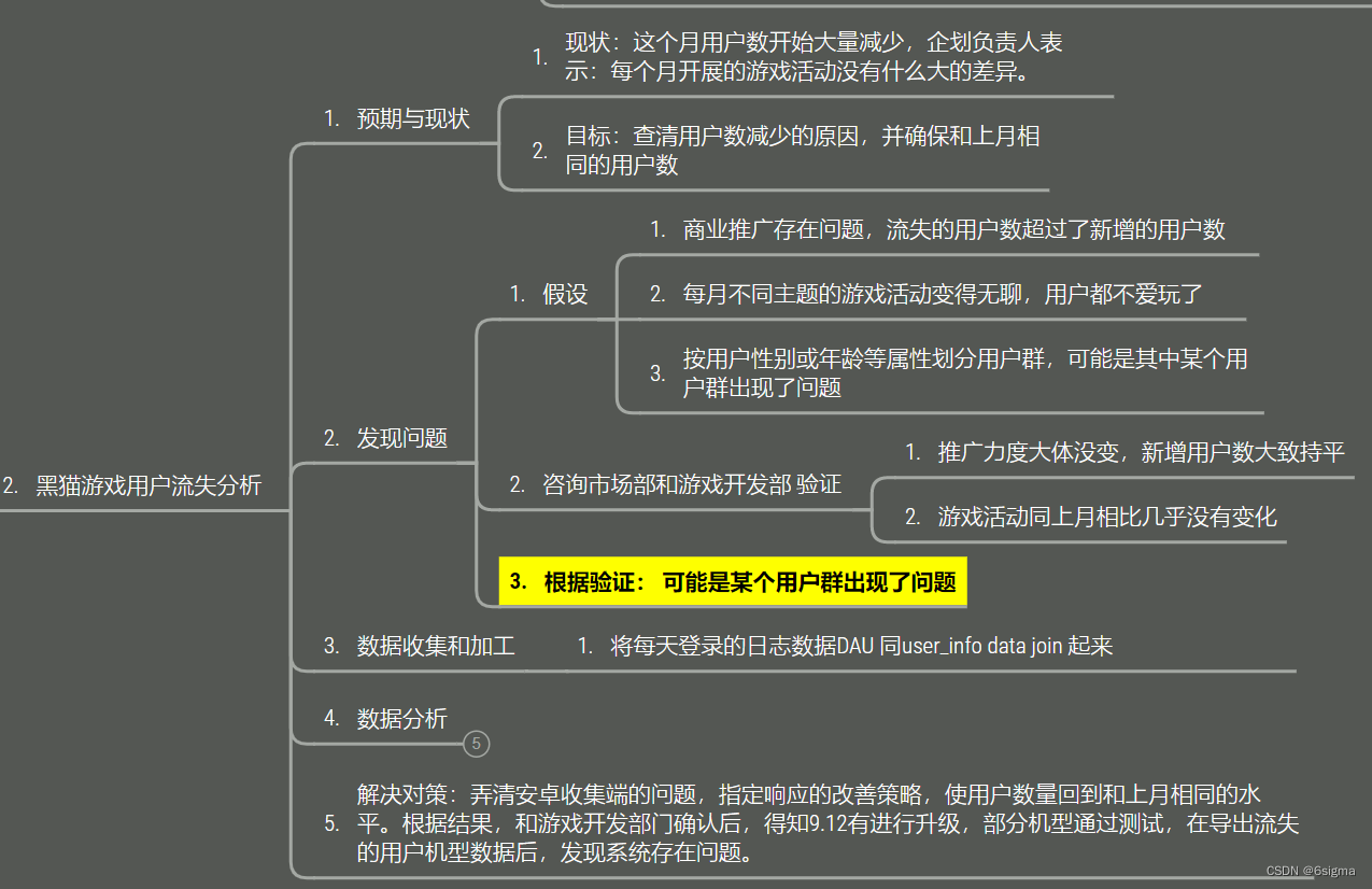
有两个样本:
winequality-red.csv:红葡萄酒样本
winequality-white.csv:白葡萄酒样本
每个样本都有得分从1到10的质量评分,以及若干理化检验的结果
| # | 理化性质 | 字段名称 |
|---|---|---|
| 1 | 固定酸度 | fixed acidity |
| 2 | 挥发性酸度 | volatile acidity |
| 3 | 柠檬酸 | citric acid |
| 4 | 残糖 | residual sugar |
| 5 | 氯化物 | chlorides |
| 6 | 游离二氧化硫 | free sulfur dioxide |
| 7 | 总二氧化硫 | total sulfur dioxide |
| 8 | 密度 | density |
| 9 | PH值 | pH |
| 10 | 硫酸盐 | sulphates |
| 11 | 酒精度 | alcohol |
| 12 | 质量 | quality |
导入数据和库依赖
import pandas as pd
import numpy as np
import matplotlib.pyplot as plt
# import seaborn as sns
%matplotlib inline
plt.style.use('ggplot')
# sep参数默认逗号
red_df = pd.read_csv('winequality-red.csv', sep=';')
white_df = pd.read_csv('winequality-white.csv', sep=';')
# 查看表头
red_df.head()
| fixed_acidity | volatile_acidity | citric_acid | residual_sugar | chlorides | free_sulfur_dioxide | total_sulfur-dioxide | density | pH | sulphates | alcohol | quality | |
|---|---|---|---|---|---|---|---|---|---|---|---|---|
| 0 | 7.4 | 0.70 | 0.00 | 1.9 | 0.076 | 11.0 | 34.0 | 0.9978 | 3.51 | 0.56 | 9.4 | 5 |
| 1 | 7.8 | 0.88 | 0.00 | 2.6 | 0.098 | 25.0 | 67.0 | 0.9968 | 3.20 | 0.68 | 9.8 | 5 |
| 2 | 7.8 | 0.76 | 0.04 | 2.3 | 0.092 | 15.0 | 54.0 | 0.9970 | 3.26 | 0.65 | 9.8 | 5 |
| 3 | 11.2 | 0.28 | 0.56 | 1.9 | 0.075 | 17.0 | 60.0 | 0.9980 | 3.16 | 0.58 | 9.8 | 6 |
| 4 | 7.4 | 0.70 | 0.00 | 1.9 | 0.076 | 11.0 | 34.0 | 0.9978 | 3.51 | 0.56 | 9.4 | 5 |
修改列名
发现 total_sulfur-dioxide 这个属性命名不规范,修改一下:
red_df.rename(columns={"total_sulfur-dioxide":"total_sulfur_dioxide"}, inplace=True)
# 查看修改成功
red_df.head(5)
| fixed_acidity | volatile_acidity | citric_acid | residual_sugar | chlorides | free_sulfur_dioxide | total_sulfur_dioxide | density | pH | sulphates | alcohol | quality | |
|---|---|---|---|---|---|---|---|---|---|---|---|---|
| 0 | 7.4 | 0.70 | 0.00 | 1.9 | 0.076 | 11.0 | 34.0 | 0.9978 | 3.51 | 0.56 | 9.4 | 5 |
| 1 | 7.8 | 0.88 | 0.00 | 2.6 | 0.098 | 25.0 | 67.0 | 0.9968 | 3.20 | 0.68 | 9.8 | 5 |
| 2 | 7.8 | 0.76 | 0.04 | 2.3 | 0.092 | 15.0 | 54.0 | 0.9970 | 3.26 | 0.65 | 9.8 | 5 |
| 3 | 11.2 | 0.28 | 0.56 | 1.9 | 0.075 | 17.0 | 60.0 | 0.9980 | 3.16 | 0.58 | 9.8 | 6 |
| 4 | 7.4 | 0.70 | 0.00 | 1.9 | 0.076 | 11.0 | 34.0 | 0.9978 | 3.51 | 0.56 | 9.4 | 5 |
回答以下问题
- 每个数据集中的样本数
- 每个数据集中的列数
- 具有缺少值的特征
- 红葡萄酒数据集中的重复行
- 数据集中的质量等级唯一值的数量
- 红葡萄酒数据集的平均密度
# 查看基本信息
red_df.info()
<class 'pandas.core.frame.DataFrame'>
RangeIndex: 1599 entries, 0 to 1598
Data columns (total 12 columns):
fixed_acidity           1599 non-null float64
volatile_acidity        1599 non-null float64
citric_acid             1599 non-null float64
residual_sugar          1599 non-null float64
chlorides               1599 non-null float64
free_sulfur_dioxide     1599 non-null float64
total_sulfur_dioxide    1599 non-null float64
density                 1599 non-null float64
pH                      1599 non-null float64
sulphates               1599 non-null float64
alcohol                 1599 non-null float64
quality                 1599 non-null int64
dtypes: float64(11), int64(1)
memory usage: 150.0 KB
# 查看样本数量
len(red_df)
1599
# 数据集中列数
len(red_df.columns)
12
# 红葡萄酒中重复行的数量
sum(red_df.duplicated())
240
# 质量的唯一值
len(red_df['quality'].unique())
6
# 红葡萄酒数据集中的平均密度
red_df['density'].mean()
0.9967466791744833
合并基本数据集
# 合并红、白葡萄酒的数据

# 为红葡萄酒数据框创建颜色数组(生成多个新行)
color_red = np.repeat("red",red_df.shape[0])

# 为白葡萄酒数据框创建颜色数组
color_white = np.repeat("white", white_df.shape[0])
len(color_red)
1599
red_df['color'] = color_red
# 查看新添加的列,发现添加成功
red_df.head()
| fixed_acidity | volatile_acidity | citric_acid | residual_sugar | chlorides | free_sulfur_dioxide | total_sulfur_dioxide | density | pH | sulphates | alcohol | quality | color | |
|---|---|---|---|---|---|---|---|---|---|---|---|---|---|
| 0 | 7.4 | 0.70 | 0.00 | 1.9 | 0.076 | 11.0 | 34.0 | 0.9978 | 3.51 | 0.56 | 9.4 | 5 | red |
| 1 | 7.8 | 0.88 | 0.00 | 2.6 | 0.098 | 25.0 | 67.0 | 0.9968 | 3.20 | 0.68 | 9.8 | 5 | red |
| 2 | 7.8 | 0.76 | 0.04 | 2.3 | 0.092 | 15.0 | 54.0 | 0.9970 | 3.26 | 0.65 | 9.8 | 5 | red |
| 3 | 11.2 | 0.28 | 0.56 | 1.9 | 0.075 | 17.0 | 60.0 | 0.9980 | 3.16 | 0.58 | 9.8 | 6 | red |
| 4 | 7.4 | 0.70 | 0.00 | 1.9 | 0.076 | 11.0 | 34.0 | 0.9978 | 3.51 | 0.56 | 9.4 | 5 | red |
white_df["color"] = color_white
white_df.head()
| fixed_acidity | volatile_acidity | citric_acid | residual_sugar | chlorides | free_sulfur_dioxide | total_sulfur_dioxide | density | pH | sulphates | alcohol | quality | color | |
|---|---|---|---|---|---|---|---|---|---|---|---|---|---|
| 0 | 7.0 | 0.27 | 0.36 | 20.7 | 0.045 | 45.0 | 170.0 | 1.0010 | 3.00 | 0.45 | 8.8 | 6 | white |
| 1 | 6.3 | 0.30 | 0.34 | 1.6 | 0.049 | 14.0 | 132.0 | 0.9940 | 3.30 | 0.49 | 9.5 | 6 | white |
| 2 | 8.1 | 0.28 | 0.40 | 6.9 | 0.050 | 30.0 | 97.0 | 0.9951 | 3.26 | 0.44 | 10.1 | 6 | white |
| 3 | 7.2 | 0.23 | 0.32 | 8.5 | 0.058 | 47.0 | 186.0 | 0.9956 | 3.19 | 0.40 | 9.9 | 6 | white |
| 4 | 7.2 | 0.23 | 0.32 | 8.5 | 0.058 | 47.0 | 186.0 | 0.9956 | 3.19 | 0.40 | 9.9 | 6 | white |
print(len(red_df))
print(len(white_df))
1599
4898
# 附加数据框
wine_df = red_df.append(white_df)

# 查看数据框,检查是否成功
wine_df.head()
| fixed_acidity | volatile_acidity | citric_acid | residual_sugar | chlorides | free_sulfur_dioxide | total_sulfur_dioxide | density | pH | sulphates | alcohol | quality | color | |
|---|---|---|---|---|---|---|---|---|---|---|---|---|---|
| 0 | 7.4 | 0.70 | 0.00 | 1.9 | 0.076 | 11.0 | 34.0 | 0.9978 | 3.51 | 0.56 | 9.4 | 5 | red |
| 1 | 7.8 | 0.88 | 0.00 | 2.6 | 0.098 | 25.0 | 67.0 | 0.9968 | 3.20 | 0.68 | 9.8 | 5 | red |
| 2 | 7.8 | 0.76 | 0.04 | 2.3 | 0.092 | 15.0 | 54.0 | 0.9970 | 3.26 | 0.65 | 9.8 | 5 | red |
| 3 | 11.2 | 0.28 | 0.56 | 1.9 | 0.075 | 17.0 | 60.0 | 0.9980 | 3.16 | 0.58 | 9.8 | 6 | red |
| 4 | 7.4 | 0.70 | 0.00 | 1.9 | 0.076 | 11.0 | 34.0 | 0.9978 | 3.51 | 0.56 | 9.4 | 5 | red |
wine_df.shape
(6497, 13)
保存合并后的数据集
# 保存自己的数据集
wine_df.to_csv("winequality_edited.csv",index=False)
# 设置seaborn的样式
# sns.set_style("ticks")
wine_df = pd.read_csv("winequality_edited.csv")
wine_df.shape
(6497, 13)
可视化探索
- 根据此数据集中的列的直方图,以下哪个特征变量显示为右偏态?固定酸度、总二氧化硫、pH 值、酒精度
hist方法详解
subplot返回值理解
subplot画图详解
绘制柱状图
fig, axs = plt.subplots(2, 2, figsize=(8, 8))

#  _ 代表不分配名字的变量
_ = wine_df.fixed_acidity.plot.hist(ax=axs[0][0], rwidth=0.9)
_ = wine_df.total_sulfur_dioxide.plot.hist(ax=axs[0][1], rwidth=0.9)
_ = wine_df.pH.plot.hist(ax=axs[1][0], rwidth=0.9)
_ = wine_df.alcohol.plot.hist(ax=axs[1][1], rwidth=0.9)
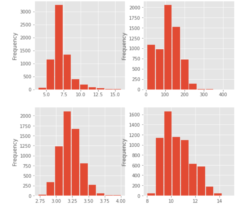
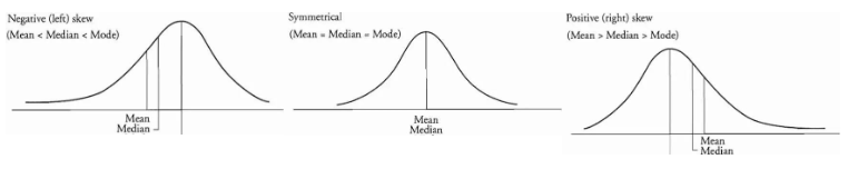
偏态的判定
下图依次表示左偏态、正态、右偏态
wine_df.skew(axis=0)
fixed_acidity           1.723290
volatile_acidity        1.495097
citric_acid             0.471731
residual_sugar          1.435404
chlorides               5.399828
free_sulfur_dioxide     1.220066
total_sulfur_dioxide   -0.001177
density                 0.503602
pH                      0.386839
sulphates               1.797270
alcohol                 0.565718
quality                 0.189623
dtype: float64
偏度值为正,则为右偏态,说明fixed_acidity、pH、alcohol都是右偏态
- 根据质量对不同特征变量的散点图,以下哪个最有可能对质量产生积极的影响?_挥发性酸度、残糖、pH 值、酒精度
x = wine_df[["fixed_acidity", "total_sulfur_dioxide", "pH", "alcohol", "quality"]]

fig, axs = plt.subplots(2, 2, figsize=(12, 8))

_  = x.plot.scatter(y='fixed_acidity', x='quality', ax=axs[0][0], linewidths=0.001, marker='o')
_  = x.plot.scatter(y='total_sulfur_dioxide', x='quality', ax=axs[0][1], linewidths=0.001, marker='o')
_  = x.plot.scatter(y='pH', x='quality', ax=axs[1][0], linewidths=0.001, marker='o')
_  = x.plot.scatter(y='alcohol', x='quality', ax=axs[1][1], linewidths=0.001, marker='o')

# sns.despine()

从图上看其实并不是很明显,因此采用定量计算的方式,通过计算两个变量之间的相关系数,相关系数越大则越说明有积极影响
相关系数
sub_df = wine_df.iloc[:,np.r_[0,6,8,10,11]]
sub_df.corr()['quality']
fixed_acidity          -0.076743
total_sulfur_dioxide   -0.041385
pH                      0.019506
alcohol                 0.444319
quality                 1.000000
Name: quality, dtype: float64
发现alcohol的相关系数最大,说明起到的积极作用最大
查看平均值
wine_df.mean()
fixed_acidity             7.215307
volatile_acidity          0.339666
citric_acid               0.318633
residual_sugar            5.443235
chlorides                 0.056034
free_sulfur_dioxide      30.525319
total_sulfur_dioxide    115.744574
density                   0.994697
pH                        3.218501
sulphates                 0.531268
alcohol                  10.491801
quality                   5.818378
dtype: float64
按属性分组
# 按quality分组,查看每组均值
wine_df.groupby('quality').mean()
| fixed_acidity | volatile_acidity | citric_acid | residual_sugar | chlorides | free_sulfur_dioxide | total_sulfur_dioxide | density | pH | sulphates | alcohol | |
|---|---|---|---|---|---|---|---|---|---|---|---|
| quality | |||||||||||
| 3 | 7.853333 | 0.517000 | 0.281000 | 5.140000 | 0.077033 | 39.216667 | 122.033333 | 0.995744 | 3.257667 | 0.506333 | 10.215000 |
| 4 | 7.288889 | 0.457963 | 0.272315 | 4.153704 | 0.060056 | 20.636574 | 103.432870 | 0.994833 | 3.231620 | 0.505648 | 10.180093 |
| 5 | 7.326801 | 0.389614 | 0.307722 | 5.804116 | 0.064666 | 30.237371 | 120.839102 | 0.995849 | 3.212189 | 0.526403 | 9.837783 |
| 6 | 7.177257 | 0.313863 | 0.323583 | 5.549753 | 0.054157 | 31.165021 | 115.410790 | 0.994558 | 3.217726 | 0.532549 | 10.587553 |
| 7 | 7.128962 | 0.288800 | 0.334764 | 4.731696 | 0.045272 | 30.422150 | 108.498610 | 0.993126 | 3.228072 | 0.547025 | 11.386006 |
| 8 | 6.835233 | 0.291010 | 0.332539 | 5.382902 | 0.041124 | 34.533679 | 117.518135 | 0.992514 | 3.223212 | 0.512487 | 11.678756 |
| 9 | 7.420000 | 0.298000 | 0.386000 | 4.120000 | 0.027400 | 33.400000 | 116.000000 | 0.991460 | 3.308000 | 0.466000 | 12.180000 |
# 分别以quality和color为两级索引进行分组,并查看均值
wine_df.groupby(['quality','color']).mean()
| fixed_acidity | volatile_acidity | citric_acid | residual_sugar | chlorides | free_sulfur_dioxide | total_sulfur_dioxide | density | pH | sulphates | alcohol | ||
|---|---|---|---|---|---|---|---|---|---|---|---|---|
| quality | color | |||||||||||
| 3 | red | 8.360000 | 0.884500 | 0.171000 | 2.635000 | 0.122500 | 11.000000 | 24.900000 | 0.997464 | 3.398000 | 0.570000 | 9.955000 |
| white | 7.600000 | 0.333250 | 0.336000 | 6.392500 | 0.054300 | 53.325000 | 170.600000 | 0.994884 | 3.187500 | 0.474500 | 10.345000 | |
| 4 | red | 7.779245 | 0.693962 | 0.174151 | 2.694340 | 0.090679 | 12.264151 | 36.245283 | 0.996542 | 3.381509 | 0.596415 | 10.265094 |
| white | 7.129448 | 0.381227 | 0.304233 | 4.628221 | 0.050098 | 23.358896 | 125.279141 | 0.994277 | 3.182883 | 0.476135 | 10.152454 | |
| 5 | red | 8.167254 | 0.577041 | 0.243686 | 2.528855 | 0.092736 | 16.983847 | 56.513950 | 0.997104 | 3.304949 | 0.620969 | 9.899706 |
| white | 6.933974 | 0.302011 | 0.337653 | 7.334969 | 0.051546 | 36.432052 | 150.904598 | 0.995263 | 3.168833 | 0.482203 | 9.808840 | |
| 6 | red | 8.347179 | 0.497484 | 0.273824 | 2.477194 | 0.084956 | 15.711599 | 40.869906 | 0.996615 | 3.318072 | 0.675329 | 10.629519 |
| white | 6.837671 | 0.260564 | 0.338025 | 6.441606 | 0.045217 | 35.650591 | 137.047316 | 0.993961 | 3.188599 | 0.491106 | 10.575372 | |
| 7 | red | 8.872362 | 0.403920 | 0.375176 | 2.720603 | 0.076588 | 14.045226 | 35.020101 | 0.996104 | 3.290754 | 0.741256 | 11.465913 |
| white | 6.734716 | 0.262767 | 0.325625 | 5.186477 | 0.038191 | 34.125568 | 125.114773 | 0.992452 | 3.213898 | 0.503102 | 11.367936 | |
| 8 | red | 8.566667 | 0.423333 | 0.391111 | 2.577778 | 0.068444 | 13.277778 | 33.444444 | 0.995212 | 3.267222 | 0.767778 | 12.094444 |
| white | 6.657143 | 0.277400 | 0.326514 | 5.671429 | 0.038314 | 36.720000 | 126.165714 | 0.992236 | 3.218686 | 0.486229 | 11.636000 | |
| 9 | white | 7.420000 | 0.298000 | 0.386000 | 4.120000 | 0.027400 | 33.400000 | 116.000000 | 0.991460 | 3.308000 | 0.466000 | 12.180000 |
# 分组属性不作为索引
wine_df.groupby(['quality','color'], as_index=False).mean()
| quality | color | fixed_acidity | volatile_acidity | citric_acid | residual_sugar | chlorides | free_sulfur_dioxide | total_sulfur_dioxide | density | pH | sulphates | alcohol | |
|---|---|---|---|---|---|---|---|---|---|---|---|---|---|
| 0 | 3 | red | 8.360000 | 0.884500 | 0.171000 | 2.635000 | 0.122500 | 11.000000 | 24.900000 | 0.997464 | 3.398000 | 0.570000 | 9.955000 |
| 1 | 3 | white | 7.600000 | 0.333250 | 0.336000 | 6.392500 | 0.054300 | 53.325000 | 170.600000 | 0.994884 | 3.187500 | 0.474500 | 10.345000 |
| 2 | 4 | red | 7.779245 | 0.693962 | 0.174151 | 2.694340 | 0.090679 | 12.264151 | 36.245283 | 0.996542 | 3.381509 | 0.596415 | 10.265094 |
| 3 | 4 | white | 7.129448 | 0.381227 | 0.304233 | 4.628221 | 0.050098 | 23.358896 | 125.279141 | 0.994277 | 3.182883 | 0.476135 | 10.152454 |
| 4 | 5 | red | 8.167254 | 0.577041 | 0.243686 | 2.528855 | 0.092736 | 16.983847 | 56.513950 | 0.997104 | 3.304949 | 0.620969 | 9.899706 |
| 5 | 5 | white | 6.933974 | 0.302011 | 0.337653 | 7.334969 | 0.051546 | 36.432052 | 150.904598 | 0.995263 | 3.168833 | 0.482203 | 9.808840 |
| 6 | 6 | red | 8.347179 | 0.497484 | 0.273824 | 2.477194 | 0.084956 | 15.711599 | 40.869906 | 0.996615 | 3.318072 | 0.675329 | 10.629519 |
| 7 | 6 | white | 6.837671 | 0.260564 | 0.338025 | 6.441606 | 0.045217 | 35.650591 | 137.047316 | 0.993961 | 3.188599 | 0.491106 | 10.575372 |
| 8 | 7 | red | 8.872362 | 0.403920 | 0.375176 | 2.720603 | 0.076588 | 14.045226 | 35.020101 | 0.996104 | 3.290754 | 0.741256 | 11.465913 |
| 9 | 7 | white | 6.734716 | 0.262767 | 0.325625 | 5.186477 | 0.038191 | 34.125568 | 125.114773 | 0.992452 | 3.213898 | 0.503102 | 11.367936 |
| 10 | 8 | red | 8.566667 | 0.423333 | 0.391111 | 2.577778 | 0.068444 | 13.277778 | 33.444444 | 0.995212 | 3.267222 | 0.767778 | 12.094444 |
| 11 | 8 | white | 6.657143 | 0.277400 | 0.326514 | 5.671429 | 0.038314 | 36.720000 | 126.165714 | 0.992236 | 3.218686 | 0.486229 | 11.636000 |
| 12 | 9 | white | 7.420000 | 0.298000 | 0.386000 | 4.120000 | 0.027400 | 33.400000 | 116.000000 | 0.991460 | 3.308000 | 0.466000 | 12.180000 |
# 查看分组后pH属性所在列
wine_df.groupby(['quality','color'], as_index=False)['pH'].mean()
| quality | color | pH | |
|---|---|---|---|
| 0 | 3 | red | 3.398000 |
| 1 | 3 | white | 3.187500 |
| 2 | 4 | red | 3.381509 |
| 3 | 4 | white | 3.182883 |
| 4 | 5 | red | 3.304949 |
| 5 | 5 | white | 3.168833 |
| 6 | 6 | red | 3.318072 |
| 7 | 6 | white | 3.188599 |
| 8 | 7 | red | 3.290754 |
| 9 | 7 | white | 3.213898 |
| 10 | 8 | red | 3.267222 |
| 11 | 8 | white | 3.218686 |
| 12 | 9 | white | 3.308000 |
问题 1:某种类型的葡萄酒(红葡萄酒或白葡萄酒)是否代表更高的品质?
# 用 groupby 计算每个酒类型(红葡萄酒和白葡萄酒)的平均质量
wine_df.groupby("color")["quality"].mean()
color
red      5.636023
white    5.877909
Name: quality, dtype: float64
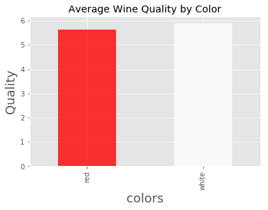
发现白葡萄酒的品质高于红葡萄酒
哪个酸度水平的平均评分最高?
# 用 Pandas 描述功能查看最小、25%、50%、75% 和 最大 pH 值
wine_df.pH.describe()
count    6497.000000
mean        3.218501
std         0.160787
min         2.720000
25%         3.110000
50%         3.210000
75%         3.320000
max         4.010000
Name: pH, dtype: float64
# 对用于把数据“分割”成组的边缘进行分组
bin_edges = [2.72, 3.11 ,3.21 ,3.32 ,4.01 ] # 用刚才计算的五个值填充这个列表
# 四个酸度水平组的标签
bin_names = [ "high", "median_high", "mediam", "low"] # 对每个酸度水平类别进行命名
help(pd.cut)
Help on function cut in module pandas.core.reshape.tile:

cut(x, bins, right=True, labels=None, retbins=False, precision=3, include_lowest=False, duplicates='raise')
    Bin values into discrete intervals.

    Use `cut` when you need to segment and sort data values into bins. This
    function is also useful for going from a continuous variable to a
    categorical variable. For example, `cut` could convert ages to groups of
    age ranges. Supports binning into an equal number of bins, or a
    pre-specified array of bins.

    Parameters
    ----------
    x : array-like
        The input array to be binned. Must be 1-dimensional.
    bins : int, sequence of scalars, or pandas.IntervalIndex
        The criteria to bin by.

        * int : Defines the number of equal-width bins in the range of `x`. The
          range of `x` is extended by .1% on each side to include the minimum
          and maximum values of `x`.
        * sequence of scalars : Defines the bin edges allowing for non-uniform
          width. No extension of the range of `x` is done.
        * IntervalIndex : Defines the exact bins to be used.

    right : bool, default True
        Indicates whether `bins` includes the rightmost edge or not. If
        ``right == True`` (the default), then the `bins` ``[1, 2, 3, 4]``
        indicate (1,2], (2,3], (3,4]. This argument is ignored when
        `bins` is an IntervalIndex.
    labels : array or bool, optional
        Specifies the labels for the returned bins. Must be the same length as
        the resulting bins. If False, returns only integer indicators of the
        bins. This affects the type of the output container (see below).
        This argument is ignored when `bins` is an IntervalIndex.
    retbins : bool, default False
        Whether to return the bins or not. Useful when bins is provided
        as a scalar.
    precision : int, default 3
        The precision at which to store and display the bins labels.
    include_lowest : bool, default False
        Whether the first interval should be left-inclusive or not.
    duplicates : {default 'raise', 'drop'}, optional
        If bin edges are not unique, raise ValueError or drop non-uniques.

        .. versionadded:: 0.23.0

    Returns
    -------
    out : pandas.Categorical, Series, or ndarray
        An array-like object representing the respective bin for each value
        of `x`. The type depends on the value of `labels`.

        * True (default) : returns a Series for Series `x` or a
          pandas.Categorical for all other inputs. The values stored within
          are Interval dtype.

        * sequence of scalars : returns a Series for Series `x` or a
          pandas.Categorical for all other inputs. The values stored within
          are whatever the type in the sequence is.

        * False : returns an ndarray of integers.

    bins : numpy.ndarray or IntervalIndex.
        The computed or specified bins. Only returned when `retbins=True`.
        For scalar or sequence `bins`, this is an ndarray with the computed
        bins. If set `duplicates=drop`, `bins` will drop non-unique bin. For
        an IntervalIndex `bins`, this is equal to `bins`.

    See Also
    --------
    qcut : Discretize variable into equal-sized buckets based on rank
        or based on sample quantiles.
    pandas.Categorical : Array type for storing data that come from a
        fixed set of values.
    Series : One-dimensional array with axis labels (including time series).
    pandas.IntervalIndex : Immutable Index implementing an ordered,
        sliceable set.

    Notes
    -----
    Any NA values will be NA in the result. Out of bounds values will be NA in
    the resulting Series or pandas.Categorical object.

    Examples
    --------
    Discretize into three equal-sized bins.

    >>> pd.cut(np.array([1, 7, 5, 4, 6, 3]), 3)
    ... # doctest: +ELLIPSIS
    [(0.994, 3.0], (5.0, 7.0], (3.0, 5.0], (3.0, 5.0], (5.0, 7.0], ...
    Categories (3, interval[float64]): [(0.994, 3.0] < (3.0, 5.0] ...

    >>> pd.cut(np.array([1, 7, 5, 4, 6, 3]), 3, retbins=True)
    ... # doctest: +ELLIPSIS
    ([(0.994, 3.0], (5.0, 7.0], (3.0, 5.0], (3.0, 5.0], (5.0, 7.0], ...
    Categories (3, interval[float64]): [(0.994, 3.0] < (3.0, 5.0] ...
    array([0.994, 3.   , 5.   , 7.   ]))

    Discovers the same bins, but assign them specific labels. Notice that
    the returned Categorical's categories are `labels` and is ordered.

    >>> pd.cut(np.array([1, 7, 5, 4, 6, 3]),
    ...        3, labels=["bad", "medium", "good"])
    [bad, good, medium, medium, good, bad]
    Categories (3, object): [bad < medium < good]

    ``labels=False`` implies you just want the bins back.

    >>> pd.cut([0, 1, 1, 2], bins=4, labels=False)
    array([0, 1, 1, 3])

    Passing a Series as an input returns a Series with categorical dtype:

    >>> s = pd.Series(np.array([2, 4, 6, 8, 10]),
    ...               index=['a', 'b', 'c', 'd', 'e'])
    >>> pd.cut(s, 3)
    ... # doctest: +ELLIPSIS
    a    (1.992, 4.667]
    b    (1.992, 4.667]
    c    (4.667, 7.333]
    d     (7.333, 10.0]
    e     (7.333, 10.0]
    dtype: category
    Categories (3, interval[float64]): [(1.992, 4.667] < (4.667, ...

    Passing a Series as an input returns a Series with mapping value.
    It is used to map numerically to intervals based on bins.

    >>> s = pd.Series(np.array([2, 4, 6, 8, 10]),
    ...               index=['a', 'b', 'c', 'd', 'e'])
    >>> pd.cut(s, [0, 2, 4, 6, 8, 10], labels=False, retbins=True, right=False)
    ... # doctest: +ELLIPSIS
    (a    0.0
     b    1.0
     c    2.0
     d    3.0
     e    4.0
     dtype: float64, array([0, 2, 4, 6, 8]))

    Use `drop` optional when bins is not unique

    >>> pd.cut(s, [0, 2, 4, 6, 10, 10], labels=False, retbins=True,
    ...    right=False, duplicates='drop')
    ... # doctest: +ELLIPSIS
    (a    0.0
     b    1.0
     c    2.0
     d    3.0
     e    3.0
     dtype: float64, array([0, 2, 4, 6, 8]))

    Passing an IntervalIndex for `bins` results in those categories exactly.
    Notice that values not covered by the IntervalIndex are set to NaN. 0
    is to the left of the first bin (which is closed on the right), and 1.5
    falls between two bins.

    >>> bins = pd.IntervalIndex.from_tuples([(0, 1), (2, 3), (4, 5)])
    >>> pd.cut([0, 0.5, 1.5, 2.5, 4.5], bins)
    [NaN, (0, 1], NaN, (2, 3], (4, 5]]
    Categories (3, interval[int64]): [(0, 1] < (2, 3] < (4, 5]]
# 创建 acidity_levels 列
wine_df['acidity_levels'] = pd.cut(wine_df['pH'], bin_edges, labels=bin_names)

# 检查该列是否成功创建
wine_df.head()
| fixed_acidity | volatile_acidity | citric_acid | residual_sugar | chlorides | free_sulfur_dioxide | total_sulfur_dioxide | density | pH | sulphates | alcohol | quality | color | acidity_levels | |
|---|---|---|---|---|---|---|---|---|---|---|---|---|---|---|
| 0 | 7.4 | 0.70 | 0.00 | 1.9 | 0.076 | 11.0 | 34.0 | 0.9978 | 3.51 | 0.56 | 9.4 | 5 | red | low |
| 1 | 7.8 | 0.88 | 0.00 | 2.6 | 0.098 | 25.0 | 67.0 | 0.9968 | 3.20 | 0.68 | 9.8 | 5 | red | median_high |
| 2 | 7.8 | 0.76 | 0.04 | 2.3 | 0.092 | 15.0 | 54.0 | 0.9970 | 3.26 | 0.65 | 9.8 | 5 | red | mediam |
| 3 | 11.2 | 0.28 | 0.56 | 1.9 | 0.075 | 17.0 | 60.0 | 0.9980 | 3.16 | 0.58 | 9.8 | 6 | red | median_high |
| 4 | 7.4 | 0.70 | 0.00 | 1.9 | 0.076 | 11.0 | 34.0 | 0.9978 | 3.51 | 0.56 | 9.4 | 5 | red | low |
# 用 groupby 计算每个酸度水平的平均质量
wine_df.groupby("acidity_levels")['quality'].mean()
acidity_levels
high           5.783343
median_high    5.784540
mediam         5.850832
low            5.859593
Name: quality, dtype: float64
发现酸度越低,质量评分就越好
# 保存更改,供下一段使用
wine_df.to_csv('winequality_edited_al.csv', index=False)
酒精含量高的酒是否评分较高?
# 获取酒精含量的中位数
alcohol_median = wine_df.alcohol.median()
wine_df.head();
# 选择酒精含量小于中位数的样本
low_alcohol = wine_df.query("alcohol < @alcohol_median")

# 选择酒精含量大于等于中位数的样本
high_alcohol = wine_df.query("alcohol >= @alcohol_median")
# 获取低酒精含量组和高酒精含量组的平均质量评分
print("低浓度酒精:",low_alcohol.quality.mean())
print("高浓度酒精:", high_alcohol.quality.mean())
低浓度酒精: 5.475920679886686
高浓度酒精: 6.146084337349397
发现高浓度酒精的质量评级更高
口感较甜的酒是否评分较高?
# 获取残留糖分的中位数
sugar_median = wine_df["residual_sugar"].median()
# 选择残留糖分小于中位数的样本
low_sugar = wine_df.query("residual_sugar < @sugar_median")

# 选择残留糖分大于等于中位数的样本
high_sugar = wine_df.query("residual_sugar >= @sugar_median")

# 确保这些查询中的每个样本只出现一次
num_samples = wine_df.shape[0]
num_samples == low_sugar['quality'].count() + high_sugar['quality'].count() # 应为真
True
# 获取低糖分组和高糖分组的平均质量评分
print("高糖分质量评分:",high_sugar.quality.mean())
print("低糖分质量评分:",low_sugar.quality.mean())
高糖分质量评分: 5.82782874617737
低糖分质量评分: 5.808800743724822
发现高糖分的酒质量评分更高
类和质量图
首先查看一下两种酒的质量均值
colors = ['red','white']
color_means = wine_df.groupby('color')['quality'].mean()
color_means.plot(kind='bar', title='Average Wine Quality by Color', color=colors, alpha=.8)
plt.xlabel('colors', fontsize=18);
plt.ylabel('Quality', fontsize=18);
进一步按质量和颜色分组查看
counts = wine_df.groupby(['quality', 'color']).count()['pH']
counts.plot(kind='bar', title='Counts by Wine Color and quality', color=counts.index.get_level_values(1), alpha=.7)
plt.xlabel('Quality and Color', fontsize=18)
plt.ylabel('Count', fontsize=18)
Text(0, 0.5, 'Count')
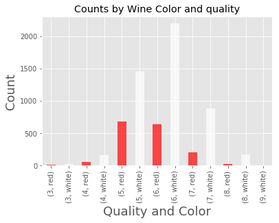
但红酒和白酒的样本数本来就相差较大,所以我们查看比例才更准确。
totals = wine_df.groupby('color').count()['pH']
counts = wine_df.groupby(['quality', 'color']).count()['pH']
proportions = counts / totals
proportions.plot(kind='bar', title='Counts by Wine Color and quality',color=counts.index.get_level_values(1), alpha=.7)
plt.xlabel('Quality and Color', fontsize=18)
plt.ylabel('Proportions', fontsize=18)
Text(0, 0.5, 'Proportions')
# 用 Matplotlib 创建柱状图
pyplot 的 bar 功能中有两个必要参数:条柱的 x 坐标和条柱的高度。
plt.bar([1, 2, 3], [224, 620, 425], color='blue');
可以利用 pyplot 的 xticks 功能,或通过在 bar 功能中指定另一个参数,指定 x 轴刻度标签。以下两个框的结果相同。
# 绘制条柱
plt.bar([1, 2, 3], [224, 620, 425])

# 为 x 轴指定刻度标签及其标签
plt.xticks([1, 2, 3], ['a', 'b', 'c']);
# 用 x 轴的刻度标签绘制条柱
plt.bar([1, 2, 3], [224, 620, 425], tick_label=['a', 'b', 'c']);

用以下方法设置轴标题和标签。
plt.bar([1, 2, 3], [224, 620, 425], tick_label=['a', 'b', 'c'])
plt.title('Some Title')
plt.xlabel('Some X Label')
plt.ylabel('Some Y Label');
# example
import matplotlib.pyplot as plt
import numpy as np

x = np.linspace(0, 1, 10)
number = 5
cmap = plt.get_cmap('gnuplot')
colors = [cmap(i) for i in np.linspace(0, 1, number)]

for i, color in enumerate(colors, start=1):
    plt.plot(x, i * x + i, color=color, label='$y = {i}x + {i}$'.format(i=i))
plt.legend(loc='best')
plt.show()