需求背景:用于小程序在上线之前为了展现页面效果,实现简单的用户登录功能,并提供切换页面元素状态的功能。输入账号密码点击登录后跳转到首页,效果如下图所示:

使用的开发工具为:微信小程序开发工具
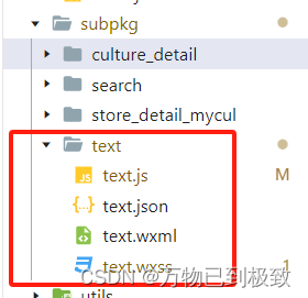
在微信小程序开发工具中的分包subpkg目录下新建text页面,
接着执行以下操作:
第一步:在分包的js文件中:
1. 定义一个名为 toggle 的函数,用于切换页面中的某个属性值(这里是type),根据当前值是"图片"还是"文字"进行切换。
2. 定义一个名为 login 的函数,用于处理用户登录操作。如果输入的用户名和密码分别为 "zhangsan" 和 "123123" 时,则调用微信小程序的 switchTab 方法跳转到首页页面;否则显示一个提示框提示账号密码错误。
代码示例:
// subpkg/text/text.js
Page({

  /**
   * 页面的初始数据
   */
  data:{
    code:"0",
    location:[],
    imageUrl: "https://profile-avatar.csdnimg.cn/default.jpg!0",
    userName:"",
    userPass:"",
    condition1: 'value1',
    condition2: false,
    type: '图片'
  },
  toggle: function(e) {
    var that = this;
    var type = that.data.type === '图片' ? '文字' : '图片';
    that.setData({
        type: type
    });
},
  login: function () {
    if (this.data.userName === "changjiang" && this.data.userPass === "123123") {
      wx.switchTab({
        url: '/pages/home/home',
        success: function(res) {
          console.log('router1 success');
        },
        fail: function(res) {
          console.log('router1 fail');
          console.log(res)
        }
      })
    } else {
      wx.showToast({
        title: '账号密码错误',
        icon: 'none'
      })
    }
  }

})第二步:在分包的json文件中引入组件:
代码示例:
// subpkg/text/text.json
{
"usingComponents": {
"van-icon": "@vant/weapp/icon/index",
"van-divider": "@vant/weapp/divider/index"
},
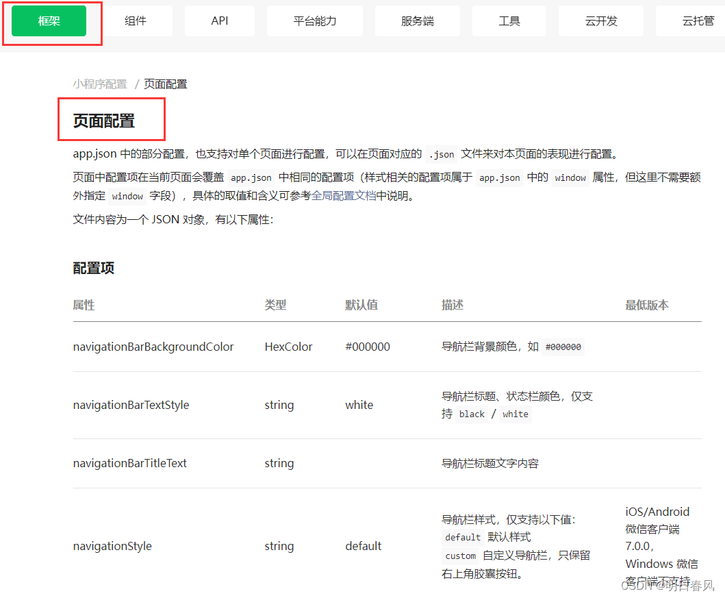
"navigationStyle": "custom"
}
其中:
"usingComponents" 是一个对象,用于注册使用的自定义组件。在这个例子中,使用了两个自定义组件 van-icon 和 van-divider,它们分别来自于 @vant/weapp 这个包。
"navigationStyle" 是一个字符串,用于指定页面的导航栏样式。在这个例子中,设置为 "custom" 表示自定义导航栏样式。
第三步:在分包的wxml文件中设置页面布局,根据变量 type 的不同值来控制页面中不同部分的显示与隐藏。如果 type 的值是 "图片",则显示第一个部分;如果 type 的值是 "文字",则显示第二个部分:
1. <view class="box1" wx:if="{{type=='图片'}}"> 表示当 type 的值为 "图片" 时,显示包含在这个标签内的内容。其中:
1.1 <image class="img" src="/images/tabs/login.jpg" mode="aspectFill"></image> 显示一张图片,路径为 "/images/tabs/login.jpg",并设置图片填充模式为 "aspectFill"。
1.2 <view class="green-box"> 是一个绿色背景的容器。
1.3 <text> 标签用于显示文本内容。
2. <view class="box2" wx:if="{{type=='文字'}}"> 表示当 type 的值为 "文字" 时,显示包含在这个标签内的内容。其中:
2.1 <my-userinfo></my-userinfo> 是自定义组件 my-userinfo 的使用方式。
2.2 <image class="else-img" src="/images/tabs/login_mohu.jpg" mode="aspectFill"></image> 显示一张带有模糊效果的图片。
2.3 .container 类选择器表示一个容器,包含了标题、输入框和登录按钮等元素。
代码示例:
<!--subpkg/text/text.wxml-->
<view>
  <view class="box1" wx:if="{{type=='图片'}}">
    <view>
      <image class="img" src="/images/tabs/login.jpg" mode="aspectFill"></image>
      <view class="green-box">
        <view class="text-box">
          <text class="text">欢迎!</text>
          <text class="text1">加入我们 ! 体验更多服务</text>
        </view>
        <view class="button-box">
          <button class="buttonStyle" >注册</button>
        </view>
        <view class="button-box1">
          <button class="buttonStyle" bindtap="toggle">登录</button>
        </view>
      </view>
    </view>
  </view>

  <view class="box2" wx:if="{{type=='文字'}}">
    <view wx:if="{{condition2}}">
      <my-userinfo></my-userinfo>
    </view>
    <view class="else-box" wx:else>
      <image class="else-img" src="/images/tabs/login_mohu.jpg" mode="aspectFill"></image>
      <view class="container">
        <view class="title">登录测试</view>
        <view class="inputRow">
         <van-icon name="manager" size="20px" color="white"/>
         <input type="text" style="color: antiquewhite;"  model:value="{{userName}}" placeholder="user" class="phone_number"></input>
        </view>
        <view class="inputRow1">
          <van-icon name="lock" size="20px" color="white" />
          <input type="text" style="color: antiquewhite;"  model:value="{{userPass}}" placeholder="password" class="phone_number"></input>
        </view>
        <button class="buttonStyle1"  bindtap="login">登录</button>
        <view class="buttom-box"></view>
      </view>
     </view>
  </view>

</view>
第四步:在分包的wxss文件中设置界面样式:
代码示例:
.else-img {
  height: 1750rpx;
  width: 100%;
}
.container {
  background-color:rgb(0,0,0,0.2);color:#000000;/*设置背景颜色为 rgba(0, 0, 0, 0.2),其中最后一个参数 0.2 表示透明度为 20%。color: #000000;*/ 设置文字颜色为黑色
  height: 500rpx;
  width: 600rpx;
  position: absolute;
  left: 18%;
  top: 35%;
  transform: translate(-10%,-10%);
}
.title {
  position: relative;
  bottom: 60px;
  color: #ffffff;
}
.phone_number {
  font-size: 14px;

}

.buttom-box {
  background-color: #c0d87e;
  height: 40rpx;
  width: 100%;
  position: absolute;
  bottom: 0;
  left: 0;
  border-radius: 100%;
  transform: translateY(50%);
}
.inputRow {
  height: 200rpx;
  display: flex;
  align-items: center;
  justify-content: space-between;
  border: 1px solid #9acd32;
  border-width: 0 0 1px 0;
  position: relative;
  bottom: 20px;

}
.inputRow1 {
  height: 200rpx;
  display: flex;
  align-items: center;
  justify-content: space-between;
  border: 1px solid #9acd32;
  border-width: 0 0 1px 0;
  position: relative;
  bottom: -10px;
}
.inputRow-text {
  font-size: 18px;
}
.input-text {
  background-color: #ffffff;
}
.buttonStyle1 {
  width: 400rpx;
  height: 50rpx;
  background-color: #ffffff;
  border-radius: 18px;
  position: absolute;
  left: 23%;
  top: 80%;
  transform: translate(-10%,-10%);
  font-size: 12px;
  color: #000000;
  display: flex;
  align-items: center;
  justify-content: center;
}
.buttonStyle1:active, .buttonStyle:focus {
  background-color: #8ad1fa;
  color: #ffffff; /* 默认文字颜色 */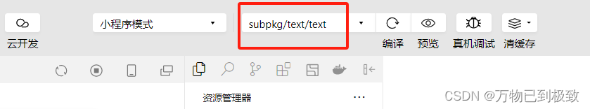
}最后一步:编译模式切换到登录页面再预览


![[Kubernetes] kube-proxy 详解](https://img-blog.csdnimg.cn/direct/23d215c073b0431292657c5c940d2d86.png)