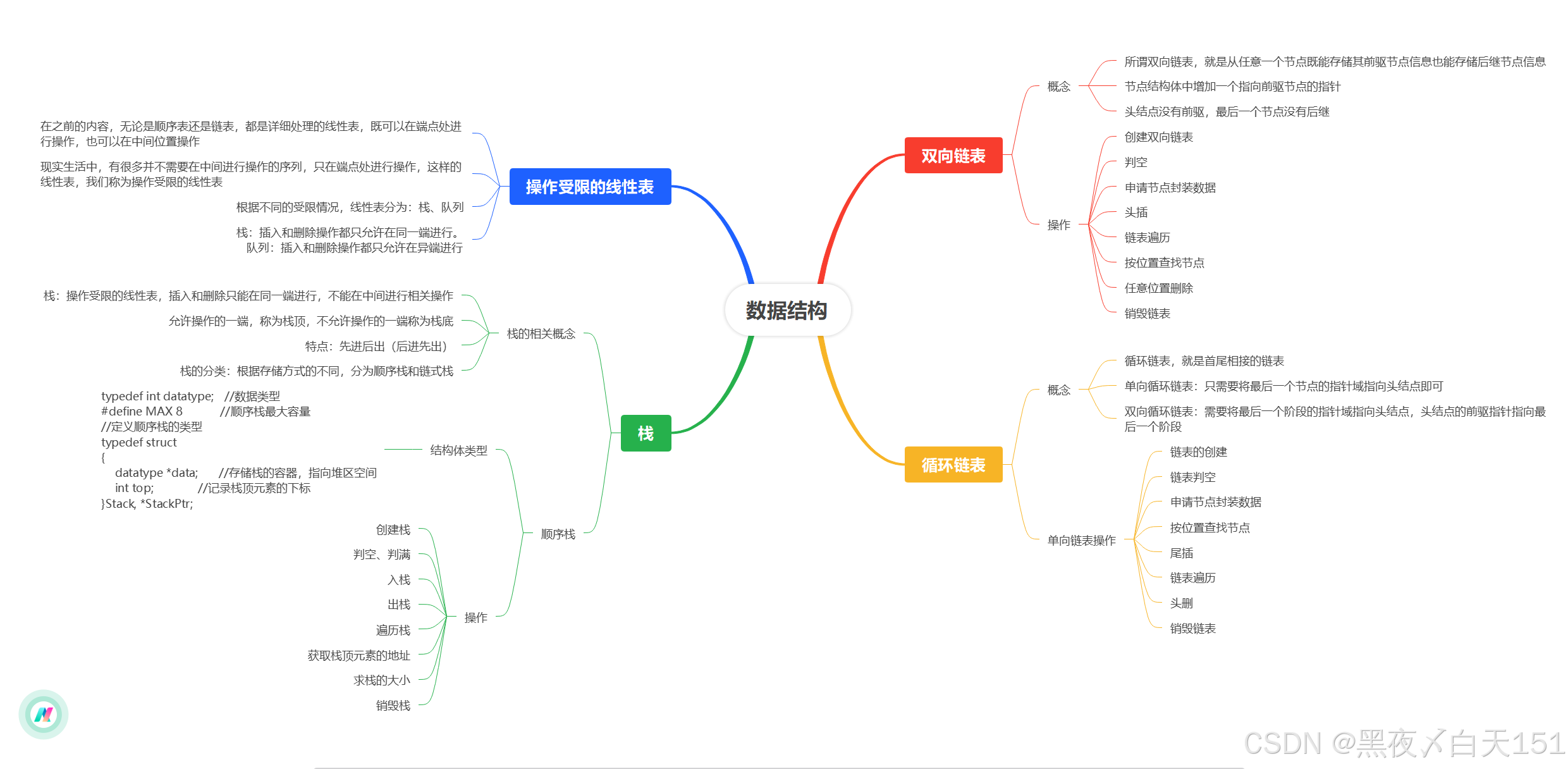
数据集有13个分类,每个分类都有颜色,怎么生成色块的图例。
import matplotlib.pyplot as plt
import matplotlib.patches as mpatches

s3dis_color = [[255, 248, 220], [220, 220, 220], [139, 71, 38], [238, 197, 145], [70, 130, 180], [179, 238, 58], [110, 139, 61], [105, 105, 105], [0, 0, 128], [205, 92, 92], [244, 164, 96], [147, 112, 219], [255, 228, 225]]

labels_dict = {
    "0_ceiling": 0,
    "1_floor": 1,
    "2_wall": 2,
    "3_beam": 3,
    "4_column": 4,
    "5_window": 5,
    "6_door": 6,
    "7_table": 7,
    "8_chair": 8,
    "9_sofa": 9,
    "10_bookcase": 10,
    "11_board": 11,
    "12_clutter": 12
}

labels = labels_dict.keys()

# 创建一个图例对象
legend_elements = []
for color, label in zip(s3dis_color, labels):
    # 将RGB颜色值转换为范围在[0,1]之间的浮点数
    color = [c / 255 for c in color]
    # 创建填充颜色的矩形
    rect = mpatches.Rectangle((0, 0), 1, 1, facecolor=color)
    # 创建图例元素并添加到图例对象中
    legend_elements.append((rect, label))

# 创建图例
fig, ax = plt.subplots()

legend = ax.legend(*zip(*legend_elements), loc='center', ncol=3)


# 去除坐标轴
ax.axis('off')


# 保存图例
plt.savefig("legend.png", bbox_inches='tight', pad_inches=0)
这是S3DIS数据集的图例。


![[VIM] MiniBufExplorer插件](https://img-blog.csdnimg.cn/direct/a9b08d9adad84de3bef6d7cc1f54d1ad.png)