一、声明式UI
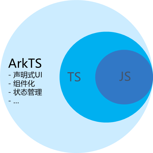
声明式UI是一种编写用户界面的范式。
1.1 声明组件
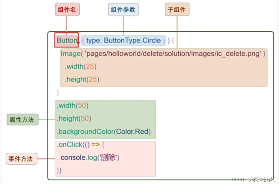
build() {
Column() {
Button({type:ButtonType.Circle}){
Image('src/main/ets/pages/3.png')
.width(25)
.height(25)
}
.width(50)
.height(50)
.backgroundColor(Color.Red)
.onClick(() =>{
console.log('删除');
})
}
.width('100%')
.height('100%')
.justifyContent(FlexAlign.Center);
}
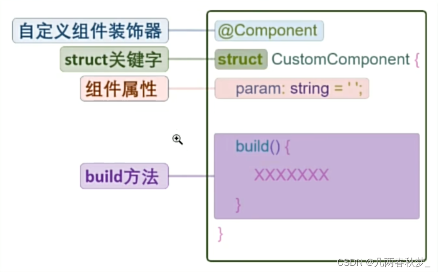
}1.2 自定义组件
使用自定义组件,可以使代码结构更加清晰,并且能提高代码的复用性
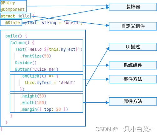
@Entry
@Component
struct Index {
  @State message: string = 'Hello World'
  build() {
      Column() {
        RedButton({color:Color.Red}) //给自定义组件传参,必须是一个对象
        .onClick(() =>{
          console.log('删除');
        })
      }
      .width('100%')
      .height('100%')
      .justifyContent(FlexAlign.Center);
  }
}
@Component
struct RedButton {
  color:Color = Color.Black;

  build() {
    Button({type:ButtonType.Circle}){
      Image('src/main/ets/pages/3.png')
        .width(25)
        .height(25)
    }
    .width(50)
    .height(50)
    .backgroundColor(this.color)
  }
}
1.3 渲染控制
1.3.1 条件渲染
条件渲染可根据应用的不同状态渲染不同的UI界面
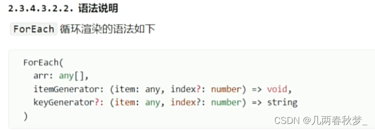
1.3.2 循环渲染
循环渲染可使用ForEach语句基于一个数组来快速渲染一个组件列表
二、常用组件
2.1 图片
2.1.1图片参数
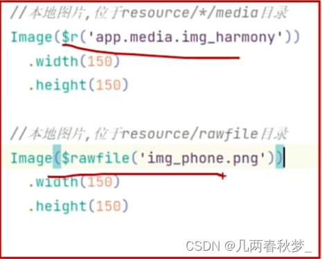
Image组件的参数类型为string | Resource | media PixeMap
Resource类型:
media PixeMap:
指的是像素位图,其通常是一个二维数组,数组中的每个元素对应着图片中的一个像素,其包含了该像素的颜色等信息。
2.1.2 常用属性
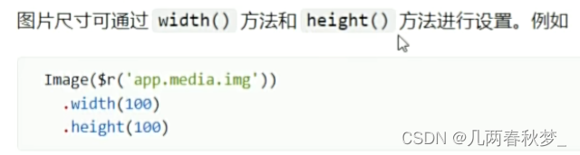
参数有string、number、Resource类型
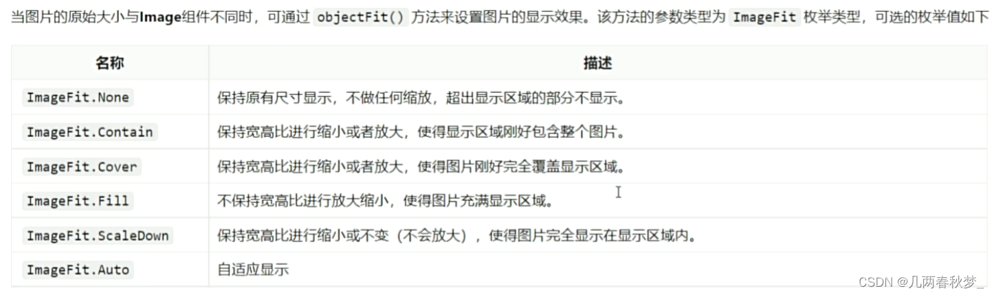
2.1.3 图片缩放
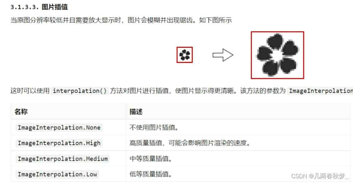
2.1.4 图片插值
是图像过渡更加平滑


