简单
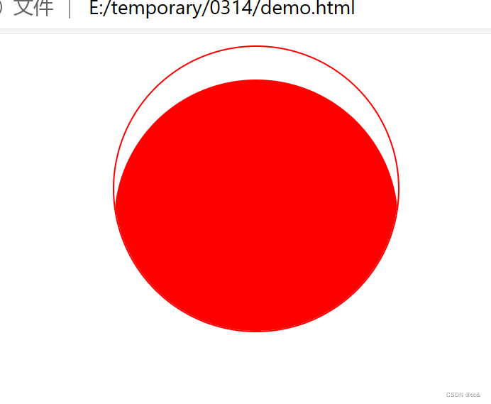
代码
<!DOCTYPE html>
<html lang="en">

<head>
    <meta charset="UTF-8">
    <meta name="viewport" content="width=device-width, initial-scale=1.0">
    <title>Document</title>
    <style>
        div {
            width: 200px;
            height: 200px;
            margin-left: 200px;
            border: 1px solid red;
            border-radius: 50%;
            position: relative;
            overflow: hidden;
        }

        div::before {
            content: "";
            position: absolute;
            top: 100%;
            left: 0;
            background-color: red;
            width: 200px;
            height: 200px;
            border-radius: 50%;
            transition: 0.5s;
        }

        div:hover:before {
            top: 0;
        }
    </style>
</head>

<body>
    <div></div>
</body>

</html>
复杂
代码
<!DOCTYPE html>
<html lang="en">

<head>
    <meta charset="UTF-8">
    <meta name="viewport" content="width=device-width, initial-scale=1.0">
    <title>Document</title>
    <style>
        .container {
            width: 1000px;
            height: 580px;
            margin: 50px auto;
            border: 1px solid green;
            position: relative;
        }

        .top {
            margin: 0 auto 0px;
            padding: 10px 0;
            background: deepskyblue;
            color: #fff;
        }

        .dajianshi {
            width: 100%;
            height: 400px;
            position: relative;
        }

        ul {
            display: flex;
            position: absolute;
            top: 50%;
            left: 50%;
            transform: translate(-50%, -50%);
        }

        ul li {
            list-style: none;
        }

        ul li span {
            width: 120px;
            height: 120px;
            background-color: #fff;
            text-align: center;
            line-height: 120px;
            margin: 0 10px;
            display: block;
            border-radius: 50%;
            position: relative;
            overflow: hidden;
            border: 3px solid #cde;
            z-index: 1;
        }

        ul li span:before {
            content: "";
            position: absolute;
            top: 100%;
            left: 0;
            width: 100%;
            height: 100%;
            transition: 0.5s;
            z-index: 2;
        }

        ul li span:hover:before {
            top: 0;
        }

        ul li:nth-child(1) span:before {
            background: red;
        }

        ul li:nth-child(2) span:before {
            background: orange;
        }

        ul li:nth-child(3) span:before {
            background: yellow;
        }

        ul li:nth-child(4) span:before {
            background: green;
        }
    </style>
</head>

<body>
    <div class="container">
        <div class="top">
            <h3>球体涨水的效果</h3>
        </div>
        <div class="dajianshi">
            <ul>
                <li>
                    <span></span>
                </li>
                <li>
                    <span></span>
                </li>
                <li>
                    <span></span>
                </li>
                <li>
                    <span></span>
                </li>
            </ul>
        </div>
    </div>
</body>

</html>