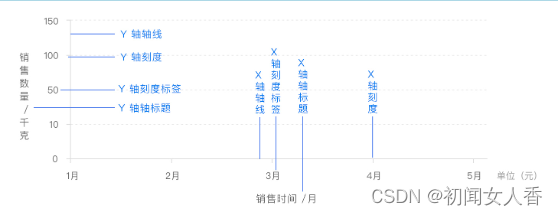
坐标轴 x、y轴
x 轴和 y 轴都由轴线、刻度、刻度标签、轴标题四个部分组成。部分图表中还会有网格线来帮助查看和计算数据
普通的二维数据坐标系都有x轴和y轴,通常情况下,x轴显示在图表底部,y轴显示在左侧,一般配置如下:
option = {
  xAxis: {
    // ...
  },
  yAxis: {
    // ...
  }};
option = {
  xAxis: {
    type: 'time',
    name: '时间'
    // ...
  },
  yAxis: {
    type: 'value',
    name: '数量'
    // ...
  }
  // ...};
当 x 轴(水平坐标轴)跨度很大,可以采用区域缩放方式灵活显示数据内容。
option = {
  xAxis: {
    type: 'time',
    name: '时间'
    // ...
  },
  yAxis: {
    type: 'value',
    name: '数量'
    // ...
  },
  dataZoom: [
    // ...
  ]
  // ...};
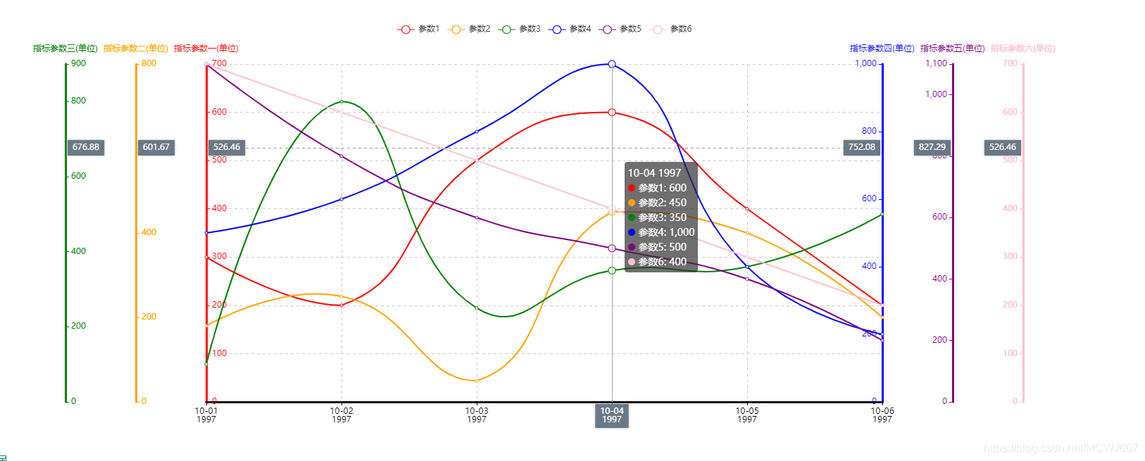
在二维数据中,轴也可以有多个。
ECharts 中一般情况下单个 grid 组件最多只能放两个 x/y 轴,
多于两个 x/y 轴需要通过配置 offset 属性
防止同个位置多个轴的重叠。两个 x 轴显示在上下,两个 y 轴显示在左右两侧。
option = {
  xAxis: {
    type: 'time',
    name: '销售时间'
    // ...
  },
  yAxis: [
    {
      type: 'value',
      name: '数量'
      // ...
    },
    {
      type: 'value',
      name: '金额'
      // ...
    }
  ]
  // ...};
轴线 axisLine
轴线两端的箭头,轴线的样式:
option = {
  xAxis: {
    axisLine: {
      symbol: 'arrow',
      lineStyle: {
        type: 'dashed'
        // ...
      }
    }
    // ...
  },
  yAxis: {
    axisLine: {
      symbol: 'arrow',
      lineStyle: {
        type: 'dashed'
        // ...
      }
    }
  }
  // ...};
刻度axisTick
刻度线的长度,样式:
option = {
  xAxis: {
    axisTick: {
      length: 6,
      lineStyle: {
        type: 'dashed'
        // ...
      }
    }
    // ...
  },
  yAxis: {
    axisTick: {
      length: 6,
      lineStyle: {
        type: 'dashed'
        // ...
      }
    }
  }
  // ...};
刻度标签axisLable
文字对齐方式,自定义刻度标签内容:
option = {
  xAxis: {
    axisLabel: {
      formatter: '{value} kg',
      align: 'center'
      // ...
    }
    // ...
  },
  yAxis: {
    axisLabel: {
      formatter: '{value} 元',
      align: 'center'
      // ...
    }
  }
  // ...};
一定要引入库
<script src="https://cdn.jsdelivr.net/npm/echarts@5.2.1/dist/echarts.min.js"></script>
一个基础树状图
<!DOCTYPE html>
<html lang="en">

<head>
    <meta charset="UTF-8">
    <title>ECharts Example</title>
    <script src="https://cdn.jsdelivr.net/npm/echarts@5.2.1/dist/echarts.min.js"></script>
    <style>
        #chart {
            width: 600px;
            height: 400px;
        }
    </style>
</head>

<body>
    <div id="chart"></div>

    <script>
        // 初始化echarts实例
        var myChart = echarts.init(document.getElementById('chart'));

        // 定义x轴和y轴的配置
        var option = {
            xAxis: {
                type: 'category',
                data: ['A', 'B', 'C', 'D', 'E'], // 示例数据
            },
            yAxis: {
                type: 'value',
            },
            series: [{
                type: 'bar',
                data: [10, 20, 30, 40, 50], // 示例数据
            }]
        };

        // 使用配置项显示图表
        myChart.setOption(option);
    </script>
</body>

</html>