目录
写在前面:文献中关于特征的筛选(根据P值,然后计算→排序→绘图)
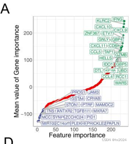
Signature Genes reduction To optimize tumor microenvironment evaluation for more convenient translational medicine, dimension reduction was conducted to choose most predictive genes from 244 TMEscore relevant signature genes which established in our previous study1. All signature genes were ordered by the feature importance contributed to prediction accuracy for immune checkpoint blockades response in these datasets1-3. Gene importance was calculated as following formula: Feature importance = ∑ −𝑙𝑜𝑔10(𝑃𝑟𝑒𝑑𝑖𝑐𝑡𝑖𝑣𝑒 𝑃 𝑣𝑎𝑙𝑢𝑒) 𝐼𝑛𝑣𝑜𝑙𝑒𝑑 𝑃𝑎𝑡𝑖𝑒𝑛𝑡𝑠 Genes with feature importance lesser than -90 and larger than +80 (Fig. S1A) were selected as signature genes which applied to tumor microenvironment evaluation using PCA methodology1.
散点图绘制
使用dotchart() 函数创建点图
基础版
数据格式

rm(list = ls())
library(ggplot2)
library(dplyr)
data <- mtcars##数据查看

##基础图绘制##
p <- dotchart(mtcars$mpg,labels=row.names(mtcars),
              cex=.7,##要使用的字符大小。将cex设置为小于1的值可以有效避免标签重叠。
              main="Gas Mileage for Car Models",##标题
              xlab="Miles Per Gallon")##X轴为公里
升级调序
dev.off()
x<-mtcars[order(mtcars$mpg),]##进行从小到大排序
x$cyl <- factor(x$cyl)##cyl设置分类

#进行颜色设置
x$color[x$cyl==4]<-"red"
x$color[x$cyl==6]<-"blue"
x$color[x$cyl==8]<-"darkgreen"

P1 <- dotchart(x$mpg,
               labels=row.names(x),#标签名
               cex=.7,
               groups =x$cyl,##这里增加了分组(设置了不同的颜色)
               gcolor ="black",
               color =x$color,
               pch=19,#要使用的绘图字符或符号。https://blog.csdn.net/sanqima/article/details/51322992
               main ="Gas Mileage for Car Models\ngrouped by cylinder",
               xlab ="Miles Per Gallon")
添加标签和拟合曲线
3.11 在散点图中添加标签(1) - 知乎 (zhihu.com)
R语言绘图基础篇-添加拟合曲线(geom_smooth) - 知乎 (zhihu.com)
整理后的数据格式:

基础版
#重新整理数据添加标签及曲线拟合##
rm(list = ls())
library(ggplot2)
library(dplyr)
data <- mtcars##数据查看
data1 <- data[order(data$mpg),]#进行排序
data1$ID <- paste0("",1:nrow(data1))##添加排序的ID
data2 <- data1[,c(1,12)]#[1] "mpg" "ID" #注意需要转换为数值型
data3 <- apply(data2,2,as.numeric) #转化为数值型
rownames(data3) <- rownames(data2)
data3 <- as.data.frame(data3)
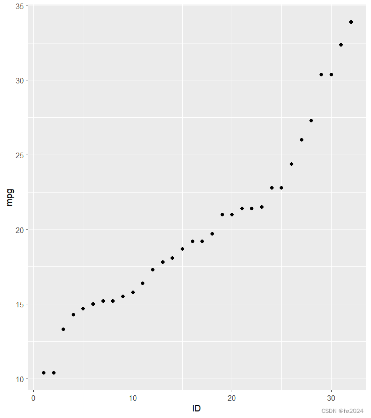
##进行散点图绘制##
library(ggplot2)
library(gcookbook)
library(dplyr)
P2 <- ggplot(data3,
aes(x = ID, y = mpg)) +
geom_point()
P2
添加标签
手动添加一个标签
#添加标签:手动添加部分
data3$name <- rownames(data3)
data3[1:5,]
P3 <- ggplot(data3,
             aes(x = ID, y = mpg)) +
  geom_point()+
  annotate("text", x = 1, y = 10.4, label = "Cadillac Fleetwood")
P3
添加多个标签
#添加标签多个标签:将不需要添加的标签设置为空值测试6-27行为空值
data4 <- data3[c(6:27),]
data4$name <- ""
data5 <- data3[c(1:5,28:32),]
data6 <- rbind(data4,data5)
data6 <- data6[order(data6$ID),]##将6-27行的name 变为空值
library(ggrepel)##防止标签重叠
P4 <- ggplot(data6,aes(x = ID, y = mpg)) +
     geom_point()+
  #geom_text_repel(aes(label = name), size = 3)
  geom_label_repel(aes(label = name),
                   size = 3)#生成带边框的数据
P4
dev.off()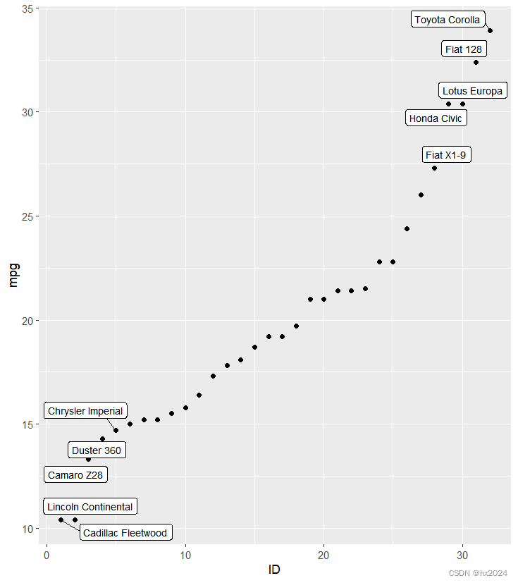
拟合曲线
#拟合曲线#
P5 <- ggplot(data6,aes(x = ID, y = mpg)) +
  geom_point()+
  #geom_text_repel(aes(label = name), size = 3)
  geom_label_repel(aes(label = name),
                   size = 3)+#生成带边框的数据
  geom_smooth(method = "loess")##生成拟合曲线"lm",
P5
dev.off()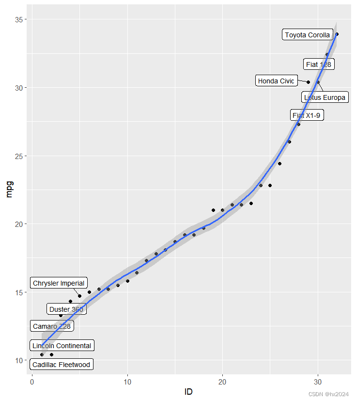
设置分组颜色
##设置颜色分组##
data6$grou <- c(rep(c("1","2","3"),c(5,22,5)))##设置分组
data6$grou <- as.factor(data6$grou)

P6 <- ggplot(data6,aes(x = ID, y = mpg,fill = grou)) +#添加分组设置
  geom_point()+
  #geom_text_repel(aes(label = name), size = 3)
  geom_label_repel(aes(label = name), size = 3)+#生成带边框的数据
  geom_smooth(method = "loess")+##生成拟合曲线"lm"
  theme_bw() + theme(panel.grid=element_blank())##去除背景和网格线

P6
dev.off()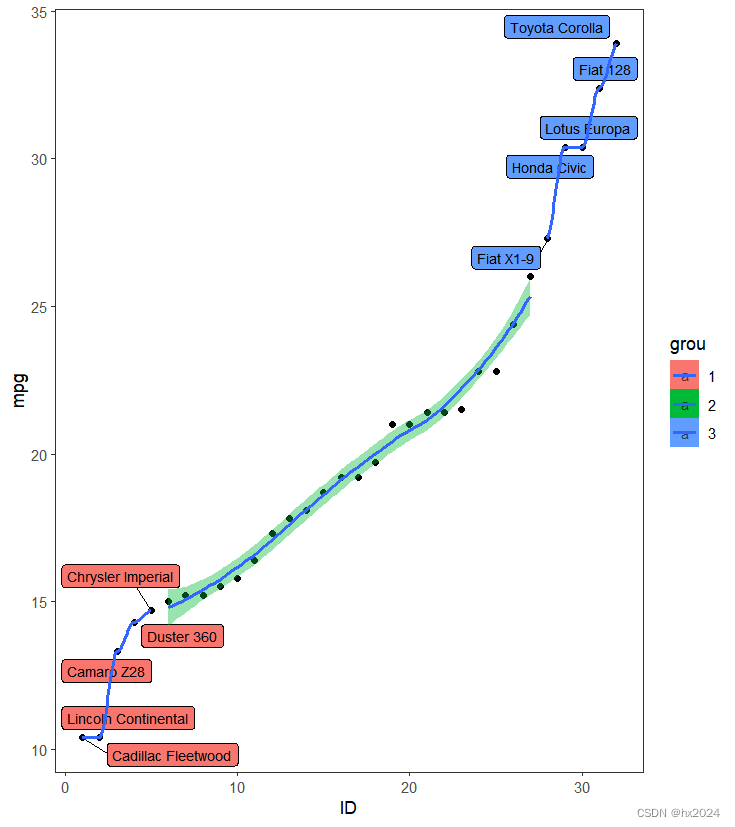
参考:
1:Tumor microenvironment evaluation promotes precise checkpoint immunotherapy of advanced gastric cancer
2:《R语言实战.第2版》