如何用css画出一个三角形
1、第一步
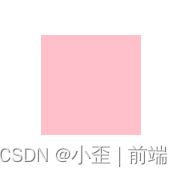
写一个正常的盒子模型,先给个正方形的div,便于观察,给div设置宽高和背景颜色
<body>
    <div class="box"></div>
</body>
<style>
    .box {
         width: 100px;
         height: 100px;
         background-color: pink;
     }
</style>
2、第二步
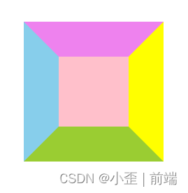
便于观察,给div设置四个不同颜色的的边框border
<style>
   .box {
        width: 100px;
        height: 100px;
        background-color: pink;
        border-left: 50px solid skyblue;
        border-right: 50px solid yellow;
        border-bottom: 50px solid yellowgreen;
        border-top: 50px solid violet;
    }
</style>
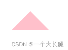
四种不同颜色的边框,已经可以看出来,四个边框差个尖尖就是三角形
3、第三步
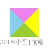
把中间的div的宽高设置为0像素,即可得到四个等腰三角形
<style>
   .box {
        width: 0px;
        height: 0px;
        background-color: pink;
        border-left: 50px solid skyblue;
        border-right: 50px solid yellow;
        border-bottom: 50px solid yellowgreen;
        border-top: 50px solid violet;
    }
</style>
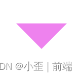
4、第四步
我们需要哪一边的三角形,把另外三边的边框设置透明transparent即可
比如我现在需要上面的三角形,我就可以把左右下的边框设置透明,并且把div的背景色删掉或者注释掉
<style>
    .box {
        width: 0px;
        height: 0px;
        /* background-color: pink; */
        border-left: 50px solid transparent;
        border-right: 50px solid transparent;
        border-bottom: 50px solid transparent;
        border-top: 50px solid violet;
    }
</style>
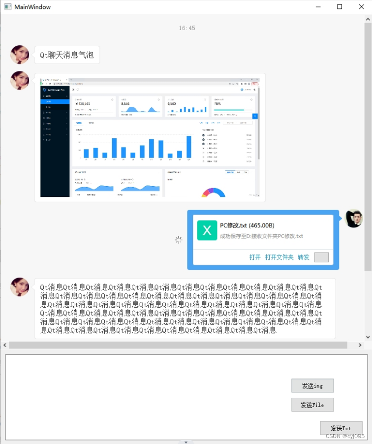
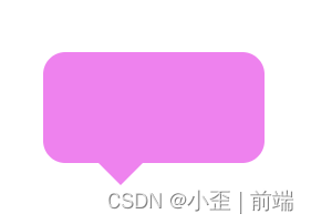
聊天气泡实现
<body>
    <div class="box"></div>
</body>
<style>
    .box {
        width: 200px;
        height: 100px;
        /*父级给相对定位,伪元素根据父级给绝对定位 */
        position: relative;
        background-color: violet;
        border-radius: 20px;
    }

    .box::after {
        content: '';
        width: 0px;
        height: 0px;
        border: 20px solid;
        border-left: 20px solid transparent;
        border-right: 20px solid transparent;
        border-bottom: 20px solid transparent;
        border-top: 20px solid violet;
        /*给绝对定位,根据需求设置三角形的位置*/
        position: absolute;
        top: 100px;
        left: 50px;
    }
</style>
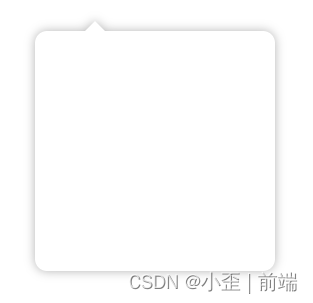
简单代码实现
<div class="wrapper"></div>
<style>
	.wrapper {
		position: relative;
		width: 200px;
		height: 200px;
		margin: 50px auto;
		border-radius: 12px;
		background: #ffffff;
		filter: drop-shadow(0 0 5px rgba(0, 0, 0, 0.3));
		padding: 20px;
	}
	.wrapper:before {
		content: "";
		position: absolute;
		width: 0;
		height: 0;
		border: 10px solid transparent;
		border-bottom-color: #ffffff;
		top: -20px;
		left: 50px;
	}
</style>