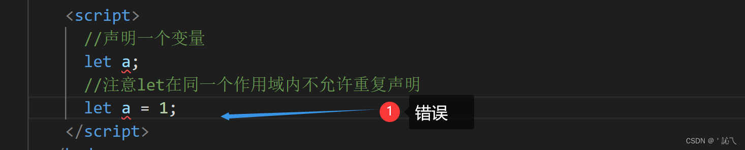
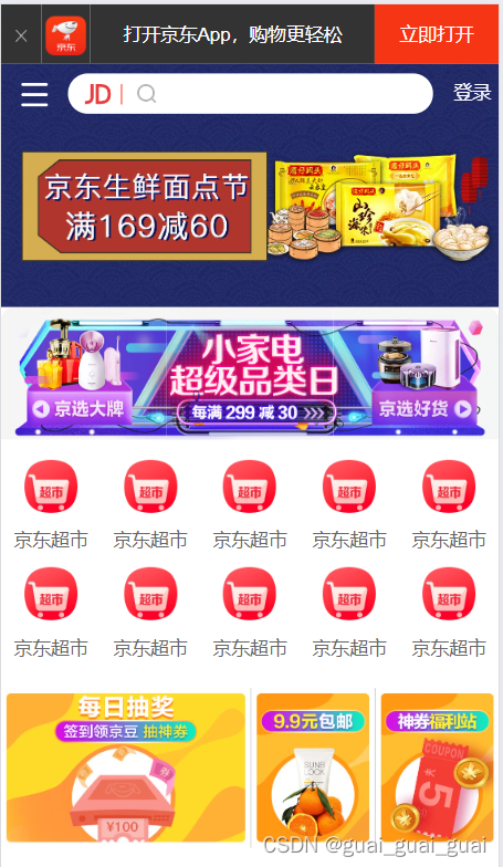
设置视口标签以及引入初始化样式
    <link rel="stylesheet" href="./css/normalize.css">
    <link rel="stylesheet" href="./css/index.css">
body常用初始化样式
body {
    width: 100%;
    min-width: 320px;
    max-width: 640px;
    margin: 0 auto;
    background: #fff;
    font-size: 14px;
    font-family: -apple-system, Helvetica, sans-serif;
    line-height: 1.5;
    color: #666;
}
头部制作
- 移动端宽度一般用百分比
- 插入图片时记得设置图片的宽高
- 图片默认与文字的基线对齐,所以设置垂直居中时,要给图片加上vertical-align:middle
ul {
margin: 0;
padding: 0;
}
ul li {
list-style: none;
}
.app {
height: 45px;
}
.app ul li {
float: left;
height: 45px;
line-height: 45px;
text-align: center;
background-color: #333;
color:#fff;
}
.app ul li:nth-child(1){
width: 8%;
}
.app ul li:nth-child(1) img {
width: 10px;
vertical-align: middle;
}
.app ul li:nth-child(2){
width: 10%;
}
.app ul li:nth-child(2) img {
width: 30px;
/* 图片与文字的基线默认对齐 */
vertical-align: middle;
}
.app ul li:nth-child(3){
width: 57%;
}
.app ul li:nth-child(4){
width: 25%;
background-color: #f63515;
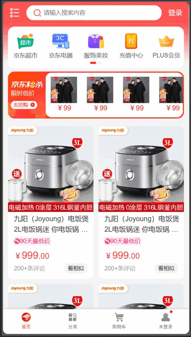
} <header class="app">
<ul>
<li><img src="./images/close.png" alt=""></li>
<li><img src="./images/logo.png" alt=""></li>
<li>打开京东App,购物更轻松</li>
<li>立即打开</li>
</ul>
</header> 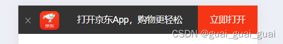
搜索框
- 搜索框主体部分会随着页面宽度的变化而变化,左右两边的盒子宽度不变,故只需将左右两边盒子定位定宽定高,中间主体部分宽度百分百,之后再设置左右margin即可。
- 京东后面的竖线可设置伪元素,记得转换伪元素为块级元素
- 二倍精灵图要先将原图等比例缩放至原来的一半,之后根据改变之后的图片测量坐标,同时background-size变为原来精灵图宽度的一半,高度auto
- 图片在搜索区域下方显示,将搜索区域设置为固定定位,一定要设置宽度,宽度100%
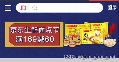
<div class="search-wrap">
<div class="search-btn"></div>
<div class="search">
<div class="jd-icon"></div>
<div class="sou"></div>
</div>
<div class="search-login">登录</div>
</div>
<!-- 主体内容部分 -->
<div class="main-content">
<!-- 滑动图 -->
<div class="slider">
<img src="./upload/banner.dpg" alt="">
</div>
</div>/* 搜索 */
.search-wrap {
width: 100%;
position: fixed;
height: 44px;
/* 解决外边距合并问题 */
overflow: hidden;
max-width: 640px;
min-width: 320px;
}
.search-btn {
position: absolute;
top: 0;
left: 0;
width: 40px;
height: 44px;
}
.search-btn::before{
content: "";
/* 伪元素为行内元素 */
display: block;
width: 20px;
height: 18px;
background: url(../images/s-btn.png) no-repeat;
background-size: 20px 18px;
margin: 14px 0 0 15px;
}
.search-login {
position: absolute;
top: 0;
right: 0;
width: 40px;
height: 44px;
color:#fff;
text-align: center;
line-height: 44px;
}
.search {
position: relative;
height: 30px;
margin: 7px 50px;
border-radius: 15px;
background-color: #fff;
}
.jd-icon {
width: 20px;
height: 15px;
position: absolute;
top: 8px;
left: 13px;
background: url(../images/jd.png) no-repeat;
background-size: 20px 15px;
}
.jd-icon::after {
content: "";
position: absolute;
right: -8px;
display: block;
width: 1px;
height: 15px;
background-color: #f63515;
}
.sou {
position: absolute;
top: 8px;
left: 50px;
width: 18px;
height: 15px;
/*二倍精灵图*/
background: url(../images/jd-sprites.png) no-repeat -81px 0;
background-size: 200px auto;
}
.slider img {
width: 100%;
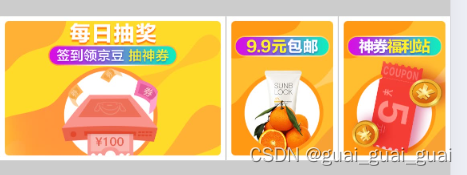
}品牌日
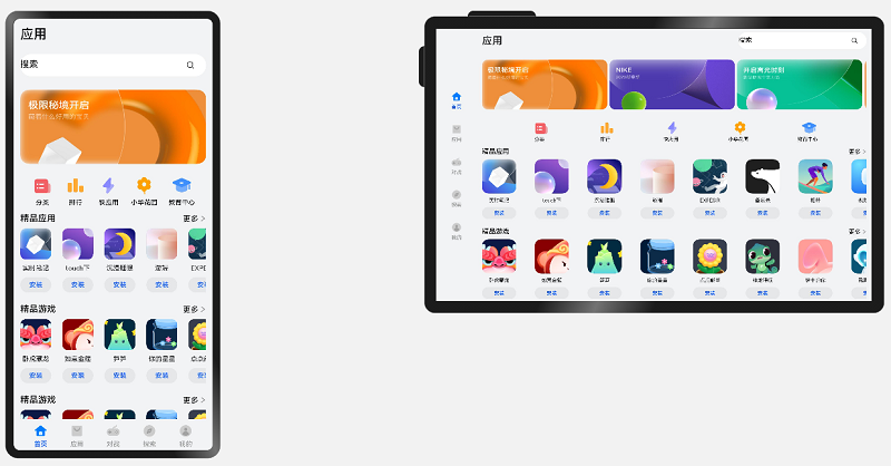
- 由三张图片组成,每个图片均为一个链接
- div里的每张图片宽度均为三分之一,即33.33%
- 给brand加圆角边框时,记得要溢出隐藏,因为图片并未设置圆角边框
- 上面图片底部有缝隙,去除图片底部缝隙只需给图片加上vertical-align:top;
- 每个div浮动即可
<div class="brand">
<div>
<a href=""><img src="./upload/pic11.dpg" alt=""></a>
</div>
<div>
<a href=""><img src="./upload/pic22.dpg" alt=""></a>
</div>
<div>
<a href=""><img src="./upload/pic33.dpg" alt=""></a>
</div>
</div>.brand {
border-radius: 10px 10px 0 0;
overflow: hidden;
}
.brand div {
float:left;
width: 33.33%;
}
.brand div img {
width: 100%;
}图片格式
- DPG图片压缩技术
京东自主研发推出DPG图片压缩技术,经测试该技术,可直接节省用户近50%的浏览流量,极大的提升了用户的网页打开速度。能够兼容jpeg,实现全平台、全部浏览器的兼容支持,经过内部和外部上万张图片的人眼浏览测试后发现,压缩后的图片和webp的清晰度对比没有差距。
- webp图片格式
谷歌开发的一种旨在加快图片加载速度的图片格式。图片压缩体积大约只有JPEG的2/3,并能节省大量的服务器宽带资源和数据空间
导航栏
- nav里10个a,a里有图片和文字
- 将a浮动起来,且每个a宽度占20%,设置a里的内容水平居中即可
- 适当设置nav与其他元素的距离
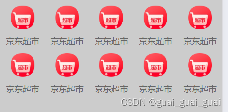
<nav>
<a href=""><img src="./upload/nav1.webp" alt="">
<span>京东超市</span></a>
<a href=""><img src="./upload/nav1.webp" alt="">
<span>京东超市</span></a>
<a href=""><img src="./upload/nav1.webp" alt="">
<span>京东超市</span></a>
<a href=""><img src="./upload/nav1.webp" alt="">
<span>京东超市</span></a>
<a href=""><img src="./upload/nav1.webp" alt="">
<span>京东超市</span></a>
<a href=""><img src="./upload/nav1.webp" alt="">
<span>京东超市</span></a>
<a href=""><img src="./upload/nav1.webp" alt="">
<span>京东超市</span></a>
<a href=""><img src="./upload/nav1.webp" alt="">
<span>京东超市</span></a>
<a href=""><img src="./upload/nav1.webp" alt="">
<span>京东超市</span></a>
<a href=""><img src="./upload/nav1.webp" alt="">
<span>京东超市</span></a>
</nav>nav {
padding-top: 5px;
}
nav a {
float: left;
width: 20%;
text-align: center;
}
nav a img {
width: 40px;
margin: 10px 0;
}
nav a span {
display: block;
}新闻模块
- 三张图片,均浮动,a里面包括一张图片
- 给每个a设置宽度,里面的图片百分百即可
- 因为后两张图片有边框,为了不影响布局,应该让a元素变成CSS3模型(box-sizing:border-box)这样最后一张图片就不会挤下去
<div class="news clearfix">
<a href="">
<img src="./upload/new1.dpg" alt="">
</a>
<a href="">
<img src="./upload/new2.dpg" alt="">
</a>
<a href="">
<img src="./upload/new3.dpg" alt="">
</a>
</div>
.news {
margin-top: 20px;
}
.news a:nth-child(1) {
width: 50%;
}
.news a {
float: left;
box-sizing: border-box;
}
.news a:nth-child(n+2) {
width: 25%;
border-left: 1px solid #ccc;
}
.news a img {
width: 100%;
}整体代码:
body {
width: 100%;
min-width: 320px;
max-width: 640px;
margin: 0 auto;
font-size: 14px;
font-family: -apple-system, Helvetica, sans-serif;
/* 当前文字的1.5倍 */
line-height: 1.5;
color: #666;
}
.clearfix::after {
content: "";
display: block;
clear: both;
}
a {
color: #666;
text-decoration: none;
}
ul {
margin: 0;
padding: 0;
}
img {
/* 去除图片底部的缝隙 */
vertical-align: top;
}
ul li {
list-style: none;
}
.app {
height: 45px;
}
.app ul li {
float: left;
height: 45px;
line-height: 45px;
text-align: center;
background-color: #333;
color: #fff
}
.app ul li:nth-child(1) {
width: 8%;
}
.app ul li:nth-child(1) img {
width: 10px;
vertical-align: middle;
}
.app ul li:nth-child(2) {
width: 10%;
}
.app ul li:nth-child(2) img {
width: 30px;
/* 图片与文字的基线默认对齐 */
vertical-align: middle;
}
.app ul li:nth-child(3) {
width: 57%;
}
.app ul li:nth-child(4) {
width: 25%;
background-color: #f63515;
}
/* 搜索 */
.search-wrap {
width: 100%;
position: fixed;
height: 44px;
/* 解决外边距合并问题 */
overflow: hidden;
max-width: 640px;
min-width: 320px;
}
.search-btn {
position: absolute;
top: 0;
left: 0;
width: 40px;
height: 44px;
}
.search-btn::before {
content: "";
/* 伪元素为行内元素 */
display: block;
width: 20px;
height: 18px;
background: url(../images/s-btn.png) no-repeat;
background-size: 20px 18px;
margin: 14px 0 0 15px;
}
.search-login {
position: absolute;
top: 0;
right: 0;
width: 40px;
height: 44px;
color: #fff;
text-align: center;
line-height: 44px;
}
.search {
position: relative;
height: 30px;
margin: 7px 50px;
border-radius: 15px;
background-color: #fff;
}
.jd-icon {
width: 20px;
height: 15px;
position: absolute;
top: 8px;
left: 13px;
background: url(../images/jd.png) no-repeat;
background-size: 20px 15px;
}
.jd-icon::after {
content: "";
position: absolute;
right: -8px;
display: block;
width: 1px;
height: 15px;
background-color: #f63515;
}
.sou {
position: absolute;
top: 8px;
left: 50px;
width: 18px;
height: 15px;
background: url(../images/jd-sprites.png) no-repeat -81px 0;
background-size: 200px auto;
}
.slider img {
width: 100%;
}
.brand {
border-radius: 10px 10px 0 0;
overflow: hidden;
}
.brand div {
float: left;
width: 33.33%;
}
.brand div img {
width: 100%;
}
nav {
padding-top: 5px;
}
nav a {
float: left;
width: 20%;
text-align: center;
}
nav a img {
width: 40px;
margin: 10px 0;
}
nav a span {
display: block;
}
/* news */
.news {
margin-top: 20px;
}
.news a:nth-child(1) {
width: 50%;
}
.news a {
float: left;
box-sizing: border-box;
}
.news a:nth-child(n+2) {
width: 25%;
border-left: 1px solid #ccc;
}
.news a img {
width: 100%;
}<!DOCTYPE html>
<html lang="en">
<head>
<meta charset="UTF-8">
<meta name="viewport"
content="width=device-width, initial-scale=1.0, user-scalable=no,maximum-scale=1.0, minimum-scale=1.0">
<title>Document</title>
<!-- 引入初始化样式 -->
<link rel="stylesheet" href="./css/normalize.css">
<link rel="stylesheet" href="./css/index.css">
</head>
<body>
<!-- 顶部 -->
    <header class="app">
        <ul>
            <li><img src="./images/close.png" alt=""></li>
            <li><img src="./images/logo.png" alt=""></li>
            <li>打开京东App,购物更轻松</li>
            <li>立即打开</li>
        </ul>
    </header>
<!-- 搜索 -->
<div class="search-wrap">
<div class="search-btn"></div>
<div class="search">
<div class="jd-icon"></div>
<div class="sou"></div>
</div>
<div class="search-login">登录</div>
</div>
<!-- 主体内容部分 -->
<div class="main-content">
<!-- 滑动图 -->
<div class="slider">
<img src="./upload/banner.dpg" alt="">
</div>
<!-- 品牌日 -->
        <div class="brand">
            <div>
                <a href=""><img src="./upload/pic11.dpg" alt=""></a>
            </div>
            <div>
                <a href=""><img src="./upload/pic22.dpg" alt=""></a>
            </div>
            <div>
                <a href=""><img src="./upload/pic33.dpg" alt=""></a>
            </div>
        </div>
<!-- nav部分 -->
<nav class="clearfix">
<a href=""><img src="./upload/nav1.webp" alt="">
<span>京东超市</span></a>
<a href=""><img src="./upload/nav1.webp" alt="">
<span>京东超市</span></a>
<a href=""><img src="./upload/nav1.webp" alt="">
<span>京东超市</span></a>
<a href=""><img src="./upload/nav1.webp" alt="">
<span>京东超市</span></a>
<a href=""><img src="./upload/nav1.webp" alt="">
<span>京东超市</span></a>
<a href=""><img src="./upload/nav1.webp" alt="">
<span>京东超市</span></a>
<a href=""><img src="./upload/nav1.webp" alt="">
<span>京东超市</span></a>
<a href=""><img src="./upload/nav1.webp" alt="">
<span>京东超市</span></a>
<a href=""><img src="./upload/nav1.webp" alt="">
<span>京东超市</span></a>
<a href=""><img src="./upload/nav1.webp" alt="">
<span>京东超市</span></a>
</nav>
<!-- 新闻模块 -->
        <div class="news clearfix">
            <a href="">
                <img src="./upload/new1.dpg" alt="">
            </a>
            <a href="">
                <img src="./upload/new2.dpg" alt="">
            </a>
            <a href="">
                <img src="./upload/new3.dpg" alt="">
            </a>
        </div>
</div>
</body>
</html>
之后的布局以及样式都与上面大致相同,京东移动端的练习就先到这里啦