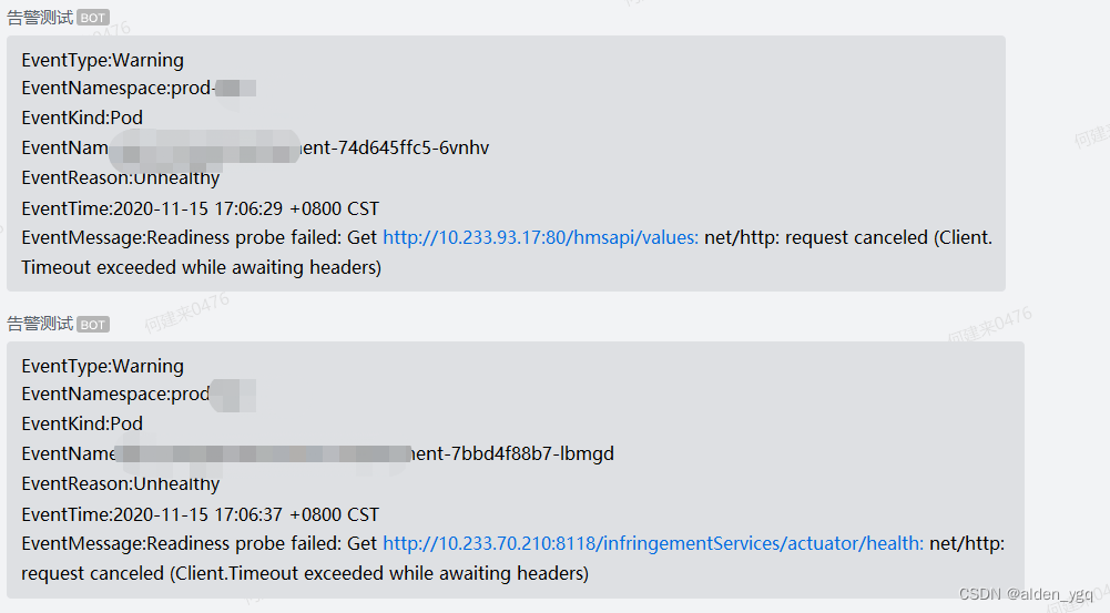
基于Element的进度条loading组件
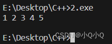
前端在中后台项目开发中经常要使用到loading遮罩层在数据交互时展示,目前我使用element组件库的loading,发现不能自定义,loading的样式比较少,官方只提供修改loading的图标和文字。
但是我的需求是希望展示的是进度条一样的效果,那就不用loading组件,使用element的Progress进度条组件,自己写一个。
代码如下。组件的api可以自行添加
<template>
    <div class="loadingModal" :style="{'height':fatherHeight+'px'}" v-if="progressLoading">
        <el-progress
            :style="{width:'20%',margin:'0 auto',marginTop:`${fatherHeight*0.3}px`}"
            :type="type"
            :width="70"
            :text-inside="true"
            :stroke-width="type?undefined:strokeWidth"
            :percentage="percentage"
            :color="colors"
            :show-text="showText"
            :status="percentage === 100?undefined:'success'"
        ></el-progress>
    </div>
</template>
<script>
/**
 * @file progress.vue
 * @author yahooJ
 * @creatdate 2020-08-19
 * @update 2020-08-20
 */
export default {
  data() {
    return {
      percentage: 0,
      timeStart: 0,
      fatherHeight: 0, // 父级元素高度
      colors: [
        { color: "#1989fa", percentage: 99 },
        { color: "#2BD176", percentage: 100 },
      ],
      progressLoading: false,
    };
  },
  props: {
    strokeWidth: {
      type: Number,
      default: () => {
        return this.type ? undefined : 24;
      },
    },
    showText: {
      type: Boolean,
      default: true,
    },
    // 进度条状态
    type: {
      type: String,
      default: () => {
        return undefined;
      },
    },
    // 显示状态
    loading: {
      type: Boolean,
      default: false,
    },
  },
  mounted() {
    // 获取父级元素的高度,使组件高度与父元素高度相同
    // 相对于父元素定位
    this.$el.parentNode.style.position = "relative";
  },
  computed: {},
  methods: {
    // 进度条开始
    start() {
      const that = this;
      that.fatherHeight = this.$el.parentNode.offsetHeight;
      that.$nextTick(() => {
        that.progressLoading = true;
        that.percentage = 0;
        that.timeStart = setInterval(() => {
          if (that.percentage < 95) {
            that.percentage += 5;
          }
        }, 100);
      });
    },
    // 进度条结束
    end() {
      const that = this;
      that.percentage = 100;
      clearInterval(this.timeStart);
      setTimeout(() => {
        that.progressLoading = false;
      }, 300);
    },
  },
  watch: {
    // 监听loading状态控制进度条显示
    loading(value, newValue) {
      const that = this;
      if (value) {
        that.start();
      } else {
        that.end();
      }
    },
  },
};
</script>
<style >
.loadingModal {
  height: var(height);
  width: 100%;
  background: rgba(255, 255, 255, 0.9);
  text-align: center;
  position: absolute;
  top: 0;
  left: 0;
  z-index: 999999;
}
</style>
使用方式:
在需要遮罩的元素内放入即可,接收loading参数控制是否展示,展示时会覆盖父级元素


