1、平面转换-旋转
<!DOCTYPE html>
<html lang="en">
<head>
    <meta charset="UTF-8">
    <meta name="viewport" content="width=device-width, initial-scale=1.0">
    <title>Document</title>
    <style>
        img {
            width: 200px;
            transition: all 2s;
        }

        /* 鼠标悬停到图片上面,添加旋转效果 */
        img:hover {
            /* 正数:顺时针旋转; 负数:逆时针旋转 */
            transform: rotate(360deg);
            transform: rotate(-360deg);
        }
    </style>
</head>
<body>
    <img src="../photo/1.jpg" alt="">
</body>
</html>
2、平面旋转-改变转换原点
默认情况下,转换原点是盒子中心点
取值
- 方位名词(left、top、right、bottom、center)
- 像素单位数值
- 百分比
<!DOCTYPE html>
<html lang="en">
<head>
<meta charset="UTF-8">
<meta name="viewport" content="width=device-width, initial-scale=1.0">
<title>Document</title>
<style>
img {
width: 200px;
border: 1px solid #000;
transition: all 1s;
transform-origin: right bottom;
}
img:hover {
transform: rotate(360deg);
}
</style>
</head>
<body>
<img src="../photo/1.jpg" alt="">
</body>
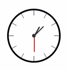
</html>3、案例 时钟
<!DOCTYPE html>
<html lang="en">
  <head>
    <meta charset="UTF-8" />
    <meta name="viewport" content="width=device-width, initial-scale=1.0" />
    <title>Document</title>
    <style>
      .clock {
        width: 250px;
        height: 250px;
        border: 8px solid #000;
        border-radius: 50%;
        margin: 100px auto;
        position: relative;
      }

      .line {
        /* 1.定位 */
        position: absolute;
        width: 4px;
        height: 250px;
        background-color: #999;
        left: 50%;
        transform: translate(-50%);
      }

      /* 线2: 旋转, 每条线旋转角度不同, 单独选中不同的line, 写rotate代码 */
      /* 一圈是360度, 等分成  xx 份 */
      .line:nth-child(2) {
        transform: translate(-50%) rotate(30deg);
      }

      .line:nth-child(3) {
        transform: translate(-50%) rotate(60deg);
      }

      .line:nth-child(4) {
        transform: translate(-50%) rotate(90deg);
      }

      .line:nth-child(5) {
        transform: translate(-50%) rotate(120deg);
      }

      .line:nth-child(6) {
        transform: translate(-50%) rotate(150deg);
      }

      /* 第一根和第四跟宽度大一些 */
      .line:nth-child(1),
      .line:nth-child(4) {
        width: 5px;
      }

      /* 遮罩圆形 */
      .cover {
        position: absolute;
        left: 50%;
        top: 50%;
        transform: translate(-50%, -50%);
        width: 200px;
        height: 200px;
        background-color: #fff;
        border-radius: 50%;
      }

      /* 表针 */
      /* 并集选择器放在单独选择器的上面, 避免transform属性的层叠 */
      .hour,
      .minute,
      .second {
        position: absolute;
        left: 50%;
        /* 盒子底部在盒子中间 */
        bottom: 50%;
      }

      .hour {
        width: 6px;
        height: 50px;
        background-color: #333;
        margin-left: -3px;
        transform: rotate(15deg);
        transform-origin: center bottom;
      }

      .minute {
        width: 5px;
        height: 65px;
        background-color: #333;
        margin-left: -3px;
        transform: rotate(90deg);
        transform-origin: center bottom;
      }

      .second {
        width: 4px;
        height: 80px;
        background-color: red;
        margin-left: -2px;
        transform: rotate(240deg);
        transform-origin: center bottom;
      }

      /* 螺丝 */
      .dotted {
        position: absolute;
        left: 50%;
        top: 50%;
        transform: translate(-50%, -50%);
        width: 18px;
        height: 18px;
        background-color: #333;
        border-radius: 50%;
      }
    </style>
  </head>

  <body>
    <div class="clock">
      <!-- 刻度线 -->
      <div class="line"></div>
      <div class="line"></div>
      <div class="line"></div>
      <div class="line"></div>
      <div class="line"></div>
      <div class="line"></div>

      <!-- 遮罩圆形 -->
      <div class="cover"></div>
      <!-- 表针 -->
      <div class="hour"></div>
      <div class="minute"></div>
      <div class="second"></div>

      <!-- 螺丝 -->
      <div class="dotted"></div>
    </div>
  </body>
</html>