样式
const styles = StyleSheet.create({
  container: {
    flex: 1,
    justifyContent: 'center',
    alignItems: 'center',
    backgroundColor: '#F5FCFF',
  },
  welcome: {
    fontSize: 20,
    textAlign: 'center',
    margin: 10,
  },
  instructions: {
    textAlign: 'center',
    color: '#333333',
    marginBottom: 5,
  },
});
使用-内联样式

注意
1.react-native的样式的属性名,需要使用驼峰方式。
2.react-native的样式应用于某一个组件上的话,该样式不会继承下去,而是只应用于设置该style的节点上(Text相关样式除外,Text嵌套的话,其文字属性也会应用于子元素)。
3.react-native的样式中width/height的单位是DP。并不是PX,这点请同学们注意一下。
4.应用于组件的style属性上的样式,可以不止一个,可以使用多个,以逗号分隔。如 style={styles.a,styles.b}
元素的宽度等于屏幕的宽度
const styles = StyleSheet.create({
    container: {
        flex: 1,
        flexDirection: 'column',
        width: Dimensions.get('window').width,
    },
});
react-native中所有能用到的属性
1 背景相关(background)
backfaceVisibility 改元素背面面向屏幕时是否可见
backgroundColor 元素的背景色

2 布局相关(flex)
alignItems flex布局元素中,子元素沿纵轴排列方式
alignSelf flex元素中,本项元素的纵轴对其方式
flex 这里指代flex-grow,描述了元素的宽度比例值
flexDirection 指代flex元素的排列方向
flexWrap 指代flex元素的换行方式,取值为 nowrap|wrap|wrap-reverse
justifyContent 指代flex元素在横轴上的排列方式,之后会进行详解。

3 布局相关(margin/padding/border)
margin 留白
marginBottom 底部留白
marginLeft 左外留白
marginRight 右外留白
marginTop 上外留白
marginVertical 上下外留白的简写,如果marginTop与marginBottom一样的话,可以直接用这个值代替
marginHorizontal 左右外留白的简写
borderColor 整体边框颜色
borderRadius 整体边框的圆角
borderWidth 整体边框的宽
borderStyle 边框样式 dotted solid double dashed等
borderBottomColor 底边框颜色
borderBottomWidth 底边框宽度
borderLeftColor 左边框颜色
borderLeftWidth 左边框宽度
borderRightColor 右边框颜色
borderRightWidth 右边框宽度
borderTopColor 上边框颜色
borderTopWidth 上边框宽度
borderBottomLeftRadius 左下角圆角边框
borderBottomRightRadius 右下角圆角边框
borderTopLeftRadius 上边框左圆角
borderTopRightRadius 上边框右圆角
padding 内留白
paddingBottom
paddingTop
paddingLeft
paddingRight
paddingHorizontal
paddingVertical
height 元素高度,包含padding与border
width 元素宽度,包含padding与border

4 定位相关
position
top
right
bottom
left

5 文字相关
color
fontFamily
fontSize
fontStyle
fontWeight
textAlign
textDecorationColor
textDecorationLine
textDecorationStyle
letterSpacing
lineHeight

6 阴影相关
shadowColor 阴影色IOS only
shadowOffset 阴影距离IOS only
shadowOpacity 阴影透明度IOS only
shadowRadius 阴影半径 IOS only
elevation 仰角 android only

7 其他
opacity
overflow
resizeMode
rotation
scaleX
scaleY
transform
transformMatrix
translateX
translateY
writingDirection
详解-示例
背景相关属性
backgroundColor 元素的背景色
class hellowReact extends Component {
    constructor(props) {
        super(props);
    }
    render() {
        return (
            <View style={styles.container}>
                <View style={[styles.colorBlock, styles.back1]}></View>
                <View style={[styles.colorBlock, styles.back2]}></View>
                <View style={[styles.colorBlock, styles.back3]}></View>
                <View style={[styles.colorBlock, styles.back4]}></View>
            </View>
        );
    }
}

const styles = StyleSheet.create({
    container: {
        flex: 1,
        flexDirection: 'column',
        backgroundColor: '#fff',
    },
    colorBlock: {
        height: 100,
        width: 100,
    },
    back1: {
        // 普通的16进制值
        backgroundColor: '#000'
    },
    back2: {
        // 颜色名称的简写
        backgroundColor: 'blue'
    },
    back3: {
        // 颜色的RGB表示
        backgroundColor: 'rgb(255, 0, 255)',
    },
    back4: {
        // 颜色的RGBA表示
        backgroundColor: 'rgba(255, 0, 255, 0.5)',
    },
});
backfaceVisibility 改元素背面面向屏幕时是否可见
class hellowReact extends Component {
    constructor(props) {
        super(props);
    }
    render() {
        return (
            <View style={styles.container}>
                <View style={[styles.rotateBlock, styles.back1]}>
                    <Text>Hello</Text>
                </View>
                <View style={[styles.rotateBlock, styles.back2]}>
                    <Text>Hello</Text>
                </View>
                <View style={[styles.rotateBlock, styles.back3]}>
                    <Text>Hello</Text>
                </View>
            </View>
        );
    }
}

const styles = StyleSheet.create({
    container: {
        flex: 1,
        flexDirection: 'column',
        backgroundColor: '#fff',
    },
    rotateBlock: {
        marginTop: 50,
        height: 100,
        width: 100,
        backgroundColor: '#0f0',
    },
    back1: {
        transform: [{rotateY: '135deg'}],
        backfaceVisibility: 'visible'
    },
    back2: {
        backfaceVisibility: 'hidden',
        transform: [{rotateY: '180deg'}],
    },
    back3: {
        backfaceVisibility: 'hidden',
        transform: [{rotateY: '360deg'}],
    },
});
布局相关(margin/padding/border)
传统的网页设计的,使用css的盒子模型,来搭建元素的布局
一个元素由,内容、填充(内留白)、边框、边界(外留白)组成。对应上了我们这一组 布局相关的属性
class hellowReact extends Component {
    constructor(props) {
        super(props);
    }
    render() {
        return (
            <View style={styles.container}>
                <View style={[styles.rotateBlock, styles.back1]}>
                    <Text>Hello</Text>
                </View>
            </View>
        );
    }
}

const styles = StyleSheet.create({
    container: {
        flex: 1,
        flexDirection: 'column',
        backgroundColor: '#fff',
    },
    rotateBlock: {
        height: 100,
        width: 100,
        backgroundColor: '#0f0',
    },
    back1: {

    },
});
为其加上50的padding

发现其宽高并没有变,表明我们这里的盒子模型其实有别与传统的盒子模型。它的宽高是包含了padding(内留白)在内的。
const styles = StyleSheet.create({
    container: {
        flex: 1,
        flexDirection: 'column',
        backgroundColor: '#fff',
    },
    rotateBlock: {
        height: 100,
        width: 100,
        padding: 30,
        borderWidth: 10,
        borderColor: '#000',
        backgroundColor: '#0f0',
    },
    back1: {

    },
});
react-native的盒模型,可以认为是border-box的模型。即,width或者height的设定值,包含了padding、border和content。
const styles = StyleSheet.create({
    container: {
        flex: 1,
        flexDirection: 'column',
        backgroundColor: '#fff',
    },
    rotateBlock: {
        height: 100,
        width: 100,
        padding: 30,
        borderWidth: 10,
        borderColor: '#000',
        margin: 10,
        backgroundColor: '#0f0',
    },
    back1: {

    },
});
看到margin并不会被算到width、height的值当中。而是产生了外部留白
特殊属性解释
这里请注意,marginvVerticl,marginHorizontal这两个属性是(marginTop,marginBottom)与(marginLeft,marginRight)的简写。
同理可证,paddingVertical,paddingHorizontal。这几个属性在css中没有,但是react提供了更为简洁的设置方法。
borderStyle,这个属性是设置border的展现样式的。其可取的值有:
'solid'(默认), 'dotted', 'dashed',但是经过本人实验,在android环境下,几个属性貌似不能用
定位相关
一个元素如果不设定position去定位话,默认会形成文档流。每个元素会按顺序出现在文档流中,排到自己的位置上
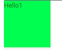
class hellowReact extends Component {
    constructor(props) {
        super(props);
    }
    render() {
        return (
            <View style={styles.container}>
                <View style={[styles.rotateBlock, styles.back1]}>
                    <Text>Hello1</Text>
                </View>
                <View style={[styles.rotateBlock, styles.back2]}>
                    <Text>Hello2</Text>
                </View>
                <View style={[styles.rotateBlock, styles.back3]}>
                    <Text>Hello3</Text>
                </View>
            </View>
        );
    }
}

const styles = StyleSheet.create({
    container: {
        flex: 1,
        backgroundColor: '#fff',
    },
    rotateBlock: {
        height: 100,
        width: 100,
        backgroundColor: '#0f0',
    },
    back1: {

    },
    back2: {
    },
    back3: {

    },
});
将第二个view的定位设定为absolute(绝对定位)

第二个view不见了,那么它去哪儿了呢?它已经脱离了我们的文档流,留下1和3,还规规矩矩的排在那里。我们为了找到第二个view,目前到底在哪儿,来尝试着更改其top和left。top/right/bottom/left决定了定位元素的位置。我们先调整其left为20
back2: {
    position: 'absolute',
    backgroundColor: '#f00',
    left: 30,
}, 
可见第二个元素虽然脱离了文档流但是还是在原先的位置上。只不过是被后面的第三个view给盖住了。这和我们在前端的常识不同。不过也可以理解为,此时的top与left。设定为了与自己未脱离文档流时候的top和left一致。
如果两个元素都设定为position:absolute,我们会看到排列顺序是按照文档流出现的顺序,下面的盖住上面的。但是如果我们像调整一下覆盖的顺序呢?我们在这里要介绍一下elevation,这个属性,这个属性比较奇特,他不仅可以控制覆盖顺序(就像z-index那样),同时会产生一个阴影特效
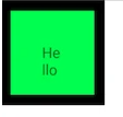
class hellowReact extends Component {
    constructor(props) {
        super(props);
    }
    render() {
        return (
            <View style={styles.container}>
                <View style={[styles.shadowBlock, styles.back1]}>
                    <Text>Hello1</Text>
                </View>
                <View style={[styles.shadowBlock, styles.back2]}>
                    <Text>Hello2</Text>
                </View>
            </View>
        );
    }
}

const styles = StyleSheet.create({
    container: {
        flex: 1,
        backgroundColor: '#fff',
    },
    shadowBlock: {
        height: 100,
        width: 100,
        backgroundColor: '#0f0',
    },
    back1: {
        position: 'absolute',
    },
    back2: {
        position: 'absolute',
    },
});
文档流中后出现的hello2覆盖掉了hello1。那么我们将两个元素都设置上elevation属性
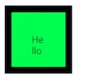
back1: {
    position: 'absolute',
    elevation: 1,
},
back2: {
    position: 'absolute',
},
剧情发生了反转,有elevation的hello1,覆盖住了在文档流中后出现的hello2。其实hello2的elevation值,我们可以认为是0,
结论:当两个元素,显示上有重叠的时候,elevation大的元素,会覆盖掉elevation值较小的元素。
相应的例子代码,在本文例子中的index.android.js.elevation文件里
如果position设定为relative的话,会怎样呢
const styles = StyleSheet.create({
    container: {
        flex: 1,
        backgroundColor: '#fff',
    },
    rotateBlock: {
        height: 100,
        width: 100,
        backgroundColor: '#0f0',
    },
    back1: {

    },
    back2: {
        position: 'relative',
        backgroundColor: '#f00',
    },
    back3: {

    },
});
并没有发生什么异样,文档流还是那个文档流,but,如果此时,我们设置了left: 20的话
back2: {
    position: 'relative',
    left: 20,
    backgroundColor: '#f00',
},
第二个view并未脱离文档流,而是按照自己之前的位置,进行了偏移。
如上述所示,其实各位发现react的定位,并不复杂。另外,元素默认的position,是relative,所以其实上面的例子,我们不用指定position,也能得到同样的效果
back2: {
    left: 20,
    backgroundColor: '#f00',
},
阴影相关
阴影可以让我们的应用变得更加的立体,呈现出更好的展示效果
shadowColor
shadowOffset
shadowOpacity
shadowRadius
这些属性,目前只适用于IOS系统,android的话,有一个替代属性elevation,这个属性影响着元素的z-index,就是绝对定位时的覆盖顺序(上面我们提到过),也会在元素上产生一个阴影。
class hellowReact extends Component {
    constructor(props) {
        super(props);
    }
    render() {
        return (
            <View style={styles.container}>
                <View style={[styles.shadowBlock, styles.back1]}>
                    <Text>Hello1</Text>
                </View>
            </View>
        );
    }
}

const styles = StyleSheet.create({
    container: {
        flex: 1,
        backgroundColor: '#fff',
    },
    shadowBlock: {
        height: 100,
        width: 100,
        backgroundColor: '#0f0',
    },
    back1: {
        elevation: 5,
    },
});
可以利用这个属性来设定阴影,elevation的值会影响阴影的offset