微信小程序实战系列
前言
本文继续完成最后一个部分“动态翻页效果”。
动态翻页效果实现
clock.wxml
<view class="container">
<view class="clock-container">
  <view class="flip-container">
    <block wx:for="{
    {timeArr}}" wx:for-item="unit" wx:for-index="unitIndex" wx:key="unitIndex">
      <view class="flip-items">
        <block wx:for="{
    {unit.max+1}}" wx:for-item="item" wx:for-index="index" wx:key="index">
          <view class="{
    {['item',(unit.current==index)?'current':'',(unit.current-1==index||index==unit.max&&unit.current==0)?'past':'']}}">
            <view class="up">
              <view class="inner">{
  {index}}</view>
              <view class="shadow"></view>
            </view>
            <view class="down">
              <view class="inner">{
  {index}}</view>
              <view class="shadow"></view>
            </view>
          </view>
        </block>
      </view>
    </block>
  </view>
</view>
</view>
clock.wxss
.flip-container {

  display: flex;
  justify-content: center;
  position: relative;
  padding: 0 20rpx;
}


.flip-items {

  position: relative;
  width: 90rpx;
  height: 145rpx;
  font-size: 128rpx;
  font-weight: bold;
  border-radius: 10rpx;
  border: 1rpx solid rgba(121, 121, 121, 0.384);
  box-shadow: 0 2rpx 18rpx rgba(0, 0, 0, 0.7);
}

.flip-container .flip-items:nth-of-type(2n+1) {

  margin-right: 12rpx;
}

.flip-container .flip-items:nth-of-type(2),
.flip-container .flip-items:nth-of-type(4) {

  margin-right: 36rpx;
}

.flip-container .flip-items:nth-of-type(2)::after,
.flip-container .flip-items:nth-of-type(4)::after,
.flip-container .flip-items:nth-of-type(2)::before,
.flip-container .flip-items:nth-of-type(4)::before {

  position: absolute;
  right: -18rpx;
  content: '';
  transform: translateX(50%);
  width: 25rpx;
  height: 25rpx;
  border-radius: 50%;
  box-shadow: rgba(0, 0, 0, 0.7) 1px 1px 5px;
  background-color: rgba(0, 0, 0, 0.801);
}

.flip-container .flip-items:nth-of-type(2)::before,
.flip-container .flip-items:nth-of-type(4)::before {

  top: 25%;
}

.flip-container .flip-items:nth-of-type(2)::after,
.flip-container .flip-items:nth-of-type(4)::after {

  bottom: 25%;
}


.item {

  position: absolute;
  top: 0;
  left: 0;
  right: 0;
  bottom: 0;
  z-index: 1;
}

.item::before {

  position: absolute;
  content: '';
  top: 75rpx;
  width: 100%;
  height: 5rpx;
  background-color: rgba(0, 0, 0, 0.5);
  z-index: 9;
}

.flip-container .flip-items .item .up,
.flip-container .flip-items .item .down {

  position: absolute;
  left: 0;
  right: 0;
  height: 50%;
  overflow: hidden;
}

/* 设置transform的原点 */
.up {

  transform-origin: 50% 100%;
  top: 0;
}

/* 设置transform的原点 */
.flip-container .flip-items .item .down {

  transform-origin: 50% 0%;
  bottom: 0;
}

.flip-container .flip-items .item .inner {

  position: absolute;
  width: 100%;
  height: 145rpx;
  color: #252525;
  left: 0;
  line-height: 145rpx;
  text-align: center;
  text-shadow: 0 2rpx 4rpx rgb(0, 0, 0);
  border-radius: 10rpx;
  background-color: #55e3e3;
}

.flip-container .flip-items .item .up .inner {

  top: 0;
}

.flip-container .flip-items .item .down .inner {

  bottom: 0;
}

.flip-container .flip-items .item .up .shadow {

  border-top-left-radius: 10rpx;
  border-top-right-radius: 10rpx;
}

.flip-container .flip-items .item .down .shadow {

  border-bottom-left-radius: 10rpx;
  border-bottom-right-radius: 10rpx;
}

.flip-container .flip-items .item.past {

  z-index: 3;
}

/*  current time keep top z-index:4 */
.flip-container .flip-items .item.current {

  animation: highter-level 0.5s 0.5s linear forwards;
  z-index: 2;
}

/* 前一秒的上半页,旋转 0~-90deg */
.flip-container .flip-items .item.past .up {

  animation: flip-past-up 0.5s linear both;
}

/* 当前秒的下半页,旋转90~0 */
.flip-container .flip-items .item.current .down {

  animation: flip-current-down 0.5s 0.5s linear both;
}

@keyframes flip-current-down {

  from {

    transform: rotateX(90deg);
  }

  to {

    transform: rotateX(0deg);
  }
}
@keyframes flip-past-up {

  from {

    transform: rotateX(0deg);
  }

  to {

    transform: rotateX(-90deg);
  }
}

@keyframes highter-level {

  from {

    z-index: 4;
  }

  to {

    z-index: 4;
  }
}

.flip-container .flip-items .item .shadow {

  position: absolute;
  width: 100%;
  height: 100%;
}

/* show 渐变 */
.flip-container .flip-items .item.past .up .shadow {

  background: linear-gradient(rgba(0, 0, 0, 0.1) 0%, #000 100%);
  animation: show 0.5s linear both;
}

/* show 渐变 */
.flip-container .flip-items .item.past .down .shadow {

  background: linear-gradient(#000 0%, rgba(0, 0, 0, 0.1) 100%);
  animation: show 0.5s linear both;
}

/* hide 渐变 */
 .flip-container .flip-items .item.current .up .shadow {

  background: linear-gradient(rgba(0, 0, 0, 0.1) 0%, #000 100%);
  animation: hide 0.5s 0.3s linear both;
}

.flip-container .flip-items .item.current .down .shadow {

  background: linear-gradient(#000 0%, rgba(0, 0, 0, 0.1) 100%);
  animation: hide 0.5s 0.3s linear both;
}

@keyframes show {

  from {

    opacity: 0;
  }

  to {

    opacity: 1;
  }
}

@keyframes hide {

  from {

    opacity: 1;
  }

  to {

    opacity: 0;
  }
}
clock.js
Page({

  data: {


  },

  onLoad: function () {

   this.setTimeRunner()
  },

  setTimeRunner: function () {

    this.timeRunner = setInterval(() => {

      this.getTimeStr();
      this.getTimeArr();
    }, 1000);
  },

   getTimeStr: function () {

    let that = this;
    var time = new Date();
    var hour = ('0' + time.getHours()).slice(-2);
    var minute = ('0' + time.getMinutes()).slice(-2);
    var second = ('0' + time.getSeconds()).slice(-2);
    var timeStr = (hour + minute + second).split('');
    that.setData({
   timeStr:timeStr})
  },

    getTimeArr: function () {

      var timeArr = this.data.timeStr.map(function (element, index) {

        var max;
        if (index & 1 == 1) {

          max = 9;
        } else if (index == 0) {

          max = 2;
        } else if (index == 2) {

          max = 5;
        } else if (index == 4) {

          max = 5;
        }
        var current = Number(element)
        return {

          max: max,
          current: current
        };
      })
      this.setData({
   timeArr:timeArr})
    },

    beforeDestroy:function () {

      clearInterval(this.timeRunner);
    },
  onUnload: function () {

    this.beforeDestroy()
  }
})
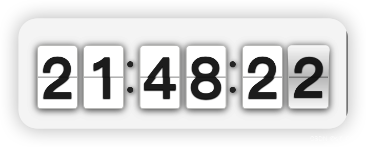
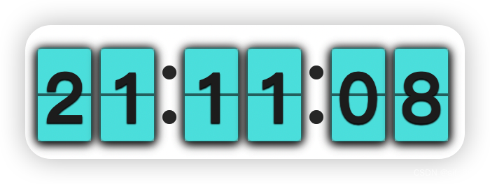
运行效果
点击翻页时钟运行效果
总结
本项目的综合性较强,对wxss、wxml、js的综合运用需要较为熟悉,是一个非常好的练手小项目。


![[Onnx简化库深度剖析] OnnxSimplifier和OnnxOptimizer解读-(4)](https://img-blog.csdnimg.cn/direct/de59cbc5a0814524b32f82243720d6eb.png)