效果演示
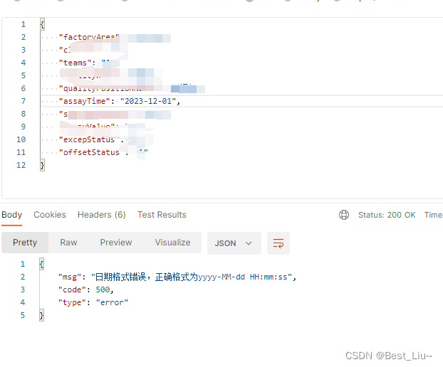
实现了一个简单的数字密码输入表单,用户需要输入一个4位数字密码来验证身份。表单包含一个标题、描述、输入字段、两个按钮和一个关闭按钮。输入字段是一个4位数字密码,用户需要在每个输入框中输入数字来输入密码。两个按钮分别是“验证”和“清除”,用户可以点击这两个按钮来进行验证和清除操作。关闭按钮用于关闭表单。整个表单的样式和布局都比较简洁明了,适合在需要输入密码的场景中使用。
Code
<form class="form">
  <span class="close">X</span>

  <div class="info">
    <span class="title">Two-Factor Verification</span>
    <p class="description">Enter the two-factor authentication code provided by the authenticator app </p>
  </div>
  <div class="input-fields">
    <input maxlength="1" type="tel" placeholder="">
    <input maxlength="1" type="tel" placeholder="">
    <input maxlength="1" type="tel" placeholder="">
    <input maxlength="1" type="tel" placeholder="">
  </div>

  <div class="action-btns">
    <a href="#" class="verify">Verify</a>
    <a href="#" class="clear">Clear</a>
  </div>

</form>
body {

    height: 100vh;
    display: flex;
    justify-content: center;
    align-items: center;
    background-color: #e8e8e8;
}

.form {

    --black: #000000;
    --ch-black: #141414;
    --eer-black: #1b1b1b;
    --night-rider: #2e2e2e;
    --white: #ffffff;
    --af-white: #f3f3f3;
    --ch-white: #e1e1e1;
    --tomato: #fa5656;
    font-family: Helvetica, sans-serif;
    padding: 25px;
    display: flex;
    max-width: 420px;
    flex-direction: column;
    align-items: center;
    overflow: hidden;
    color: var(--af-white);
    background-color: var(--black);
    border-radius: 8px;
    position: relative;
    box-shadow: 10px 10px 10px rgba(0, 0, 0, .1);
}

/*----heading and description-----*/

.info {

    margin-bottom: 20px;
    display: flex;
    flex-direction: column;
    align-items: center;
    text-align: center;
}

.title {

    font-size: 1.5rem;
    font-weight: 900;
}

.description {

    margin-top: 10px;
    font-size: 1rem;
}

/*----input-fields------*/

.form .input-fields {

    display: flex;
    justify-content: space-between;
    gap: 10px;
}

.form .input-fields input {

    height: 2.5em;
    width: 2.5em;
    outline: none;
    text-align: center;
    font-family: 'Trebuchet MS', 'Lucida Sans Unicode', 'Lucida Grande', 'Lucida Sans', Arial, sans-serif;
    font-size: 1.5rem;
    color: var(--af-white);
    border-radius: 5px;
    border: 2.5px solid var(--eer-black);
    background-color: var(--eer-black);
}

.form .input-fields input:focus {

    border: 1px solid var(--af-white);
    box-shadow: inset 10px 10px 10px rgba(0, 0, 0, .15);
    transform: scale(1.05);
    transition: 0.5s;
}

/*-----verify and clear buttons-----*/

.action-btns {

    display: flex;
    margin-top: 20px;
    gap: 0.5rem;
}

.verify {

    padding: 10px 20px;
    text-decoration: none;
    border-radius: 5px;
    font-size: 1rem;
    font-weight: 500;
    color: var(--night-rider);
    text-shadow: none;
    background: var(--af-white);
    box-shadow: transparent;
    border: 1px solid var(--af-white);
    transition: 0.3s ease;
    user-select: none;
}

.verify:hover,
.verify:focus {

    color: var(--night-rider);
    background: var(--white);
}

.clear {

    padding: 10px 20px;
    text-decoration: none;
    border-radius: 5px;
    font-size: 1rem;
    font-weight: 500;
    color: var(--ch-white);
    text-shadow: none;
    background: transparent;
    border: 1px solid var(--ch-white);
    transition: 0.3s ease;
    user-select: none;
}

.clear:hover,
.clear:focus {

    color: var(--tomato);
    background-color: transparent;
    border: 1px solid var(--tomato);
}

/*-----close button------*/

.close {

    position: absolute;
    right: 10px;
    top: 10px;
    background-color: var(--night-rider);
    color: var(--ch-white);
    height: 30px;
    width: 30px;
    display: grid;
    place-items: center;
    border-radius: 5px;
    cursor: pointer;
    font-weight: 600;
    transition: .5s ease;
}

.close:hover {

    background-color: var(--tomato);
    color: var(--white);
}
实现思路拆分
cbody {

  height: 100vh; /* 设置整个页面的高度为视口高度 */
  display: flex; /* 设置元素为flex布局 */
  justify-content: center; /* 设置主轴方向上的对齐方式为居中对齐 */
  align-items: center; /* 设置交叉轴方向上的对齐方式为居中对齐 */
  background-color: #e8e8e8; /* 设置背景颜色为浅灰色 */
}
这段代码设置了整个页面的样式,包括高度、布局方式、对齐方式和背景颜色。
.form {

  --black: #000000; /* 设置黑色变量 */
  --ch-black: #141414; /* 设置深灰色变量 */
  --eer-black: #1b1b1b; /* 设置中灰色变量 */
  --night-rider: #2e2e2e; /* 设置深黑色变量 */
  --white: #ffffff; /* 设置白色变量 */
  --af-white: #f3f3f3; /* 设置亮白色变量 */
  --ch-white: #e1e1e1; /* 设置中白色变量 */
  --tomato: #fa5656; /* 设置番茄红色变量 */
  font-family: Helvetica, sans-serif; /* 设置字体 */
  padding: 25px; /* 设置内边距 */
  display: flex; /* 设置元素为flex布局 */
  max-width: 420px; /* 设置最大宽度为420px */
  flex-direction: column; /* 设置主轴方向为垂直方向 */
  align-items: center; /* 设置交叉轴方向上的对齐方式为居中对齐 */
  overflow: hidden; /* 设置内容溢出时隐藏滚动条 */
  color: var(--af-white); /* 设置文本颜色为亮白色 */
  background-color: var(--black); /* 设置背景颜色为黑色 */
  border-radius: 8px; /* 设置圆角半径为8px */
  position: relative; /* 设置元素为相对定位 */
  box-shadow: 10px 10px 10px rgba(0, 0, 0,.1); /* 设置阴影效果 */
}
这段代码设置了表单的样式,包括变量、字体、内边距、布局方式、对齐方式、溢出处理、文本颜色、背景颜色、圆角半径、定位和阴影效果。
.info {

  margin-bottom: 20px; /* 设置下边距为20px */
  display: flex; /* 设置元素为flex布局 */
  flex-direction: column; /* 设置主轴方向为垂直方向 */
  align-items: center; /* 设置交叉轴方向上的对齐方式为居中对齐 */
  text-align: center; /* 设置文本对齐方式为居中对齐 */
}
这段代码设置了标题和描述的样式,包括下边距、布局方式、对齐方式和文本对齐方式。
.title {

  font-size: 1.5rem; /* 设置字体大小为1.5rem */
  font-weight: 900; /* 设置字体粗细为900 */
}
这段代码设置了标题的样式,包括字体大小和字体粗细。
.description {

  margin-top: 10px; /* 设置上边距为10px */
  font-size: 1rem; /* 设置字体大小为1rem */
}
这段代码设置了描述的样式,包括上边距和字体大小。
.form.input-fields {

  display: flex; /* 设置元素为flex布局 */
  justify-content: space-between; /* 设置主轴方向上的对齐方式为两端对齐 */
  gap: 10px; /* 设置两个输入框之间的间距为10px */
}
这段代码设置了输入框的样式,包括布局方式、对齐方式和间距。
.form.input-fields input {

  height: 2.5em; /* 设置输入框高度为2.5em */
  width: 2.5em; /* 设置输入框宽度为2.5em */
  outline: none; /* 去掉输入框的外边框 */
  text-align: center; /* 设置文本对齐方式为居中对齐 */
  font-family: 'Trebuchet MS', 'Lucida Sans Unicode', 'Lucida Grande', 'Lucida Sans', Arial, sans-serif; /* 设置字体 */
  font-size: 1.5rem; /* 设置字体大小为1.5rem */
  color: var(--af-white); /* 设置文本颜色为亮白色 */
  border-radius: 5px; /* 设置圆角半径为5px */
  border: 2.5px solid var(--eer-black); /* 设置输入框的边框为2.5px的黑色实线 */
  background-color: var(--eer-black); /* 设置输入框的背景颜色为黑色 */
}
这段代码设置了输入框的样式,包括高度、宽度、外边框、文本对齐方式、字体、字体大小、文本颜色、圆角半径、边框和背景颜色。
.form.input-fields input:focus {

  border: 1px solid var(--af-white); /* 设置输入框获得焦点时的边框为1px的亮白色实线 */
  box-shadow: inset 10px 10px 10px rgba(0, 0, 0,.15); /* 设置输入框获得焦点时的阴影效果 */
  transform: scale(1.05); /* 放大输入框 */
  transition: 0.5s; /* 设置过渡效果持续时间为0.5s */
}
这段代码设置了输入框获得焦点时的样式,包括边框、阴影效果、放大效果和过渡效果。
.action-btns {

  display: flex; /* 设置元素为flex布局 */
  margin-top: 20px; /* 设置上边距为20px */
  gap: 0.5rem; /* 设置两个按钮之间的间距为0.5rem */
}
这段代码设置了按钮的样式,包括布局方式、上边距和间距。
.verify {

  padding: 10px 20px; /* 设置按钮的内边距为10px 20px */
  text-decoration: none; /* 去掉链接的下划线 */
  border-radius: 5px; /* 设置按钮的圆角半径为5px */
  font-size: 1rem; /* 设置字体大小为1rem */
  font-weight: 500; /* 设置字体粗细为500 */
  color: var(--night-rider); /* 设置文本颜色为深黑色 */
  text-shadow: none; /* 去掉文本阴影 */
  background: var(--af-white); /* 设置按钮的背景颜色为亮白色 */
  box-shadow: transparent; /* 去掉按钮的阴影 */
  border: 1px solid var(--af-white); /* 设置按钮的边框为1px的亮白色实线 */
  transition: 0.3s ease; /* 设置过渡效果 */
  user-select: none; /* 禁止用户选择按钮文本 */
}
这段代码设置了“验证”按钮的样式,包括内边距、文本装饰、圆角半径、字体大小、字体粗细、文本颜色、文本阴影、背景颜色、阴影、边框、过渡效果和用户选择。
.verify:hover,
.verify:focus {

  color: var(--night-rider); /* 设置文本颜色为深黑色 */
  background: var(--white); /* 设置按钮的背景颜色为白色 */
  border: 1px solid var(--af-white); /* 设置按钮的边框为1px的亮白色实线 */
}
这段代码设置了“验证”按钮在鼠标悬停或获得焦点时的样式,包括文本颜色、背景颜色和边框。
.clear {

  padding: 10px 20px; /* 设置内边距为上下各10px,左右各20px */
  text-decoration: none; /* 去除文本装饰 */
  border-radius: 5px; /* 设置圆角半径为5px */
  font-size: 1rem; /* 设置字体大小为1rem */
  font-weight: 500; /* 设置字体粗细为500 */
  color: var(--ch-white); /* 设置文本颜色为中白色 */
  text-shadow: none; /* 去除文本阴影 */
  background: transparent; /* 去除背景 */
  border: 1px solid var(--ch-white); /* 设置边框为1px粗中白色 */
  transition: 0.3s ease; /* 设置过渡效果 */
  user-select: none; /* 禁止用户选择文本 */
}
这段代码设置了清除按钮的样式,包括内边距、圆角半径、字体大小、字体粗细、文本颜色、文本阴影、背景、边框和过渡效果等。
.clear:hover,
.clear:focus {

  color: var(--tomato); /* 设置文本颜色为番茄红色 */
  background-color: transparent; /* 去除背景颜色 */
  border: 1px solid var(--tomato); /* 设置边框为1px粗番茄红色 */
}
这段代码设置了清除按钮在鼠标悬停或获得焦点时的样式,包括文本颜色、背景颜色和边框颜色等。
.close {

  position: absolute; /* 设置元素为绝对定位 */
  right: 10px; /* 设置右边距为10px */
  top: 10px; /* 设置上边距为10px */
  background-color: var(--night-rider); /* 设置背景颜色为深黑色 */
  color: var(--ch-white); /* 设置文本颜色为中白色 */
  height: 30px; /* 设置高度为30px */
  width: 30px; /* 设置宽度为30px */
  display: grid; /* 设置元素为网格布局 */
  place-items: center; /* 设置交叉轴方向上的对齐方式为居中对齐 */
  border-radius: 5px; /* 设置圆角半径为5px */
  cursor: pointer; /* 设置鼠标指针为指针 */
  font-weight: 600; /* 设置字体粗细为600 */
  transition:.5s ease; /* 设置过渡效果 */
}
这段代码设置了关闭按钮的样式,包括位置、大小、背景颜色、文本颜色、圆角半径、鼠标指针、字体粗细和过渡效果等。
.close:hover {

  background-color: var(--tomato); /* 设置背景颜色为番茄红色 */
  color: var(--white); /* 设置文本颜色为白色 */
}
这段代码设置了关闭按钮在鼠标悬停时的样式,包括背景颜色和文本颜色等。