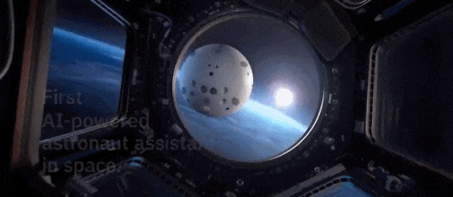
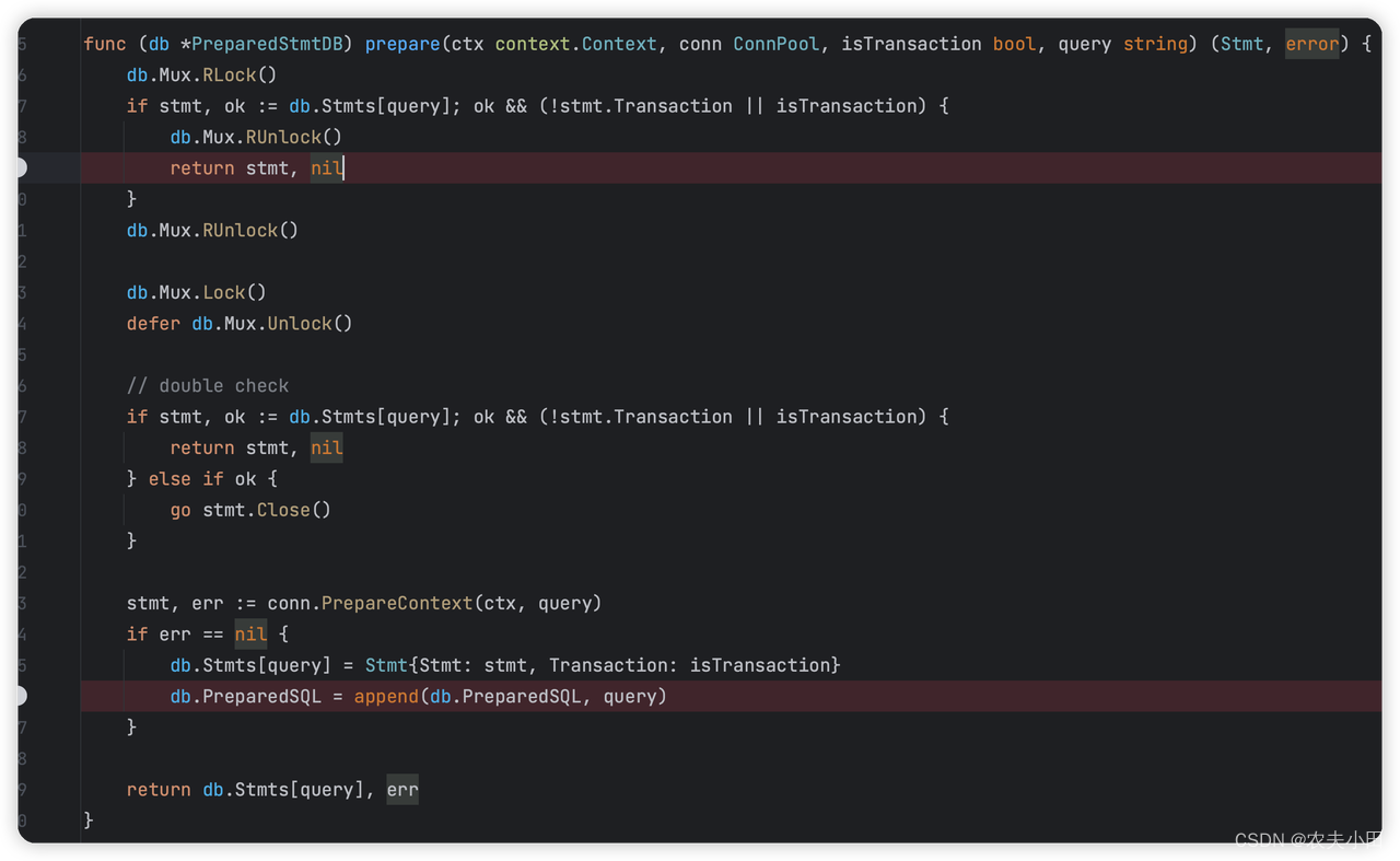
效果演示

实现了一个太空漫游的动画效果,其中包括火箭、星星和月亮。当鼠标悬停在卡片上时,太阳和星星会变成黄色,火箭会变成飞机,月亮会变成小型的月亮。整个效果非常炫酷,可以让人想起科幻电影中的太空漫游。
Code
  <div class="card">
      <div class="star star-1"></div>
      <div class="star star-2"></div>
      <div class="star star-3"></div>
      <div class="star star-4"></div>
      <div class="star star-5"></div>
      <div class="star star-6"></div>
      <div class="star star-7"></div>
      <div class="card-info">
          <span>To the moon!</span>
      </div>
      <svg class="moon" viewBox="0 0 20 20">
          <path
              d="M 10 9 z z M 7.007 6.552 c 0 -2.259 0.795 -4.33 2.117 -5.955 C 4.34 1.042 0.594 5.07 0.594 9.98 c 0 5.207 4.211 9.426 9.406 9.426 c 2.94 0 5.972 -1.354 7.696 -3.472 c -0.289 0.026 -0.987 0.044 -1.283 0.044 C 11.219 15.979 7.007 11.759 7.007 6.552 z">
          </path>
      </svg>
      <svg class="rocket" viewBox="48.0129 48.1783 416 415.6">
          <path
              d="M461.81,53.81a4.4,4.4,0,0,0-3.3-3.39c-54.38-13.3-180,34.09-248.13,102.17a294.9,294.9,0,0,0-33.09,39.08c-21-1.9-42-.3-59.88,7.5-50.49,22.2-65.18,80.18-69.28,105.07a9,9,0,0,0,9.8,10.4l81.07-8.9a180.29,180.29,0,0,0,1.1,18.3,18.15,18.15,0,0,0,5.3,11.09l31.39,31.39a18.15,18.15,0,0,0,11.1,5.3,179.91,179.91,0,0,0,18.19,1.1l-8.89,81a9,9,0,0,0,10.39,9.79c24.9-4,83-18.69,105.07-69.17,7.8-17.9,9.4-38.79,7.6-59.69a293.91,293.91,0,0,0,39.19-33.09C427.82,233.76,474.91,110.9,461.81,53.81ZM298.66,213.67a42.7,42.7,0,1,1,60.38,0A42.65,42.65,0,0,1,298.66,213.67Z">
          </path>
      </svg>

  </div>
body {

    height: 100vh; /* 设置body的高度为视口高度的100% */
    display: flex; /* 使用flexbox将内容垂直和水平居中 */
    justify-content: center; /* 水平居中内容 */
    align-items: center; /* 垂直居中内容 */
    background-color: #e8e8e8; /* 设置body的背景颜色 */
}

.card {

    width: 290px; /* 设置卡片的宽度 */
    height: 350px; /* 设置卡片的高度 */
    background: linear-gradient(135deg, rgba(48, 48, 48, 1) 48%, rgba(0, 0, 0, 1) 100%); /* 设置卡片的线性渐变背景 */
    background-size: 300%, 300%; /* 设置背景的尺寸为300% */
    display: flex; /* 使用flexbox将内容垂直和水平居中 */
    align-items: center; /* 垂直居中内容 */
    justify-content: center; /* 水平居中内容 */
    position: relative; /* 设置卡片的定位为相对定位 */
    border-radius: 15px; /* 设置卡片的圆角边框 */
    box-shadow: 5px 5px 15px 5px #000000; /* 设置卡片的阴影效果 */
    overflow: hidden; /* 隐藏卡片内容溢出部分 */
    transition: all 1s ease; /* 设置卡片的过渡效果 */
}

.moon {

    width: 70px; /* 设置月亮图标的宽度 */
    height: 70px; /* 设置月亮图标的高度 */
    top: 15%; /* 设置月亮图标距离卡片顶部的位置 */
    right: 120px; /* 设置月亮图标距离卡片右侧的位置 */
    position: absolute; /* 设置月亮图标的定位为绝对定位 */
    fill: white; /* 设置月亮图标的填充颜色为白色 */
    transform: rotate(-20deg); /* 设置月亮图标的旋转角度为-20度 */
    transition: all 1s ease; /* 设置月亮图标的过渡效果 */
}

.rocket {

    width: 70px; /* 设置火箭图标的宽度 */
    height: 70px; /* 设置火箭图标的高度 */
    bottom: -2%; /* 设置火箭图标距离卡片底部的位置 */
    left: -2%; /* 设置火箭图标距离卡片左侧的位置 */
    position: absolute; /* 设置火箭图标的定位为绝对定位 */
    fill: white; /* 设置火箭图标的填充颜色为白色 */
    transition: all 1.9s ease; /* 设置火箭图标的过渡效果 */
}

.star {

    position: absolute; /* 设置星星图标的定位为绝对定位 */
    background: radial-gradient(circle, rgba(251, 239, 63, 1) 0%, rgba(255, 253, 212, 1) 100%); /* 设置星星图标的径向渐变背景 */
    clip-path: polygon(50% 0%, 61% 35%, 98% 35%, 68% 57%, 79% 91%, 50% 70%, 21% 91%, 32% 57%, 2% 35%, 39% 35%); /* 设置星星图标的剪裁路径 */
}

.star-1 {

    width: 100px; /* 设置星星1的宽度 */
    height: 100px; /* 设置星星1的高度 */
    bottom: 90px; /* 设置星星1距离卡片底部的位置 */
    left: -15px; /* 设置星星1距离卡片左侧的位置 */
    transition: all 1s ease; /* 设置星星1的过渡效果 */
}

.star-2 {

    width: 150px; /* 设置星星2的宽度 */
    height: 150px; /* 设置星星2的高度 */
    top: -10%; /* 设置星星2距离卡片顶部的位置 */
    left: -10%; /* 设置星星2距离卡片左侧的位置 */
    transition: all .5s ease; /* 设置星星2的过渡效果 */
}

.star-3 {

    width: 100px; /* 设置星星3的宽度 */
    height: 100px; /* 设置星星3的高度 */
    bottom: 5%; /* 设置星星3距离卡片底部的位置 */
    right: -15px; /* 设置星星3距离卡片右侧的位置 */
    transition: all .3s ease; /* 设置星星3的过渡效果 */
}

.star-4 {

    width: 20px; /* 设置星星4的宽度 */
    height: 20px; /* 设置星星4的高度 */
    top: 4%; /* 设置星星4距离卡片顶部的位置 */
    right: 5px; /* 设置星星4距离卡片右侧的位置 */
    transition: all 1.4s ease; /* 设置星星4的过渡效果 */
}

.star-5 {

    width: 20px; /* 设置星星5的宽度 */
    height: 20px; /* 设置星星5的高度 */
    bottom: 24%; /* 设置星星5距离卡片底部的位置 */
    right: 45%; /* 设置星星5距离卡片右侧的位置 */
    animation: rotate 3s normal linear infinite; /* 设置星星5的旋转动画 */
}

.star-6 {

    width: 20px; /* 设置星星6的宽度 */
    height: 20px; /* 设置星星6的高度 */
    top: 14%; /* 设置星星6距离卡片顶部的位置 */
    right: 25%; /* 设置星星6距离卡片右侧的位置 */
    animation: rotate 5s normal linear infinite; /* 设置星星6的旋转动画 */
}

.star-7 {

    width: 40px; /* 设置星星7的宽度 */
    height: 40px; /* 设置星星7的高度 */
    top: 34%; /* 设置星星7距离卡片顶部的位置 */
    right: 65%; /* 设置星星7距离卡片右侧的位置 */
    animation: rotate 5s normal linear infinite; /* 设置星星7的旋转动画 */
}

.card-info span {

    font-size: 1.2em; /* 设置卡片信息中span元素的字体大小 */
    color: white; /* 设置卡片信息中span元素的字体颜色为白色 */
    font-weight: 600; /* 设置卡片信息中span元素的字体粗细为600 */
    text-transform: uppercase; /* 将卡片信息中span元素的文本转换为大写 */
    transition: all 1s ease; /* 设置卡片信息中span元素的过渡效果 */
}

.card:hover {

    background: rgb(48, 48, 48); /* 设置鼠标悬停时卡片的背景颜色 */
    background: linear-gradient(135deg, rgba(48, 48, 48, 1) 10%, rgba(0, 0, 0, 1) 90%); /* 设置鼠标悬停时卡片的线性渐变背景 */
    background-size: 100%, 100%; /* 设置鼠标悬停时背景的尺寸为100% */
}

.card:hover .star-1,
.card:hover .star-3 {

    background: linear-gradient(90deg, rgba(255, 241, 0, 1) 0%, rgba(246, 249, 93, 1) 77%, rgba(238, 255, 0, 1) 100%); /* 设置鼠标悬停时星星1和星星3的背景颜色 */
    transform: scale(1.2) rotate(10deg); /* 设置鼠标悬停时星星1和星星3的缩放和旋转效果 */
}

.card:hover .star-2,
.card:hover .star-4,
.card:hover .star-5 {

    background: linear-gradient(90deg, rgba(255, 241, 0, 1) 0%, rgba(246, 249, 93, 1) 77%, rgba(238, 255, 0, 1) 100%); /* 设置鼠标悬停时星星2、星星4和星星5的背景颜色 */
    transform: scale(1.2) rotate(-150deg); /* 设置鼠标悬停时星星2、星星4和星星5的缩放和旋转效果 */
}

.card:hover .rocket {

    transform: scale(.3) translate(450px, -730px) rotate(-260deg); /* 设置鼠标悬停时火箭图标的缩放、平移和旋转效果 */
}

.card:hover .moon {

    width: 50px; /* 设置鼠标悬停时月亮图标的宽度 */
    height: 50px; /* 设置鼠标悬停时月亮图标的高度 */
}

.card:hover span {

    font-size: 1.5em; /* 设置鼠标悬停时卡片信息中span元素的字体大小 */
}

@keyframes rotate {

    0% {

        -webkit-transform: rotate3d(0, 0, 1, 0deg); /* 设置旋转动画的初始状态 */
        transform: rotate3d(0, 0, 1, 0deg);
    }

    25% {

        -webkit-transform: rotate3d(0, 0, 1, 90deg); /* 设置旋转动画的25%状态 */
        transform: rotate3d(0, 0, 1, 90deg);
    }

    50% {

        -webkit-transform: rotate3d(0, 0, 1, 180deg); /* 设置旋转动画的50%状态 */
        transform: rotate3d(0, 0, 1, 180deg);
    }

    75% {

        -webkit-transform: rotate3d(0, 0, 1, 270deg); /* 设置旋转动画的75%状态 */
        transform: rotate3d(0, 0, 1, 270deg);
    }

    100% {

        -webkit-transform: rotate3d(0, 0, 1, 360deg); /* 设置旋转动画的结束状态 */
        transform: rotate3d(0, 0, 1, 360deg);
    }
}