一、前言
本文来自ggkegg使用手册,译文为机器翻译。译文可能与原文有所出入,请查看以原文为主,译文仅提供参考意义。
公众号原文链接:
译文:小杜的生信笔记
原文链接:https://noriakis.github.io/software/ggkegg/index.html
时间:2023.12.26
5.3 多重富集结果的可视化
您可以看到多重富集分析的结果。类似于将 ggkegg 函数与 enrichResult一起使用,有一个 append _ cp 函数可以在 mutate 函数中使用。通过为该函数提供一个富集 Result 对象,如果可视化的通路出现在结果中,则通路中的基因信息可以反映在图中。在这个例子中,除了上述尿路上皮细胞的变化,肾近端肾小管上皮细胞的变化正在进行比较
## These are RDAs storing DEGs
load("degListRPTEC.rda")
load("degURO.rda")

library(org.Hs.eg.db);
library(clusterProfiler);
input_uro <- bitr(uroUp, ## DEGs in urothelial cells
              fromType = "SYMBOL",
              toType = "ENTREZID",
              OrgDb = org.Hs.eg.db)$ENTREZID
input_rptec <- bitr(gls$day3_up_rptec, ## DEGs at 3 days post infection in RPTECs
              fromType = "SYMBOL",
              toType = "ENTREZID",
              OrgDb = org.Hs.eg.db)$ENTREZID

ekuro <- enrichKEGG(gene = input_uro)
ekrptec <- enrichKEGG(gene = input_rptec)

g1 <- pathway("hsa04110") |> mutate(uro=append_cp(ekuro, how="all"),
                                    rptec=append_cp(ekrptec, how="all"),
                                    converted_name=convert_id("hsa"))
ggraph(g1, layout="manual", x=x, y=y) +
  geom_edge_parallel(width=0.5, arrow = arrow(length = unit(1, 'mm')),
                 start_cap = square(1, 'cm'),
                 end_cap = square(1.5, 'cm'), aes(color=subtype_name))+
  geom_node_rect(aes(fill=uro, xmax=x,  filter=type=="gene"))+
  geom_node_rect(aes(fill=rptec, xmin=x, filter=type=="gene"))+
  scale_fill_manual(values=c("steelblue","tomato"), name="urothelial|rptec")+
  ggfx::with_outer_glow(geom_node_text(aes(label=converted_name, filter=type!="group"), size=2), colour="white", expand=1)+
  theme_void()

我们可以通过拼接结合 rawMap 来组合多个图块。
library(patchwork)
comb <- rawMap(list(ekuro, ekrptec), fill_color=c("tomato","tomato"), pid="hsa04110") +
rawMap(list(ekuro, ekrptec), fill_color=c("tomato","tomato"),
  pid="hsa03460")
comb

下面的例子对原始 KEGG 图谱应用了类似的反射,并突出显示了在黄色外发光中使用 ggfx 在两种条件下显示统计学显着变化的基因,并且通过拼接为富集结果构成了由 ClusterProfiler 产生的点图。
right <- (dotplot(ekuro) + ggtitle("Urothelial")) /
(dotplot(ekrptec) + ggtitle("RPTECs"))

g1 <- pathway("hsa03410") |>
  mutate(uro=append_cp(ekuro, how="all"),
        rptec=append_cp(ekrptec, how="all"),
        converted_name=convert_id("hsa"))
gg <- ggraph(g1, layout="manual", x=x, y=y)+
  ggfx::with_outer_glow(
    geom_node_rect(aes(filter=uro&rptec),
                   color="gold", fill="transparent"),
    colour="gold", expand=5, sigma=10)+
  geom_node_rect(aes(fill=uro, filter=type=="gene"))+
  geom_node_rect(aes(fill=rptec, xmin=x, filter=type=="gene")) +
  overlay_raw_map("hsa03410", transparent_colors = c("#cccccc","#FFFFFF","#BFBFFF","#BFFFBF"))+
  scale_fill_manual(values=c("steelblue","tomato"),
                    name="urothelial|rptec")+
  theme_void()
gg2 <- gg + right + plot_layout(design="
AAAA###
AAAABBB
AAAABBB
AAAA###
"
)
gg2

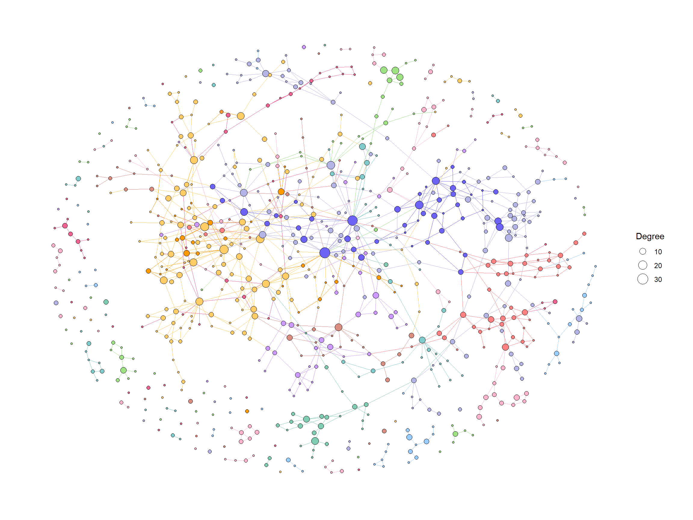
5.3.1 多重富集分析结果跨越多个途径
除了天然的布局,有时显示有趣的基因是有用的,例如 DEGs 通过多种途径。在这里,我们使用散点图库来显示多个途径的多重富集分析结果。
library(scatterpie)
## Obtain enrichment analysis results
entrezid <- uroUp |>
  clusterProfiler::bitr("SYMBOL","ENTREZID",org.Hs.eg.db)
cp <- clusterProfiler::enrichKEGG(entrezid$ENTREZID)

entrezid2 <- gls$day3_up_rptec |>
  clusterProfiler::bitr("SYMBOL","ENTREZID",org.Hs.eg.db)
cp2 <- clusterProfiler::enrichKEGG(entrezid2$ENTREZID)


## Filter to interesting pathways
include <- (data.frame(cp) |> row.names())[c(1,3,4)]
pathways <- data.frame(cp)[include,"ID"]
pathways
#> [1] "hsa04110" "hsa03460" "hsa03440"
我们获得多路径数据(函数返回本机坐标,但我们忽略它们。
g1 <- multi_pathway_native(pathways, row_num=1)
g2 <- g1 |> mutate(new_name=
                    ifelse(name=="undefined",
                           paste0(name,"_",pathway_id,"_",orig.id),
                           name)) |>
  convert(to_contracted, new_name, simplify=FALSE) |>
  activate(nodes) |>
  mutate(purrr::map_vec(.orig_data,function (x) x[1,] )) |>
  mutate(pid1 = purrr::map(.orig_data,function (x) unique(x["pathway_id"]) )) |>
  mutate(hsa03440 = purrr:::map_lgl(pid1, function(x) "hsa03440" %in% x$pathway_id) ,
         hsa04110 = purrr:::map_lgl(pid1, function(x) "hsa04110" %in% x$pathway_id),
         hsa03460 = purrr:::map_lgl(pid1, function(x) "hsa03460" %in% x$pathway_id))

nds <- g2 |> activate(nodes) |> data.frame()
eds <- g2 |> activate(edges) |> data.frame()
rmdup_eds <- eds[!duplicated(eds[,c("from","to","subtype_name")]),]

g2_2 <- tbl_graph(nodes=nds, edges=rmdup_eds)
g2_2 <- g2_2 |>  activate(nodes) |>
  mutate(
    in_pathway_uro=append_cp(cp, pid=include,name="new_name"),
    x=NULL, y=NULL,
   in_pathway_rptec=append_cp(cp2, pid=include,name = "new_name"),
   id=convert_id("hsa",name = "new_name")) |>
  morph(to_subgraph, type!="group") |>
  mutate(deg=centrality_degree(mode="all")) |>
  unmorph() |>
  filter(deg>0)
此外,我们将基于图的聚类结果分配给图,并缩放节点的大小,以便通过散点图可视化节点。
V(g2_2)$walktrap <- igraph::walktrap.community(g2_2)$membership

## Scale the node size
sizeMin <- 0.1
sizeMax <- 0.3
rawMin <- min(V(g2_2)$deg)
rawMax <- max(V(g2_2)$deg)
scf <- (sizeMax-sizeMin)/(rawMax-rawMin)
V(g2_2)$size <- scf * V(g2_2)$deg + sizeMin - scf * rawMin


## Make base graph
g3 <- ggraph(g2_2, layout="nicely")+
  geom_edge_parallel(alpha=0.9,
                 arrow=arrow(length=unit(1,"mm")),
                 aes(color=subtype_name),
                 start_cap=circle(3,"mm"),
                 end_cap=circle(8,"mm"))+
  scale_edge_color_discrete(name="Edge type")
graphdata <- g3$data
最后,我们使用 geom_scatterpie进行可视化。背景散点表示基因是否在通路中,前景表示基因是否在多个数据集中差异表达。我们突出的基因是差异表达的两个数据集的金色。
g4 <- g3+
  ggforce::geom_mark_rect(aes(x=x, y=y, group=walktrap),color="grey")+
  geom_scatterpie(aes(x=x, y=y, r=size+0.1),
                  color="transparent",
                  legend_name="Pathway",
                  data=graphdata,
                  cols=c("hsa04110", "hsa03440","hsa03460")) +
  geom_scatterpie(aes(x=x, y=y, r=size),
                           color="transparent",
                           data=graphdata, legend_name="enrich",
                           cols=c("in_pathway_rptec","in_pathway_uro"))+
  ggfx::with_outer_glow(geom_scatterpie(aes(x=x, y=y, r=size),
                  color="transparent",
                  data=graphdata[graphdata$in_pathway_rptec & graphdata$in_pathway_uro,],
                  cols=c("in_pathway_rptec","in_pathway_uro")), colour="gold", expand=3)+
  geom_node_point(shape=19, size=3, aes(filter=!in_pathway_uro & !in_pathway_rptec & type!="map"))+
  geom_node_shadowtext(aes(label=id, y=y-0.5), size=3, family="sans", bg.colour="white", colour="black")+
  theme_void()+coord_fixed()
g4

5.4 在KEGG图谱上映射基因调控网络
有了这个软件包,就可以将推断的网络,例如基因调控网络或其他软件推断的 KO 网络投射到 KEGG 地图上。以下是使用 MicrobiomeProfiler 将 CBN 图推断的通路内的 KO 网络子集投影到相应通路的参考图上的示例。当然,用其他方法创建网络也是可能的。
library(dplyr)
library(igraph)
library(tidygraph)
library(CBNplot)
library(ggkegg)
library(MicrobiomeProfiler)
data(Rat_data)
ko.res <- enrichKO(Rat_data)
exp.dat <- matrix(abs(rnorm(910)), 91, 10) %>% magrittr::set_rownames(value=Rat_data) %>% magrittr::set_colnames(value=paste0('S', seq_len(ncol(.))))
returnnet <- bngeneplot(ko.res, exp=exp.dat, pathNum=1, orgDb=NULL,returnNet = TRUE)
pg <- pathway("ko00650")
joined <- combine_with_bnlearn(pg, returnnet$str, returnnet$av)
绘制结果地图。在这个例子中,CBN 图估计的强度首先用彩色边显示,然后参考图的边在它的顶部用黑色绘制。另外,两个图中包含的边都用黄色突出显示。
## Summarize duplicate edges including `strength` attribute
number <- joined |> activate(edges) |> data.frame() |> group_by(from,to) |>
  summarise(n=n(), incstr=sum(!is.na(strength)))

## Annotate them
joined <- joined |> activate(edges) |> full_join(number) |> mutate(both=n>1&incstr>0)

joined |>
  activate(nodes) |>
  filter(!is.na(type)) |>
  mutate(convertKO=convert_id("ko")) |>
  activate(edges) |>
  ggraph(x=x, y=y) +
  geom_edge_link0(width=0.5,aes(filter=!is.na(strength),
                              color=strength), linetype=1)+
  ggfx::with_outer_glow(
    geom_edge_link0(width=0.5,aes(filter=!is.na(strength) & both,
                                  color=strength), linetype=1),
    colour="yellow", sigma=1, expand=1)+
  geom_edge_link0(width=0.1, aes(filter=is.na(strength)))+
  scale_edge_color_gradient(low="blue",high="red")+
  geom_node_rect(color="black", aes(fill=type))+
  geom_node_text(aes(label=convertKO), size=2)+
  geom_node_text(aes(label=ifelse(grepl(":", graphics_name), strsplit(graphics_name, ":") |>
                                    sapply("[",2) |> stringr::str_wrap(22), stringr::str_wrap(graphics_name, 22)),
                     filter=!is.na(type) & type=="map"), family="serif",
                 size=2, na.rm=TRUE)+
  theme_void()
5.4.1 在原始 KEGG 地图上映射
您可以直接将推断的网络投影到原始的 PATHWay 地图上,这样就可以从您自己的数据集中直接比较策划数据库和推断网络的知识。
raws <- joined |>
  ggraph(x=x, y=y) +
  geom_edge_link(width=0.5,aes(filter=!is.na(strength),
                                color=strength),
                 linetype=1,
                 arrow=arrow(length=unit(1,"mm"),type="closed"),
                 end_cap=circle(5,"mm"))+
  scale_edge_color_gradient2()+
  overlay_raw_map(transparent_colors = c("#ffffff"))+
  theme_void()
raws

5.5 在单细胞转录组学中分析簇标记基因
该软件包也可以应用于单细胞分析。作为一个例子,考虑将标记基因在簇之间映射到 KEGG 途径,并将它们与降维图一起绘制。在这里,我们使用修拉软件包。我们进行基本分析。
library(Seurat)
library(dplyr)
# dir = "../filtered_gene_bc_matrices/hg19"
# pbmc.data <- Read10X(data.dir = dir)
# pbmc <- CreateSeuratObject(counts = pbmc.data, project = "pbmc3k",
#                            min.cells=3, min.features=200)
# pbmc <- NormalizeData(pbmc)
# pbmc <- FindVariableFeatures(pbmc, selection.method = "vst")
# pbmc <- ScaleData(pbmc, features = row.names(pbmc))
# pbmc <- RunPCA(pbmc, features = VariableFeatures(object = pbmc))
# pbmc <- FindNeighbors(pbmc, dims = 1:10, verbose = FALSE)
# pbmc <- FindClusters(pbmc, resolution = 0.5, verbose = FALSE)
# markers <- FindAllMarkers(pbmc)
# save(pbmc, markers, file="../sc_data.rda")

## To reduce file size, pre-calculated RDA will be loaded
load("../sc_data.rda")
随后,我们绘制了 PCA 的降维结果,其中,在本研究中,我们对簇1和簇5的标记基因进行了富集分析。
library(clusterProfiler)

## Directly access slots in Seurat
pcas <- data.frame(
    pbmc@reductions$pca@cell.embeddings[,1],
    pbmc@reductions$pca@cell.embeddings[,2],
    pbmc@active.ident,
    pbmc@meta.data$seurat_clusters) |>
    `colnames<-`(c("PC_1","PC_2","Cell","group"))

aa <- (pcas %>% group_by(Cell) %>%
    mutate(meanX=mean(PC_1), meanY=mean(PC_2))) |>
    select(Cell, meanX, meanY)
label <- aa[!duplicated(aa),]

dd <- ggplot(pcas)+
    geom_point(aes(x=PC_1, y=PC_2, color=Cell))+
    shadowtext::geom_shadowtext(x=label$meanX,y=label$meanY,label=label$Cell, data=label,
                            bg.colour="white", colour="black")+
    theme_minimal()+
    theme(legend.position="none")

marker_1 <- clusterProfiler::bitr((markers |> filter(cluster=="1" & p_val_adj < 1e-50) |>
                                     dplyr::select(gene))$gene,fromType="SYMBOL",toType="ENTREZID",OrgDb = org.Hs.eg.db)$ENTREZID
marker_5 <- clusterProfiler::bitr((markers |> filter(cluster=="5" & p_val_adj < 1e-50) |>
                                     dplyr::select(gene))$gene,fromType="SYMBOL",toType="ENTREZID",OrgDb = org.Hs.eg.db)$ENTREZID
mk1_enrich <- enrichKEGG(marker_1)
mk5_enrich <- enrichKEGG(marker_5)
从 ggplot2中获取颜色信息,利用 ggkegg 获取颜色信息通路。在这里,我们选择破骨细胞分化(hsa04380) ,节点根据降维图中的颜色通过 ggfx 着色,两个簇中的标记均由指定的颜色(番茄)着色。这促进了路径信息(如 KEGG)和单细胞分析数据之间的联系,从而能够创建直观和可理解的视觉表示。
## Make color map
built <- ggplot_build(dd)$data[[1]]
cols <- built$colour
names(cols) <- as.character(as.numeric(built$group)-1)
gr_cols <- cols[!duplicated(cols)]

g <- pathway("hsa04380") |> mutate(marker_1=append_cp(mk1_enrich),
                                   marker_5=append_cp(mk5_enrich))
gg <- ggraph(g, layout="manual", x=x, y=y)+
    geom_node_rect(aes(filter=marker_1&marker_5), fill="tomato")+ ## Marker 1 & 5
    geom_node_rect(aes(filter=marker_1&!marker_5), fill=gr_cols["1"])+ ## Marker 1
    geom_node_rect(aes(filter=marker_5&!marker_1), fill=gr_cols["5"])+ ## Marker 5
  overlay_raw_map("hsa04380", transparent_colors = c("#cccccc","#FFFFFF","#BFBFFF","#BFFFBF"))+
  theme_void()
gg+dd+plot_layout(widths=c(0.6,0.4))

5.5.1 组合多条路径的例子
我们可以通过多种途径检测标记基因,以更好地了解标记基因的作用。
library(clusterProfiler)
library(org.Hs.eg.db)
subset_lab <- label[label$Cell %in% c("1","4","5","6"),]
dd <- ggplot(pcas) +
ggfx::with_outer_glow(geom_node_point(size=1,
aes(x=PC_1, y=PC_2, filter=group=="1", color=group)),
colour="tomato", expand=3)+
ggfx::with_outer_glow(geom_node_point(size=1,
aes(x=PC_1, y=PC_2, filter=group=="5", color=group)),
colour="tomato", expand=3)+
ggfx::with_outer_glow(geom_node_point(size=1,
aes(x=PC_1, y=PC_2, filter=group=="4", color=group)),
colour="gold", expand=3)+
ggfx::with_outer_glow(geom_node_point(size=1,
aes(x=PC_1, y=PC_2, filter=group=="6", color=group)),
colour="gold", expand=3)+
shadowtext::geom_shadowtext(x=subset_lab$meanX,
y=subset_lab$meanY, label=subset_lab$Cell,
data=subset_lab,
bg.colour="white", colour="black")+
theme_minimal()
marker_1 <- clusterProfiler::bitr((markers |> filter(cluster=="1" & p_val_adj < 1e-50) |>
dplyr::select(gene))$gene,fromType="SYMBOL",toType="ENTREZID",OrgDb = org.Hs.eg.db)$ENTREZID
marker_5 <- clusterProfiler::bitr((markers |> filter(cluster=="5" & p_val_adj < 1e-50) |>
dplyr::select(gene))$gene,fromType="SYMBOL",toType="ENTREZID",OrgDb = org.Hs.eg.db)$ENTREZID
marker_6 <- clusterProfiler::bitr((markers |> filter(cluster=="6" & p_val_adj < 1e-50) |>
dplyr::select(gene))$gene,fromType="SYMBOL",toType="ENTREZID",OrgDb = org.Hs.eg.db)$ENTREZID
marker_4 <- clusterProfiler::bitr((markers |> filter(cluster=="4" & p_val_adj < 1e-50) |>
dplyr::select(gene))$gene,fromType="SYMBOL",toType="ENTREZID",OrgDb = org.Hs.eg.db)$ENTREZID
mk1_enrich <- enrichKEGG(marker_1)
mk5_enrich <- enrichKEGG(marker_5)
mk6_enrich <- enrichKEGG(marker_6)
mk4_enrich <- enrichKEGG(marker_4)
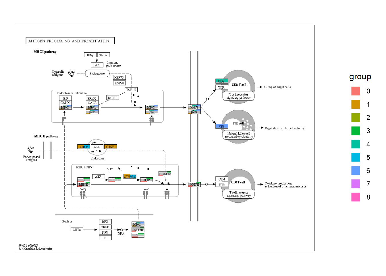
g1 <- pathway("hsa04612") |> mutate(marker_4=append_cp(mk4_enrich),
marker_6=append_cp(mk6_enrich),
gene_name=convert_id("hsa"))
gg1 <- ggraph(g1, layout="manual", x=x, y=y)+
overlay_raw_map("hsa04612", transparent_colors = c("#FFFFFF", "#BFBFFF", "#BFFFBF"))+
ggfx::with_outer_glow(
geom_node_rect(aes(filter=marker_4&marker_6), fill="white"),
colour="gold")+
ggfx::with_outer_glow(
geom_node_rect(aes(filter=marker_4&!marker_6), fill="white"),
colour=gr_cols["4"])+
ggfx::with_outer_glow(
geom_node_rect(aes(filter=marker_6&!marker_4), fill="white"),
colour=gr_cols["6"], expand=3)+
overlay_raw_map("hsa04612", transparent_colors = c("#B3B3B3", "#FFFFFF", "#BFBFFF", "#BFFFBF"))+
theme_void()
g2 <- pathway("hsa04380") |> mutate(marker_1=append_cp(mk1_enrich),
marker_5=append_cp(mk5_enrich))
gg2 <- ggraph(g2, layout="manual", x=x, y=y)+
ggfx::with_outer_glow(
geom_node_rect(aes(filter=marker_1&marker_5),
fill="white"), ## Marker 1 & 5
colour="tomato")+
ggfx::with_outer_glow(
geom_node_rect(aes(filter=marker_1&!marker_5),
fill="white"), ## Marker 1
colour=gr_cols["1"])+
ggfx::with_outer_glow(
geom_node_rect(aes(filter=marker_5&!marker_1),
fill="white"), ## Marker 5
colour=gr_cols["5"])+
overlay_raw_map("hsa04380",
transparent_colors = c("#cccccc","#FFFFFF","#BFBFFF","#BFFFBF"))+
theme_void()
left <- (gg2 + ggtitle("Marker 1 and 5")) /
(gg1 + ggtitle("Marker 4 and 6"))
final <- left + dd + plot_layout(design="
AAAAA###
AAAAACCC
BBBBBCCC
BBBBB###
")
final

5.5.2 原始地图上数值的条形图
对于它们在多个集群中富集的节点,我们可以绘制数值的条形图。引用的代码在这里,由incaven。
## Assign lfc to graph
mark_4 <- clusterProfiler::bitr((markers |> filter(cluster=="4" & p_val_adj < 1e-50) |>
                                     dplyr::select(gene))$gene,fromType="SYMBOL",toType="ENTREZID",OrgDb = org.Hs.eg.db)
mark_6 <- clusterProfiler::bitr((markers |> filter(cluster=="6" & p_val_adj < 1e-50) |>
                                   dplyr::select(gene))$gene,fromType="SYMBOL",toType="ENTREZID",OrgDb = org.Hs.eg.db)
mark_4$lfc <- markers[markers$cluster=="4" & markers$gene %in% mark_4$SYMBOL,]$avg_log2FC
mark_4$hsa <- paste0("hsa:",mark_4$ENTREZID)
mark_6$lfc <- markers[markers$cluster=="6" & markers$gene %in% mark_4$SYMBOL,]$avg_log2FC
mark_6$hsa <- paste0("hsa:",mark_6$ENTREZID)
mk4lfc <- mark_4$lfc
names(mk4lfc) <- mark_4$hsa
mk6lfc <- mark_6$lfc
names(mk6lfc) <- mark_6$hsa

g1 <- g1 |> mutate(mk4lfc=node_numeric(mk4lfc),
             mk6lfc=node_numeric(mk6lfc))

## Make data frame containing necessary data from node
subset_df <- g1 |> activate(nodes) |> data.frame() |>
    dplyr::filter(marker_4 & marker_6) |>
    dplyr::select(orig.id, mk4lfc, mk6lfc, x, y, xmin, xmax, ymin, ymax) |>
    tidyr::pivot_longer(cols=c("mk4lfc","mk6lfc"))

## Actually we dont need position list
pos_list <- list()
annot_list <- list()
for (i in subset_df$orig.id |> unique()) {
    tmp <- subset_df[subset_df$orig.id==i,]
    ymin <- tmp$ymin |> unique()
    ymax <- tmp$ymax |> unique()
    xmin <- tmp$xmin |> unique()
    xmax <- tmp$xmax |> unique()
    pos_list[[as.character(i)]] <- c(xmin, xmax,
                                     ymin, ymax)
    barp <- tmp |>
        ggplot(aes(x=name, y=value, fill=name))+
        geom_col(width=1)+
        scale_fill_manual(values=c(gr_cols["4"] |> as.character(),
                                   gr_cols["6"] |> as.character()))+
        labs(x = NULL, y = NULL) +
        coord_cartesian(expand = FALSE) +
        theme(
            legend.position = "none",
            panel.background = element_rect(fill = "transparent", colour = NA),
            line = element_blank(),
            text = element_blank()
        )
    gbar <- ggplotGrob(barp)
    panel_coords <- gbar$layout[gbar$layout$name == "panel", ]
    gbar_mod <- gbar[panel_coords$t:panel_coords$b, panel_coords$l:panel_coords$r]
    annot_list[[as.character(i)]] <- annotation_custom(gbar_mod,
                                                      xmin=xmin, xmax=xmax,
                                                      ymin=ymin, ymax=ymax)
}

## Make ggraph, annotate barplot, and overlay raw map.
graph_tmp <- ggraph(g1, layout="manual", x=x, y=y)+
    geom_node_rect(aes(filter=marker_4&marker_6),
                   fill="gold")+
    geom_node_rect(aes(filter=marker_4&!marker_6),
                   fill=gr_cols["4"])+
    geom_node_rect(aes(filter=marker_6&!marker_4),
                   fill=gr_cols["6"])+
    theme_void()
final_bar <- Reduce("+", annot_list, graph_tmp)+
overlay_raw_map("hsa04612",
                transparent_colors = c("#FFFFFF",
                                       "#BFBFFF",
                                       "#BFFFBF"))
final_bar

5.5.3 Barplot across all the clusters
通过对上述代码的迭代,我们可以将所有聚类的定量数据绘制在图上。尽管使用 ggplot2映射来生成图例比较好,但是在这里我们可以从降维图中获得图例。
g1 <- pathway("hsa04612")
for (cluster_num in seq_len(9)) {
    cluster_num <- as.character(cluster_num - 1)
    mark <- clusterProfiler::bitr((markers |> filter(cluster==cluster_num & p_val_adj < 1e-50) |>
                                         dplyr::select(gene))$gene,fromType="SYMBOL",toType="ENTREZID",OrgDb = org.Hs.eg.db)
    mark$lfc <- markers[markers$cluster==cluster_num & markers$gene %in% mark$SYMBOL,]$avg_log2FC
    mark$hsa <- paste0("hsa:",mark$ENTREZID)
    coln <- paste0("marker",cluster_num,"lfc")
    g1 <- g1 |> mutate(!!coln := node_numeric(mark$lfc |> setNames(mark$hsa)))
}
Make ggplotGrob().
subset_df <- g1 |> activate(nodes) |> data.frame() |>
    dplyr::select(orig.id, paste0("marker",seq_len(9)-1,"lfc"), x, y, xmin, xmax, ymin, ymax) |>
    tidyr::pivot_longer(cols=paste0("marker",seq_len(9)-1,"lfc"))
pos_list <- list()
annot_list <- list()
all_gr_cols <- gr_cols
names(all_gr_cols) <- paste0("marker",names(all_gr_cols),"lfc")
for (i in subset_df$orig.id |> unique()) {
    tmp <- subset_df[subset_df$orig.id==i,]
    ymin <- tmp$ymin |> unique()
    ymax <- tmp$ymax |> unique()
    xmin <- tmp$xmin |> unique()
    xmax <- tmp$xmax |> unique()
    pos_list[[as.character(i)]] <- c(xmin, xmax,
                                     ymin, ymax)
    if ((tmp |> filter(!is.na(value)) |> dim())[1]!=0) {
        barp <- tmp |> filter(!is.na(value)) |>
            ggplot(aes(x=name, y=value, fill=name))+
            geom_col(width=1)+
            scale_fill_manual(values=all_gr_cols)+
            ## We add horizontal line to show the direction of bar
            geom_hline(yintercept=0, linewidth=1, colour="grey")+
            labs(x = NULL, y = NULL) +
            coord_cartesian(expand = FALSE) +
            theme(
                legend.position = "none",
                panel.background = element_rect(fill = "transparent", colour = NA),
                text = element_blank()
            )
        gbar <- ggplotGrob(barp)
        panel_coords <- gbar$layout[gbar$layout$name == "panel", ]
        gbar_mod <- gbar[panel_coords$t:panel_coords$b, panel_coords$l:panel_coords$r]
        annot_list[[as.character(i)]] <- annotation_custom(gbar_mod,
                                                           xmin=xmin, xmax=xmax,
                                                           ymin=ymin, ymax=ymax)
    }
}
获取图例并修改。
## Take scplot legend, make it rectangle
## Make pseudo plot
dd2 <- ggplot(pcas) +
  geom_node_point(aes(x=PC_1, y=PC_2, color=group)) +
  guides(color = guide_legend(override.aes = list(shape=15, size=5)))+
  theme_minimal()

grobs <- ggplot_gtable(ggplot_build(dd2))
num <- which(sapply(grobs$grobs, function(x) x$name) == "guide-box")
legendGrob <- grobs$grobs[[num]]

## Show it
ggplotify::as.ggplot(legendGrob)
## Make dummy legend by `fill`
graph_tmp <- ggraph(g1, layout="manual", x=x, y=y)+
    geom_node_rect(aes(fill="transparent"))+
    scale_fill_manual(values="transparent" |> setNames("transparent"))+
    theme_void()

## Overlaid the raw map
overlaid <- Reduce("+", annot_list, graph_tmp)+
    overlay_raw_map("hsa04612",
                    transparent_colors = c("#FFFFFF",
                                           "#BFBFFF",
                                           "#BFFFBF"))

## Replace the guides
overlaidGtable <- ggplot_gtable(ggplot_build(overlaid))
num2 <- which(sapply(overlaidGtable$grobs, function(x) x$name) == "guide-box")
overlaidGtable$grobs[[num2]] <- legendGrob

ggplotify::as.ggplot(overlaidGtable)
5.6 自定义全局可视化
使用 ggkegg 的一个优点是使用 ggplot2和 ggraph 的能力有效地可视化全局地图。在这里,我提出了一个例子,可视化 log2倍变化值从一些微生物组实验中获得的全球地图。首先,我们加载必要的数据,这些数据可以从调查 KO 的数据集中获得,也可以从管道中获得,比如 HUMANN3。
load("../lfcs.rda") ## Storing named vector of KOs storing LFCs and significant KOs
load("../func_cat.rda") ## Functional categories for hex values in ko01100

lfcs |> head()
#>  ko:K00013  ko:K00018  ko:K00031  ko:K00042  ko:K00065
#> -0.2955686 -0.4803597 -0.3052872  0.9327130  1.0954976
#>  ko:K00087
#>  0.8713860
signame |> head()
#> [1] "ko:K00013" "ko:K00018" "ko:K00031" "ko:K00042"
#> [5] "ko:K00065" "ko:K00087"
func_cat |> head()
#> # A tibble: 6 × 3
#>   hex     class                                        top
#>   <chr>   <chr>                                        <chr>
#> 1 #B3B3E6 Metabolism; Carbohydrate metabolism          Amin…
#> 2 #F06292 Metabolism; Biosynthesis of other secondary… Bios…
#> 3 #FFB3CC Metabolism; Metabolism of cofactors and vit… Bios…
#> 4 #FF8080 Metabolism; Nucleotide metabolism            Puri…
#> 5 #6C63F6 Metabolism; Carbohydrate metabolism          Glyc…
#> 6 #FFCC66 Metabolism; Amino acid metabolism            Bios…

## Named vector for Assigning functional category
hex <- func_cat$hex |> setNames(func_cat$hex)
class <- func_cat$class |> setNames(func_cat$hex)
hex |> head()
#>   #B3B3E6   #F06292   #FFB3CC   #FF8080   #6C63F6   #FFCC66
#> "#B3B3E6" "#F06292" "#FFB3CC" "#FF8080" "#6C63F6" "#FFCC66"
class |> head()
#>                                                   #B3B3E6
#>                     "Metabolism; Carbohydrate metabolism"
#>                                                   #F06292
#> "Metabolism; Biosynthesis of other secondary metabolites"
#>                                                   #FFB3CC
#>        "Metabolism; Metabolism of cofactors and vitamins"
#>                                                   #FF8080
#>                       "Metabolism; Nucleotide metabolism"
#>                                                   #6C63F6
#>                     "Metabolism; Carbohydrate metabolism"
#>                                                   #FFCC66
#>                       "Metabolism; Amino acid metabolism"
5.6.1 预处理
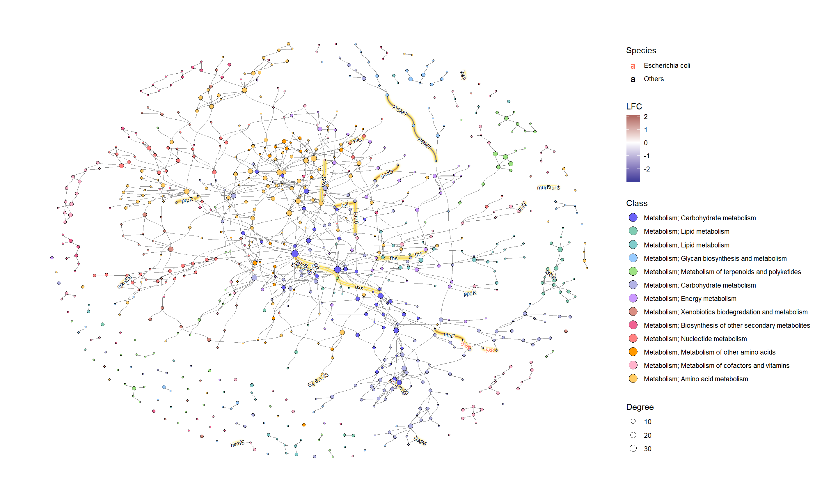
得到了 ko01100的tbl_graph,并对图进行了处理。首先,我们附加对应于复合关系的边。尽管大多数反应是可逆的,并且默认情况下在 process _ response 中增加了两条边,但是我们在这里指定single_edge=TRUE以便可视化。此外,还可以转换复合 ID 和 KO ID,并将属性附加到图形中。
g <- ggkegg::pathway("ko01100")
g <- g |> process_reaction(single_edge=TRUE)
g <- g |> mutate(x=NULL, y=NULL)
g <- g |> activate(nodes) |> mutate(compn=convert_id("compound",
                                          first_arg_comma = FALSE))
g <- g |> activate(edges) |> mutate(kon=convert_id("ko",edge=TRUE))
接下来,我们将 KO 和度等值附加到图形中。此外,我们还在图中附加了其他属性,比如哪些物种具有酶。这种类型的信息可以从分层输出的 HUMANN3获得。
g2 <- g |> activate(edges) |>
  mutate(kolfc=edge_numeric(lfcs), ## Pre-computed LFCs
         siglgl=.data$name %in% signame) |> ## Whether the KO is significant
  activate(nodes) |>
  filter(type=="compound") |> ## Subset to compound nodes and
  mutate(Degree=centrality_degree(mode="all")) |> ## Calculate degree
  activate(nodes) |>
  filter(Degree>2) |> ## Filter based on degree
  activate(edges) |>
  mutate(Species=ifelse(kon=="lyxK", "Escherichia coli", "Others"))
接下来,我们根据 ko01100检查这些 KO 的总体类别,并确定了 KO 数量最多的类别的糖代谢。
class_table <- (g |> activate(edges) |>
  mutate(siglgl=name %in% signame) |>
  filter(siglgl) |>
  data.frame())$fgcolor |>
  table() |> sort(decreasing=TRUE)
names(class_table) <- class[names(class_table)]
class_table
#>                     Metabolism; Carbohydrate metabolism
#>                                                      20
#>          Metabolism; Glycan biosynthesis and metabolism
#>                                                      16
#>        Metabolism; Metabolism of cofactors and vitamins
#>                                                      11
#>                       Metabolism; Amino acid metabolism
#>                                                       8
#>                       Metabolism; Nucleotide metabolism
#>                                                       7
#>    Metabolism; Metabolism of terpenoids and polyketides
#>                                                       3
#>                           Metabolism; Energy metabolism
#>                                                       3
#>   Metabolism; Xenobiotics biodegradation and metabolism
#>                                                       3
#>                     Metabolism; Carbohydrate metabolism
#>                                                       2
#>                            Metabolism; Lipid metabolism
#>                                                       1
#> Metabolism; Biosynthesis of other secondary metabolites
#>                                                       1
#>             Metabolism; Metabolism of other amino acids
#>                                                       1
5.6.2 绘图
我们首先使用 ko01100中的默认值和计算程度来可视化整个全局地图。
ggraph(g2, layout="fr")+
  geom_edge_link0(aes(color=I(fgcolor)), width=0.1)+
  geom_node_point(aes(fill=I(fgcolor), size=Degree), color="black", shape=21)+
  theme_graph()
为了有效地进行可视化,我们可以在 KEGG 路径中的各个组件上应用各种宝石图。在这个例子中,我们通过 ggfx 突出显示了由其 LFC 着色的重要边(KO) ,点大小对应于网络中的度,并且我们显示了重要 KO 名称的边标签。KO 名称由“物种”属性着色。这次我们把这个设置为大肠桿菌和其他。
ggraph(g2, layout="fr") +
  geom_edge_diagonal(color="grey50", width=0.1)+ ## Base edge
  ggfx::with_outer_glow(
    geom_edge_diagonal(aes(color=kolfc,filter=siglgl),
                       angle_calc = "along",
                       label_size=2.5),
    colour="gold", expand=3
  )+ ## Highlight significant edges
  scale_edge_color_gradient2(midpoint = 0, mid = "white",
                                    low=scales::muted("blue"),
                                    high=scales::muted("red"),
                                    name="LFC")+ ## Set gradient color
  geom_node_point(aes(fill=bgcolor,size=Degree),
                  shape=21,
                  color="black")+ ## Node size set to degree
  scale_size(range=c(1,4))+
  geom_edge_label_diagonal(aes(
    label=kon,
    label_colour=Species,
    filter=siglgl
  ),
  angle_calc = "along",
  label_size=2.5)+ ## Showing edge label, label color is Species attribute
  scale_label_colour_manual(values=c("tomato","black"),
                            name="Species")+ ## Scale color for edge label
  scale_fill_manual(values=hex,labels=class,name="Class")+ ## Show legend based on HEX
  theme_graph()+
  guides(fill = guide_legend(override.aes = list(size=5))) ## Change legend point size
如果我们想研究特定的类,子集由图中的 HEX 值。
## Subset and do the same thing
g2 |>
  morph(to_subgraph, siglgl) |>
  activate(nodes) |>
  mutate(tmp=centrality_degree(mode="all")) |>
  filter(tmp>0) |>
  mutate(subname=compn) |>
  unmorph() |>
  activate(nodes) |>
  filter(bgcolor=="#B3B3E6") |>
  mutate(Degree=centrality_degree(mode="all")) |> ## Calculate degree
  filter(Degree>0) |>
ggraph(layout="fr") +
  geom_edge_diagonal(color="grey50", width=0.1)+ ## Base edge
  ggfx::with_outer_glow(
    geom_edge_diagonal(aes(color=kolfc,filter=siglgl),
                       angle_calc = "along",
                       label_size=2.5),
    colour="gold", expand=3
  )+
  scale_edge_color_gradient2(midpoint = 0, mid = "white",
                             low=scales::muted("blue"),
                             high=scales::muted("red"),
                             name="LFC")+
  geom_node_point(aes(fill=bgcolor,size=Degree),
                  shape=21,
                  color="black")+
  scale_size(range=c(1,4))+
  geom_edge_label_diagonal(aes(
    label=kon,
    label_colour=Species,
    filter=siglgl
  ),
  angle_calc = "along",
  label_size=2.5)+ ## Showing edge label
  scale_label_colour_manual(values=c("tomato","black"),
                            name="Species")+ ## Scale color for edge label
  geom_node_text(aes(label=stringr::str_wrap(subname,10,whitespace_only = FALSE)),
    repel=TRUE, bg.colour="white", size=2)+
  scale_fill_manual(values=hex,labels=class,name="Class")+
  theme_graph()+
  guides(fill = guide_legend(override.aes = list(size=5)))

6. 注释
6.1通路中反应的解析
在 ggkegg 的 devel 分支中,默认情况下,ko00270中下列反应( https://www.genome.jp/entry/r00863)的 KGML 以下面的格式进行解析。
<reaction id="237" name="rn:R00863" type="irreversible">
    <substrate id="183" name="cpd:C00606"/>
    <product id="238" name="cpd:C00041"/>
    <product id="236" name="cpd:C09306"/>
</reaction>
library(ggkegg)
reac <- pathway("ko00270")
reac |> activate(edges) |> data.frame() |> filter(reaction=="rn:R00863")
#>   from  to         type subtype_name subtype_value
#> 1   91 128 irreversible    substrate          <NA>
#> 2  128 129 irreversible      product          <NA>
#> 3  128 127 irreversible      product          <NA>
#>    reaction reaction_id pathway_id
#> 1 rn:R00863         237    ko00270
#> 2 rn:R00863         237    ko00270
#> 3 rn:R00863         237    ko00270
这些边对应于化合物底物或产物与反应(矫形)节点之间的关系。这些边缘保留用于过程反应中的转换,其中基体和产品直接由边缘连接。
reac2 <- reac |> process_reaction()
node_df <- reac2 |> activate(nodes) |> data.frame()
reac2 |> activate(edges) |> data.frame() |>
    filter(reaction=="rn:R00863") |>
    mutate(from_name=node_df$name[from], to_name=node_df$name[to])
#>   from  to         type subtype_name subtype_value
#> 1   91 129 irreversible         <NA>          <NA>
#> 2   91 127 irreversible         <NA>          <NA>
#>    reaction reaction_id pathway_id      name bgcolor
#> 1 rn:R00863        <NA>       <NA> ko:K09758 #BFBFFF
#> 2 rn:R00863        <NA>       <NA> ko:K09758 #BFBFFF
#>   fgcolor  from_name    to_name
#> 1 #000000 cpd:C00606 cpd:C00041
#> 2 #000000 cpd:C00606 cpd:C09306
往期文章:
1. 复现SCI文章系列专栏
2. 《生信知识库订阅须知》,同步更新,易于搜索与管理。
3. 最全WGCNA教程(替换数据即可出全部结果与图形)
4. 精美图形绘制教程
5. 转录组分析教程
一个转录组上游分析流程 | Hisat2-Stringtie
小杜的生信筆記 ,主要发表或收录生物信息学的教程,以及基于R的分析和可视化(包括数据分析,图形绘制等);分享感兴趣的文献和学习资料!!


![IntelliJ IDEA [设置] 隐藏 .idea 等 .XXX 文件夹](https://img-blog.csdnimg.cn/direct/fdddeb46da574b2ca3f08d0269ca3875.png#pic_center)