1、ArkTS组件通用事件
1.1、点击事件
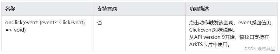
onClick(event:(event?:ClickEvent) => void)
不支持冒泡
点击动作触发该回调,支持在卡片中使用
ClickEvent对象说明
| 名称 | 类型 | 描述 |
| screenX | number | 点击位置相对于应用窗口左上角的X坐标 |
| screenY | number | 点击位置相对于应用窗口左上解的Y坐标 |
| x | number | 点击位置相对于被点击元素左上角的X坐标 |
| y | nuumber | 点击位置相对于被点击元素左上角的y坐标 |
| timestamp | number | 事件的时间戳,单位纳秒 |
| target | EventTarget | 触发事件的元素对象显示区域 区域是一个Area类型数据 |
| source | SourceType | 事件输入设备 |
@Entry
@Component
struct ClickTest {

  @State text: string = ''

  build() {
    Column() {
      Row({space:20}) {
        Button('Click').width(100).height(40)
          .onClick((event:ClickEvent) => {
            this.text = 'Click Point:' + '\n screenX:' + event.screenX + '\n screenY:' + event.screenY
            + '\n x:' + event.x + '\n y:' + event.y + '\ntarget:' + '\n component globalPos:('
            + event.target.area.globalPosition.x + ',' + event.target.area.globalPosition.y + ')\n width:'
            + event.target.area.width + '\n height:' + event.target.area.height + '\ntimestamp:' + event.timestamp;
          })
        Button('Click').width(200).height(50)
          .onClick((event:ClickEvent) => {
            this.text = 'Click Point:' + '\n screenX:' + event.screenX + '\n screenY:' + event.screenY
            + '\n x:' + event.x + '\n y:' + event.y + '\ntarget:' + '\n component globalPos:('
            + event.target.area.globalPosition.x + ',' + event.target.area.globalPosition.y + ')\n width:'
            + event.target.area.width + '\n height:' + event.target.area.height + '\ntimestamp:' + event.timestamp;
          })
      }.margin(20)
      Text(this.text).margin(15)
    }.width('100%')
  }
}
1.2、触摸事件
当手指在组件上按下、滑动、抬起时触发
onTouch(event:(event?:TouchEvent)=>void)
支持冒泡
手指触摸动作触发这个回调
TouchEvent对象说明
| 名称 | 类型 | 描述 |
| type | TouchType | 触摸事件的类型 |
| touches | Array<TouchObject> | 全部手指信息 |
| changedTouches | Array<TouchObject> | 当前发生变化的和指信息 |
| stopPropagation | () => void | 阻塞事件冒泡 |
| timestamp | number | 事件的时间戳,单位纳秒 距离系统启动的时间间隔 |
| target | EventTarget | 触发事件的元素对象显示区域 |
| source | SourceType | 事件输入设备 |
TouchObject对象说明
| 名称 | 类型 | 描述 |
| type | TouchType | 触摸事件的类型 |
| id | number | 手指唯一标识符 |
| screenX | number | 触摸点相对于应用窗口左上角的X坐标 |
| screenY | number | 触摸点相对于应用窗口左上角的Y坐标 |
| x | number | 触摸点相对于被触摸元素左上角的X坐标 |
| y | number | 触摸点相对于被触摸元素左上解的Y坐标 |
@Entry
@Component
struct TouchTest {
  @State text: string = ''
  @State eventType: string = ''

  build() {
    Column(){
      Button('Touch').height(40).width(100)
        .onTouch((event:TouchEvent) => {
          if(event.type === TouchType.Down) {
            this.eventType = 'Down'
          }
          if(event.type === TouchType.Up) {
            this.eventType = 'Up'
          }
          if(event.type === TouchType.Move) {
            this.eventType = 'Move'
          }
          this.text = 'TouchType:\t' + this.eventType + '\nDistance between touch point and touch element:\nx:\t'
          + event.touches[0].x + '\n' + 'y:\t' + event.touches[0].y + '\nComponent globalPos: ('
          + event.target.area.globalPosition.x + ',' + event.target.area.globalPosition.y + ')\nwidth:\t'
          + event.target.area.width + '\nheight:\t' + event.target.area.height
        })

      Text(this.text)
    }
    .width('100%').padding(30)
  }
}
1.3、挂载卸载事件
挂载卸载事件指组件从组件树上挂载、卸载时触发的事件
onAppear(event:()=>void)
组件挂载显示时触发此回调
不支持冒泡
onDisAppear(event:()=>void)
组件卸载消失时触发此回调
不支持冒泡
import promptAction from '@ohos.promptAction'
@Entry
@Component
struct AppearTest {
  @State isShow: boolean = true
  @State changeAppear: string = '点我卸载挂载组件'
  private myText: string = 'Text for onAppear'

  build() {
    Column(){
      Button(this.changeAppear)
        .onClick(() => {
          this.isShow = !this.isShow
        }).margin(15)
      if(this.isShow) {
        Text(this.myText).fontSize(26).fontWeight(FontWeight.Bold)
          .onAppear(() => {
            promptAction.showToast({
              message: '展示这个文本',
              duration: 2000
            })
          })
          .onDisAppear(() => {
            promptAction.showToast({
              message: '隐藏这个文本',
              duration: 2000
            })
          })
      }
    }.width('100%').padding(30)
  }
}
1.4、拖拽事件
拖拽事件指组件被长按后拖拽时触发的事件
onDragStart(event:(event?:DragEvent,extraParams?:string) => CustomBuilder | DragItemInfo)
第一次拖拽此事件绑定的组件时,触发回调
event:拖拽事件信息,包括拖拽点坐标
extraParams:拖拽事件额外信息
返回值用来显示拖拽时的提示组件
不支持冒泡
onDragEnter(event:(event?:DragEvent,extraParams?:string) => void)
拖拽进入组件范围时触发回调
event:拖拽事件信息,包括拖拽点坐标
extraParams:拖拽事件额外信息
当监听onDrop事件时,此事件才有效
不支持冒泡
onDragMove(event:(event?:DragEvent,extraParams?:string) => void)
拖拽在组件范围内移动时,触发回调
event:拖拽事件信息,包括拖拽点坐标
extraParams:拖拽事件额外信息
当监听了onDrop事件时,此事件才有效
不支持冒泡
onDragLeave(event:(event?:DragEvent,extraParams?:string) => void)
拖拽离开组件范围内时,触发回调
event:拖拽事件信息,包括拖拽点坐标
extraParams:拖拽事件额外信息
当监听了onDrop事件时,此事件才有效
不支持冒泡
onDrop(event:(event?:DragEvent,extraParams?:string) => void)
绑定此事件的组件可作为拖拽释放目标,当在本组件范围内停止拖拽行为时,触发回调
event:拖拽事件信息,包括拖拽点坐标
extraParams:拖拽事件额外信息
不支持冒泡
DragItemInfo说明
| 名称 | 类型 | 描述 |
| pixelMap | PixelMap | 非必填 设置拖拽过程中显示的图片 |
| builder | CustomBuilder | 非必填 拖拽过程中显示自定义组件 如果设置了pixelMap则忽略此值 |
| extraInfo | string | 拖拽项的描述 |
extraParams说明
拖拽事件额外信息,它是Json对象转换的string字符串,可通过Json.parse转换为Json对象获取如下属性
| 名称 | 类型 | 描述 |
| selectedIndex | number | 当拖拽事件设在父容器的子元素时,selectedIndex表示当前被拖拽子元素是父容器第selectedIndex个子元素,selectedIndex从0开始。仅在ListItem组件的拖拽事件中生效 |
| insertIndex | number | 当前拖拽元素在List组件中放下时,insertIndex表示被拖拽元素插入该组件的第insertIndex个位置,insertIndex从0开始。仅在List组件的拖拽事件中生效 |
DragEvent说明
| 名称 | 类型 | 描述 |
| getX() | number | 当前拖拽点相对于屏幕左上角的x轴坐标,单位为vp |
| getY() | number | 当前拖拽点相对于屏幕左上角的y轴坐标,单位为vp |
@Observed
class ClassA {
  public name: string
  public bol: boolean

  constructor(name:string,bol:boolean) {
    this.name = name
    this.bol = bol
  }
}

@Extend(Text) function textStyle(){
  .width('25%')
  .height(35)
  .fontSize(16)
  .textAlign(TextAlign.Center)
  .backgroundColor('#1d953f')
}

@Component
struct Child {
  @ObjectLink a: ClassA
  @Builder pixelMapBuilder() {
    Column() {
      Text(this.a.name)
        .width('50%')
        .height(60)
        .fontSize(16)
        .borderRadius(10)
        .textAlign(TextAlign.Center)
        .backgroundColor(Color.Yellow)
    }
  }

  build(){
    Column(){
      Text(this.a.name)
        .textStyle()
        .visibility(this.a.bol ? Visibility.Visible : Visibility.None)
        .onDragStart(() => {
          this.a.bol = false
          return this.pixelMapBuilder()
        })
        .onTouch((event: TouchEvent) => {
          if(event.type === TouchType.Up) {
            this.a.bol = true
          }
        })
      Text('')
        .width('25%')
        .height(35)
        .fontSize(16)
        .textAlign(TextAlign.Center)
        .border({width:5, color: 'red'})
        .visibility(!this.a.bol ? Visibility.Visible : Visibility.None)
    }
  }

}


@Entry
@Component
struct DragTest {
  @State arr: ClassA[] = [new ClassA('A',true),new ClassA('B',true),new ClassA('C',true)]
  @State dragIndex: number = 0

  changeIndex(index1: number, index2:number) {
    // 交换数组位置
    [this.arr[index1],this.arr[index2]] = [this.arr[index2],this.arr[index1]];
  }

  build() {
    Column() {
      Row({space:15}) {
        List({space:20}) {
          ForEach(this.arr,(item,index) => {
            ListItem() {
              Column(){
                Child({a: this.arr[index]})
              }
              .onTouch((event:TouchEvent) => {
                if(event.type === TouchType.Down){
                  this.dragIndex = index; // 当前拖拽的组件
                }
              })
            }
          })
        }
        .listDirection(Axis.Horizontal)
        .onDrop((event:DragEvent,extraParams:string) => {
          let js = JSON.parse(extraParams);
          this.changeIndex(this.dragIndex,js.insertIndex)
        })
      }
      .padding({top:10, bottom:10}).margin(10)
    }
    .width('100%').height('100%').padding({top:20}).margin({top:20})
  }
}
1.5、按键事件
按键事件指组件与键盘、遥控器等按键设备交互时触发的事件,适用于所有可获焦组件。对于Text,Image等默认不可获焦的组件,可以设置focusable属性为true后使用按键事件。
onKeyEvent(event:(event?:KeyEvent) => void)
绑定该方法的组件获焦后,按键动作触发该回调
支持冒泡
KeyEvent对象说明
| 名称 | 类型 | 描述 |
|
type |
KeyType |
按键的类型。 |
|
keyCode |
number |
按键的键码。 |
|
keyText |
string |
按键的键值。 |
|
keySource |
KeySource |
触发当前按键的输入设备类型。 |
|
deviceId |
number |
触发当前按键的输入设备ID。 |
|
metaKey |
number |
按键发生时元键(即Windows键盘的WIN键、Mac键盘的Command键)的状态,1表示按压态,0表示未按压态。 |
|
timestamp |
number |
事件时间戳。触发事件时距离系统启动的时间间隔,单位纳秒。 |
|
stopPropagation |
() => void |
阻塞事件冒泡传递。 |
@Entry
@Component
struct KeyEventTest {
  @State text: string = ''
  @State eventType: string = ''

  build() {
    Column() {
      Button('keyEvent')
        .onKeyEvent((event:KeyEvent) =>{
          if(event.type === KeyType.Down) {
            this.eventType = 'Down'
          }
          if(event.type === KeyType.Up) {
            this.eventType = 'Up'
          }
          this.text = 'KeyType:' + this.eventType + '\n keyCode:' + event.keyCode
          + '\nkeyText:' + event.keyText
        })
      Text(this.text).padding(15)
    }
    .height(300).width('100%').padding(35)
  }
}
1.6、焦点事件
焦点事件指页面焦点在可获焦组件间移动时触发的事件,组件可使用焦点事件来处理相关逻辑。
onFocus(event:() => void)
当前组件获取焦点时触发回调
不支持冒泡
onBlur(event:() => void)
当前组件失去焦点时触发的回调
不支持冒泡
@Entry
@Component
struct FocusTest {

  @State oneButtonColor: string = '#FFC0CB'
  @State twoButtonColor: string = '#87CEFA'
  @State threeButtonColor: string = '#90EE90'

  build() {
    Column({space: 20}) {
      Button('按钮一')
        .backgroundColor(this.oneButtonColor)
        .width(260).height(60).fontColor(Color.Black)
        .focusable(true)  // 使用组件可以获得焦点
        .onFocus(() => {
          this.oneButtonColor = '#FF0000'
        })
        .onBlur(() => {
          this.oneButtonColor = '#FFC0CB'
        })
      Button('按钮二')
        .backgroundColor(this.twoButtonColor)
        .width(260).height(60).fontColor(Color.Black)
        .focusable(true)  // 使用组件可以获得焦点
        .onFocus(() => {
          this.twoButtonColor = '#FF0000'
        })
        .onBlur(() => {
          this.twoButtonColor = '#87CEFA'
        })
      Button('按钮三')
        .backgroundColor(this.threeButtonColor)
        .width(260).height(60).fontColor(Color.Black)
        .focusable(true)  // 使用组件可以获得焦点
        .onFocus(() => {
          this.threeButtonColor = '#FF0000'
        })
        .onBlur(() => {
          this.threeButtonColor = '#90EE90'
        })
    }
    .width('100%').margin({top: 20})
  }
}
1.7、鼠标事件
在鼠标的单个动作触发多个事件时,事件的顺序是固定的,鼠标事件默认透传。
onHover(event:(isHover?:boolean) => void)
鼠标进入或退出组件时触发该回调
isHover:表示鼠标是否悬浮在组件之上,鼠标进入时为true,退出时为false
不支持冒泡
onMouse(event:(event?:MouseEvent) => void)
当前组件被鼠标按键点击时或者鼠标在组件上悬浮移动时,触发该回调
event返回值包含触发事件时的时间戳、鼠标按键、动作、鼠标位置在整个屏幕上的坐标和相对于当前组件的坐标
MouseEvent对象说明
| 名称 | 属性类型 | 描述 |
| screenX | number | 鼠标位置相对于应用窗口左上角的x轴坐标 |
| screenY | number | 鼠标位置相对于应用窗口左上角的y轴坐标 |
| x | number | 鼠标位置相对于当前组件左上角的x轴坐标 |
| y | number | 鼠标位置相对于当前组件左上角的x轴坐标 |
| button | MouseButton | 鼠标按键 |
| action | MouseAction | 鼠标动作 |
| stopPropagation | () => void | 阻塞事件冒泡 |
| timestamp | number | 事件时间戳,单位纳秒,触发时间到距离系统启动时间间隔 |
| target | EventTarget | 触发事件的元素对象显示区域 |
| source | SourceType | 事件输入设备 |
@Entry
@Component
struct MouseEventTest {

  @State hoverText: string = 'no hover'
  @State mouseText: string = ''
  @State action: string = ''
  @State mouseBtn: string = ''
  @State color: Color = Color.Blue

  build() {
    Column({space: 20}){
      Button(this.hoverText)
        .width(180).height(80)
        .backgroundColor(this.color)
        .onHover((isHover: boolean) => {
          // 通过onHover来动态修改按钮文本的颜色
          if(isHover) {
            this.hoverText = 'hover'
            this.color = Color.Pink
          } else {
            this.hoverText = 'no hover'
            this.color = Color.Blue
          }
        })
      Button('onMouse')
        .width(180).height(80)
        .onMouse((event: MouseEvent) => {
          switch (event.button) {
            case MouseButton.None:
              this.mouseBtn = 'None';
              break;
            case MouseButton.Left:
              this.mouseBtn = 'Left';
              break;
            case MouseButton.Right:
              this.mouseBtn = 'Right';
              break;
            case MouseButton.Back:
              this.mouseBtn = 'Back';
              break;
            case MouseButton.Forward:
              this.mouseBtn = 'Forward';
              break;
            case MouseButton.Middle:
              this.mouseBtn = 'Middle';
              break;
            default:
              break;
          }
          switch (event.action) {
            case MouseAction.Hover:
              this.action = 'Hover'
              break;
            case MouseAction.Press:
              this.action = 'Press'
              break;
            case MouseAction.Release:
              this.action = 'Release'
              break;
            default:
              break;
          }
          this.mouseText = 'onMouse:\nButton = ' + this.mouseBtn +
          '\nAction = ' + this.action + '\nXY=(' + event.x + ',' + event.y + ')' +
          '\nscreenXY=(' + event.screenX + ',' + event.screenY + ')';
        })
      Text(this.mouseText)
    }
    .padding({top:30}).width('100%')
  }
}
1.8、组件区域变化事件
组件区域变化事件指组件显示的尺寸、位置等发生变化时触发的事件
onAreaChange(event:(oldValue:Area,newValue:Area) => void)
组件区域变化时触发该回调。仅会响应由布局变化所导致的组件大小、位置发生变化时的回调,由绘制变化所导致的渲染属性变化不会响应回调。比如说translate、offset不会响应
Area:目标元素的宽高以及目标元素相对父元素和页面左上角的坐标位置
@Entry
@Component
struct AreaTest {
  @State value: string = 'Text'
  @State sizeValue: string = ''

  build() {
    Column() {
      Text(this.value)
        .backgroundColor(Color.Green).margin(30).fontSize(20)
        .onClick(() => {
          this.value = this.value + 'Text'
        })
        .onAreaChange((oldValue: Area, newValue: Area) => {
          this.sizeValue = JSON.stringify(newValue)
        })
      Text('new area is: \n' + this.sizeValue).margin({right: 30, left: 30})
    }
    .width('100%').height('100%').margin({top: 30})
  }
}
1.9、组件可见区域变化事件
组件可见区域变化事件是组件在屏幕中的显示区域面积变化时触发的事件,提供了判断组件是否完全或部分显示在屏幕中的能力,适用于广告曝光埋点之类的场景。
onVisibleAreaChange(ratios:Array<number>,event:(isVisible:boolean,currentRatio:number) => void)
组件可见区域变化时触发该回调
ratos: 阀值数组,每个阈值代表组件可见面积与组件自身面积的比值。当组件可见面积与自身面积的比值大于或小于阈值时,均会触发该回调
阀值的取值范围:[0.0,1.0]
isVisible:示组件的可见面积与自身面积的比值是否大于阈值,true表示大于,false表示小于
currentRatio:触发回调时,组件可见面积与自身面积的比值
注意:该接口只适用于组件布局区域超出或离开了当前屏幕显示区域的情况,不支持组件堆叠(Stack)导致的面积不可见、使用offset或translate等图形变换接口导致的面积超出情况。
@Entry
@Component
struct VisibleAreaTest {
  scroller: Scroller = new Scroller()
  private arr: number[] = [0,1,2,3,4,5,6,7,8,9]
  @State testTextStr: string = 'test'
  @State testRowStr: string = 'test'

  build() {
    Column(){
      Column(){
        Text(this.testTextStr)
          .fontSize(20)
        Text(this.testRowStr)
          .fontSize(20)
      }
      .height(100)
      .backgroundColor(Color.Gray)
      .opacity(0.3)

      Scroll(this.scroller) {
        Column(){
          Text('Test Text Visible Change')
            .fontSize(20)
            .height(200)
            .margin({top: 50, bottom: 20})
            .backgroundColor(Color.Green)
              // ratios设置为[0.0,1.0]表示完全显示或完全消失时触发回调
            .onVisibleAreaChange([0.0,1.0],(isVisible: boolean,currentRatio: number) => {
              if(isVisible && currentRatio >= 1.0) {
                this.testTextStr = 'Test Text 完全显示'
              }
              if(!isVisible && currentRatio <= 0.0) {
                this.testTextStr = 'Test Text 完全消失'
              }
            })
          Row() {
            Text('Test Row Visible Change')
              .fontSize(20)
              .margin({bottom: 20})
          }
          .height(200)
          .backgroundColor(Color.Yellow)
          .onVisibleAreaChange([0.0,1.0],(isVisible:boolean,currentRatio:number) => {
            if (isVisible && currentRatio >= 1.0) {
              this.testRowStr = 'Test Row 完全显示'
            }
            if (!isVisible && currentRatio <= 0.0) {
              this.testRowStr = 'Test Row 完全消失'
            }
          })

          ForEach(this.arr, (item) => {
            Text(item.toString())
              .width('90%')
              .height(150)
              .backgroundColor(0xFFFFFF)
              .borderRadius(15)
              .textAlign(TextAlign.Center)
              .margin({top:10})
          },item => item)
        }
        .width('100%')
      }

    .backgroundColor(0x317aff)
    .scrollable(ScrollDirection.Vertical)
    .scrollBar(BarState.On)
    .scrollBarColor(Color.Gray)
    .scrollBarWidth(10)
    .onScroll((xOffset: number, yOffset: number) => {
      console.info(xOffset + ' ' + yOffset)
    })
    .onScrollEdge((side: Edge) => {
    })
    .onScrollEnd(() => {
    })
  }.width('100%').height('100%').backgroundColor(0xDCDCDC)

  }
}