ArkUI组件使用
这里会详细演示以下组件使用:
- Image
- Text
- TextInput
- Button
- Slider
- Column&&Row
- List
- 自定义组件以及相关函数使用
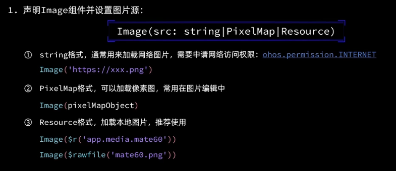
Image
可以是网络图片、可以是本地图片、也可以是像素图
 Image("https://ts1.cn.mm.bing.net/th?id=OIP-C.cYA-_PINA-ND9OeBaolDTwHaHa&w=250&h=250&c=8&rs=1&qlt=90&o=6&pid=3.1&rm=2")
          .width(200)
          .interpolation(ImageInterpolation.High)

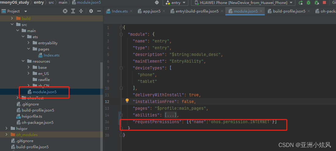
加载网络图片真机上需要申请网络访问权限: 在module.json5文件中module对象中编写
"requestPermissions": [
      {
        "name": "ohos.permission.INTERNET"
      }
    ],
这样真机才能加载网络图片
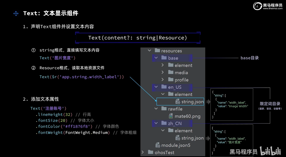
Text
用于显示文本,支持直接填写、也支持读取本地资源文件(用于多语言)

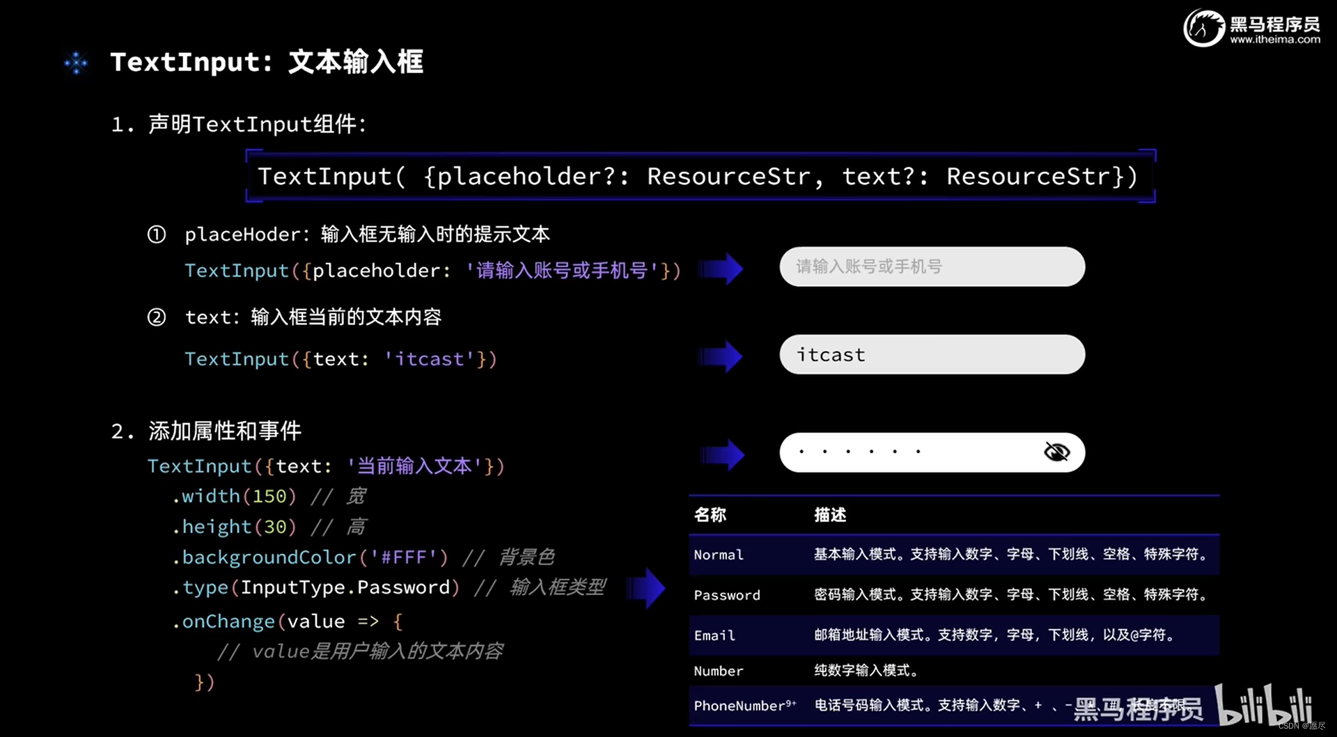
TextInput
输入框,通过设置
type属性可以是密码输入框、数字输入框、文本输入框等
- Normal:基本输入
- Password:密码输入
- Email: 邮箱输入
- Number:数字输入 -PhoneNumber: 电话号码输入

通过onChange事件可以实现自己想要的交互
Button
按钮,通过设置
type属性可以是不同的按钮类型
- Capsule:胶囊性
- Circle: 圆形
- Normal:普通按钮

Slider
滑块组件使用

通过上方属性可以进行配置使用,在onChange方法内可以实现自己的交互
Column&&Row布局
通过这个可以实现位置布局

justifyContent:设置子元素在主轴方向的对齐格式alignItem:设置子元素在交叉轴方向的对齐格式
Column


Row


布局案例(控制图片大小)
Divider分割线
@Entry
@Component
struct Index {
  @State imageWidth: number = 30

  build() {
    Column() {
      Row(){

        Image("https://i2.hdslb.com/bfs/archive/6c8d928748fcfa5b3366d141f7f3b08008fdd416.jpg@672w_378h_1c_!web-home-common-cover.webp")
          .width(this.imageWidth)
          .interpolation(ImageInterpolation.High)
      }
      .width('100%')
      .height(400)
      .justifyContent(FlexAlign.Center)
      Row(){
        Text($r('app.string.width_label'))
          .fontSize(30)
          .fontWeight('bold')
        TextInput({placeholder:"请输入图片宽度",text:this.imageWidth.toString()})
          .width(200)
          .backgroundColor("red")
          .type(InputType.Number)
          .onChange(value=>{
            this.imageWidth=parseInt(value)
          })
      }
      .width("100%")
      .padding({left:14,right:14})
      .justifyContent(FlexAlign.SpaceBetween)
      Divider()
        .width("91%")
        .margin(20)
      Row(){
        Button('缩小')
          .width(80)
          .fontSize(20)
          .onClick(()=>{
            this.imageWidth-=5;
          })
        Button('放大')
          .width(80)
          .fontSize(20)
          .onClick(()=>{
            this.imageWidth+=5;
          })
      }
      .justifyContent(FlexAlign.SpaceEvenly)
      .width('100%')
      Divider()
        .width("91%")
        .margin(20)
      Slider({min:100,max:300,value:this.imageWidth,step:10})
        .width("100%")
        .blockColor("red")
        .trackThickness(8)
        .showTips(true)
        .onChange(val=>{
          this.imageWidth=val
        })
    }
    .width('100%')
    .height('100%')
  }
}

List
列表组件,超出可滚动组件
- 使用之前了解一下
渲染控制- forEach
- if-else

通过以上可遍历多个item展示,不通过
list无法超出滚动 以下通过List修饰实现一个订单列表(通过if-else决定条件渲染):
  private items:Array<ItemList>=[
    new ItemList('华为Mate60','https://ts1.cn.mm.bing.net/th?id=OIP-C.cYA-_PINA-ND9OeBaolDTwHaHa&w=250&h=250&c=8&rs=1&qlt=90&o=6&pid=3.1&rm=2',99),
    new ItemList('华为Mate61','https://ts1.cn.mm.bing.net/th?id=OIP-C.cYA-_PINA-ND9OeBaolDTwHaHa&w=250&h=250&c=8&rs=1&qlt=90&o=6&pid=3.1&rm=2',199,20),
    new ItemList('华为Mate62','https://ts1.cn.mm.bing.net/th?id=OIP-C.cYA-_PINA-ND9OeBaolDTwHaHa&w=250&h=250&c=8&rs=1&qlt=90&o=6&pid=3.1&rm=2',39),
    new ItemList('华为Mate62','https://ts1.cn.mm.bing.net/th?id=OIP-C.cYA-_PINA-ND9OeBaolDTwHaHa&w=250&h=250&c=8&rs=1&qlt=90&o=6&pid=3.1&rm=2',39),
    new ItemList('华为Mate62','https://ts1.cn.mm.bing.net/th?id=OIP-C.cYA-_PINA-ND9OeBaolDTwHaHa&w=250&h=250&c=8&rs=1&qlt=90&o=6&pid=3.1&rm=2',39),
    new ItemList('华为Mate62','https://ts1.cn.mm.bing.net/th?id=OIP-C.cYA-_PINA-ND9OeBaolDTwHaHa&w=250&h=250&c=8&rs=1&qlt=90&o=6&pid=3.1&rm=2',39)
  ]
  build() {
    Column() {
      //头部
      Row(){
        Text("商品列表")
          .fontSize(30)
          .fontWeight("bold")
      }
      .width('100%')
      .height(30)
      .margin({bottom:20})
      List({space:8}){
        ForEach(
          this.items,
          (item: ItemList)=>{
            ListItem() {
              Row({space:10}){
                Image(item.image)
                  .width(100)
                Column({space:4}){
                  if(item.discount){
                    Text(item.name)
                      .fontSize(20)
                      .fontWeight('bold')
                    Text(`原价:¥${item.price}`)
                      .fontSize(14)
                      .fontColor('#CCC')
                      .decoration({type:TextDecorationType.LineThrough})
                    Text(`折扣价:¥${item.price-item.discount}`)
                      .fontSize(18)
                      .fontWeight('bold')
                      .fontColor('red')
                    Text(`补贴:¥${item.discount}`)
                      .fontSize(18)
                      .fontColor('red')
                  }else{
                    Text(item.name)
                      .fontSize(20)
                      .fontWeight('bold')
                    Text(`¥${item.price}`)
                      .fontSize(18)
                      .fontColor('red')
                  }

                }
                .height('100%')
                .alignItems(HorizontalAlign.Start)
              }
              .width("100%")
              .backgroundColor('#FFF')
              .borderRadius(20)
              .height(120)
              .padding(10)
              .borderRadius(10 )
              .margin(20)
            }
          }
        )
      }
      .width("100%")
      .layoutWeight(1)
    }
    .width('100%')
    .height('100%')
    .backgroundColor('#EFEFEF')
    .padding(20)
  }
}

自定义组件以及相关函数使用
将上方示例进行拆解实现组件封装~

1.将顶部栏进行封装,新建文件进行编写,或者在内部编写封装,这里我封装成公用的

@Component
export struct Header{
  private title:ResourceStr
  build(){
    Row(){
      Text('返回')
        .fontSize(25)
      Text(this.title)
        .fontSize(30)
        .fontWeight("bold")

      Blank()
      Text('刷新')
        .fontSize(25)
        .fontWeight('bold')
    }
    .width('100%')
    .height(30)
  }
}
使用:
import {Header} from "../components/Headers"
引入直接使用即可 再将列表封装,这里就直接封装成自定义构建函数
//全局自定义构建函数
@Builder function ItemCard(item:ItemList){
  Row({space:10}){
    Image(item.image)
      .width(100)
    Column({space:4}){
      if(item.discount){
        Text(item.name)
          .fontSize(20)
          .fontWeight('bold')
        Text(`原价:¥${item.price}`)
          .fontSize(14)
          .fontColor('#CCC')
          .decoration({type:TextDecorationType.LineThrough})
        Text(`折扣价:¥${item.price-item.discount}`)
          .fontSize(18)
          .fontWeight('bold')
          .fontColor('red')
        Text(`补贴:¥${item.discount}`)
          .fontSize(18)
          .fontColor('red')
      }else{
        Text(item.name)
          .fontSize(20)
          .fontWeight('bold')
        Text(`¥${item.price}`)
          .fontSize(18)
          .fontColor('red')
      }

    }
    .height('100%')
    .alignItems(HorizontalAlign.Start)
  }
  .width("100%")
  .backgroundColor('#FFF')
  .borderRadius(20)
  .height(120)
  .padding(10)
  .borderRadius(10 )
  .margin(20)
}
再封装个全局的公共样式函数
//全局公共样式函数
@Styles function fillScreen(){
  .width('100%')
  .height('100%')
  .backgroundColor('#EFEFEF')
  .padding(20)
}
最后整合代码
class ItemList{
  name:string
  image: ResourceStr
  price: number
  discount: number

  constructor(name:string,image: ResourceStr,price:number,discount:number=0) {
    this.name=name
    this.image=image
    this.price=price
    this.discount=discount
  }
}
import {Header} from "../components/Headers"

//全局自定义构建函数
@Builder function ItemCard(item:ItemList){
  Row({space:10}){
    Image(item.image)
      .width(100)
    Column({space:4}){
      if(item.discount){
        Text(item.name)
          .fontSize(20)
          .fontWeight('bold')
        Text(`原价:¥${item.price}`)
          .fontSize(14)
          .fontColor('#CCC')
          .decoration({type:TextDecorationType.LineThrough})
        Text(`折扣价:¥${item.price-item.discount}`)
          .fontSize(18)
          .fontWeight('bold')
          .fontColor('red')
        Text(`补贴:¥${item.discount}`)
          .fontSize(18)
          .fontColor('red')
      }else{
        Text(item.name)
          .fontSize(20)
          .fontWeight('bold')
        Text(`¥${item.price}`)
          .fontSize(18)
          .fontColor('red')
      }

    }
    .height('100%')
    .alignItems(HorizontalAlign.Start)
  }
  .width("100%")
  .backgroundColor('#FFF')
  .borderRadius(20)
  .height(120)
  .padding(10)
  .borderRadius(10 )
  .margin(20)
}
//全局公共样式函数
@Styles function fillScreen(){
  .width('100%')
  .height('100%')
  .backgroundColor('#EFEFEF')
  .padding(20)
}
@Entry
@Component
struct ItemPage {
  private items:Array<ItemList>=[
    new ItemList('华为Mate60','https://ts1.cn.mm.bing.net/th?id=OIP-C.cYA-_PINA-ND9OeBaolDTwHaHa&w=250&h=250&c=8&rs=1&qlt=90&o=6&pid=3.1&rm=2',99),
    new ItemList('华为Mate61','https://ts1.cn.mm.bing.net/th?id=OIP-C.cYA-_PINA-ND9OeBaolDTwHaHa&w=250&h=250&c=8&rs=1&qlt=90&o=6&pid=3.1&rm=2',199,20),
    new ItemList('华为Mate62','https://ts1.cn.mm.bing.net/th?id=OIP-C.cYA-_PINA-ND9OeBaolDTwHaHa&w=250&h=250&c=8&rs=1&qlt=90&o=6&pid=3.1&rm=2',39),
    new ItemList('华为Mate62','https://ts1.cn.mm.bing.net/th?id=OIP-C.cYA-_PINA-ND9OeBaolDTwHaHa&w=250&h=250&c=8&rs=1&qlt=90&o=6&pid=3.1&rm=2',39),
    new ItemList('华为Mate62','https://ts1.cn.mm.bing.net/th?id=OIP-C.cYA-_PINA-ND9OeBaolDTwHaHa&w=250&h=250&c=8&rs=1&qlt=90&o=6&pid=3.1&rm=2',39),
    new ItemList('华为Mate62','https://ts1.cn.mm.bing.net/th?id=OIP-C.cYA-_PINA-ND9OeBaolDTwHaHa&w=250&h=250&c=8&rs=1&qlt=90&o=6&pid=3.1&rm=2',39)
  ]
  build() {
    Column() {
      //头部
      Header({title:"商品列表"})
      .margin({bottom:20})
      List({space:8}){
        ForEach(
          this.items,
          (item: ItemList)=>{
            ListItem() {
              ItemCard(item)
            }
          }
        )
      }
      .width("100%")
      .layoutWeight(1)
    }
    .fillScreen()
  }
}
这样即可实现组件式开发,学过前端的基本都有这样的概念
总结自定义组件使用


通过以上内容即可学会
ArkUI组件的基本使用了。
为了能让大家更好的学习鸿蒙 (Harmony OS) 开发技术,这边特意整理了《鸿蒙 (Harmony OS)开发学习手册》(共计890页),希望对大家有所帮助:https://qr21.cn/FV7h05
《鸿蒙 (Harmony OS)开发学习手册》
- 应用开发导读(ArkTS)
- 应用开发导读(Java)

HarmonyOS 概念:https://qr21.cn/FV7h05
- 系统定义
- 技术架构
- 技术特性
- 系统安全

如何快速入门:https://qr21.cn/FV7h05
- 基本概念
- 构建第一个ArkTS应用
- 构建第一个JS应用
- ……

开发基础知识:https://qr21.cn/FV7h05
- 应用基础知识
- 配置文件
- 应用数据管理
- 应用安全管理
- 应用隐私保护
- 三方应用调用管控机制
- 资源分类与访问
- 学习ArkTS语言
- ……

基于ArkTS 开发:https://qr21.cn/FV7h05
- Ability开发
- UI开发
- 公共事件与通知
- 窗口管理
- 媒体
- 安全
- 网络与链接
- 电话服务
- 数据管理
- 后台任务(Background Task)管理
- 设备管理
- 设备使用信息统计
- DFX
- 国际化开发
- 折叠屏系列
- ……


