目录
CSS position 属性用于指定一个元素在文档中的定位方式。top,right,bottom 和 left 属性则决定了该元素的最终位置。
1、定位类型
- 定位元素(positioned element)是其计算后位置属性为
relative,absolute,fixed或sticky的一个元素(换句话说,除static以外的任何东西)。 - 相对定位元素(relatively positioned element)是计算后位置属性为
relative的元素。 - 绝对定位元素(absolutely positioned element)是计算后位置属性为
absolute或fixed的元素。 - 粘性定位元素(stickily positioned element)是计算后位置属性为
sticky的元素。
大多数情况下,height和width 被设定为 auto 的绝对定位元素,按其内容大小调整尺寸。但是,被绝对定位的元素可以通过指定top和bottom ,保留height未指定(即auto),来填充可用的垂直空间。它们同样可以通过指定left 和 right并将width 指定为auto来填充可用的水平空间。
除了刚刚描述的情况(绝对定位元素填充可用空间):
- 如果
top和bottom都被指定(严格来说,这里指定的值不能为auto),top优先。 - 如果指定了
left和right,当 direction设置为ltr(水平书写的中文、英语)时left优先,当direction设置为rtl(阿拉伯语、希伯来语、波斯语由右向左书写)时right优先。
2、取值
2.1、static
该关键字指定元素使用正常的布局行为,即元素在文档常规流中当前的布局位置。此时 top, right, bottom, left 和 z-index 属性无效。
2.2、relative
该关键字下,元素先放置在未添加定位时的位置,再在不改变页面布局的前提下调整元素位置(因此会在此元素未添加定位时所在位置留下空白)。position:relative 对 table-*-group, table-row, table-column, table-cell, table-caption 元素无效。
2.3、absolute
元素会被移出正常文档流,并不为元素预留空间,通过指定元素相对于最近的非 static 定位祖先元素的偏移,来确定元素位置。绝对定位的元素可以设置外边距(margins),且不会与其他边距合并。
2.4、fixed
元素会被移出正常文档流,并不为元素预留空间,而是通过指定元素相对于屏幕视口(viewport)的位置来指定元素位置。元素的位置在屏幕滚动时不会改变。打印时,元素会出现在的每页的固定位置。fixed 属性会创建新的层叠上下文。当元素祖先的 transform、perspective、filter 或 backdrop-filter 属性非 none 时,容器由视口改为该祖先。
2.5、stickty
元素根据正常文档流进行定位,然后相对它的最近滚动祖先(nearest scrolling ancestor)和 containing block(最近块级祖先 nearest block-level ancestor),包括 table-related 元素,基于 top、right、bottom 和 left 的值进行偏移。偏移值不会影响任何其他元素的位置。 该值总是创建一个新的层叠上下文(stacking context)。注意,一个 sticky 元素会“固定”在离它最近的一个拥有“滚动机制”的祖先上(当该祖先的 overflow 是 hidden、scroll、auto 或 overlay 时),即便这个祖先不是最近的真实可滚动祖先。这有效地抑制了任何“sticky”行为(详情见 Github issue on W3C CSSWG)。
3、示例
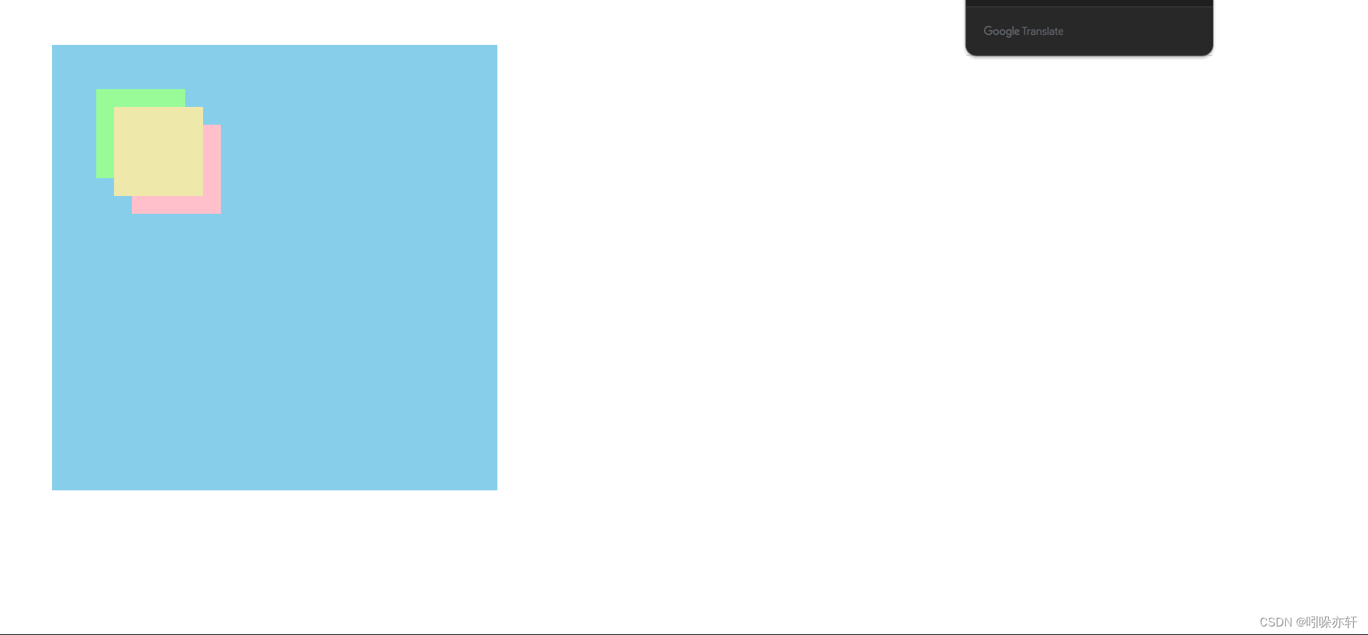
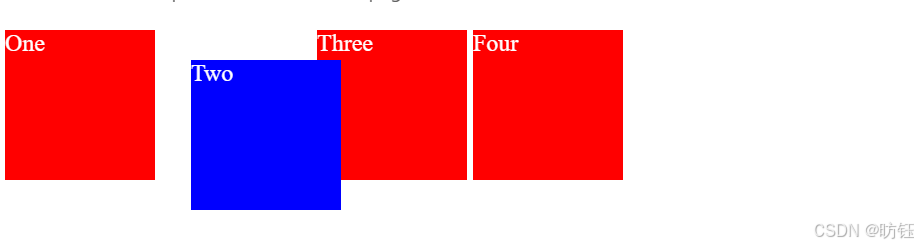
3.1、相对定位(relative)
相对定位的元素是在文档中的正常位置偏移给定的值,但是不影响其他元素的偏移。下面的例子中,注意未应用定位的其他元素是按照 "Two" 在正常位置的情况下进行布局的。
<!DOCTYPE html>
<html>

<head>
    <meta charset="utf-8">
    <title>元素定位学习</title>
    <style>
        .box {
            display: inline-block;
            width: 100px;
            height: 100px;
            background: red;
            color: white;
        }

        #two {
            position: relative;
            top: 20px;
            left: 20px;
            background: blue;
        }
    </style>
</head>

<body>
    <div class="box" id="one">One</div>
    <div class="box" id="two">Two</div>
    <div class="box" id="three">Three</div>
    <div class="box" id="four">Four</div>
</body>

</html>
运行效果如下:
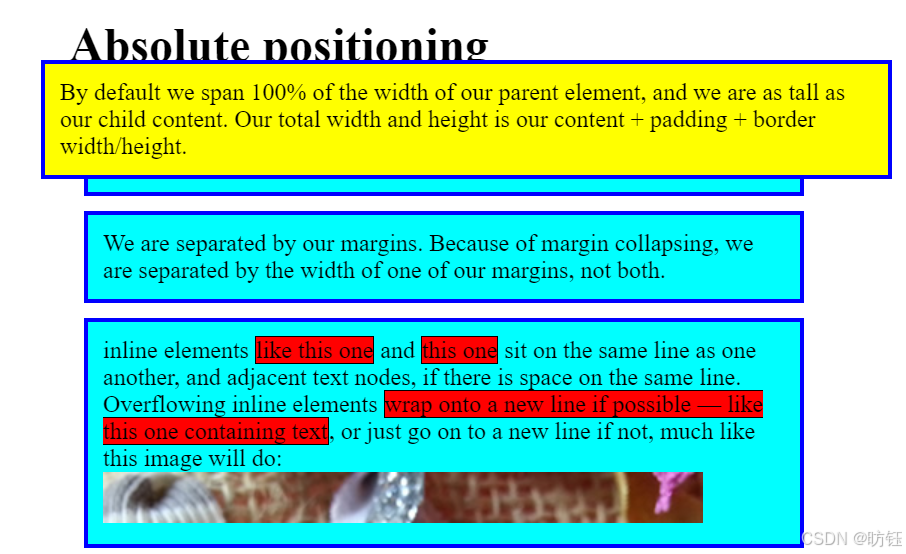
3.2、绝对定位(absolute)
相对定位的元素并未脱离文档流,而绝对定位的元素则脱离了文档流。在布置文档流中其他元素时,绝对定位元素不占据空间。绝对定位元素相对于最近的非 static 祖先元素定位。当这样的祖先元素不存在时,则相对于 ICB(initial containing block,初始包含块)。
<!DOCTYPE html>
<html>

<head>
    <meta charset="utf-8">
    <title>元素定位学习</title>
    <style>
        * {
            box-sizing: border-box;
        }

        body {
            width: 500px;
            margin: 0 auto;
        }

        p {
            background: aqua;
            border: 3px solid blue;
            padding: 10px;
            margin: 10px;
        }

        span {
            background: red;
            border: 1px solid black;
        }

        .positioned {
            position: absolute;
            background: yellow;
            top: 40px;
            left: 30px;
        }
    </style>
</head>

<body>
    <h1>Absolute positioning</h1>

    <p>
        I am a basic block level element. My adjacent block level elements sit on new
        lines below me.
    </p>

    <p class="positioned">
        By default we span 100% of the width of our parent element, and we are as tall
        as our child content. Our total width and height is our content + padding +
        border width/height.
    </p>

    <p>
        We are separated by our margins. Because of margin collapsing, we are
        separated by the width of one of our margins, not both.
    </p>

    <p>
        inline elements <span>like this one</span> and <span>this one</span> sit on
        the same line as one another, and adjacent text nodes, if there is space on
        the same line. Overflowing inline elements
        <span>wrap onto a new line if possible — like this one containing text</span>,
        or just go on to a new line if not, much like this image will do:
        <img src="./images/long.png" />
    </p>

</body>

</html>
运行效果如下:
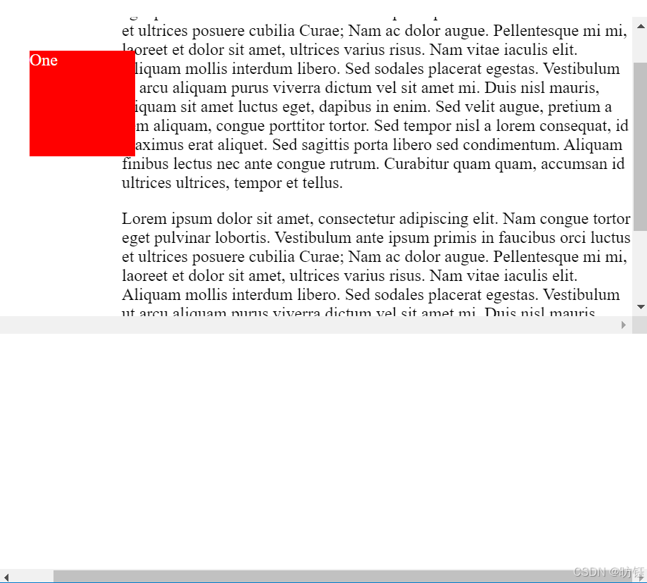
3.3、固定定位(fixed)
固定定位与绝对定位相似,但元素的包含块为 viewport 视口。该定位方式常用于创建在滚动屏幕时仍固定在相同位置的元素。在下面的示例中,"One" 元素定位在离页面顶部 20px,离页面左侧 20px 的位置。
<!DOCTYPE html>
<html>

<head>
    <meta charset="utf-8">
    <title>元素定位学习</title>
    <style>
        .box {
            background: red;
            width: 100px;
            height: 100px;
            margin: 20px;
            color: white;
        }

        #one {
            position: fixed;
            top: 20px;
            left: 10px;
        }

        .outer {
            width: 500px;
            height: 300px;
            overflow: scroll;
            padding-left: 150px;
        }
    </style>
</head>

<body>
    <div class="outer">
        <p>
            Lorem ipsum dolor sit amet, consectetur adipiscing elit. Nam congue tortor
            eget pulvinar lobortis. Vestibulum ante ipsum primis in faucibus orci luctus
            et ultrices posuere cubilia Curae; Nam ac dolor augue. Pellentesque mi mi,
            laoreet et dolor sit amet, ultrices varius risus. Nam vitae iaculis elit.
            Aliquam mollis interdum libero. Sed sodales placerat egestas. Vestibulum ut
            arcu aliquam purus viverra dictum vel sit amet mi. Duis nisl mauris, aliquam
            sit amet luctus eget, dapibus in enim. Sed velit augue, pretium a sem
            aliquam, congue porttitor tortor. Sed tempor nisl a lorem consequat, id
            maximus erat aliquet. Sed sagittis porta libero sed condimentum. Aliquam
            finibus lectus nec ante congue rutrum. Curabitur quam quam, accumsan id
            ultrices ultrices, tempor et tellus.
        </p>
        <div class="box" id="one">One</div>
    </div>

</body>

</html>
运行效果如下:
3.4、粘性定位(sticky)
粘性定位可以被认为是相对定位和固定定位的混合。元素在跨越特定阈值前为相对定位,之后为固定定位。例如:
#one {
  position: sticky;
  top: 10px;
}
在 viewport 视口滚动到元素 top 距离小于 10px 之前,元素为相对定位。之后,元素将固定在与顶部距离 10px 的位置,直到 viewport 视口回滚到阈值以下。
粘性定位常用于定位字母列表的头部元素。标示 B 部分开始的头部元素在滚动 A 部分时,始终处于 A 的下方。而在开始滚动 B 部分时,B 的头部会固定在屏幕顶部,直到所有 B 的项均完成滚动后,才被 C 的头部替代。
须指定 top, right, bottom 或 left 四个阈值其中之一,才可使粘性定位生效。否则其行为与相对定位相同。
<!DOCTYPE html>
<html>

<head>
    <meta charset="utf-8">
    <title>元素定位学习</title>
    <style>
        * {
            box-sizing: border-box;
        }

        dl {
            margin: 0;
            padding: 24px 0 0 0;
        }

        dt {
            background: #b8c1c8;
            border-bottom: 1px solid #989ea4;
            border-top: 1px solid #717d85;
            color: #fff;
            font:
                bold 18px/21px Helvetica,
                Arial,
                sans-serif;
            margin: 0;
            padding: 2px 0 0 12px;
            position: -webkit-sticky;
            position: sticky;
            top: -1px;
        }

        dd {
            font:
                bold 20px/45px Helvetica,
                Arial,
                sans-serif;
            margin: 0;
            padding: 0 0 0 12px;
            white-space: nowrap;
        }

        dd+dd {
            border-top: 1px solid #ccc;
        }
    </style>
</head>

<body>
    <div>
        <dl>
            <dt>A</dt>
            <dd>Andrew W.K.</dd>
            <dd>Apparat</dd>
            <dd>Arcade Fire</dd>
            <dd>At The Drive-In</dd>
            <dd>Aziz Ansari</dd>
        </dl>
        <dl>
            <dt>C</dt>
            <dd>Chromeo</dd>
            <dd>Common</dd>
            <dd>Converge</dd>
            <dd>Crystal Castles</dd>
            <dd>Cursive</dd>
        </dl>
        <dl>
            <dt>E</dt>
            <dd>Explosions In The Sky</dd>
        </dl>
        <dl>
            <dt>T</dt>
            <dd>Ted Leo & The Pharmacists</dd>
            <dd>T-Pain</dd>
            <dd>Thrice</dd>
            <dd>TV On The Radio</dd>
            <dd>Two Gallants</dd>
        </dl>
    </div>

</body>

</html>
运行效果如下:
sticky定位效果
4、综合示例
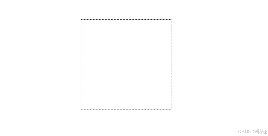
如下是我们要实现的一个效果:
首先是中间的虚线方框:
<!DOCTYPE html>
<html>

<head>
    <meta charset="utf-8">
    <title>元素定位学习</title>
    <style>
        div {
            height: 200px;
            width: 200px;
            position: absolute;
            left: 200px;
            top: 50px;
            font-size: 4rem;
            line-height: 200px;
            text-align: center;
        }

        .original {
            border: 1px dashed;
        }

    </style>
</head>

<body>
    <div class="original"></div>

</body>

</html>
效果如下:
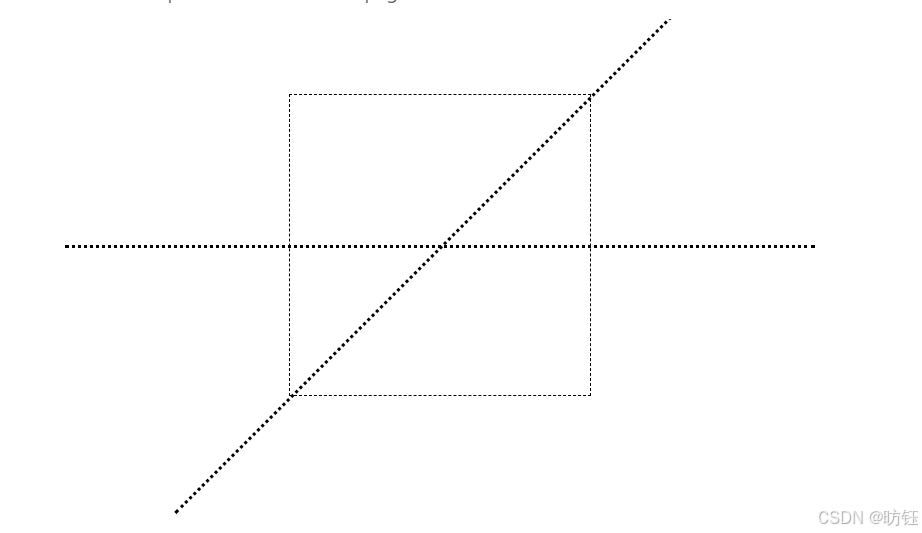
没错就是一个方框,接下来添加两条虚线,水平的那条是没有旋转的线,另外一条旋转了135度(顺时针方向):
<!DOCTYPE html>
<html>

<head>
    <meta charset="utf-8">
    <title>元素定位学习</title>
    <style>
        div {
            height: 200px;
            width: 200px;
            position: absolute;
            left: 200px;
            top: 50px;
            font-size: 4rem;
            line-height: 200px;
            text-align: center;
        }

        .original {
            border: 1px dashed;
        }

        .original:before,
        .original:after {
            content: "";
            position: absolute;
            top: 100px;
            width: 500px;
            left: -150px;
            height: 1px;
            border-top: 2px dotted;
        }

        .original:after {
            transform: rotate(135deg);
        }

    </style>
</head>

<body>
    <div class="original"></div>

</body>

</html>
效果如下:
这里使用了伪元素.original:before及 .original:after,这两个伪元素就是负责添加水平虚线和另外一条旋转过的虚线的。
        .original:after {
            content: "";
            position: absolute;
            top: 100px;
            width: 500px;
            left: -150px;
            height: 1px;
            border-top: 2px dotted;
} 定位方式为绝对定位,而绝对定位元素相对于最近的非 static 祖先元素定位。当这样的祖先元素不存在时,则相对于 ICB(initial containing block,初始包含块),这里其实是相对于div定位了。
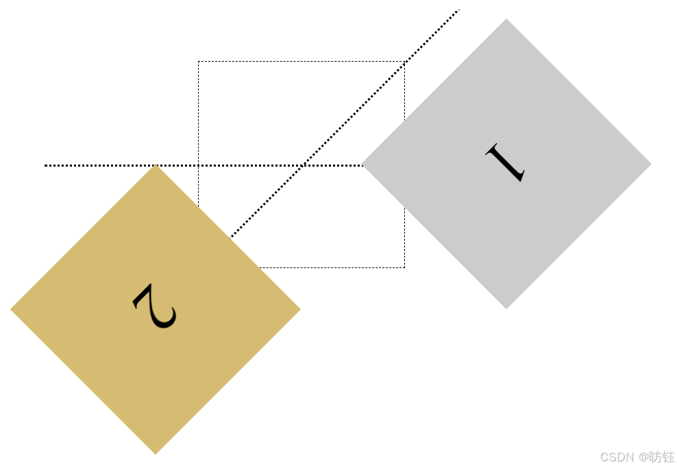
接下来就是完整的效果,代码如下:
<!DOCTYPE html>
<html>

<head>
    <meta charset="utf-8">
    <title>元素定位学习</title>
    <style>
        div {
            height: 200px;
            width: 200px;
            position: absolute;
            left: 200px;
            top: 50px;
            font-size: 4rem;
            line-height: 200px;
            text-align: center;
        }

        .original {
            border: 1px dashed;
        }

        .original:before,
        .original:after {
            content: "";
            position: absolute;
            top: 100px;
            width: 500px;
            left: -150px;
            height: 1px;
            border-top: 2px dotted;
        }

        .original:after {
            transform: rotate(135deg);
        }

        .one {
            background-color: #ccc;
        }

        .two {
            background-color: #d6bb72;
        }

        .one {
            transform: translateX(200px) rotate(135deg);
        }

        .two {
            transform: rotate(135deg) translateX(200px);
        }
    </style>
</head>

<body>
    <div class="original"></div>
    <div class="one">1</div>
    <div class="two">2</div>

</body>

</html>
该案例有助于理解元素定位以及transform的作用。