前言
本篇博客就不给大家讲解了,直接上代码
💓 个人主页:普通young man-CSDN博客
若有问题 评论区见📝
🎉欢迎大家点赞👍收藏⭐文章
 https://blog.csdn.net/2302_78381559/category_12697865.html
目录
大家直接复制吧,如果需要图片的可以私信我,免费给大家,大家给个关注点赞评论就行
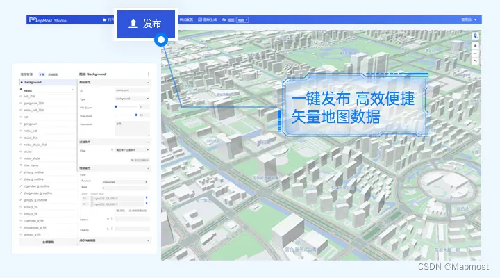
网页展示


代码
HTML
enroll.html
<!DOCTYPE html>
<html lang="en">
  <head>
    <meta charset="UTF-8" />
    <meta http-equiv="X-UA-Compatible" content="IE=edge" />
    <meta name="viewport" content="width=device-width, initial-scale=1.0" />
    <title>Document</title>
     <link rel="stylesheet" href="login_enrool.css" />
  </head>
  <style>

  </style>
  <body>
    <div class="all">
      <div class="reg">
        <div class="reg_1">
          <h2>已有账号?</h2>
          <p>请使用你的账号进行登录!</p>
          <a href="login.html">
            <button type="button" class="sig">登录</button>
          </a>
        </div>
      </div>
      <div class="log">
        <div>
          <div class="register" id="tiao">
            <form>
              <div class="register-top-grid">
                <h3>注册新用户</h3>
                <div class="input">
                  <input
                    class="input-text"
                    type="text"
                    placeholder="请输入用户名"
                    v-model="name"
                  />
                </div>
                <div class="input">
                  <input
                    class="input-text"
                    type="password"
                    placeholder="请输入密码"
                    v-model="password"
                  />
                </div>
                <div class="clearfix"></div>
              </div>
              <div class="text-center">
                <a href="index.html"><button type="button" class="zhuce">注册</button></a>

              </div>

            </form>

          </div>
        </div>
      </div>
    </div>

  </body>
</html>
index.html
<!DOCTYPE html>
<html lang="en">
<head>
<meta charset="UTF-8">
<meta name="viewport" content="width=device-width, initial-scale=1.0">
<title>oppo官网</title>
<!-- 引入重置样式 -->
<link rel="stylesheet" href="reset.css">
<!-- 引入自定义样式 -->
<link rel="stylesheet" href="style.css">
</head>
<!--saks -->
<body>
<div class="topBar">
<div class="barIn w">
<!-- 顶通栏的左边 -->
<div class="barL">
<a href="#">
<img src="img/微博.png" alt="">
</a>
<p>4001-666-888</p>
</div>
<!-- 顶通栏的右边 -->
<ul class="barR">
<li><a href="login.html">登录</a></li>
<li><a href="enroll.html">注册</a></li>
<li><a href="#">积分兑换</a></li>
<li><a href="#">帮助中心</a></li>
<li><a href="#" class="gwc">购物车</a></li>
</ul>
</div>
</div>
<!-- 头部 -->
<div class="header w">
<!-- 左边的logo -->
<div class="logo">
<img src="img/oppo.jpg">
</div>
<!-- 右边的导航 -->
<ul class="nav">
<li class="cur"><a href="#">首页</a></li>
<li class="cur"><a href="#">手机配件</a></li>
<li class="cur"><a href="#">服务</a></li>
<li class="cur"><a href="#">专卖店</a></li>
<li class="cur"><a href="#">应用商店</a></li>
<li class="cur"><a href="#">ColorOS</a></li>
<li class="cur"><a href="#">社区</a></li>
</ul>
</div>
<!-- banner -->
<div class="banner">
<a href="#"></a>
</div>
<!-- 内容区域 -->
<!-- 明星机型 -->
<div class="star">
<div class="starIn w">
<!-- 标题盒子 -->
<div class="star_title">
<!-- 线 -->
<div class="line"></div>
<h3>OPPO <strong>STAR</strong> 明星机型</h3>
<div class="line"></div>
<h4> COLLECTION <a href="">全部手机</a></h4>
</div>
<!-- 手机 -->
<div class="mobile">
<ul >
<li>
<img src="img/手机/1.png">
<h3>坤坤手机</h3>
<p></p>
</li>
<li>
<img src="img/手机/2.png">
<h3>坤坤手机</h3>
<p></p>
</li>
<li>
<img src="img/手机/3.png">
<h3>坤坤手机</h3>
<p></p>
</li>
<li>
<img src="img/手机/4.png">
<h3>坤坤手机</h3>
<p></p>
</li>
<li>
<img src="img/手机/5.png">
<h3>坤坤手机</h3>
<p></p>
</li>
<li>
<img src="img/手机/6.png">
<h3>坤坤手机</h3>
<p></p>
</li>
<li>
<img src="img/手机/7.png">
<h3>坤坤手机</h3>
<p></p>
</li>
<li>
<img src="img/手机/8.png">
<h3>坤坤手机</h3>
<p></p>
</li>
</ul>
</div>
</div>
</div>
</div>
</div>
<!-- machine 配件区域开始 -->
<!-- 探索区域开始 -->
<div class="tansuo">
<div class="w">
<div class="tansuo-top">
<div class="conmon-title">
<div class="line"></div>
<div class="title">
<span>WORLD</span> OF OPPO 探索欧珀
</div>
<div class="line"></div>
</div>
</div>
<div class="tansuo-bottom">
<div class="left">
<ul>
<li class="large-img"><img src="img/手机/a1.png" alt=""></li>
<li><img src="img/手机/a2.jpg" alt=""></li>
<li><img src="img/手机/a3.jpg" alt=""></li>
<li><img src="img/1570600296511873.jpg" alt=""></li>
<!-- 其他小图片... -->
</ul>
</div>
</div>
<div class="right">
<div class="container">
<div class="right">
<div class="accessory-card">
<img src="img/其他/202003100403395e674cabe09be.png" alt="原装耳机" class="accessory-img">
<div class="accessory-info">
<h3>智能手表</h3>
<p>完美适配全系列手机,提供沉浸式音质体验。</p>
<p class="price">价格: ¥2999</p>
<a href="#" class="learn-more">了解更多</a>
</div>
</div>
<div class="accessory-card">
<img src="img/其他/2021051809051360a3bbc549fb2.png" alt="原装耳机" class="accessory-img">
<div class="accessory-info">
<h3>原装耳机</h3>
<p>完美适配全系列手机,提供沉浸式音质体验。</p>
<p class="price">价格: ¥199</p>
<a href="#" class="learn-more">了解更多</a>
</div>
</div>
<div class="accessory-card">
<img src="img/其他/R-C.png" alt="原装耳机" class="accessory-img">
<div class="accessory-info">
<h3>头戴耳机</h3>
<p>完美适配全系列手机,提供沉浸式音质体验。</p>
<p class="price">价格: ¥1999</p>
<a href="#" class="learn-more">了解更多</a>
</div>
</div>
<div class="accessory-card">
<img src="img/其他/011.png" alt="原装耳机" class="accessory-img">
<div class="accessory-info">
<h3>充电器</h3>
<p>完美适配全系列手机,提供沉浸式音质体验。</p>
<p class="price">价格: ¥60</p>
<a href="#" class="learn-more">了解更多</a>
</div>
</div>
<div class="accessory-card">
<img src="img/其他/rrrrr.png" alt="原装耳机" class="accessory-img">
<div class="accessory-info">
<h3>游戏手柄</h3>
<p>完美适配全系列手机,提供沉浸式音质体验。</p>
<p class="price">价格: ¥199</p>
<a href="#" class="learn-more">了解更多</a>
</div>
</div>
<div class="accessory-card">
<img src="img/其他/vvvv.png" alt="原装耳机" class="accessory-img">
<div class="accessory-info">
<h3>移动电源</h3>
<p>完美适配全系列手机,提供沉浸式音质体验。</p>
<p class="price">价格: ¥1999</p>
<a href="#" class="learn-more">了解更多</a>
</div>
</div>
<div class="accessory-card">
<img src="img/其他/dddd.png" alt="原装耳机" class="accessory-img">
<div class="accessory-info">
<h3>智能眼镜</h3>
<p>完美适配全系列手机,提供沉浸式音质体验。</p>
<p class="price">价格: ¥60</p>
<a href="#" class="learn-more">了解更多</a>
</div>
</div>
<div class="accessory-card">
<img src="img/其他/cccc.png" alt="原装耳机" class="accessory-img">
<div class="accessory-info">
<h3>音响</h3>
<p>完美适配全系列手机,提供沉浸式音质体验。</p>
<p class="price">价格: ¥60</p>
<a href="#" class="learn-more">了解更多</a>
</div>
</div>
<!-- 重复上述结构以添加更多卡片 -->
<!-- ... -->
</div>
</div>
</div>
</div>
</div>
<div class="main conter">
<div class="top">
<h1>推荐信息</h1>
</div>
<div class="new">
<!-- ... 其他内容省略以保持简洁,你可以根据上面提供的样式自行添加... -->
<!-- 示例部分 -->
<div class="new1-content clearfix">
<a href="" target="_blank">
<div class="left fl">
<img src="img/推荐/1.jpg">
<div class="text">
<p class="cate">产品</p>
<p class="name">K系列</p>
<a href="">了解更多<span>></span></a>
</div>
</div>
</a>
<a href="" target="_blank">
<div class="left fl">
<img src="img/推荐/2.png">
<div class="text">
<p class="cate">产品</p>
<p class="name">OPPO IoT产品</p>
<a href="">了解更多<span>></span></a>
</div>
</div>
</a>
<a href="" target="_blank">
<div class="left fl">
<img src="img/推荐/3.jpg">
<div class="text">
<p class="cate">产品</p>
<p class="name">oppo手机降价!</p>
<a href="">了解更多<span>></span></a>
</div>
</div>
</a>
<a href="" target="_blank">
<div class="left fl">
<img src="img/推荐/4.jpg">
<div class="text">
<p class="cate">产品</p>
<p class="name">ColorOS</p>
<a href="">了解更多<span>></span></a>
</div>
</div>
</a>
<a href="" target="_blank">
<div class="left fl">
<img src="img/推荐/5.jpg">
<div class="text">
<p class="cate">产品</p>
<p class="name">K系列</p>
<a href="">了解更多<span>></span></a>
</div>
</div>
</a>
</div>
<div class="new1-content clearfix">
<a href="" target="_blank">
<div class="left fl">
<img src="img/推荐/6.png">
<div class="text">
<p class="cate">产品</p>
<p class="name">OPPO智能电视</p>
<a href="">了解更多<span>></span></a>
</div>
</div>
</a>
<a href="" target="_blank">
<div class="left fl">
<img src="img/推荐/7.jpg">
<div class="text">
<p class="cate">产品</p>
<p class="name">OPPO IoT</p>
<a href="">了解更多<span>></span></a>
</div>
</div>
</a>
<a href="" target="_blank">
<div class="left fl">
<img src="img/推荐/8.jpg">
<div class="text">
<p class="cate">产品</p>
<p class="name">OPPO Watch</p>
<a href="">了解更多<span>></span></a>
</div>
</div>
</a>
<a href="" target="_blank">
<div class="left fl">
<img src="img/推荐/10.jpg">
<div class="text">
<p class="cate">产品</p>
<p class="name">OPPO Enco</p>
<a href="">了解更多<span>></span></a>
</div>
</div>
</a>
<a href="" target="_blank">
<div class="left fl">
<img src="img/推荐/9.jpg">
<div class="text">
<p class="cate">产品</p>
<p class="name">oppo Find</p>
<a href="">了解更多<span>></span></a>
</div>
</div>
</a>
<a href="" target="_blank">
<div class="left fl">
<img src="img/1570600296511873.jpg">
<div class="text">
<p class="cate">产品</p>
<p class="name">oppo Find</p>
<a href="">了解更多<span>></span></a>
</div>
</div>
</a>
</div>
<!-- 更多内容请参照上面的结构自行添加 -->
</div>
</div>
<!-- 底部区域开始 -->
<!-- 保障区域开始-->
<div class="baozhang w">
<ul>
<li>
<p>正品保障</p>
<p>保障所有产品都是原装正品</p>
</li>
<li>
<p>正品保障</p>
<p>保障所有产品都是原装正品</p>
</li>
<li>
<p>正品保障</p>
<p>保障所有产品都是原装正品</p>
</li>
<li>
<p>正品保障</p>
<p>保障所有产品都是原装正品</p>
</li>
<li>
<p>正品保障</p>
<p>保障所有产品都是原装正品</p>
</li>
</ul>
</div>
<!-- 保障区域结束-->
<!-- list 链接区域开始 -->
<div class="list">
<div class="w">
<dl>
<dt>关于我们</dt>
<dd><a href="#">关于我们</a></dd>
<dd><a href="#">新闻中心</a></dd>
<dd><a href="#">人才招聘</a></dd>
</dl>
<dl>
<dt>关于我们</dt>
<dd><a href="#">关于我们</a></dd>
<dd><a href="#">新闻中心</a></dd>
<dd><a href="#">人才招聘</a></dd>
</dl>
<dl>
<dt>关于我们</dt>
<dd><a href="#">关于我们</a></dd>
<dd><a href="#">新闻中心</a></dd>
<dd><a href="#">人才招聘</a></dd>
</dl>
<dl>
<dt>关于我们</dt>
<dd><a href="#">关于我们</a></dd>
<dd><a href="#">新闻中心</a></dd>
<dd><a href="#">人才招聘</a></dd>
</dl>
<dl>
<dt>关于我们</dt>
<dd><a href="#">关于我们</a></dd>
<dd><a href="#">新闻中心</a></dd>
<dd><a href="#">人才招聘</a></dd>
</dl>
<dl class="last">
<dt>关于我们</dt>
<dd>
<p class="contact">4001-666-888</p>
<p>7*24小时客服电话</p>
</dd>
<dd class="qq">
<p class="contact">在线QQ客服</p>
<p>服务时间段8:30-22:00</p>
</dd>
</dl>
</div>
</div>
<!-- list 链接区域结束 -->
<!-- 底部区域结束 -->
<!-- footer区域 -->
<div class="footer"> -->
<div class="w">
<div class="left">
©2014东莞市永盛通信科技有限公司 粤ICP 备08130115号
</div>
<ul class="right">
<li><a href="#">版权说明</a></li>
<li><a href="#">使用协议</a></li>
<li><a href="#">网站地图</a></li>
<li><a href="#">联系我们</a></li>
</ul>
</div>
</div>
<!-- footer区域结束 -->
</body>
</html>login.html
<!DOCTYPE html>
<html lang="en">
  <head>
    <meta charset="UTF-8" />
    <meta http-equiv="X-UA-Compatible" content="IE=edge" />
    <meta name="viewport" content="width=device-width, initial-scale=1.0" />
    <title>Document</title>
    <link rel="stylesheet" href="login_enrool.css" />
  </head>
  <style>


  </style>
  <body>
    <div class="all">
      <div class="log">
        <div class="register">
          <form>
            <div class="register-top-grid">
              <h3>用户登录</h3>
              <div class="input">
                <span>用户名 <label style="color: red">* </label></span>
                <input
                  type="text"
                  v-model="name"
                  placeholder="请输入用户名"
                  class="input-text"
                />
              </div>
              <div class="input">
                <span>密码 <label style="color: red">*</label></span>
                <input
                  type="password"
                  v-model="password"
                  placeholder="请输入密码"
                  class="input-text"
                />
              </div>
            </div>
            <div class="text-center">
                <a href="index.html"><button type="button" class="zhuce">登录</button></a>
            </div>
          </form>
        </div>
      </div>
      <div class="reg">
        <div class="reg_1">
          <h2>没有账号?</h2>
          <p>请点击这里注册账号</p>
          <a href="enroll.html">
            <button type="primary" class="sig">注册</button>
          </a>
        </div>
      </div>
    </div>
  </body>
</html>
CSS
login_enrool.css
/*登录/注册*/
.all {
    width: 800px;
    box-shadow: -10px 10px 25px rgba(210, 210, 210, 0.9);
    margin: auto;
    margin-top: 5%;
    display: flex;
    border-radius: 35px;
    background-color: #ffffff;
    height: 550px;
  }
  .log {
    width: 50%;
    margin: auto;
  }
  .reg {
    width: 50%;
    height: 100%;
    margin: auto;
    background-color: #20b2aa;
    border-radius: 35px;
    color: #ffffff;
  }
  .reg_1 {
    text-align: center;
    margin: auto;
    margin-top: 50%;
  }
  .reg_1 h2 {
    font-weight: 700;
  }
  .reg_1 p {
    margin: 15px 0px 25px 0px;
  }
  .sig {
    width: 70px;
    height: 30px;
    border-radius: 12px;
    background-color: #20b2aa;
    border-color: #fff;
    color: #ffffff;
  }
  #tiao {
    padding: 0em 0;
  }
  .reg_1 a {
    color: #ffffff;
  }
  h3 {
    font-size: 3em;
    color: black;
    padding-bottom: 1em;
    margin: 0;
    text-align: center;
    font-family: "Marvel-Regular";
  }
  .input {
    margin: 10px 50px;
    width: 300px;
    height: 70px;
  }
  span {
    color: #999;
    font-size: 0.85em;
    padding-bottom: 0.2em;
    display: block;
    text-transform: uppercase;
    margin-bottom: 4px;
  }

  .input-text {
    border: 1px solid #555;
    outline-color: #fd9f3e;
    width: 90%;
    font-size: 1em;
    padding: 0.5em;
    line-height: inherit;
  }

  .input-text {
    border: 1px solid #555;
    outline-color: #fd9f3e;
    width: 90%;
    font-size: 1em;
    padding: 0.5em;
    line-height: inherit;
  }
  .register-top-grid {
    color: black;
    padding-bottom: 1em;
    margin: 0;
    font-family: "Marvel-Regular";
    margin: 10px 0;
  }
  .text-center {
    text-align: center;
  }
  .zhuce {
    color: rgb(255, 253, 253);
    width: 80px;
    height: 35px;
    background-color: rgb(40, 40, 40);
    border: none;
  }


  .zhuce:hover {
    background-color: #606160; /* 深绿色背景,鼠标悬停时改变颜色 */
}

.sig:hover {
    background-color: #1fa7a0; /* 深绿色背景,鼠标悬停时改变颜色 */
}
reset.css
/* 因为不是全部标签都有默认内外边距,做项目的时候清除默认边距可以选中对应标签去清除,代码执行效率就更高 */
h1,
h2,
h3,
h4,
h5,
h6,
body,
p,
dl,
dt,
dd,
ul,
li,
ol {
    padding: 0;
    margin: 0;
}

li {
    list-style: none;
}

body {
    font: 14px "微软雅黑";
    color: #999;
}

a {
    text-decoration: none;
    color: #999;
}
style.css
/* 版心 */

.w {
    width: 1200px;
    margin: 0 auto;
	/* background-color: #e90000; */
}

.topBar {
    height: 37px;
    background: #585757;
    border-top: 3px solid green;
}
.barIn{
	margin-top: 6px;
	height: 37px;
	/* background-color: pink; */
}

.barL{
	float: left;
	/* background-color: rgb(247, 109, 132);  */
}
.barL a,p,li{
	float: left;
}
/*
 设置顶通栏左边图片的位置
 */
.barL :nth-child(1){
	margin:2px 15px 0 0;
}
.barL :nth-child(2){
	margin:4px 15px 0 0;
}
.barL a img{
	width: 20px;
	/* background-color: #00925f; */
}

 /*
 设置顶通栏右边的导航栏
 */
.barR{

	margin-top: 6px;
	float:right;
	/* background-color: #00925f; */
}
.barR li{
	float: left;
}
.barR a{
	padding: 0 15px;
	border-right: 1px solid #999999;
	/* background-color: black; */
}
/* 设置购物车图标
background:颜色 url 禁止平铺 坐标x 坐标Y
*/

.barR .gwc {
	text-decoration: none;
	/* color: #bdbdbd; */
	font-family:'Franklin Gothic Medium', 'Arial Narrow', Arial, sans-serif;
	background:linear-gradient(to right,#ffffff,#ffffff) no-repeat left bottom;
	background-size: 0 1px;
	transition: background-size 100ms;
}
/*文字变色*/
.barR li a {
    text-decoration: none;
    color: #bdbdbd;
    font-family:'Franklin Gothic Medium', 'Arial Narrow', Arial, sans-serif;
    background:linear-gradient(to right,#ffffff,#ffffff) no-repeat left bottom;
    background-size: 0 1px;
    transition: background-size 100ms;
}
.barR li a:hover {
    color: rgb(121, 115, 115);
    background-position-x:left;
    background-size:100% 2px;
}

/*在上面的顶通栏添加个超出隐藏*/
.topBar {
    height: 37px;
    background: #2b2b2b;
    border-top: 3px solid rgb(0, 0, 0);
	/* 添加个超出隐藏 */
	overflow: hidden;
}


/* 头部 */
.header{
	 height: 80px;
}
.logo {
	width: 160px;
	height: 50px;
	float: left;
	/* background-color: #00925f; */
	margin-top: -10px;
}
/* a指定宽高不会生效 所以要变成块 */
.logo img{
	width: 170px;
	height: 50px;
	margin-top: 30px;
	/* background-color: #00935f; */
}
.nav{
	height: 80px;
	float: right;
	line-height: 80px;
}
.nav li{
	float: left;
	font-size: 18px;
	font-weight: bold;
	margin: 0 18px;

	/* 添加以下两行以实现椭圆化和设置透明度 */
     border-radius: 10px;/* 来调整椭圆程度 */
    opacity: 0.5; /* 设置透明度,范围从0(完全透明)到1(完全不透明) */
    transition: background-color 0.3s ease; /* 添加过渡效果,使颜色变化更平滑 */
}
.nav  a{
	color: #000000;
}
.cur a{
	color: #000000;
}
.cur:hover{

	background-color: #b8bab8;
}


/**
 * banner
 */
.banner{
	height: 621px;

}
.banner a{
	display: block;
	height: 621px;
	/* 设置背景图片 */
    background-image: url("img/banner.jpg");
    /* 设置图片在水平方向平铺 */
    background-repeat: repeat;

    /* 图片大小覆盖整个屏幕/容器,这里的关键是 'cover',它会保持图片的宽高比并将图片缩放以完全覆盖背景区域 */
    background-size: cover;
    /* 确保背景图片始终居中 */
    background-position: center;
	/* background-color: #00925f; */
}


/**
  * 内容区域
  */
/* 明星机型 */
.star {
	height: 846px;
	background-color: #f2f2f2;
}

.starIn {
	height: 846px;
	/* height: 1180px; */
	margin: 0 auto;
}

.star_title {
	padding-top: 47px;
	text-align: center;
	/* background-color: #00925f; */
}

.star_title .line {
	width: 92px;
	height: 1px;
	background-color: #dadada;
	margin: 0 auto;
	transition: 0.5s;
}


.star_title h3 {
	height: 48px;
	line-height: 48px;
	font-size: 28px;
	font-weight: 400;
	text-align: center;
	color: #2b2b2b;
}

.star_title h4{
	/* background-color: #585757; */
	line-height: 62px;
	text-align: center;
}
.star_title h4 a{
	color: #00935f;
}
/* 鼠标移动线变长的动画 */
.star_title:hover .line{
	width: 150px;
}

.mobile {
	background-color: rgba(181, 183, 182, 0.5); /* 修改此处,颜色值和透明度 */
	margin-right: 20px;
}
.mobile ul li{
	text-align: center;
	float: left;
	/* border-bottom: 5px solid #dfdfdf; */
	width: 240px;
	height: 300px;
	margin: 15px;
	/* background-color: #9c9c9c; */
}
.mobile ul{
	margin-left: 25px;
	position: relative; /* 为绝对定位的伪元素做准备 */
	display: inline-block;
	text-align: center;
	cursor: pointer; /* 改变鼠标指针形状,提示可点击 */
}

.mobile ul {
	list-style: none;
	display: flex;
	flex-wrap: wrap;
	justify-content: center;
	gap: 1rem;
	padding: 0;
  }


  .mobile li img {
	width: 100%;
	height: auto;
	transition: transform 0.3s ease; /* 平滑的过渡效果 */
  }

  .mobile li:hover img {
	transform: scale(1.1); /* 鼠标悬停时放大图片 */
  }

  .mobile h3 {
	margin: 0.5rem 0; /* 给标题留出一点空间 */
  }


/* machine 配件区域开始 */
/* machine 配件区域开始 */
/* 全局样式 */
body {
	font-family: Arial, sans-serif;
	margin: 0;
	padding: 0;
  }

  /* 探索区域样式 */
  .tansuo {
	background-color: #f8f8f8;
	padding: 80px 0;
  }

  .w {
	max-width: 1200px;
	margin: 0 auto;
  }

  /* 标题样式 */
  .tansuo-top {
	text-align: center;
  }

  .conmon-title {
	display: flex;
	align-items: center;
	justify-content: center;
	gap: 10px;
  }

  .line {
	height: 2px;
	width: 40px;
	background-color: #000;
  }

  .title {
	font-size: 24px;
	font-weight: bold;
	color: #000;
  }

  .title span {
	color: #0091ff;
  }

  /* 内容区域样式 */


  /* 设置左侧列表项的基础样式与悬停效果 */
.left li {
	position: relative; /* 为绝对定位的子元素准备 */
	overflow: hidden; /* 防止悬停效果超出边界 */
}

/* 图片基础样式,确保响应式且填充容器 */
.large-img img, .left li img {
	width: 100%;
	height: auto;
	object-fit: cover; /* 保持图片原始比例并填满容器 */
	transition: opacity 0.3s; /* 平滑过渡透明度变化 */
}

/* 大图布局调整,跨多列和行以突出显示 */
.large-img img {
	grid-column: span 2; /* 横向跨越两列 */
	grid-row: span 2; /* 纵向跨越两行,可按需调整 */
}

/* 鼠标悬停时降低图片透明度 */
.left li:hover img {
	opacity: 0.8;
}

/* 底部区域布局 */
.tansuo-bottom {
	display: flex;
	justify-content: space-between;
	margin-top: 50px;
}

/* 左侧列表去除默认样式并设置弹性布局 */
.left ul {
	list-style-type: none;
	display: flex;
	flex-wrap: wrap;
	justify-content: space-around;
	gap: 20px;
}

/* 左侧区域整体网格布局配置 */
.left {
	display: grid;
	grid-template-columns: repeat(auto-fit, minmax(200px, 1fr)); /* 自适应列宽 */
	grid-gap: 10px;
	padding: 10px;
}

/* 大图容器样式 */
.large-img {
	grid-column: span 2;
	grid-row: span 2;
	max-width: 100%;
	height: auto; /* 自动高度适应内容 */
}

/* 重复定义左侧列表项,确保一致性和明确性 */
.left li {
	list-style-type: none;
	position: relative;
	overflow: hidden;
}

/* 左右两侧图片圆角美化 */
.left li img,
.right img {
	width: 100%;
	height: auto;
	border-radius: 8px;
	object-fit: cover;
}

/* 右侧图片宽度调整 */
.right img {
	width: calc(50% - 20px);
}

/* 鼠标悬停放大效果 */
.left li img:hover,
.right img:hover {
	transform: scale(1.1); /* 图片放大 */
	transition: transform 0.3s ease; /* 平滑动画过渡 */
}

/* 响应式设计,针对小屏幕优化 */
@media (max-width: 768px) {
	.tansuo-bottom {
		flex-direction: column; /* 垂直堆叠元素 */
	}

	.right img {
		width: 100%; /* 图片全宽适应小屏 */
		margin-top: 20px; /* 上边距调整 */
	}
}

/*右侧表单*/
.container {
    /* 假设这是外部容器,可以根据需要调整 */
}

.right {
    display: grid;
    grid-template-columns: repeat(4, 1fr);
    grid-gap: 20px;
}

.accessory-card {
    box-shadow: 0 4px 6px rgba(0, 0, 0, 0.1);
    border-radius: 10px;
    background-color: #ffffff;
    padding: 10px; /* 减少内边距以提供更多空间给图片 */
    margin-bottom: 20px;
    display: flex;
    flex-direction: column;
    justify-content: space-between;
    width: 270px;
    max-width: 300px;
    margin-top: 50px;
}

.accessory-img {
    max-width: 100%;
    height: 250px; /* 进一步增加图片高度以突出 */
    object-fit: cover; /* 保持图片比例并填充容器 */
    border-radius: 8px 8px 0 0; /* 只给图片上边和左边加圆角 */
    margin-bottom: 10px;
}

.accessory-info {
    flex: 1;
    display: flex;
    flex-direction: column;
    justify-content: space-between;
    padding: 10px 20px; /* 内容区域增加一些内边距 */
    text-align: center;
}

.accessory-card h3 {
    margin: 0;
    color: #333;
    font-size: 16px;
    line-height: 1.2;
}

.accessory-card p {
    margin: 5px 0 10px;
    color: #666;
    font-size: 14px;
    line-height: 1.4;
}

.accessory-card .price {
    font-weight: bold;
    color: #c00;
}

.accessory-card a {
    display: block;
    margin: 10px auto 0;
    padding: 8px 16px;
    background-color: #0091FF;
    color: #fff;
    text-decoration: none;
    border-radius: 4px;
    transition: background-color 0.3s ease;
    width: fit-content; /* 使按钮宽度自适应内容 */
}

.accessory-card a:hover {
    background-color: #0056b3;
}

/*  machine 配件区域结束 */


/* 探索区域开始 */


.main {
    max-width: 1400px;
    margin: 0 auto;
}

.top {
    text-align: center;
}

.new {
    margin-top: 20px;
}

.new1-content, .new2-content, .new3-content {
    display: flex;
    justify-content: space-between;
    margin-bottom: 20px;
}

.clearfix::after {
    content: "";
    display: table;
    clear: both;
}

.left, .right {
    position: relative;
}

.left img, .right img {
    width: 100%;
    height: auto;
}

.text {
    padding: 10px;
    background-color: rgba(255, 255, 255, 0.8);
    position: absolute;
    bottom: 0;
    left: 0;
    right: 0;
    color: #333;
}

.cate {
    font-size: 14px;
    margin-bottom: 5px;
}

.name {
    font-size: 18px;
    margin-bottom: 10px;
}

a {
    color: #007bff;
    text-decoration: none;
}

a:hover {
    text-decoration: underline;
}

/* 探索区域结束 */
/*内容区域结束 */


/* 保障区域开始 */
.baozhang {
    padding: 43px 0 36px 0;
    height: 45px;
}

.baozhang li {
    float: left;
    height: 45px;
    padding-left: 55px;
    /* width: 236px; */
    width: 181px;
    background: url(img/保障.png) no-repeat left center;
    /* background-color: pink; */
    font-size: 14px;
}

.baozhang li p {
    height: 21px;
    line-height: 21px;
}

.baozhang li p:nth-child(2) {
    color: #999999;
}

/* 保障区域结束 */

/* list 链接区域开始 */
.list {
    border-top: 1px solid #ccc;
    padding-top: 34px;
    height: 175px;
}
.list dl {
    float: left;
    width: 196px;
    font-size: 14px;
}
.list dl dt,
.list dl dd {
    height: 30px;
    line-height: 30px;
}

.list dl dt {
    font-weight: 700;
}
.list dl dd a {
    color: #999999;
}
.list dl.last dd {
    margin-top: 7px;
    height: 50px;
    padding-left: 50px;
    background: url(img/电话.png) no-repeat;
}
.list dl.last dd.qq {
    background: url(img/QQ.png) no-repeat;
}
.list dl.last dd p {
    font-size: 12px;
    line-height: 17px;
    color: #999;
}
.list dl.last dd p.contact {
    color: #00925f;
}
/* list 链接区域结束 */


/*  footer区域 */
.footer {
    height: 72px;
    line-height: 25px;
    background-color: #2b2b2b;
    font-size: 12px;
}

.footer .left {
    float: left;
    padding-left: 130px;
	margin-top: -10px;
    background: url(img/oppo000.png) no-repeat left center;
    color: #929292;
}

.footer .right {
	/* background-color: #0056b3; */
	margin-top: 20px;
	width: 500px;
    float: right;
}

.footer .right li {

	margin-top: -20px;
    float: left;
    margin-left: 40px;
}

.footer .right li a {
	font-size: 13px;
    color: #929292;
}
大家直接复制吧,如果需要图片的可以私信我,免费给大家,大家给个关注点赞评论就行