如何实现炫酷按钮
本文将详细介绍如何使用 HTML 和 CSS 实现一个炫酷按钮。这个按钮具有渐变边框、圆角、悬停发光和点击缩放效果。
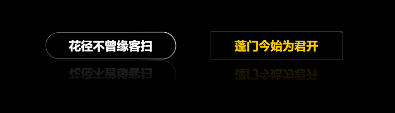
效果图

实现思路
- HTML 结构:创建一个包含按钮的容器。按钮内部包含文本和四个用于动画边框的
span元素。 - CSS 样式:
- 设置按钮的基本样式:包括尺寸、圆角、字体、颜色、阴影等。
- 使用伪元素实现按钮边框动画:通过
@keyframes实现边框线条从一侧移动到另一侧的动画效果。 - 设置按钮的悬停和点击效果:悬停时按钮发光,点击时按钮缩放并发光。
实现步骤
1. 创建 HTML 结构
首先,创建一个基本的 HTML 结构,其中包含一个按钮。按钮内部包含四个 span 元素,用于动画边框。
<!DOCTYPE html>
<html lang="en">
<head>
    <meta charset="UTF-8">
    <meta name="viewport" content="width=device-width, initial-scale=1.0">
    <title>炫酷按钮</title>
    <style>
        /* 在这里添加 CSS 样式 */
    </style>
</head>
<body>
    <div class="button-container">
        <button class="glow-button" onclick="handleClick()" style="--btn-color: #2af598;">
            炫酷按钮
            <div class="border-lines">
                <span class="line top"></span>
                <span class="line right"></span>
                <span class="line bottom"></span>
                <span class="line left"></span>
            </div>
        </button>
    </div>

    <script>
        function handleClick() {
            console.log('Button clicked!');
        }
    </script>
</body>
</html>
2. 添加 CSS 样式
在 <style> 标签内添加以下 CSS 样式,以实现按钮的各种效果。
body {
    margin: 0;
    height: 100vh;
    display: flex;
    justify-content: center;
    align-items: center;
    font-family: Arial, sans-serif;
    background: #1a1a1a;
}

.button-container {
    position: relative;
    display: flex;
    justify-content: center;
    align-items: center;
}

.glow-button {
    position: relative;
    width: 240px;
    height: 72px;
    border: none;
    border-radius: 4px;
    background: transparent;
    color: var(--btn-color);
    font-size: 32px;
    font-weight: 700;
    text-align: center;
    line-height: 72px;
    cursor: pointer;
    overflow: hidden;
    box-shadow: 0 0 1px var(--btn-color);
    transition: box-shadow 0.3s, background-color 0.3s, color 0.3s;
}

.glow-button:hover {
    background-color: var(--btn-color);
    color: #fff;
    box-shadow: 0 0 5px var(--btn-color), 0 0 25px var(--btn-color), 0 0 50px var(--btn-color), 0 0 100px var(--btn-color);
}

.glow-button:active {
    background-color: var(--btn-color);
    color: #fff;
    box-shadow: 0 0 15px var(--btn-color), 0 0 30px var(--btn-color), 0 0 60px var(--btn-color), 0 0 120px var(--btn-color);
    transform: scale(0.95);
}

.border-lines {
    position: absolute;
    top: 0;
    left: 0;
    width: 100%;
    height: 100%;
    pointer-events: none;
}

.line {
    position: absolute;
    display: block;
    background: linear-gradient(90deg, transparent, var(--btn-color));
}

.top {
    top: 0;
    left: -100%;
    width: 100%;
    height: 2px;
    animation: topAnim 4s linear infinite;
}

@keyframes topAnim {
    0% {
        left: -100%;
    }
    50%,
    100% {
        left: 100%;
    }
}

.right {
    top: -100%;
    right: 0;
    width: 2px;
    height: 100%;
    animation: rightAnim 4s linear infinite 1s;
    background: linear-gradient(180deg, transparent, var(--btn-color));
}

@keyframes rightAnim {
    0% {
        top: -100%;
    }
    50%,
    100% {
        top: 100%;
    }
}

.bottom {
    bottom: 0;
    right: -100%;
    width: 100%;
    height: 2px;
    animation: bottomAnim 4s linear infinite 2s;
    background: linear-gradient(270deg, transparent, var(--btn-color));
}

@keyframes bottomAnim {
    0% {
        right: -100%;
    }
    50%,
    100% {
        right: 100%;
    }
}

.left {
    bottom: -100%;
    left: 0;
    width: 2px;
    height: 100%;
    animation: leftAnim 4s linear infinite 3s;
    background: linear-gradient(360deg, transparent, var(--btn-color));
}

@keyframes leftAnim {
    0% {
        bottom: -100%;
    }
    50%,
    100% {
        bottom: 100%;
    }
}
总结
通过以上步骤,你可以实现一个炫酷的按钮,具有以下效果:
- 渐变边框动画
- 悬停时按钮发光
- 点击时按钮缩放并发光
这样你就得到了一个炫酷的按钮!


![[自学记录09*]Unity Shader:在Unity里渲染一个黑洞](https://img-blog.csdnimg.cn/direct/506aab167d8a40b995a0392ea744c705.png)