一、自定义指令
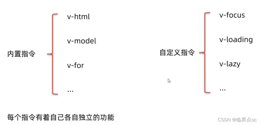
自定义指令:自己定义的指令,可以封装一些dom操作,扩展额外功能
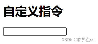
需求:当页面加载时,让元素将获得焦点
(autofocus在safari浏览器有兼容性)
操作dom:dom元素.focus()
mounted() {
    this.$refs.inp.focus()
}
1. 基本语法(全局 & 局部注册)
全局注册 — 语法
Vue.directive('指令名', {
    "inserted" (el) {
     // 可以对el标签,扩展额外功能
     el.focus()
    }
})
使用:
<input v-指令名 type="text">局部注册 — 语法
directives: {
    "指令名": {
        inserted() {
            // 可以对el标签,扩展额外功能
            el.focus()
        }
    }
}
使用:
<input v-指令名 type="text">示例:
全局注册:main.js
import Vue from 'vue'
import App from './App.vue'

Vue.config.productionTip = false

// 1. 全局注册指令
Vue.directive('focus', {
  // inserted 会在指令所在的元素,被插入到页面中触发
  inserted(el) {
    // el就是指令所绑定的元素
    // console.log(el);
    el.focus()
  }
})

//

new Vue({
  render: h => h(App),
}).$mount('#app')
局部注册:App.vue
<template>
  <div>
    <h1>自定义指令</h1>
    <input v-focus ref="inp" type="text">
  </div>
</template>

<script>
export default {
  // mounted() {
  //   this.$refs.inp.focus()
  // }


  // 2. 局部注册指令
  directives: {
    // 指令名:指令的配置项
    focus: {
      inserted(el) {
        el.focus()
      }
    }
  }

}
</script>

<style>

</style>
效果:
2. 指令的值
语法:在绑定指令时,可以通过“等号”的形成为指令绑定具体的参数值
<div v-指令名="指令值">我是内容</div>通过binding.value可以拿到指令值,指令值修改会触发update函数。
directives: {
    color: {
        inserted(el, binding) {
            el.style.color = binding.value
        },
        update(el, binding) {
            // 可以监听指令值的变化,进行dom更新操作
            el.style.color = binding.value
        }
    }
}需求:实现一个color指令 — 传入不同的颜色,给标签设置文字颜色
App.vue
<template>
  <div>
    <h1 v-color="color1">指令的值1测试</h1>
    <h1 v-color="color2">指令的值2测试</h1>
  </div>
</template>

<script>
export default {
  data() {
    return {
      color1: 'red',
      color2: 'green'
    }
  },
  directives: {
    color: {
      // 1. inserted提供的是元素被添加到页面中时的逻辑
      inserted(el, binding) {
        // console.log(el, binding.value)
        // binding.value就是指令的值
        el.style.color = binding.value
      },
      // 2. update指令的值修改的时候触发,提供值变化后,dom更新的逻辑
      update(el, binding) {
        console.log('指令的值修改了')
        el.style.color = binding.value
      }
    }
  }
}
</script>

<style>

</style>
效果:

3. v-loading指令封装
场景:实际开发过程中,发送请求需要时间,在请求的数据未回来时,页面会处于空白状态 => 用户体验不好
需求:封装一个v-loading指令,实现加载中的效果
分析:
1. 本质loading效果就是一个蒙层,盖在了盒子上
2. 数据请求中,开启loading状态,添加蒙层
3. 数据请求完毕,关闭loading状态,移除蒙层
实现:
- 1. 准备loading类,通过伪元素定位,设置宽高,实现蒙层
.loading:before {
    content: "",
    position: absolute;
    left: 0;
    top: 0;
    width: 100%;
    height: 100%;
    background: #fff url("./loading.gif") np-repeat center;
}- 2. 开启关闭loading状态(添加移除蒙层),本质只需要添加或移除类即可
- 3. 结合自定义指令的语法进行封装复用
示例代码:
App.vue
<template>
  <div class="main">
    <div class="box" v-loading="isLoading">
      <ul>
        <li v-for="item in list" :key="item.id" class="news">
          <div class="left">
            <div class="title">{{ item.title }}</div>
            <div class="info">
              <span>{{ item.source }}</span>
              <span>{{ item.time }}</span>
            </div>
          </div>

          <div class="right">
            <img :src="item.img" alt="">
          </div>
        </li>
      </ul>
    </div>
    <div class="box2" v-loading="isLoading2">

    </div>
  </div>
</template>

<script>
// 安装axios =>  yarn add axios / npm install axios
import axios from 'axios'

// 接口地址:http://hmajax.itheima.net/api/news
// 请求方式:get
export default {
  data () {
    return {
      list: [],
      isLoading: true,
      isLoading2: true
    }
  },
  async created () {
    // 1. 发送请求获取数据
    const res = await axios.get('http://hmajax.itheima.net/api/news')

    setTimeout(() => {
      // 2. 更新到 list 中
      this.list = res.data.data
      this.isLoading = false
    }, 2000)
  },
  directives: {
    loading: {
      inserted(el, binding) {
        binding.value ? el.classList.add('loading') : el.classList.remove('loading')
      },
      update(el, binding) {
        binding.value ? el.classList.add('loading') : el.classList.remove('loading')
      }
    }
  }
}
</script>

<style>
/* 伪类 - 蒙层效果 */
.loading:before {
  content: '';
  position: absolute;
  left: 0;
  top: 0;
  width: 100%;
  height: 100%;
  background: #fff url('./loading.gif') no-repeat center;
}

.box2 {
  width: 400px;
  height: 400px;
  border: 2px solid #000;
  position: relative;
}

.box {
  width: 800px;
  min-height: 500px;
  border: 3px solid orange;
  border-radius: 5px;
  position: relative;
}
.news {
  display: flex;
  height: 120px;
  width: 600px;
  margin: 0 auto;
  padding: 20px 0;
  cursor: pointer;
}
.news .left {
  flex: 1;
  display: flex;
  flex-direction: column;
  justify-content: space-between;
  padding-right: 10px;
}
.news .left .title {
  font-size: 20px;
}
.news .left .info {
  color: #999999;
}
.news .left .info span {
  margin-right: 20px;
}
.news .right {
  width: 160px;
  height: 120px;
}
.news .right img {
  width: 100%;
  height: 100%;
  object-fit: cover;
}
</style>
效果:

4. 补充
Vue为自定义指令提供了如下几个钩子函数(均为可选):
- bind:指令与元素绑定时调用;
- inserted:指令绑定的元素被挂载到父元素上时调用;
- update:指令所在VNode更新时调用,可能发生在其子VNode更新之前;
- componentUpdated:指令所在VNode及其子VNode全部更新后调用;
- unbind:指令与元素解绑时调用。
同时,钩子函数会被传入以下参数:
- el:指令所绑定元素,可用于操作DOM;
- binding:包含指令相关属性的对象。
binding包含以下属性:
- name:指令名称;
- value:指令绑定的值,如在v-some=“2*2”中,绑定值为4。
- oldValue:指令值改变前的值,仅在update和componentUpdated钩子函数中可用。
- expression:字符串类型的指令表达式,如在v-some=“2*2”中,值为“2*2”。
- arg:传给指令的参数,如在v-some:someValue中,值为“someValue"。
- modifiers:修饰符对象,如在v-some.uper中,值为 {upper.true}。
- vnode:虚拟节点。
- oldNode:虚拟节点更新前的值,仅在update和componentUpdated钩子函数中可用。
二、插槽
1. 默认插槽
作用:让组件内部的一些结构支持自定义。
插槽基本语法:
- 1. 组件内需要定制的结构部分,改用<slot></slot>占位
- 2. 使用组件时,<MyDialog></MyDialog>标签内部,传入结构替换slot
场景:当组件内某一部分结构不确定,想要自定义怎么办?用插槽slot占位封装。
<template>
    <div class="dialog">
        <div class="dialog-header">
            <h3>友情提示</h3>
            <span class="close">X</span>
        </div>

        <div class="dialog-content">
            <slot></slot>
        </div>
        <div class="dialog-footer">
            <button>取消</button>
            <button>确认</button>
        </div>
    </div>
</template>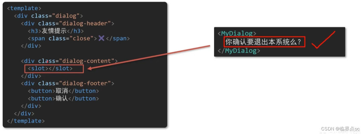
需求:要在页面中显示一个对话框,封装成一个组件
问题:组件的内容部分,不希望写死,希望能使用的时候自定义。怎么办?
示例代码:
components/MyDialog.vue
<template>
  <div class="dialog">
    <div class="dialog-header">
      <h3>友情提示</h3>
      <span class="close">✖️</span>
    </div>

    <div class="dialog-content">
      <!-- 1. 在需要定制的位置,使用<slot></slot>占位 -->
      <slot></slot>
    </div>
    <div class="dialog-footer">
      <button>取消</button>
      <button>确认</button>
    </div>
  </div>
</template>

<script>
export default {
  data () {
    return {

    }
  }
}
</script>

<style scoped>
* {
  margin: 0;
  padding: 0;
}
.dialog {
  width: 470px;
  height: 230px;
  padding: 0 25px;
  background-color: #ffffff;
  margin: 40px auto;
  border-radius: 5px;
}
.dialog-header {
  height: 70px;
  line-height: 70px;
  font-size: 20px;
  border-bottom: 1px solid #ccc;
  position: relative;
}
.dialog-header .close {
  position: absolute;
  right: 0px;
  top: 0px;
  cursor: pointer;
}
.dialog-content {
  height: 80px;
  font-size: 18px;
  padding: 15px 0;
}
.dialog-footer {
  display: flex;
  justify-content: flex-end;
}
.dialog-footer button {
  width: 65px;
  height: 35px;
  background-color: #ffffff;
  border: 1px solid #e1e3e9;
  cursor: pointer;
  outline: none;
  margin-left: 10px;
  border-radius: 3px;
}
.dialog-footer button:last-child {
  background-color: #007acc;
  color: #fff;
}
</style>
App.vue
<template>
<div>
<!-- 2. 在使用组件时,在组件标签内填入内容 -->
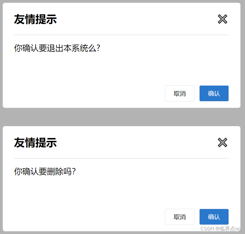
<MyDialog>你确认要退出本系统么?</MyDialog>
<MyDialog><p>你确认要删除吗?</p></MyDialog>
</div>
</template>
<script>
import MyDialog from "./components/MyDialog.vue"
export default {
data() {
return {}
},
components: {
MyDialog,
},
}
</script>
<style>
body {
background-color: #b3b3b3;
}
</style>效果:
2. 后备内容(默认值)
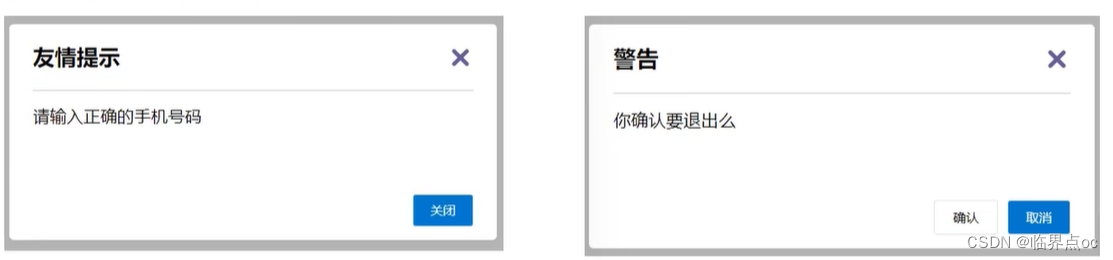
通过插槽完成了内容的定制,传什么显示什么,但是如果不传,则是空白
能否给插槽设置默认显示内容呢?
插槽后备内容:封装组件时,可以为预留的`<slot>`插槽提供后备内容(默认内容)。
语法:在<slot>标签内,写好后备内容,作为默认显示内容
效果:
外部使用组件时,不传东西,则slot会显示后备内容
<MyDialog></MyDialog>外部使用组件时,传东西了,则slot整体会被换掉
<MyDialog>我是内容</MyDialog>示例:
components/MyDialog.vue
<template>
  <div class="dialog">
    <div class="dialog-header">
      <h3>友情提示</h3>
      <span class="close">✖️</span>
    </div>

    <div class="dialog-content">
      <!-- 往slot标签内部编写内容,作为后备内容 -->
      <slot>默认内容</slot>
    </div>
    <div class="dialog-footer">
      <button>取消</button>
      <button>确认</button>
    </div>
  </div>
</template>

<script>
export default {
  data () {
    return {

    }
  }
}
</script>

<style scoped>
* {
  margin: 0;
  padding: 0;
}
.dialog {
  width: 470px;
  height: 230px;
  padding: 0 25px;
  background-color: #ffffff;
  margin: 40px auto;
  border-radius: 5px;
}
.dialog-header {
  height: 70px;
  line-height: 70px;
  font-size: 20px;
  border-bottom: 1px solid #ccc;
  position: relative;
}
.dialog-header .close {
  position: absolute;
  right: 0px;
  top: 0px;
  cursor: pointer;
}
.dialog-content {
  height: 80px;
  font-size: 18px;
  padding: 15px 0;
}
.dialog-footer {
  display: flex;
  justify-content: flex-end;
}
.dialog-footer button {
  width: 65px;
  height: 35px;
  background-color: #ffffff;
  border: 1px solid #e1e3e9;
  cursor: pointer;
  outline: none;
  margin-left: 10px;
  border-radius: 3px;
}
.dialog-footer button:last-child {
  background-color: #007acc;
  color: #fff;
}
</style>
App.vue
<template>
  <div>
    <MyDialog></MyDialog>
    <MyDialog>确认要删除吗?</MyDialog>
  </div>
</template>

<script>
import MyDialog from './components/MyDialog.vue'
export default {
  data () {
    return {

    }
  },
  components: {
    MyDialog
  }
}
</script>

<style>
body {
  background-color: #b3b3b3;
}
</style>
效果:

3. 具名插槽
需求:一个组件内有多处不确定的结构,需要外部传入标签,进行定制
默认插槽:一个的定制位置
具名插槽语法:
1. 多个slot使用name属性区分名字
<div class="dialog-header">
    <slot name="head"></slot>
</div>
<div class="dialog-content">
    <slot name="content"></slot>
</div>
<div class="dialog-footer">
    <slot name="footer"></slot>
</div>
2. template配合 v-slot:名字 来区分对应标签
<MyDialog>
    <template v-slot:head>
        大标题
    </template>
    <template v-slot:content>
        内容文本
    </template>
    <template v-slot:footer>
        <button>按钮</button>
    </template>
</MyDialog>
3. v-slot:插槽名 可以简化成 #插槽名
<MyDialog>
    <template #head>
        大标题
    </template>
    <template #content>
        内容文本
    </template>
    <template #footer>
        <button>按钮</button>
    </template>
</MyDialog>
示例:
components/MyDialog.vue
<template>
  <div class="dialog">
    <div class="dialog-header">
      <!-- 一旦插槽起了名字,就是具名插槽,只支持定向分发 -->
      <slot name="head"></slot>
    </div>

    <div class="dialog-content">
      <slot name="content"></slot>
    </div>

    <div class="dialog-footer">
      <slot name="footer"></slot>
    </div>
  </div>
</template>

<script>
export default {
  data() {
    return {}
  },
}
</script>

<style scoped>
* {
  margin: 0;
  padding: 0;
}
.dialog {
  width: 470px;
  height: 230px;
  padding: 0 25px;
  background-color: #ffffff;
  margin: 40px auto;
  border-radius: 5px;
}
.dialog-header {
  height: 70px;
  line-height: 70px;
  font-size: 20px;
  border-bottom: 1px solid #ccc;
  position: relative;
}
.dialog-header .close {
  position: absolute;
  right: 0px;
  top: 0px;
  cursor: pointer;
}
.dialog-content {
  height: 80px;
  font-size: 18px;
  padding: 15px 0;
}
.dialog-footer {
  display: flex;
  justify-content: flex-end;
}
.dialog-footer button {
  width: 65px;
  height: 35px;
  background-color: #ffffff;
  border: 1px solid #e1e3e9;
  cursor: pointer;
  outline: none;
  margin-left: 10px;
  border-radius: 3px;
}
.dialog-footer button:last-child {
  background-color: #007acc;
  color: #fff;
}
</style>
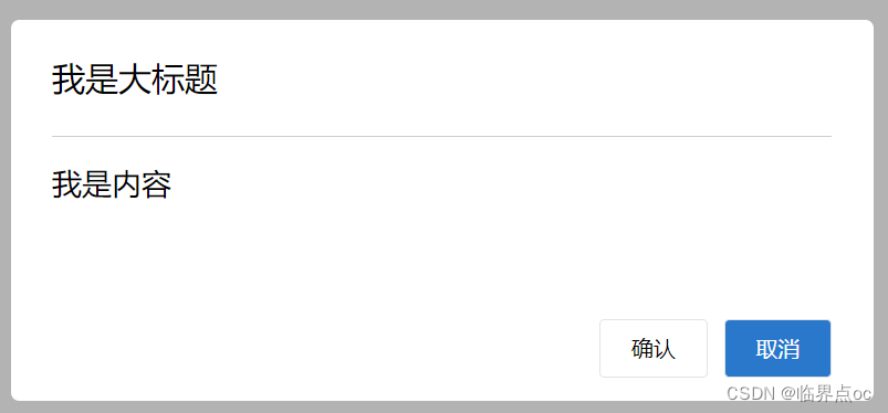
App.vue
<template>
  <div>
    <MyDialog>
      需要通过template标签包裹我们需要分发到结构,包成一个整体
      <template v-slot:head>
        <div>我是大标题</div>
      </template>
      <template v-slot:content>
        <div>我是内容</div>
      </template>
      <template #footer>
        <button>确认</button>
        <button>取消</button>
      </template>
    </MyDialog>
  </div>
</template>

<script>
import MyDialog from "./components/MyDialog.vue";
export default {
  data() {
    return {};
  },
  components: {
    MyDialog,
  },
};
</script>

<style>
body {
  background-color: #b3b3b3;
}
</style>
效果:
4. 作用域插槽
作用域插槽:定义slot插槽的同时,是可以传值的。给插槽上可以绑定数据,将来使用组件时可以用。
场景:封装表格组件

1. 父传子,动态渲染表格内容
2. 利用默认插槽,定制操作列
<MyTable :list="list">
    <button>删除</button>
</MyTable>
<MyTable :list="list2">
    <button>查看</button>
</MyTable>
基本使用步骤:
1. 给slot标签,以添加属性的方式传值
<slot :id="item.id" msg="测试文本"></slot>2. 所有添加的属性,都会被收集到一个对象中
{ id: 3, msg: '测试文本' }3. 在template中,通过`#插槽名="obj"` 接收,默认插槽名为default
<MyTable :list="list">
    <template #default="obj">
        <button @click="del(obj.id)">删除</button>
    <template>
</MyTable>
示例代码:
MyTable.vue
<template>
<table class="my-table">
<thead>
<tr>
<th>序号</th>
<th>姓名</th>
<th>年纪</th>
<th>操作</th>
</tr>
</thead>
<tbody>
<tr v-for="(item, index) in data" :key="item.id">
<td>{{ index + 1 }}</td>
<td>{{ item.name }}</td>
<td>{{ item.age }}</td>
<td>
<!-- 1. 给slot标签,以添加属性的方式传值 -->
<slot :row="item" msg="测试文本"></slot>
<!-- 2. 将所有的属性,添加到一个对象中
{
row: {id:2, name: '孙大明', age: 19},
msg: '测试文本'
}
-->
</td>
</tr>
</tbody>
</table>
</template>
<script>
export default {
props: {
data: Array,
},
}
</script>
<style scoped>
.my-table {
width: 450px;
text-align: center;
border: 1px solid #ccc;
font-size: 24px;
margin: 30px auto;
}
.my-table thead {
background-color: #1f74ff;
color: #fff;
}
.my-table thead th {
font-weight: normal;
}
.my-table thead tr {
line-height: 40px;
}
.my-table th,
.my-table td {
border-bottom: 1px solid #ccc;
border-right: 1px solid #ccc;
}
.my-table td:last-child {
border-right: none;
}
.my-table tr:last-child td {
border-bottom: none;
}
.my-table button {
width: 65px;
height: 35px;
font-size: 18px;
border: 1px solid #ccc;
outline: none;
border-radius: 3px;
cursor: pointer;
background-color: #ffffff;
margin-left: 5px;
}
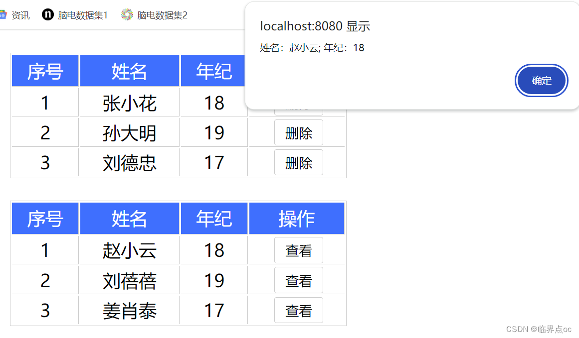
</style>App.vue
<template>
  <div>
    <MyTable :data="list">
      <!-- 3. 通过 template #插槽名="变量名" 接收 -->
      <template #default="obj">
        <!-- {{ obj }} -->
        <button @click="del(obj.row.id)">删除</button>
      </template>
    </MyTable>

    <MyTable :data="list2">
      <template #default="{ row }">
        <button @click="show(row)">查看</button>
      </template>
    </MyTable>
  </div>
</template>

<script>
import MyTable from './components/MyTable.vue'
export default {
  data () {
    return {
      list: [
        { id: 1, name: '张小花', age: 18 },
        { id: 2, name: '孙大明', age: 19 },
        { id: 3, name: '刘德忠', age: 17 },
      ],
      list2: [
        { id: 1, name: '赵小云', age: 18 },
        { id: 2, name: '刘蓓蓓', age: 19 },
        { id: 3, name: '姜肖泰', age: 17 },
      ]
    }
  },
  methods: {
    del(id) {
      // console.log(id)
      this.list = this.list.filter(item => item.id !== id)
    },
    show(row) {
      // console.log(row)
      alert(`姓名:${row.name}; 年纪:${row.age}`)
    }
  },
  components: {
    MyTable
  }
}
</script>
效果:
三、综合案例:商品列表
需求说明:
1. MyTag组件封装
(1)双击显示输入框,输入框获取焦点
(2)失去焦点,隐藏输入框
(3)回显标签信息
(4)内容修改,回车 -> 修改标签信息
2. MyTable组件封装
(1)动态传递表格数据渲染
(2)表头支持用户自定义
(3)主题支持用户自定义
示例代码:
main.js
import Vue from 'vue'
import App from './App.vue'

Vue.config.productionTip = false

// 封装全局指令 focus
Vue.directive('focus', {
  // 指令所在的dom元素,被插入到页面中时触发
  inserted(el) {
    el.focus()
  }
})

new Vue({
  render: h => h(App),
}).$mount('#app')
components/MyTag.vue
<template>
    <div class="my-tag">
        <input
            v-if="isEdit"
            v-focus
            ref="inp"
            @blur="isEdit = false"
            class="input"
            type="text"
            placeholder="输入标签"
            :value="value"
            @keyup.enter="handleEnter" />
        <div
            v-else
            @dblclick="handleClick"
            class="text">{{ value }}</div>
    </div>
</template>

<script>
export default {
    props: {
        value: String
    },
    data() {
        return {
            isEdit: false
        }
    },
    methods: {
        handleClick() {
            // 双击显示
            this.isEdit = true

           // 等dom更新完成,再获取焦点
        //    this.$nextTick(() => {
        //     // 立刻获取焦点
        //     this.$refs.inp.focus()
        //    })
        },
        handleEnter(e) {
            // 判空
            if(e.target.value.trim() === '') {
                alert('标签内容不能为空')
                return
            }
            // console.log('回车了')
            // 子传父 将回车时,输入框的内容提交给父组件更新
            // 由于父组件是v-model,触发事件,需要触发input事件
            // console.log(e.target.value)
            this.$emit('input', e.target.value)
            // 提交完成,关闭输入状态
            this.isEdit = false
        }
    }
};
</script>

<style lang="less" scoped>
.my-tag {
  cursor: pointer;
  .input {
    appearance: none;
    outline: none;
    border: 1px solid #ccc;
    width: 100px;
    height: 40px;
    box-sizing: border-box;
    padding: 10px;
    color: #666;
    &::placeholder {
      color: #666;
    }
  }
}
</style>
components/MyTable.vue
<template>
    <table class="my-table">
        <thead>
            <tr>
                <slot name="head"></slot>
            </tr>
        </thead>
        <tbody>
            <tr v-for="(item, index) in data" :key="item.id">
                <slot name="body" :item="item" :index="index"></slot>
            </tr>
        </tbody>
    </table>
</template>

<script>
export default {
    props: {
        data: {
            type: Array,
            required: true
        }
    }
}
</script>

<style lang="less" scoped>
.my-table {
    width: 100%;
    border-spacing: 0;

    img {
        width: 100px;
        height: 100px;
        object-fit: contain;
        vertical-align: middle;
    }

    th {
        background: #f5f5f5;
        border-bottom: 2px solid #069;
    }

    td {
        border-bottom: 1px dashed #ccc;
    }

    td,
    th {
        text-align: center;
        padding: 10px;
        transition: all 0.5s;

        &.red {
            color: red;
        }
    }

    .none {
        height: 100px;
        line-height: 100px;
        color: #999;
    }
}
</style>
App.vue
<template>
  <div class="table-case">
    <MyTable :data="goods">
      <!-- 表头自定义 -->
      <template #head>
        <th>编号</th>
        <th>名称</th>
        <th>图片</th>
        <th width="100px">标签</th>
      </template>
      <!-- 主体自定义 -->
      <template #body="{item, index}">
        <td>{{ index + 1 }}</td>
        <td>{{ item.name }}</td>
        <td>
          <img :src="item.picture" />
        </td>
        <td>
          <!-- 标签组件 -->
          <MyTag v-model="item.tag"></MyTag>
        </td>
      </template>
    </MyTable>
  </div>
</template>


<script>
// my-tag标签组件的封装
// 1. 创建组件 - 初始化
// 2. 实现功能
//  (1)双击,开启输入框的显示并获取焦点
//      v-if v-else @dbclick
//      自动聚焦:
//      ①$nextTick = > $refs 获取到dom,进行focus获取焦点
//      ②封装v-focus指令
//  (2)失去焦点,隐藏输入框
//    @blur 操作isEdit

//  (3)回显标签信息
//    回显的标签信息是父组件传递过来的
//    v-model实现功能(简化代码) v-model => :value 和 @input
//    组件内部通过props接收, :value设置给输入框
//  (4)内容如果修改了,回车 => 修改信息
//    @keyup.enter,触发事件 $emit('input', e.target.value)

// my-table 表格组件的封装
// 1. 数据不能写死,动态传递表格渲染的数据
// 2. 结构不能写死  - 多出结构自定义[具名插槽]
//  (1)表头支持自定义
//  (2)主体支持自定义


import MyTag from './components/MyTag.vue'
import MyTable from './components/MyTable.vue'
export default {
  name: 'TableCase',
  components: {
    MyTag,
    MyTable
  },
  data() {
    return {
      // 测试组件功能的临时数据
      tempText: '水杯',
      tempText2: '鞋子',
      goods: [
        {
          id: 101,
          picture:
            'https://yanxuan-item.nosdn.127.net/f8c37ffa41ab1eb84bff499e1f6acfc7.jpg',
          name: '梨皮朱泥三绝清代小品壶经典款紫砂壶',
          tag: '茶具',
        },
        {
          id: 102,
          picture:
            'https://yanxuan-item.nosdn.127.net/221317c85274a188174352474b859d7b.jpg',
          name: '全防水HABU旋钮牛皮户外徒步鞋山宁泰抗菌',
          tag: '男鞋',
        },
        {
          id: 103,
          picture:
            'https://yanxuan-item.nosdn.127.net/cd4b840751ef4f7505c85004f0bebcb5.png',
          name: '毛茸茸小熊出没,儿童羊羔绒背心73-90cm',
          tag: '儿童服饰',
        },
        {
          id: 104,
          picture:
            'https://yanxuan-item.nosdn.127.net/56eb25a38d7a630e76a608a9360eec6b.jpg',
          name: '基础百搭,儿童套头针织毛衣1-9岁',
          tag: '儿童服饰',
        },
      ],
    }
  },
}
</script>

<style lang="less" scoped>
.table-case {
  width: 1000px;
  margin: 50px auto;

  img {
    width: 100px;
    height: 100px;
    object-fit: contain;
    vertical-align: middle;
  }
}
</style>
效果:

小结:
1. 商品列表的实现封装了几个组件?
答:2个组件,标签组件和表格组件
2. 封装用到的核心技术点有哪些?
答:(1)①props父传子;②$emit子传父;③v-model
(2)$nextTick自定义指令
(3)插槽:具名插槽,作用域插槽
四、路由入门
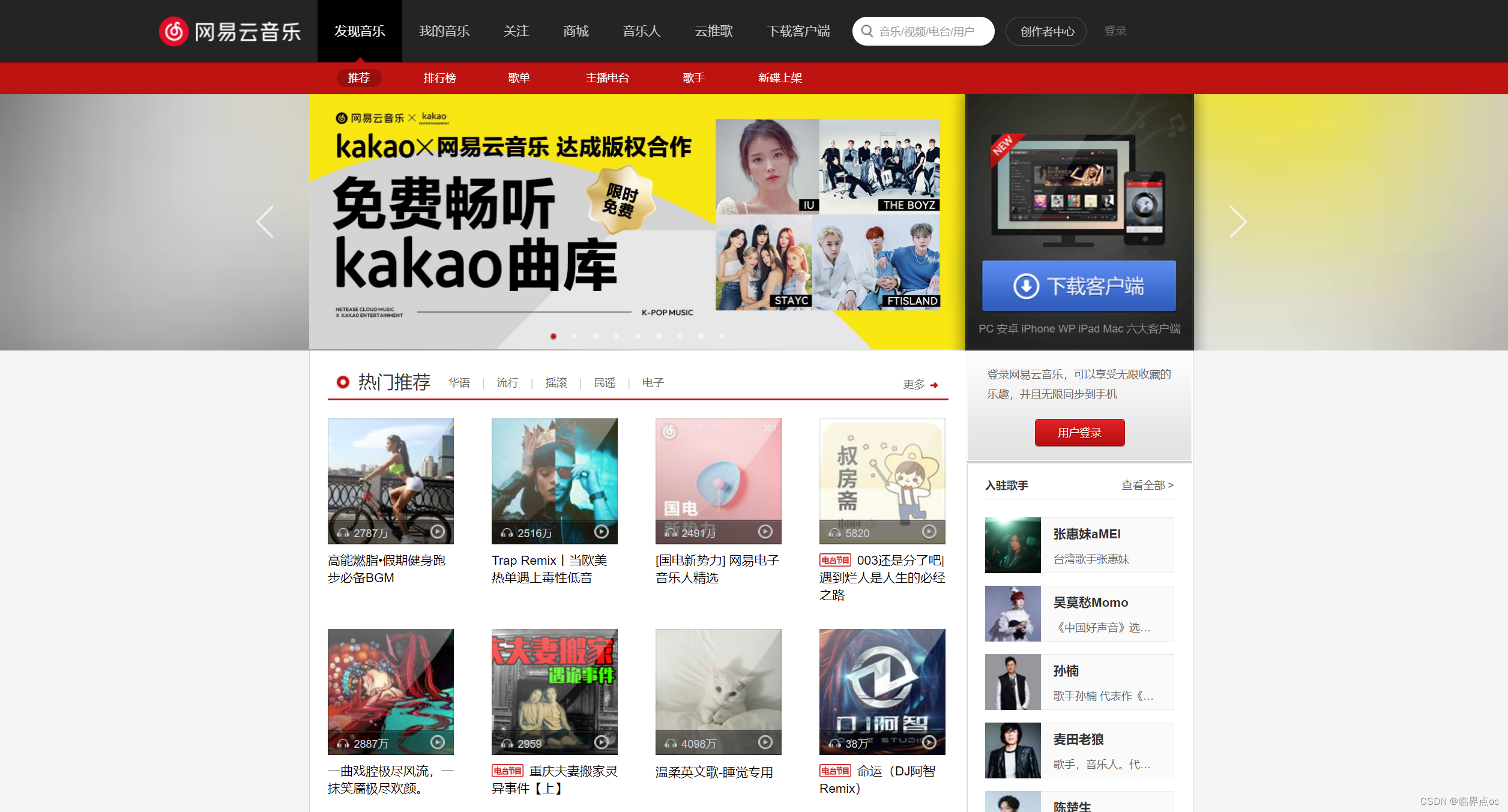
1. 单页应用程序:SPA - Single Page Application
单页面应用(SPA):所有功能都在一个html页面上实现
具体实例:网易云音乐 https://music.163.com/
| 开发分类 | 实现方式 | 页面性能 | 开发效率 | 用户体验 | 学习成本 | 首屏加载 | SEO |
| 单页 | 一个html页面 | 按需更新 性能高 |
高 | 非常好 | 高 | 慢 | 差 |
| 多页 | 多个html页面 | 整页更新 性能低 |
中等 | 一般 | 中等 | 快 | 优 |
单页面应用场景:系统类网站 / 内部网站 / 文档类网站 / 移动端站点
多页面应用场景:公司官网 / 电商类网站
2. 路由概念
路由的介绍
Vue中路由:路径 和 组件 的映射关系
3. VueRouter的基本使用(5 + 2)
目的:认识插件VueRouter,掌握VueRouter的基本使用步骤
作用:修改地址栏路径时,切换显示匹配的组件
说明:Vue是官方的一个路由插件,是一个第三方包
官网:https://v3.router.vuejs.org/zh/
5个基础步骤(固定)
①下载:下载VueRouter模块到当前工程,版本3.6.5
npm install vue-router@3.6.5yarn add vue-router@3.6.5②引入
import VueRouter from 'vue-router'③安装注册
Vue.use(VueRouter)④创建路由对象
const router = new VueRouter()⑤注入,将路由对象注入到new Vue实例中,建立关联
new Vue({
    render: h => h(App),
    router: router
}).$mount('#app')
2个核心步骤
①创建需要的组件(views目录),配置路由规则
Find.vue My.vue Friend.vue
import Find from './views/Find'
import My from './views/My'
import Friend from './views/Friend'

const router = new VueRouter({
  // routes 路由规则们
  // route  一条路由规则 { path: 路径, component: 组件 }
  routes: [
    { path: '/find', component: Find },
    { path: '/my', component: My },
    { path: '/friend', component: Friend },
  ]
})②配置导航,配置路由出口(路径匹配的组件显示的位置)
    <div class="footer_wrap">
      <a href="#/find">发现音乐</a>
      <a href="#/my">我的音乐</a>
      <a href="#/friend">朋友</a>
    </div>
    <div class="top">
      <!-- 路由出口 → 匹配的组件所展示的位置 -->
      <router-view></router-view>
    </div>
示例代码:
main.js
import Vue from 'vue'
import App from './App.vue'

// 路由的使用步骤 5 + 2
// 5个基础步骤
// 1. 下载 v3.6.5
// 2. 引入
// 3. 安装注册 Vue.use(Vue插件)
// 4. 创建路由对象
// 5. 注入到new Vue中,建立关联

// 2个核心步骤
// 1. 建组件(views目录),配规则
// 2. 准备导航链接,配置路由出口(匹配的组件展示的位置)
import Find from './views/Find'
import My from './views/My'
import Friend from './views/Friend'
import VueRouter from 'vue-router'
Vue.use(VueRouter) // VueRouter插件初始化

const router = new VueRouter({
  // routes 路由规则们
  // route  一条路由规则 { path: 路径, component: 组件 }
  routes: [
    { path: '/find', component: Find },
    { path: '/my', component: My },
    { path: '/friend', component: Friend },
  ]
})

Vue.config.productionTip = false

new Vue({
  render: h => h(App),
  router
}).$mount('#app')
Find.vue
<template>
  <div>
    <p>发现音乐</p>
    <p>发现音乐</p>
    <p>发现音乐</p>
    <p>发现音乐</p>
  </div>
</template>

<script>
export default {
  name: 'FindMusic'
}
</script>

<style>

</style>
My.vue
<template>
  <div>
    <p>我的音乐</p>
    <p>我的音乐</p>
    <p>我的音乐</p>
    <p>我的音乐</p>
  </div>
</template>

<script>
export default {
  name: 'MyMusic'
}
</script>

<style>

</style>
Friend.vue
<template>
  <div>
    <p>我的朋友</p>
    <p>我的朋友</p>
    <p>我的朋友</p>
    <p>我的朋友</p>
  </div>
</template>

<script>
export default {
  name: 'MyFriend'
}
</script>

<style>

</style>
App.vue
<template>
  <div>
    <div class="footer_wrap">
      <!-- 准备导航链接,配置路由出口(匹配的组件展示的位置)  -->
      <a href="#/find">发现音乐</a>
      <a href="#/my">我的音乐</a>
      <a href="#/friend">朋友</a>
    </div>
    <div class="top">
      <!-- 路由出口 → 匹配的组件所展示的位置 -->
      <router-view></router-view>
    </div>
  </div>
</template>

<script>
export default {};
</script>

<style>
body {
  margin: 0;
  padding: 0;
}
.footer_wrap {
  position: relative;
  left: 0;
  top: 0;
  display: flex;
  width: 100%;
  text-align: center;
  background-color: #333;
  color: #ccc;
}
.footer_wrap a {
  flex: 1;
  text-decoration: none;
  padding: 20px 0;
  line-height: 20px;
  background-color: #333;
  color: #ccc;
  border: 1px solid black;
}
.footer_wrap a:hover {
  background-color: #555;
}
</style>
效果:

4. 组件目录存放问题(组件分类)
注意:.vue文件本质无区别
路由相关的组件,为什么放在views目录呢?
组件分类:.vue文件分2类,页面组件 & 复用组件
目的:分类开来,更易维护
src/views文件夹
- 页面组件 - 页面展示 - 配合路由用
src/components文件夹
- 复用组件 - 展示数据 - 常用于复用