这个结构和Flutter阿、Compose阿挺像,顺水行舟,都为生命式UI方式,看下组件吧:
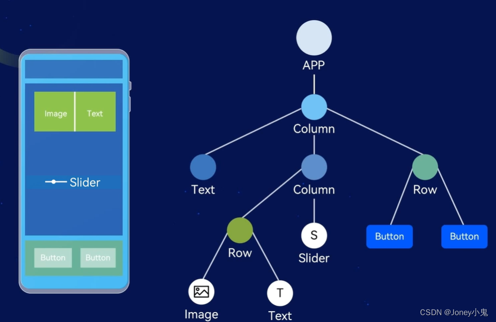
1. 组件介绍:
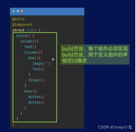
@Entry
代表一个界面的入口,跟Activity声明有点像
@Component
代表是一个UI布局的结构体声明,下面跟结构体
结构体内,组件在build方法内,每个组件都必须实现build方法,是用于定义组件的声明式UI描述
2. 基础组件
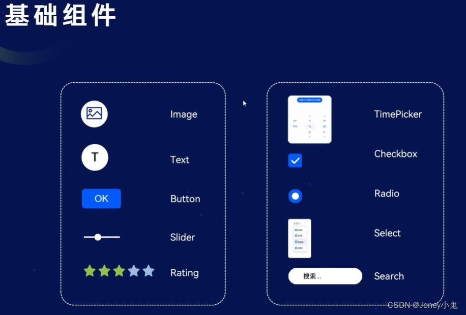
基础组件的声明式使用,参数方式传递,参数既可以用直接输入、也可以来源于资源(当然正常编码都用资源啦,涉及到多语言等自动适配啦)
Text
Column() {
  Text(this.message)//外部文字定义使用
    .fontSize('36.00fp')
    .fontWeight(FontWeight.Bold)
  Text("一段文字")//直接字符串
    .fontColor("#ff00ff")
  Text($r("app.string.EntryAbility_label"))//string资源使用
    .fontColor($r('app.color.main_text_color'))//color资源使用
}
Button
Column() {
  Button("button", { type: ButtonType.Normal })//矩形
  Button("button", { type: ButtonType.Capsule })//默认的胶囊型
}
容器:
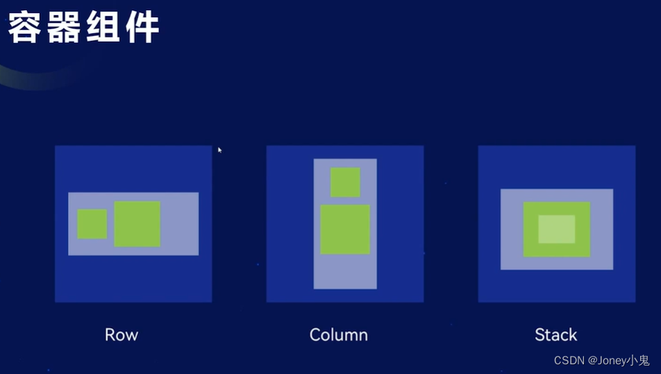
Colume:列容器
| 接口 | 参数说明 |
|---|---|
| alignItems | 水平对齐:HorizontalAlign枚举,默认Center |
| justifyContent | 垂直对齐:FlexAlign枚举,默认Top |
Column() {
  Text('Text1')
    .width(fp2px(50))
    .height(fp2px(50))
    .backgroundColor(Color.White)
    .textAlign(TextAlign.Center)

  Text('Text2')
    .width(fp2px(50))
    .height(fp2px(50))
    .backgroundColor(Color.White)
    .textAlign(TextAlign.Center)

  Text('Text3')
    .width(fp2px(50))
    .height(fp2px(50))
    .backgroundColor(Color.White)
    .textAlign(TextAlign.Center)
}
.width('100%')
.height('100%')
.backgroundColor(Color.Green)
.alignItems(HorizontalAlign.End)
.justifyContent(FlexAlign.End)
Row:行容器
| 接口 | 参数说明 |
|---|---|
| alignItems | 垂直对齐:VerticalAlign枚举,默认Center |
| justifyContent | 水平对齐:FlexAlign枚举,默认Start |
Row() {
  Text('Text1')
    .width(fp2px(50))
    .height(fp2px(50))
    .backgroundColor(Color.White)
    .textAlign(TextAlign.Center)

  Text('Text2')
    .width(fp2px(50))
    .height(fp2px(50))
    .backgroundColor(Color.White)
    .textAlign(TextAlign.Center)

  Text('Text3')
    .width(fp2px(50))
    .height(fp2px(50))
    .backgroundColor(Color.White)
    .textAlign(TextAlign.Center)
}
.width('100%')
.height('100%')
.backgroundColor(Color.Green)
.alignItems(VerticalAlign.Center)
.justifyContent(FlexAlign.Start)
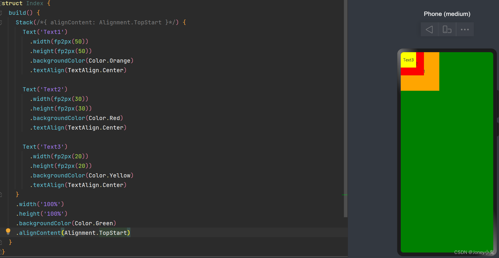
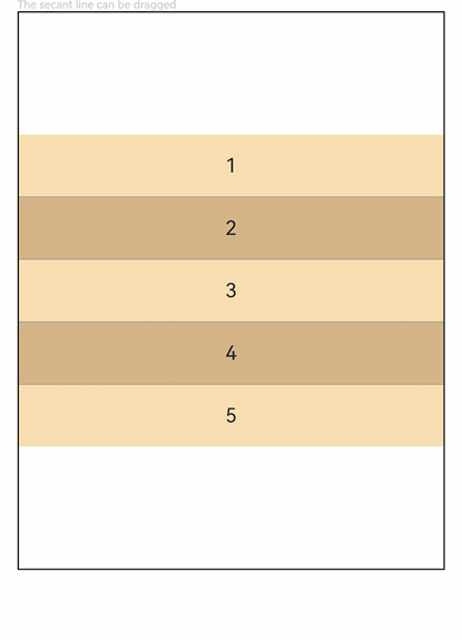
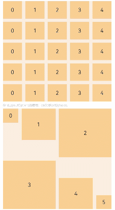
Stack:栈容器
堆叠型容器
| 接口 | 参数说明 |
|---|---|
| alignContent | 对齐:Alignment,默认是Center |
Stack(/*{ alignContent: Alignment.TopStart }*/) {
  Text('Text1')
    .width(fp2px(50))
    .height(fp2px(50))
    .backgroundColor(Color.Orange)
    .textAlign(TextAlign.Center)

  Text('Text2')
    .width(fp2px(30))
    .height(fp2px(30))
    .backgroundColor(Color.Red)
    .textAlign(TextAlign.Center)

  Text('Text3')
    .width(fp2px(20))
    .height(fp2px(20))
    .backgroundColor(Color.Yellow)
    .textAlign(TextAlign.Center)
}
.width('100%')
.height('100%')
.backgroundColor(Color.Green)
如下图:后面的覆盖在前面的上面
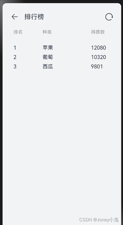
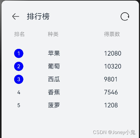
练习:静态水果排行榜页面
build() {
  Column() {
    /*顶部标题栏*/
    Row() {
      /*左侧*/
      Row() {
        Image($r('app.media.ic_public_back'))
          .width(22)
          .height(22)
          .margin({ right: 18 })

        Text("排行榜")
          .fontSize(20)
      }
      .width('50%')
      .height(100)
      .justifyContent(FlexAlign.Start)
      /*右侧*/

      Row() {
        Image($r('app.media.loading'))
          .width(22)
          .height(22)
      }
      .width('50%')
      .height(100)
      .justifyContent(FlexAlign.End) //右对齐
    }
    .width('100%')
    .height(47)
    .padding({ left: 26, right: 26 })
    .margin({ top: 18 })


    /*水果排行榜标题*/
    Row() {
      Text("排名")
        .fontSize(14)
        .width('30%')
        .fontColor('#989a9c')
      Text("种类")
        .fontSize(14)
        .width('50%')
        .fontColor('#989a9c')
      Text("得票数")
        .fontSize(14)
        .width('20%')
        .fontColor('#989a9c')
    }
    .width('90%')
    .padding(15)

    /*水果排行内容*/
    Column() {
      List({space: 10}) {
        ListItem() {
          Row() {
            Text("1")
              .width('30%')
            Text("苹果")
              .width('50%')
            Text("12080")
              .width('20%')
          }
        }

        ListItem() {
          Row() {
            Text("2")
              .width('30%')
            Text("葡萄")
              .width('50%')
            Text("10320")
              .width('20%')
          }
        }

        ListItem() {
          Row() {
            Text("3")
              .width('30%')
            Text("西瓜")
              .width('50%')
            Text("9801")
              .width('20%')
          }
        }
      }
      .width('90%')
      .padding(15)
    }
  }
  .backgroundColor("#F1F3F5")
  .width('100%')
  .height('100%')
}
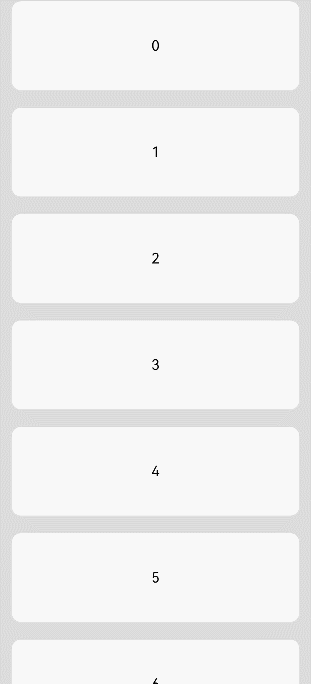
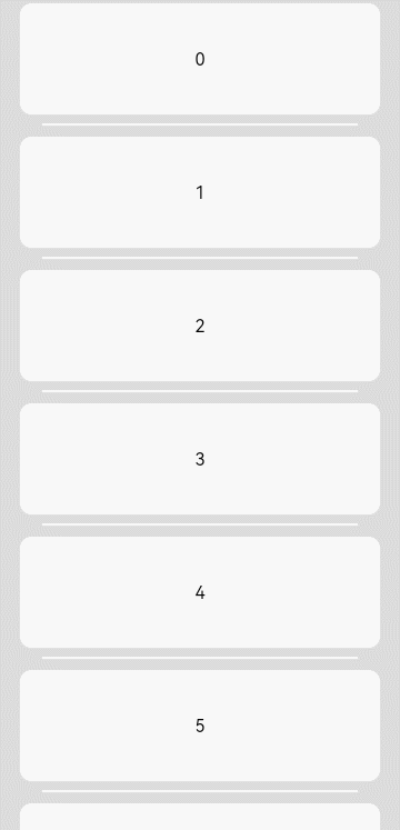
还是有点像模像样的啦: 布局拆解后,按横向纵向排列布局处理,响应式写法确实帅。就是括号嵌套层级有点多,看起来有点难受,看下效果
练习:动态渲染数据
静态的每个自己添加在实际使用的时候是不切实际的,肯定是根据数据进行遍历添加。试一下foreach
/**
 * 水果排行数组
 */
fruits: Array<Object> = [{
  id: '1',
  name: "苹果",
  vote: "12080"
}, {
  id: '2',
  name: "葡萄",
  vote: "10320"
}, {
  id: '3',
  name: "西瓜",
  vote: "9801"
}, {
  id: '4',
  name: "香蕉",
  vote: "7546"
}, {
  id: '5',
  name: "菠萝",
  vote: "1208"
}]
/**
 * 水果排行榜页面 静态练习
 */
build() {
  Column() {
    /*顶部标题栏*/
    Row() {
      /*左侧*/
      Row() {
        Image($r('app.media.ic_public_back'))
          .width(22)
          .height(22)
          .margin({ right: 18 })

        Text("排行榜")
          .fontSize(20)
      }
      .width('50%')
      .height(100)
      .justifyContent(FlexAlign.Start)
      /*右侧*/

      Row() {
        Image($r('app.media.loading'))
          .width(22)
          .height(22)
      }
      .width('50%')
      .height(100)
      .justifyContent(FlexAlign.End) //右对齐
    }
    .width('100%')
    .height(47)
    .padding({ left: 26, right: 26 })
    .margin({ top: 18 })


    /*水果排行榜标题*/
    Row() {
      Text("排名")
        .fontSize(14)
        .width('30%')
        .fontColor('#989a9c')
      Text("种类")
        .fontSize(14)
        .width('50%')
        .fontColor('#989a9c')
      Text("得票数")
        .fontSize(14)
        .width('20%')
        .fontColor('#989a9c')
    }
    .width('90%')
    .padding(15)

    /*水果排行内容*/
    Column() {
      List({ space: 10 }) {
        /*采用对象来*/
        ForEach(this.fruits, (item) => {
          ListItem() {
            Row() {
              if (item.id <= 3) {
                Column() {
                  Row() {
                    Text(item.id)
                      .fontSize(14)
                      .fontColor(Color.White)
                  }
                  .width(24)
                  .height(24)
                  .borderRadius(18)
                  .backgroundColor(Color.Blue)
                  .justifyContent(FlexAlign.Center) //水平对齐
                }
                .width('30%')
                .alignItems(HorizontalAlign.Start) //水平对齐
              }
              else {
                Column() {
                  Text(item.id)
                    .fontSize(14)
                    .textAlign(TextAlign.Center)//文字居中,对应上面的Row的水平居中
                    .width(24)
                    .height(24)
                }
                .width('30%')
                .alignItems(HorizontalAlign.Start) //水平对齐
              }
              Text(item.name)
                .width('50%')
              Text(item.vote)
                .width('20%')
            }
          }
        })
      }
      .width('90%')
      .padding(15)
    }
  }
  .backgroundColor("#F1F3F5")
  .width('100%')
  .height('100%')
}
主要关键修改是增加了一个数组Array,然后使用foreach来遍历产生ListItem
效果:
组件事件修饰器
- onclick事件
Button("点击")
  .onClick(event => {
    this.count++
    console.log("点击事件触发:" + this.count)
  })
- @State修饰器
我们希望对应值修改后能体现在UI上则可以用改状态修饰器修饰对应的值定义
@State count: number = 0

#在count变化后, Text控件自动会刷新
Text("文字" + this.count)
@Link 修饰器
通过@link修饰器可以将子组件的变量与父组件的变量建立关联关系@Builder 修饰器
可以将组件抽象提取为函数,重复UI利用,在build里调用
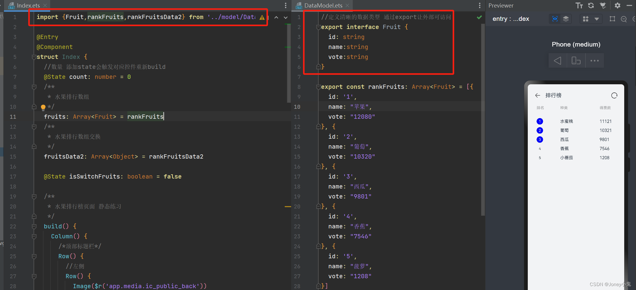
3. 模块化
数据与页面分离:
将页面和数据分离开到不同文件,可以方便管理代码
(1)另建ets文件
(2)将类类型、静态数据声明放到独立的ets中
(3)将类型、数据声明加export,让外部可以使用
(4)在需要使用的地方,使用import ··· from 方式来引用
如下:
布局分离:
一个etx中有多个view时,可以拆分成不同的自定义view,或者说组合多个自定义view到布局:
- 新建etx文件,使用 子组件方式,修饰结构体
@Component
export struct TitleComponent{
    //这样实现build方法即可
  build(){
  }
}
- 对于子组件中有变量要与父控件保持一致时,使用前面说的@Link,建议关联父控件值时,名称也要与父控件声明一样(不一样也没啥,传参绑定)
@Component
struct TitleComponent{
    //关联父控件中传入变量的值
  @Link isSwitchFruits:boolean
  build(){
    Row() {
      //左侧
      Row() {
        Image($r('app.media.ic_public_back'))
          .width(22)
          .height(22)
          .margin({ right: 18 })

        Text("排行榜")
          .fontSize(20)
      }
      .width('50%')
      .height(100)
      .justifyContent(FlexAlign.Start)

      //右侧

      Row() {
        Image($r('app.media.loading'))
          .width(22)
          .height(22)
          .onClick(() => {
            this.isSwitchFruits = !this.isSwitchFruits
          })
      }
      .width('50%')
      .height(100)
      .justifyContent(FlexAlign.End) //右对齐
    }
    .width('100%')
    .height(47)
    .padding({ left: 26, right: 26 })
    .margin({ top: 18 })
  }
}
使用时:
//引用
import {TitleComponent} from '../view/TitleComponent'

//使用传参方式绑定子控件内容,左侧为子控件变量,右侧用取值方式取当前要传的值
TitleComponent({sisSwitchFruits:$isSwitchFruits})
- 对于可以重复利用的使用@Builder
/**
 * 水果排行榜页面 静态练习
 */
build() {
  Column() {
    /*顶部标题栏*/
    //使用传参方式绑定子空间内容
    TitleComponent({ sisSwitchFruits: $isSwitchFruits })

    //水果排行榜标题
    ListTitleComponent()

    /*水果排行内容*/
    this.RankList()
  }
  .backgroundColor("#F1F3F5")
  .width('100%')
  .height('100%')
}

/**
 * UI做builder声明方式,UI组件作为函数使用,被build内调用
 */
@Builder RankList() {
  Column() {
    List({ space: 10 }) {
      //采用对象来
      ForEach(this.isSwitchFruits ? this.fruits : this.fruitsData2, (item: Fruit) => {
        ListItem() {
          ItemComponent({
            itemId: item.id,
            itemName: item.name,
            itemVote: item.vote
          })
        }
      })
    }
    .width('90%')
    .padding(15)
  }
}
至此,简单的布局就可以啦:
1.简单的组件使用布局:Column、Row、Stack、ListItem
2.状态改变等:@State 来关注变化、@link 来子控件关联父控件变量、
3.将view独立:独立函数@Builder抽离view到函数,独立文件 @Component 和 import、from


