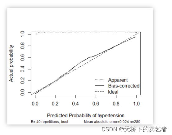
校准曲线图表示的是预测值和实际值的差距,作为预测模型的重要部分,目前很多函数能绘制校准曲线。
一般分为两种,一种是通过Hosmer-Lemeshow检验,把P值分为10等分,求出每等分的预测值和实际值的差距
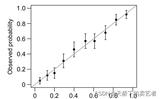
另外一种是calibration函数重抽样绘制连续的校准图
我们既往文章《手动绘制logistic回归预测模型校准曲线》已经进行了手动绘制logistic回归预测模型校准曲线,今天继续视频来介绍外部数据的校准曲线验证和分类数据的校准曲线
R语言手动绘制logistic回归预测模型校准曲线(Calibration curve)(2)
代码
library(ggplot2)
library(rms)
source("E:/r/test/ggfit.R")
#公众号:零基础说科研,公众号回复:早产数据,可以获得数据
#公众号回复:代码,可以获得我自写gg2函数
bc<-read.csv("E:/r/test/zaochan.csv",sep=',',header=TRUE)
#########
bc$race<-ifelse(bc$race=="black",1,ifelse(bc$race=="white",2,3))
bc$smoke<-ifelse(bc$smoke=="nonsmoker",0,1)
bc$race<-factor(bc$race)
bc$ht<-factor(bc$ht)
bc$ui<-factor(bc$ui)
###
set.seed(123)
tr1<- sample(nrow(bc),0.6*nrow(bc))##随机无放抽取
bc_train <- bc[tr1,]#60%数据集
bc_test<- bc[-tr1,]#40%数据集
##
fit<-glm(low ~ age + lwt + race + smoke + ptl + ht + ui + ftv,
family = binomial("logit"),
data = bc_train )
pr1<- predict(fit,type = c("response"))#得出预测概率
#外部数据生成概率
pr2 <- predict(fit,newdata= bc_test,type = c("response"))
#生成两个数据的结局变量
y1<-bc_train[, "low"]
y2<-bc_test[, "low"]
###
plot1<-gg2(bc_train,pr1,y1)
ggplot(plot1, aes(x=meanpred, y=meanobs)) +
geom_errorbar(aes(ymin=meanobs-1.96*se, ymax=meanobs+1.96*se), width=.02)+
annotate(geom = "segment", x = 0, y = 0, xend =1, yend = 1)+
expand_limits(x = 0, y = 0) +
scale_x_continuous(expand = c(0, 0)) +
scale_y_continuous(expand = c(0, 0))+
geom_point(size=3, shape=21, fill="white")+
xlab("预测概率")+
ylab("实际概率")
##
plot2<-gg2(bc_test,pr2,y2)
ggplot(plot2, aes(x=meanpred, y=meanobs)) +
geom_errorbar(aes(ymin=meanobs-1.96*se, ymax=meanobs+1.96*se), width=.02)+
annotate(geom = "segment", x = 0, y = 0, xend =1, yend = 1)+
expand_limits(x = 0, y = 0) +
scale_x_continuous(expand = c(0, 0)) +
scale_y_continuous(expand = c(0, 0))+
geom_point(size=3, shape=21, fill="white")+
xlab("预测概率")+
ylab("实际概率")
#########
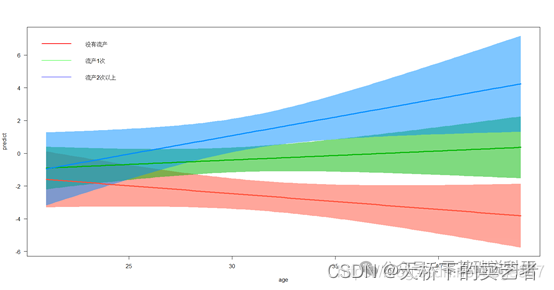
# 假设我们想了解吸烟人群和不吸烟人群比较,模型的预测能力有什么不同,可以把原数据分成2个模型,分别做成校准曲线,然后进行比较,
# 先分成吸烟组和不吸烟组两个数据
dat0<-subset(bc,bc$smoke==0)
dat00<-dat0[,-6]
dat1<-subset(bc,bc$smoke==1)
dat11<-dat1[,-6]
##
fit0<-glm(low ~ age + lwt + race + ptl + ht + ui + ftv,
family = binomial("logit"),
data = dat00)
fit1<-glm(low ~ age + lwt + race + ptl + ht + ui + ftv,
family = binomial("logit"),
data = dat11)
##
pr0<- predict(fit0,type = c("response"))#得出预测概率
y0<-dat00[, "low"]
pr1<- predict(fit1,type = c("response"))#得出预测概率
y1<-dat11[, "low"]
###
# 做分类的时候有5个参数,前面3个是数据,概率和Y值,group = 2是固定的,
# leb = "nosmoke"是你想给这个分类变量取的名字,生成如下数据
smoke0<-gg2(dat00,pr0,y0,group = 2,leb = "nosmoke")
#接下来做吸烟组的数据
smoke1<-gg2(dat11,pr1,y1,group = 2,leb = "smoke")
#把两个数据合并最后生成绘图数据
plotdat<-rbind(smoke0,smoke1)
#生成了绘图数据后就可以绘图了,只需把plotdat放进去其他不用改,当然你想自己调整也是可以的
ggplot(plotdat, aes(x=meanpred, y=meanobs, color=gro,fill=gro,shape=gro)) +
geom_line() +
geom_point(size=4)+
annotate(geom = "segment", x = 0, y = 0, xend =1, yend = 1)+
expand_limits(x = 0, y = 0)
###美化
ggplot(plotdat, aes(x=meanpred, y=meanobs, color=gro,fill=gro,shape=gro)) +
geom_line() +
geom_point(size=4)+
annotate(geom = "segment", x = 0, y = 0, xend =1, yend = 1)+
expand_limits(x = 0, y = 0)+
scale_x_continuous(expand = c(0, 0)) +
scale_y_continuous(expand = c(0, 0))+
xlab("predicted probability")+
ylab("actual probability")+
theme_bw()+
theme(panel.grid.major = element_blank(),panel.grid.minor = element_blank())+
theme(legend.justification=c(1,0),
legend.position=c(1,0))
##我们还可以做出带可信区间的分类校准曲线
smoke0<-gg2(dat00,pr0,y0,group = 2,leb = "nosmoke",g=5)
smoke1<-gg2(dat11,pr1,y1,group = 2,leb = "smoke",g=5)
plotdat<-rbind(smoke0,smoke1)
ggplot(plotdat, aes(x=meanpred, y=meanobs, color=gro,fill=gro)) +
geom_errorbar(aes(ymin=meanobs-1.96*se, ymax=meanobs+1.96*se,), width=.02)+
geom_point(size=4)+
annotate(geom = "segment", x = 0, y = 0, xend =1, yend = 1)+
expand_limits(x = 0, y = 0)+
scale_x_continuous(expand = c(0, 0)) +
scale_y_continuous(expand = c(0, 0))+
xlab("predicted probability")+
ylab("actual probability")+
theme_bw()+
theme(panel.grid.major = element_blank(),panel.grid.minor = element_blank())+
theme(legend.justification=c(1,0),legend.position=c(1,0))
###也可以加入连线,不过我这个数据加入连线感觉不是很美观
ggplot(plotdat, aes(x=meanpred, y=meanobs, color=gro,fill=gro)) +
geom_errorbar(aes(ymin=meanobs-1.96*se, ymax=meanobs+1.96*se,), width=.02)+
geom_point(size=4)+
annotate(geom = "segment", x = 0, y = 0, xend =1, yend = 1)+
expand_limits(x = 0, y = 0)+
scale_x_continuous(expand = c(0, 0)) +
scale_y_continuous(expand = c(0, 0))+
xlab("predicted probability")+
ylab("actual probability")+
theme_bw()+
theme(panel.grid.major = element_blank(),panel.grid.minor = element_blank())+
theme(legend.justification=c(1,0),
legend.position=c(1,0)) +
geom_line()