**摘要:**本文将深入介绍C# WPF中的RadioButton控件。我们将探讨其功能、用法、优化技巧,并提供一些实际应用示例。通过本文,你将能够更好地理解如何使用RadioButton控件来创建具有丰富用户体验的WPF应用程序。
引言
在WPF应用程序中,RadioButton控件是一种常用的用户界面元素,用于允许用户在多个选项中选择一个唯一的值。RadioButton控件是Windows Forms中的一个经典控件,在WPF中同样受到支持。本文将介绍如何在C# WPF中使用RadioButton控件,以及如何优化其性能和用户体验。
1. RadioButton控件的功能
RadioButton控件允许用户在多个选项中选择一个唯一的值。它通常与复选框(CheckBox)控件一起使用,以提供单选或多选的功能。在WPF中,RadioButton控件可以与数据绑定结合使用,以便轻松地管理和显示选项。
2. RadioButton控件的用法
要在WPF应用程序中使用RadioButton控件,你需要先定义一个RadioButton控件,并设置其属性,例如Content、GroupName等。然后,你可以通过代码或XAML绑定数据源,以便动态地更新选项。
以下是一个简单的示例,展示如何在XAML中定义一个RadioButton控件:
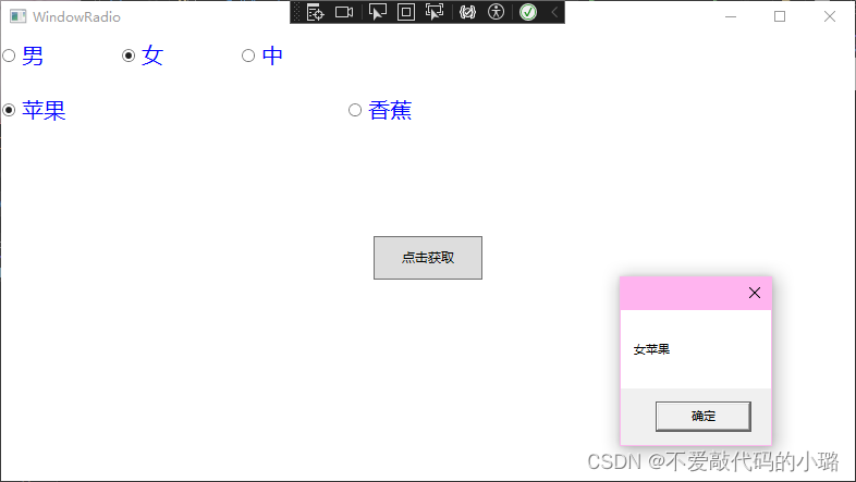
<RadioButton Content="Option 1" GroupName="options" />
<RadioButton Content="Option 2" GroupName="options" />
<RadioButton Content="Option 3" GroupName="options" />
在这个示例中,我们定义了三个RadioButton控件,它们都属于同一个组(options)。这意味着用户只能从这三个选项中选择一个值。
3. 优化技巧
为了提高RadioButton控件的性能和用户体验,你可以采取以下优化措施:
使用数据绑定: 通过数据绑定,你可以将RadioButton控件与后端数据源(如集合、对象等)连接起来。这样可以减少前端代码的数量,并使界面与数据源保持同步。
减少不必要的模板: 尽量避免为RadioButton控件创建复杂的模板。简单的模板不仅易于维护,而且可以提高性能。
使用视觉状态管理: 通过使用视觉状态管理,你可以为RadioButton控件创建不同的状态(如正常、悬停、选中等)。这样可以提高用户体验,并使界面更加吸引人。
使用命名组: 通过为 RadioButton 集合使用相同的 GroupName 属性,确保它们之间是互斥的。
数据绑定: 利用数据绑定减少重复代码,提高代码的可维护性。
视觉样式: 为 RadioButton 定义清晰的视觉样式,增强可读性和美观性。
焦点管理: 确保 RadioButton 能够正确接收和处理焦点,优化键盘导航。
异步更新: 在更新 RadioButton 状态时使用异步操作,避免界面冻结。
4. 实际应用示例
以下是一些实际的应用示例,展示如何在WPF应用程序中使用RadioButton控件:
选项选择
在表单或设置界面中,RadioButton控件常用于允许用户从多个选项中选择一个值。
<StackPanel>
    <RadioButton Content="Option 1" GroupName="options" />
    <RadioButton Content="Option 2" GroupName="options" />
    <RadioButton Content="Option 3" GroupName="options" />
</StackPanel>
数据绑定
你可以将RadioButton控件与数据源(如集合、对象等)绑定,以便动态地更新选项。
<ListView ItemsSource="{Binding Options}">
    <ListView.ItemTemplate>
        <DataTemplate>
            <RadioButton Content="{Binding OptionText}" GroupName="options" />
        </DataTemplate>
    </ListView.ItemTemplate>
</ListView>
视觉状态管理
通过使用视觉状态管理,你可以为RadioButton控件创建不同的状态(如正常、悬停、选中等)。
<Style x:Key="RadioButtonStyle" TargetType="RadioButton">
    <Setter Property="Template">
        <Setter.Value>
            <ControlTemplate TargetType="RadioButton">
                <Border x:Name="border" Background="{TemplateBinding Background}"
                        BorderBrush="{TemplateBinding BorderBrush}"
                        BorderThickness="{TemplateBinding BorderThickness}">
                    <ContentPresenter HorizontalAlignment="{TemplateBinding HorizontalContentAlignment}"
                                      VerticalAlignment="{TemplateBinding VerticalContentAlignment}"
                                      Margin="{TemplateBinding Padding}" />
                </Border>
                <ControlTemplate.Triggers>
                    <Trigger Property="IsChecked"
                                        <Trigger Property="IsChecked" Value="True">
                        <Setter TargetName="border" Property="Background" Value="{StaticResource SelectedBrush}" />
                    </Trigger>
                    <Trigger Property="IsMouseOver" Value="True">
                        <Setter TargetName="border" Property="BorderBrush" Value="{StaticResource HoverBorderBrush}" />
                    </Trigger>
                </ControlTemplate.Triggers>
            </ControlTemplate>
        </Setter.Value>
    </Setter>
</Style>
5.添加自定义样式
在WPF中,你可以通过创建一个ControlTemplate来为RadioButton添加自定义样式。以下是一个简单的例子,展示了如何创建一个自定义的RadioButton样式:
<Window x:Class="RadioButtonCustomization.MainWindow"
        xmlns="http://schemas.microsoft.com/winfx/2006/xaml/presentation"
        xmlns:x="http://schemas.microsoft.com/winfx/2006/xaml"
        Title="MainWindow" Height="200" Width="300">
    <StackPanel>
        <RadioButton x:Name="CustomRadioButton" Content="自定义RadioButton" Style="{StaticResource CustomRadioButtonStyle}" />
    </StackPanel>
</Window>
<ResourceDictionary xmlns="http://schemas.microsoft.com/winfx/2006/xaml/presentation"
                    xmlns:x="http://schemas.microsoft.com/winfx/2006/xaml">
    <Style x:Key="CustomRadioButtonStyle" TargetType="RadioButton">
        <Setter Property="Template">
            <Setter.Value>
                <ControlTemplate TargetType="RadioButton">
                    <Border x:Name="border"
                            BorderBrush="{TemplateBinding BorderBrush}"
                            BorderThickness="{TemplateBinding BorderThickness}"
                            Background="{TemplateBinding Background}">
                        <ContentPresenter HorizontalAlignment="Center"
                                          VerticalAlignment="Center"
                                          Margin="10" />
                    </Border>
                    <ControlTemplate.Triggers>
                        <Trigger Property="IsChecked" Value="True">
                            <Setter TargetName="border" Property="Background" Value="{StaticResource SelectedBrush}" />
                        </Trigger>
                        <Trigger Property="IsMouseOver" Value="True">
                            <Setter TargetName="border" Property="BorderBrush" Value="{StaticResource HoverBorderBrush}" />
                        </Trigger>
                        <Trigger Property="IsEnabled" Value="False">
                            <Setter TargetName="border" Property="Opacity" Value="0.5"/>
                        </Trigger>
                    </ControlTemplate.Triggers>
                </ControlTemplate>
            </Setter.Value>
        </Setter>
    </Style>
</ResourceDictionary>
在这个例子中,我们定义了一个名为CustomRadioButtonStyle的样式,并将其应用于RadioButton控件。ControlTemplate定义了RadioButton的外观,包括边框、背景和内容呈现器。我们还在Triggers部分添加了几个Trigger,以便在不同的状态下(如选中、悬停、禁用)应用不同的样式。
你可以通过添加更多的Setter和Trigger来自定义RadioButton的外观和行为。例如,你可以改变边框的颜色、宽度、圆角等,或者在不同的状态下改变背景颜色。
请注意,你需要将ResourceDictionary添加到你的App.xaml文件中,以便它可以在整个应用程序中使用:
<Application.Resources>
    <ResourceDictionary>
        <ResourceDictionary.MergedDictionaries>
            <ResourceDictionary Source="Styles.xaml"/>
        </ResourceDictionary.MergedDictionaries>
    </ResourceDictionary>
</Application.Resources>
在Styles.xaml文件中定义了自定义样式。这样,你就可以在应用程序的任何地方使用这个样式了。
6. 实际应用场景
RadioButton 控件在多种应用场景中都非常有用,以下是一些具体的例子:
- 表单输入:在数据输入表单中,使用 RadioButton 让用户从一组预定义的选项中做出选择。
- 配置设置:在应用程序的设置界面中,使用 RadioButton 允许用户选择不同的配置选项。
- 信息选择:在提供多项信息选择的应用场景中,如调查问卷或考试选择题,使用 RadioButton 控件让用户做出选择。
结论
RadioButton 控件是 C# WPF 应用程序中一个强大的 UI 元素,用于实现单选功能,支持用户在多个选项中做出唯一选择。通过本文的介绍,您应该已经了解了 RadioButton 控件的基本功能、标准用法、可优化的技巧以及在不同场景中的应用方法。掌握这些知识,可以帮助您开发出更加直观、易用的 WPF 用户界面。在实际开发过程中,不断实践和探索,能够进一步提升您使用这一控件的能力。