The data:Student's BMI survey
What we want to visualize
1. Relation between BMI and GPA, BMI and homework, BMI and nbr of step per day(two continuous variables)
2. Relation between Gender and BMI, Department and BMI (one categorical/one continuos)
3. Relation between video game and place of birth, and gender (two categorical variables)
BMI and GPA
On our data set Students BMI we want to analyze the correlation between two variables GPA and BMI(necessarily as strong correlation since weigth is use to calculate BMI)
The most common way to visualize such correlation is to use a scatter plotIn R language it means that we will use geom_point() in the geom part
ggplot(Student_BMI_2, aes(x=BMI,y=GPA))+geom_point(size=3)ggplot(Student_BMI_2, aes(x=BMI,y=GPA,color=Gender,shape=Dpt))+geom_point(size=2)( color is decides based on gender, and the shape is decided based on Department)
We suspect that physical activity might have some influence on students BMI
We suspect that student commitment to their studies influence their BMIExercise:
1. Visualize the correlation between BMI and homework_day
2. Visualize the correlation between BMI and walk_meter_day
3. Redo the graphs while adding information on students department (Dpt)
#Practice
#Visualize relation between BMI and homework_day
ggplot(Student_BMI_2,aes(y=BMI,x=homework_day))+geom_point(size=2,color="blue")
#visualize the relation between GPA and walk_meter_day
ggplot(Student_BMI_2,aes(y=BMI,x=walk_meter_day))+geom_point(size=2,color="blue")
#use color to show the difference by Department
ggplot(Student_BMI_2,aes(y=BMI,x=walk_meter_day,color=Dpt))+geom_point(size=2)
ggplot(Student_BMI_2,aes(y=BMI,x=homework_day,color=Dpt))+geom_point(size=2)
#adding a curve showing the tendency (loess curve or linear model)
ggplot(Student_BMI_2, aes(x=BMI,y=weight))+geom_point()+geom_smooth(method="lm")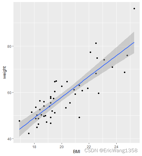
ggplot(Student_BMI_2, aes(x=BMI,y=weight))+geom_point()+geom_smooth(method="loess")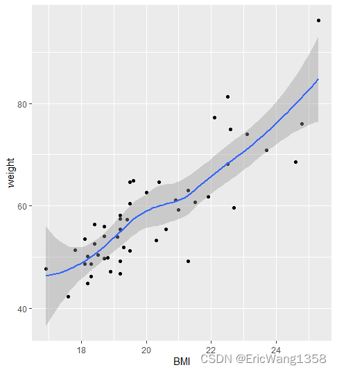
#Add a loess curve
ggplot(Student_BMI_2,aes(x=BMI,y=homework_day))+geom_point(size=2)+geom_smooth(method="loess")
ggplot(Student_BMI_2,aes(x=BMI,y=walk_meter_day))+geom_point(size=2,color="blue")+geom_smooth(method="loess")
Continuos and a categorical one
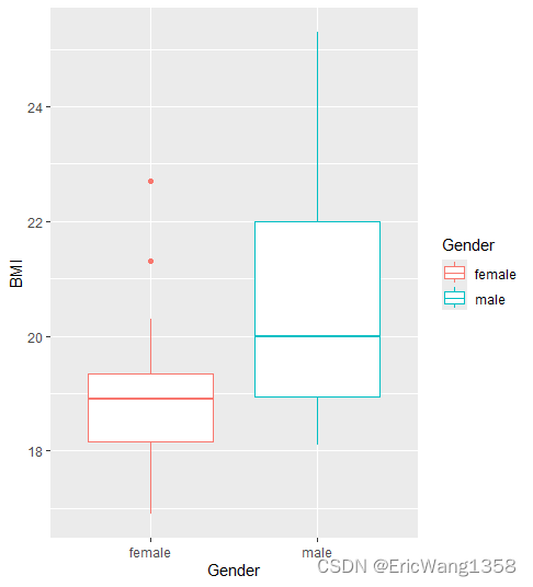
In the dataset BMI_students, BMI is continuous while Gender, Department are discrete (-categorical =factor)
#doing a bar boxplot: visualize the relation between BMI, department and gender
ggplot(Student_BMI_2,aes(x=Gender,y=BMI,color=Gender))+geom_boxplot()
#Practice
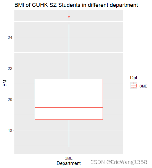
ggplot(Student_BMI_2,aes(x=Dpt,y=BMI,color=Dpt))+geom_boxplot()+labs(title="BMI of CUHK SZ Students in different department",x="Department")
ggplot(Student_BMI_2,aes(x=Dpt,y=BMI,color=Gender))+geom_boxplot()+labs(title="Boxplot of Students' BMI by Department and Gender", x="Department")

Two categorical ones
#Graphing two categorical variables
# bar chart of students origin per department
Student_BMI_2$`place of birth`<-as.factor(Student_BMI_2$`place of birth`)
ggplot(Student_BMI_2,aes(fill=`place of birth`,x=Dpt))+geom_bar(position="dodge")
#Do even better
Student_BMI_2$`place of birth`<-factor(Student_BMI_2$`place of birth`,levels=c("Guangdong","Other_province","International"))
levels(Student_BMI_2$`place of birth`)
ggplot(Student_BMI_2,aes(fill=`place of birth`,x=Dpt))+geom_bar(position="dodge")
In the context of ggplot2 in R, the position = "dodge" argument is used to adjust the position of elements, such as bars in a bar plot, so that they are placed side by side rather than being stacked on top of each other.
library(ggplot2)

# Sample data
data <- data.frame(
  Category = c("A", "A", "B", "B"),
  Subcategory = c("X", "Y", "X", "Y"),
  Count = c(10, 20, 15, 25)
)

# Bar plot with position = "dodge"
ggplot(data, aes(x = Category, y = Count, fill = Subcategory)) +
  geom_bar(stat = "identity", position = "dodge") +
  ggtitle("Dodged Bar Plot")

If = fill;
# Sample data
data <- data.frame(
  Category = c("A", "A", "B", "B"),
  Subcategory = c("X", "Y", "X", "Y"),
  Count = c(10, 20, 15, 25)
)

# Bar plot with position = "dodge"
ggplot(data, aes(x = Category, y = Count, fill = Subcategory)) +
  geom_bar(stat = "identity", position = "fill") +
ggtitle("Dodged Bar Plot") 
if = "stack"
library(ggplot2)

# Sample data
data <- data.frame(
  Category = c("A", "A", "B", "B"),
  Subcategory = c("X", "Y", "X", "Y"),
  Count = c(10, 20, 15, 25)
)

# Bar plot with position = "dodge"
ggplot(data, aes(x = Category, y = Count, fill = Subcategory)) +
  geom_bar(stat = "identity", position = "stack") +
  ggtitle("Dodged Bar Plot")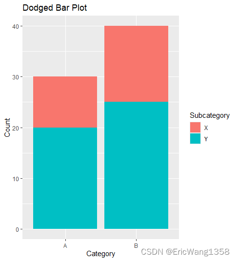
if = jitter; to avoid overplotting


![[Gitlab CI] 自动取消旧流水线](https://img-blog.csdnimg.cn/img_convert/03390e6a6dde3bc60e3eab14627a734e.png)