📚js
🐇整体框架
🐇整体框架
- 使用
echarts.init方法初始化了一个 ECharts 实例,指定了一个 div 元素作为图表的容器。 - 定义图表的配置项option,其中包括了图表的标题、提示框、x 轴、y 轴、数据系列等等。
- 通过
myChart.setOption将配置项应用到echarts实例。 - 绑定事件处理函数
myChart.resize以便让图表自适应新的窗口大小,确保图表在不同尺寸的屏幕上能够正确显示。var myChart = echarts.init(document.getElementById('test1')); var option = { ...}; if (option && typeof option === 'object') { myChart.setOption(option); } window.addEventListener('resize', myChart.resize);
🐇option
标题、悬浮提示框、图例
- 如果tooltip设置为空即
tooltip:{},则将会用默认的样式和行为。(为空为默认样式,如果干脆不写tooltip那就没有悬浮框效果了)。 - 在默认情况下,tooltip 的行为会在鼠标悬停时触发,并显示该数据点的数值。会显示以下信息: ①数据项的名称(如果有) ②相关数据项的数值。至于样式,通常是一个半透明的浮动框,如下:
legend里data的内容和后续数据项配置的name对应。
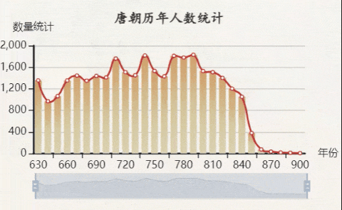
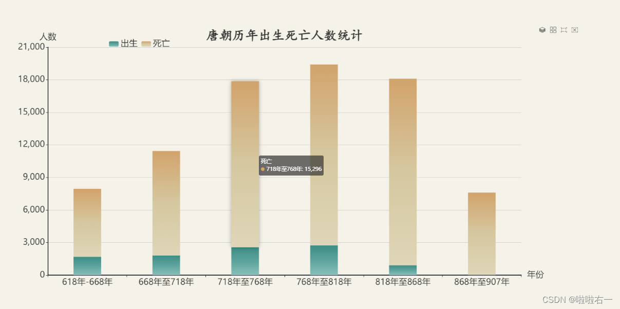
title: { text: '唐朝历年出生死亡人数统计', left: 'center', top: '1%', textStyle: { color: '#333', fontSize: 34, fontWeight: 'bold', fontFamily: 'KaiTi, serif' } }, tooltip: { }, legend: { data: ['出生', '死亡'], left: '20%', top: '5%', textStyle: { fontSize: 22 } }- 如果tooltip设置为空即
神奇的brush和toolbox🔥
brush是 ECharts 中的刷选功能,它允许用户在图表中进行区域选择或刷选。toolbox: ['rect', 'clear']:配置了画笔(brush)工具栏中包含的功能按钮。‘rect’ 表示矩形选框,‘clear’ 表示清除选框。这样用户在图表上就可以使用画笔工具在 x 轴上进行区域选取。- 除了 ‘rect’ 和 ‘clear’,ECharts 中还有其他一些可用的画笔(brush)类型,例如:‘lineX’:横向刷选 ; ‘lineY’:纵向刷选 ;‘keep’:保持之前的选框 ;‘unKeep’:清除之前的选框。
toolbox是 ECharts 中的工具箱功能,提供了一系列交互式的工具按钮,如刷新图表、保存为图片等。feature:用于配置工具箱中的功能按钮。magicType:其中的 type 属性用于配置图表切换类型的功能按钮。
通过这样的配置,用户可以在图表中使用 brush 工具在 x 轴进行区域选择,并且可以在工具箱中切换图表类型。
brush: {

   toolbox: ['rect', 'clear'],
    xAxisIndex: 0
},
toolbox: {

    feature: {

        magicType: {

            type: ['stack', 'tiled']
        },
        saveAsImage: {
     },  // 添加保存为图片功能按钮
        dataView: {
     },      // 添加数据视图功能按钮
        restore: {
     }         // 添加刷新按钮
    }
}
X轴Y轴
- 关注
rotate属性,当坐标轴标签字体过大以至于信息显示不全时,可以通过适当旋转来使其完全显示。
xAxis: { data: ['618年-668年','668年至718年', '718年至768年', '768年至818年', '818年至868年', '868年至907年'], name: '年份', nameTextStyle: { color: '#333', fontSize: 28 }, axisLine: { lineStyle: { color: '#151d29', width: 2 }, }, axisLabel: { textStyle: { color: '#333', fontSize: 28 }, rotate: 12, } }, yAxis: { name: '人数', nameTextStyle: { color: '#333', fontSize: 28 }, axisLine: { lineStyle: { color: '#151d29', width: 2 } }, axisLabel: { textStyle: { color: '#333', fontSize: 28 } } }- 关注
数据系列配置:两组数据就命好名字,分别
{}配置,中间,连接,整体[]包裹。series: [ { name: '出生', type: 'bar', barWidth : '35%', barCategoryGap: '0', // 设置柱体无间隔 stack: 'one', itemStyle: { color: new echarts.graphic.LinearGradient(0, 0, 0, 1, [ { offset: 0, color: '#3d8e86' }, { offset: 0.5, color: '#5da39d' }, { offset: 1, color: '#88bfb8' } ]) }, emphasis: { itemStyle: { shadowBlur: 10, shadowColor: 'rgba(0,0,0,0.3)' } }, data: [1693, 1813, 2568, 2739, 908, 26] }, { name: '死亡', type: 'bar', barWidth : '35%', barCategoryGap: '0', stack: 'one', showBackground: true, itemStyle: { color: new echarts.graphic.LinearGradient(0, 0, 0, 1, [ { offset: 0, color: '#d2a36c' }, { offset: 0.5, color: '#d5c8a0' }, { offset: 1, color: '#dfd6b8' } ]) }, emphasis: { itemStyle: { shadowBlur: 10, shadowColor: 'rgba(0,0,0,0.3)' } }, data: [6258, 9623, 15296, 16672, 17191, 7581] } ]
🐇字体大小设置总结
标题字体
title: {

    textStyle: {

        fontSize: 34,
    }
}
坐标轴字体
- 刻度字体
xAxis: { axisLabel: { fontSize: 22 } } - 坐标轴名称字体
xAxis: {

	name: '年份',
	nameTextStyle: {

	    color: '#333',
	    fontSize: 22
	}
}
- 刻度字体
标线字体
markLine: {

    label: {

        fontSize: 22
    }
}
legend字体
legend: {

    textStyle: {

        fontSize: 22
    }
}